Component Layout Differences between EspressReport and Java
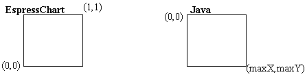
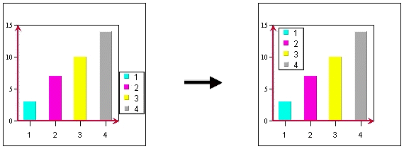
EspressReport describes its component layout in relative coordinates. On the other hand, Java uses layout format in terms of pixels. Due to backward-compatibility issues, the EspressReport layout format will not be changed. The issues pertaining to relative & absolute position is less relevant in Chart Designer since there is a graphical user’s interface. However, it is helpful to know how the layout format is in Chart API: the origin (0, 0) is at the lower left-hand corner of the canvas and the maximum (1, 1) is at the upper right-hand corner.
In the Java layout format, the origin is at the upper left-hand corner and the maximum pixel (maximumX, maximumY) is at the lower right-hand corner.
In the IAxis Class, the methods setMaxScale, setMinScale, and setScaleStep refer to the range and interval of the axis. Therefore, these methods would not affect the apparent length of the axis, rather, they specify the range of the axis.
The following sections discuss some examples of customization techniques relating to layout of chart components, re-sizing and data point labeling.
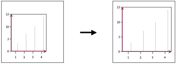
Enlarging the Chart Plot Area
The default relative size of the chart plot area is 0.6 in the x dimension and 0.6 in the y dimension. If you want to adjust these ratios using the API, you can use the setRelativeHeight() and setRelativeWidth() methods.
// chart plot’s default relative size is 0.6, 0.6
IPlot chartPlot = chart.gethChartPlot();
chartPlot.setRelativeHeight( (float) 0.75);
chartPlot.setRelativeWidth( (float) 0.8);
To adjust the chart plot in the Chart Designer, simply click and hold down the right mouse button when the mouse cursor is on the chart. Drag the mouse to the right to increase the chart plot area and to the left to decrease the chart plot area. Depending on the direction that you move the mouse (either vertically, horizontally, or diagonally), the chart plot changes in one or in both dimensions.
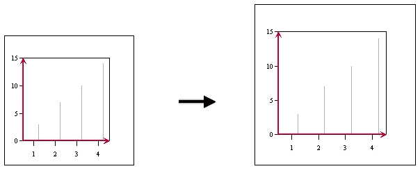
Enlarging the Canvas Area
This example shows you how to adjust the size of the canvas while keeping the Chart Plot size constant in relation to the canvas.
// default canvas size is 600 pixels by 500 pixels
int width = 500; // in pixels
int height = 550; // in pixels
chart.gethCanvas().setSize( new Dimension(width, height));
To change the canvas area in the Chart Designer, go to → and change the dimensions there. Note that the canvas is always equal to or greater than the Chart Designer window size. If you want a smaller Canvas area, you must reduce the dimensions of the Chart Designer window first.
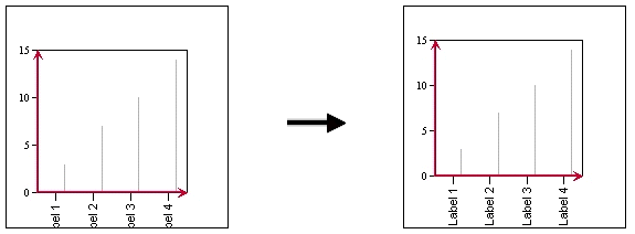
Fitting Chart Elements onto Canvas
If you notice that there are chart elements (e.g., ticker labels for the Category Axis) that are “chopped off” by the canvas, you can use the setFitOnCanvas() method to do the necessary adjustments.
// try to reposition chart location or reduce chart size until
// EspressReport is able to fit a whole chart
// on canvas. Default value is FALSE
chart.gethCanvas().setFitOnCanvas(true);
Changing the Position of the Legend Box
The position of the legend box can be adjusted if the default location is not what you want. Please note that the reference point is the center of the legend box.
// Legend Box can be moved with a specified new relative position
ILegend hLegend = chart.gethLegend();
float x = 0.2;
float y = 0.7;
hLegend.setPosition( new Position( x, y) );
Legend box size is dependent on the size of the text font & text strings. Therefore, you cannot set the legend box size directly, but you can get the size of the legend box. Here are some sample codes:
ILegend hLegend = chart.gethLegend()
float relWidth = hLegend.getRelativeWidth();
float relHeight = hLegend.getRelativeHeight();
To change the position of the legend in the Chart Designer, left click on the legend and drag it to the desired position on the canvas.
Depending on your needs, it is sometimes necessary to have labels attached to data points. EspressReport provides a few features to fulfill these requirements. For example, you can attach annotation text to trend lines. When the trend line moves with the data, the annotation text will move in tandem with the trend line. Top labels can be set visible and appear at the top of every data point. However, in certain situations, you may want to have labels attached to just a few selected data points. How would you go about doing this?
You can use existing features to achieve this as follows: First, draw a constant horizontal line with value of the desired data point. Next, attach an annotation text to the line. Hide the legend for the line. Finally, make the horizontal line invisible by simply choosing a dashed line style and making both the fill and empty pixel lengths to be 255.
The following code fragment demonstrates this technique and the following tables show the data referred to in the code. The objective is to attach labels to two data points at the far right of the chart (the maximum of both series) and to attach one label to a data point at the left side of the chart (the minimum as shown below).
Please note that the positions of the labels are updated automatically when one of the last data points changed from $700 to $500.
| Day | Value1 | Value2 |
|---|---|---|
| 1 | 100 | 100 |
| 2 | 150 | 300 |
| 3 | 200 | 500 |
| 4 | 250 | 700 |
Original Data
| Day | Value1 | Value2 |
|---|---|---|
| 1 | 100 | 100 |
| 2 | 150 | 300 |
| 3 | 200 | 450 |
| 4 | 250 | 500 |
New Data
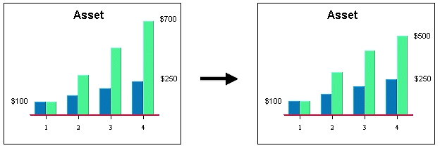
Chart with Original Data Changing to Chart with New Data
// example finds one of the value points in the last row of a database query.
// it’s not necessary to label the last value in particular, you can specify
// whichever values to label in your program, i.e. maximum, minimum,
// or average....

// get handle on the first set of data points
IRow rowInit = chart.gethInputData().getRow(0);
// get initial value.  if the first series is from column 3, index is 3
int valueInit = Integer.parseInt(rowInit.getObject(3).toString());

// get handle on the last set of data points
int lastRownumber = chart.gethInputData().getRowCount() - 1;
IRow lastRow = chart.gethInputData().getRow(lastRownumber);
IRow lastButOneRow = chart.gethInputData().getRow(lastRownumber-1);

// the second series last value is in the last row
int value1 = Integer.parseInt(lastRow.getObject(3).toString());
// the first series last value is in the last but one row
int value2 = Integer.parseInt(lastButOneRow.getObject(3).toString());

String labelInit = "$" + valueInit;
String label1 = "$" + value1;
String label2 = "$" + value2;

// add the line for the initial value
IDataLineSet hDataLines = chart.gethDataLines();
IHorzVertLine hvInit = hDataLines.newHorzVertLine(
IHorzVertLine.HORIZONTAL_LINE, labelInit);

hvInit.setLineValue(valueInit);   // horizontal line at value0
hvInit.setLineStyle( ((255*256) + 255) *256); // set line invisible
hDataLines.add(hvInit);

// add the line for the ending value of the first series
IHorzVertLine hv1 = hDataLines.newHorzVertLine(
IHorzVertLine.HORIZONTAL_LINE, label1);

hv1.setLineValue(value1);   // horizontal line at value1
hv1.setLineStyle( ((255*256) + 255) *256); // set line invisible
hDataLines.add(hv1);

// add the line for the ending value of the second series
IHorzVertLine hv2 = hDataLines.newHorzVertLine(
IHorzVertLine.HORIZONTAL_LINE, label2);

hv2.setLineValue(value2);   // horizontal line at value1
hv2.setLineStyle( ((255*256) + 255) *256); // set line invisible
hDataLines.add(hv2);

// Add Annotations to the lines
IAnnotationSet hAnnotation = chart.gethAnnotations();
IAnnotation annoInit = hAnnotation.newAnnotation(labelInit, hvInit);
IAnnotation anno1 = hAnnotation.newAnnotation(label1, hv1);
IAnnotation anno2 = hAnnotation.newAnnotation(label2, hv2);

// Add annoInit to the left of the chart plot area. ($100)
hvInit.addAnnotation(annoInit);
annoInit.setRelativePosition(new Point_2D( -(float)chart.gethChartPlot().getRelativeWidth(), 0f));

// Add annotation1 to the line, so it will appear on the chart
hv1.addAnnotation(anno1);

// Add annotation2 to the chart, so it will appear on the chart
hv2.addAnnotation(anno2);

// set legend box invisible
chart.gethLegend().setVisible(false);
If you want to show individual category top labels selectively, you can add a vertical trend line with the corresponding category value. Within EspressReport’s graphical mechanism, category data point positions are always referenced as numbers even though they are usually not numbers. The first data point is always referenced as 0.5 and each of the following points would have 1.0 added to it. Thus, a set of points would always be referenced as 0.5, 1.5, 2.5, 3.5...etc. The only exceptions are in Scatter and Bubble Charts.
After inserting the line in the right position, we can make the line invisible by setting the line style. Annotation is then added.
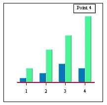
Adding "Point 4" to the chart
// adding a label above the fourth point, “Point 4”
ITrendLine tr1 = hDataLines.newTrendLine(ITrendLine.VERTICAL_LINE, 1, "Point 4");
tr1.setTitleVisibleInLegend(false);   // don't show title on legend
tr1.setLineValue(3.5);   // vertical line on the 4th data point
tr1.setLineStyle( ((255*256) + 255) *256); // set line invisible
hDataLines.add(tr1);

// Add Annotations to the lines
IAnnotationSet hAnnotation = chart.gethAnnotations();
IAnnotation annoTr1 = hAnnotation.newAnnotation(“Point 4”, tr1);

// Add annoTr1 to the line, so it will appear on the chart
tr1.addAnnotation(annoTr1);
As the scale of the chart or data point value changes, the label will always be displayed at the top of the data point.