To create a new chart, you must specify the chart type, the dimension of the chart, the input data source information, and the column mapping for the chart template. In this appendix, we look at the various chart types and the methods used to map the columns. There are also a number of fully functional examples in this appendix. Note that unless otherwise noted, all examples use the Woodview HSQL database, which is located in the <ERESInstall>/help/examples/DataSources/database directory. In order to run the examples, you'll need to add database HSQL JDBC driver (hsqldb.jar) to your classpath. The driver is located in the <ERESInstall>/WEB-INF/lib directory.
Charts can either be two or three-dimensional. Given below are the dimensions and the constant to select that dimension:
Two-Dimensional | QbChart.VIEW2D |
Three-Dimensional | QbChart.VIEW3D |
Charts have one of the following chart types. Given below are the different dimensions and the constants to select them:
Column Chart |
|
Bar Chart |
|
Line Chart |
|
Area Chart |
|
Pie Chart |
|
XY(Z) Scatter Chart |
|
Stack Column Chart |
|
Stack Bar Chart |
|
Stack Area Chart |
|
High Low Chart |
|
HLCO Chart |
|
Percentage Column Chart |
|
Surface Chart |
|
Bubble Chart |
|
Overlay Chart |
|
Box Chart |
|
Radar Chart |
|
Dial Chart |
|
Gantt Chart |
|
Polar Chart |
|
For more information on the different chart types, please refer to the Section 3.13 - Chart Types and Data Mapping.
Each chart type requires two (or more) data columns to be mapped in order to create a chart object. For more detail on the mapping (and for a definition of the terms used here), please refer to the Section 3.13 - Chart Types and Data Mapping.
To define the Column Mapping for the chart template, the ColInfo class (located in the quadbase.reportdesigner.util package) is used.
The columns (from the data source) are numbered from left to right, starting with Column “0”. The column positions, passed to the ColInfo object, are based on the data table. Note that the parameters for ColInfo objects are “-1” by default. A negative column position indicates that the particular parameter is not being used.
![[Caution]](../../../images/caution.png) | Caution |
|---|---|
As you may know, creating objects in java is a resource intensive operation. It is always recommended that you do not create too many objects. One way to conserve resource is to reuse |
Column/Bar/Line/Area/Pie/Overlay charts need a category and a value axis. Those are the minimum requirements for constructing such types of charts. You can also add in a series and a subvalue if needed. The subvalue refers to the secondary axis i.e., it contains the column that gets mapped to the secondary axis.
For instance, given the data shown below:
| Order # | Product | Units Ordered | Units Shipped |
|---|---|---|---|
| 12 | Chair | 15 | 12 |
| 12 | Table | 34 | 26 |
| 14 | Chair | 8 | 8 |
| 14 | Table | 23 | 14 |
Original Data
The following code sets the category to be Column 1 (Product), the series to be Column 0 (Order #), the value to be Column 3 (Units Shipped) and the subvalue to be Column 2 (Units Ordered):
ColInfo colInfo = new ColInfo();
colInfo.category = 1;
colInfo.series = 0;
colInfo.value = 3;
colInfo.subvalue = 2;
Constructing a Column chart is relatively straight forward. We have already discussed how to set the ColInfo array and how to obtain the data in previous sections. The following code demonstrates how to create the aforementioned Column chart.
Component doDataFromArguments(Applet applet) {


    // Do not connect to EspressManager
    QbChart.setEspressManagerUsed(false);

    // Column Mapping
    ColInfo colInfo = new ColInfo();
    colInfo.category = 1;
    colInfo.series = 0;
    colInfo.value = 3;
    colInfo.subvalue = 2;

    String dataType[] = {"integer", "varchar", "decimal", "decimal"};
    String fieldName[] = {"Order #", "Product", "Units Ordered", "Units Shipped"};
    String records[][] = {{"12", "Chair","15", "12"}, {"12", "Table","34", "26"},
                         {"14" , "Chair","8", "8"}, {"14" , "Table","23", "14"}};
    DbData data = new DbData(dataType, fieldName, records);
    QbChart chart = new QbChart
                                (applet,              // Applet
                                QbChart.VIEW2D,       // Two-Dimensional
                                QbChart.COL,          // Column Chart
                                data,                 // Data
                                colInfo,              // Column information
                                null);                // No specified template
    return chart;

}When the above code is run as an applet or an application, it will produce a two-dimensional Column chart shown below:
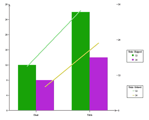
Generated Column Chart
Note that the chart created is a default chart without any formatting done to it.
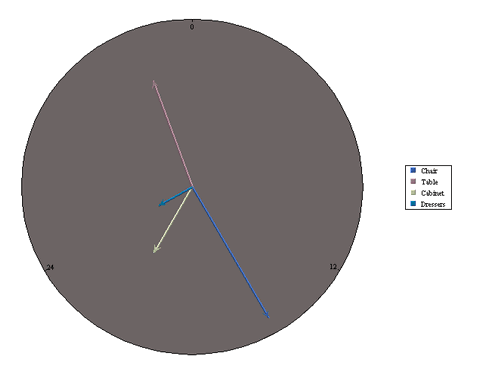
The ColInfo parameters for a Radar chart are the same as the parameters for a Column/Bar/Line/Area chart except the subvalue. A secondary axis cannot be defined.
For instance, given the data shown below:
| Order # | Product | Units Ordered |
|---|---|---|
| 12 | Chair | 15 |
| 12 | Table | 34 |
| 12 | Cabinet | 21 |
| 12 | Dresser | 24 |
| 14 | Chair | 23 |
| 14 | Table | 23 |
| 14 | Cabinet | 16 |
| 14 | Dresser | 19 |
Original Data
The following code sets the category to be Column 1 (Product), the series to be Column 0 (“Order #”) and the value to be Column 2 (“Units Ordered”):
ColInfo colInfo = new ColInfo();
colInfo.category = 1;
colInfo.series = 0;
colInfo.value = 2;
The following code demonstrates how to create the aforementioned Radar chart.
      Component doDataFromArguments(Applet applet) {

            // Do not connect to ERES Server
            QbChart.setEspressManagerUsed(false);

            // Column Mapping
            ColInfo colInfo = new ColInfo();
            colInfo.category = 1;
            colInfo.series = 0;
            colInfo.value = 2;

            String dataType[] = {"integer", "varchar", "decimal"};
            String fieldName[] = {"Order #", "Product", "Units Ordered"};
            String records[][] = {{"12", "Chair", "15"}, {"12", "Table", "34"},
                                           {"12" , "Cabinet", "21"}, {"12" , "Dresser", "24"},
                                           {"14" , "Chair", "23"}, {"14" , "Table", "23"},
                                           {"14" , "Chair", "23"}, {"14" , "Table", "23"}};
            DbData data = new DbData(dataType, fieldName, records);
            QbChart chart = new QbChart
                                                      (applet,              // Applet
                                                      QbChart.VIEW2D,       // Two-Dimensional
                                                      QbChart.RADAR,        // Radar Chart
                                                      data,                 // Data
                                                      colInfo,              // Column information
                                                      null);                // No specified template
return chart; }When the above code is run as an applet or an application, it will produce a two-dimensional Radar chart shown below:
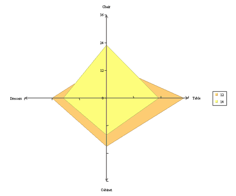
Generated Radar Chart
Note that the chart created is a default chart without any formatting done to it.
Scatter charts need a xvalue and a yvalue axis. Those are the minimum requirements for constructing such types of charts. You can also add in a series and a zvalue (for three-dimensional Scatter charts) axis if needed.
For instance, given the data shown below:
| Season | High Temperature | Average Temperature | Low Temperature |
|---|---|---|---|
| Summer | 110 | 101 | 96 |
| Fall | 103 | 85 | 78 |
| Winter | 85 | 75 | 67 |
| Spring | 93 | 88 | 81 |
Original Data
The following code sets the xvalue to be Column 2 (Average Temperature), the yvalue to be Column 1 (High Temperature), and the zvalue to be Column 3 (Low Temperature):
ColInfo colInfo = new ColInfo();
colInfo.xvalue = 2;
colInfo.yvalue = 1;
colInfo.zvalue = 3;
The following code demonstrates how to create the aforementioned Scatter chart.
      Component doDataFromArguments(Applet applet) {

            // Do not connect to ERES Server
            QbChart.setEspressManagerUsed(false);

            // Column Mapping
            ColInfo colInfo = new ColInfo();
            colInfo.xvalue = 2;
            colInfo.yvalue = 1;
            colInfo.zvalue = 3;

            String dataType[] = {"varchar", "integer", "integer", "integer"};
            String fieldName[] = {"Season", "High Temperature", "Average Temperature", "Low Temperature"};
            String records[][] = {{"Summer", "110", "101", "96"}, {"Fall", "103", "85", "78"},
                                           {"Winter", "85", "75", "67"}, {"Spring", "93", "88", "81"}};
            DbData data = new DbData(dataType, fieldName, records);
            QbChart chart = new QbChart
                                                      (applet,              // Applet
                                                      QbChart.VIEW3D,       // Three-Dimensional
                                                      QbChart.SCATTER,      // Scatter Chart
                                                      data,                 // Data
                                                      colInfo,              // Column information
                                                      null);                // No specified template
return chart; }When the above code is run as an applet or an application, it will produce a three-dimensional Scatter chart shown below:
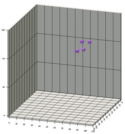
Generated Scatter Chart
Note that the chart created is a default chart without any formatting done to it.
In addition to the parameters for a Column/Line/Area chart, a Stack Column/Percentage Column/Stack Bar/Stack Area also requires the SumBy parameter to be set. The minimum requirements for creating a Stack Column/Percentage Column/Stack Bar/Stack Area chart are the category, the value and the sumby parameters. You can also add in a series and a subvalue if needed.
For instance, given the data shown below:
| Day | Drink | Total | Average |
|---|---|---|---|
| Monday | Water | 101 | 5.4 |
| Monday | Coffee | 85 | 2.4 |
| Tuesday | Water | 143 | 6.7 |
| Tuesday | Coffee | 92 | 2.5 |
| Wednesday | Water | 186 | 7.6 |
| Wednesday | Coffee | 121 | 4.2 |
| Thursday | Water | 173 | 6.3 |
| Thursday | Coffee | 75 | 1.1 |
| Friday | Water | 88 | 3.6 |
| Friday | Coffee | 193 | 5.9 |
| Saturday | Water | 152 | 7.3 |
| Saturday | Coffee | 57 | 1.6 |
| Sunday | Water | 194 | 8.8 |
| Sunday | Coffee | 25 | 0.6 |
Original Data
The following code sets the category to be Column 0 (“Day”), the value to be Column 2 (“Total”), the sumby to be Column 1 (“Drink”) and the subvalue to be Column 3 (“Average”):
ColInfo colInfo = new ColInfo();
colInfo.category = 0;
colInfo.value = 2;
colInfo.subvalue = 3;
colInfo.sumBy = 1;
The following code demonstrates how to create the aforementioned Stack Area chart.
      Component doDataFromArguments(Applet applet) {

            // Do not connect to ERES Server
            QbChart.setEspressManagerUsed(false);

            // Column Mapping
            ColInfo colInfo = new ColInfo();
            colInfo.category = 0;
            colInfo.value = 2;
            colInfo.subvalue = 3;
            colInfo.sumBy = 1;

            String dataType[] = {"varchar", "varchar", "integer", "double"};
            String fieldName[] = {"Day", "Drink", "Total","Average"};
            String records[][] = {{"Monday", "Water", "101","5.4"}, {"Monday", "Coffee", "85","2.4"},
                                           {"Tuesday", "Water", "143","6.7"}, {"Tuesday", "Coffee", "92","2.5"},
                                           {"Wednesday", "Water", "186","7.6"}, {"Wednesday", "Coffee", "121","4.2"},
                                           {"Thursday", "Water", "173","6.3"}, {"Thursday", "Coffee", "75","1.1"},
                                           {"Friday", "Water", "88","3.6"}, {"Friday", "Coffee", "193","5.9"},
                                           {"Saturday", "Water", "152","7.3"}, {"Saturday", "Coffee", "57","1.6"},
                                           {"Sunday", "Water", "194","8.8"}, {"Sunday", "Coffee", "25","0.6"}};
            DbData data = new DbData(dataType, fieldName, records);
            QbChart chart = new QbChart
                                                      (applet,              // Applet
                                                      QbChart.VIEW2D,       // Two-Dimensional
                                                      QbChart.STACKAREA,    // Stack Area Chart
                                                      data,                 // Data
                                                      colInfo,              // Column information
                                                      null);                // No specified template
return chart; }When the above code is run as an applet or an application, it will produce a two-dimensional Stack Area chart shown below:
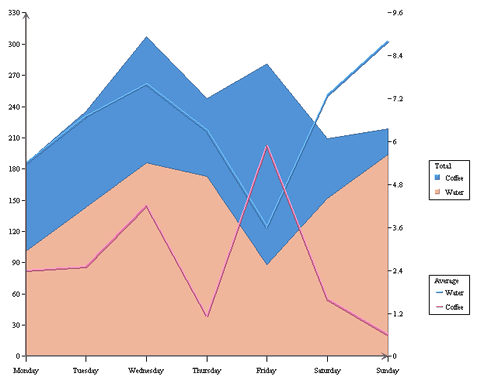
Generated Stack Area Chart
Note that the chart created is a default chart without any formatting done to it.
The ColInfo parameters for a Dial chart are the same as the parameters for a Radar chart except the series. A series column cannot be defined.
For instance, given the data shown below:
| Product | Units Ordered |
|---|---|
| Chair | 15 |
| Table | 34 |
| Cabinet | 21 |
| Dresser | 24 |
Original Data
The following code sets the category to be Column 0 (“Product”) and the value to be Column 1 (“Units Ordered”):
ColInfo colInfo = new ColInfo();
colInfo.category = 0;
colInfo.value = 1;
The following code demonstrates how to create the aforementioned Dial chart.
      Component doDataFromArguments(Applet applet) {

            // Do not connect to ERES Server
            QbChart.setEspressManagerUsed(false);

            // Column Mapping
            ColInfo colInfo = new ColInfo();
            colInfo.category = 0;
            colInfo.value = 1;

            String dataType[] = {"varchar", "integer"};
            String fieldName[] = {"Product", "Units Ordered"};
            String records[][] = {{"Chair", "15"}, {"Table", "34"},
                                           {"Cabinet", "21"}, {"Dresser", "24"}};
            DbData data = new DbData(dataType, fieldName, records);
            QbChart chart = new QbChart
                                                      (applet,              // Applet
                                                      QbChart.VIEW2D,       // Two-Dimensional
                                                      QbChart.DIAL,         // Dial Chart
                                                      data,                 // Data
                                                      colInfo,              // Column information
                                                      null);                // No specified template
return chart; }When the above code is run as an applet or an application, it will produce a two-dimensional Dial chart shown below:
Generated Dial Chart
Note that the chart created is a default chart without any formatting done to it.
The ColInfo parameters for a Box chart are the same as the parameters for a Column/Bar/Line/Area/Pie/Overlay chart except the series. A series column cannot be defined.
For instance, given the data shown below:
| Subject | Student | Score |
|---|---|---|
| Math | A.S. | 65 |
| Math | T.E. | 75 |
| Math | V.Q. | 83 |
| Math | X.C. | 87 |
| Math | I.Z. | 93 |
| Science | A.S. | 86 |
| Science | T.E. | 90 |
| Science | V.Q. | 73 |
| Science | X.C. | 95 |
| Science | I.Z. | 84 |
Original Data
The following code sets the category to be Column 0 (“Subject”) and the value to be Column 2 (“Score”):
ColInfo colInfo = new ColInfo();
colInfo.category = 0;
colInfo.value = 2;
The following code demonstrates how to create the aforementioned Box chart.
      Component doDataFromArguments(Applet applet) {,

            // Do not connect to ERES Server
            QbChart.setEspressManagerUsed(false);

            // Column Mapping
            ColInfo colInfo = new ColInfo();
            colInfo.category = 0;
            colInfo.value = 2;

            String dataType[] = {"varchar", "varchar", "integer"};
            String fieldName[] = {"Subject", "Student", "Score"};
            String records[][] = {{"Math", "A.S.", "65"}, {"Math", "T.E.", "75"},
                                           {"Math", "V.Q.", "83"}, {"Math", "X.C.", "87"},
                                           {"Math", "I.Z.", "93"}, {"Science", "A.S.", "86"},
                                           {"Science", "T.E.", "90"}, {"Science", "V.Q.", "73"},
                                           {"Science", "X.C.", "95"}, {"Science", "I.Z.", "84"}};
            DbData data = new DbData(dataType, fieldName, records);
            QbChart chart = new QbChart
                                                      (applet,              // Applet
                                                      QbChart.VIEW2D,       // Two-Dimensional
                                                      QbChart.BOX,          // Box Chart
                                                      data,                 // Data
                                                      colInfo,              // Column information
                                                      null);                // No specified template
return chart; }When the above code is run as an applet or an application, it will produce a two-dimensional Box chart shown below:
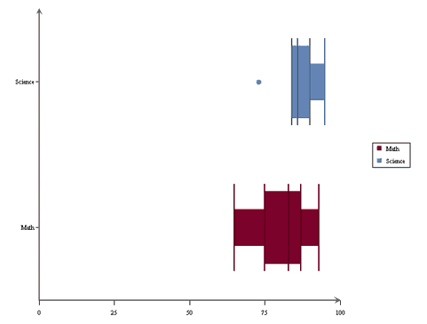
Generated Box Chart
Note that the chart created is a default chart without any formatting done to it.
The ColInfo parameters for a Bubble chart are the same as the parameters for a three-dimensional Scatter Chart. The xvalue, yvalue and zvalue parameters are necessary to draw a Bubble Chart. Note that for a bubble chart, the zvalue refers to the Bubble Size.
For instance, given the data shown below:
| Drink | High | Average | Low |
|---|---|---|---|
| Water | 3 | 2 | 2 |
| Soda | 1 | 1 | 0 |
| Coffee | 5 | 2 | 1 |
| Tea | 3 | 1 | 1 |
Original Data
The following code sets the series to be Column 0 (“Drink”), xvalue to be Column 1 (“quote>High”), the yvalue to be Column 3 (“Low”), and the zvalue to be Column 2 (“Average”):
ColInfo colInfo = new ColInfo();
colInfo.xvalue = 1;
colInfo.yvalue = 3;
colInfo.zvalue = 2;
colInfo.series = 0;
The following code demonstrates how to create the aforementioned Bubble chart.
Component doDataFromArguments(Applet applet) {


      // Do not connect to ERES Server
      QbChart.setEspressManagerUsed(false);

      // Column Mapping
      ColInfo colInfo = new ColInfo();
      colInfo.xvalue = 1;
      colInfo.yvalue = 3;
      colInfo.zvalue = 2;
      colInfo.series = 0;

      String dataType[] = {"varchar", "integer", "integer", "integer"};
      String fieldName[] = {"Drink", "High", "Average", "Low"};
      String records[][] = {{"Water", "3", "2", "2"}, {"Soda", "1", "1", "0"},
                                     {"Coffee", "5", "2", "1"}, {"Tea", "3", "1", "1"}};
      DbData data = new DbData(dataType, fieldName, records);
      QbChart chart = new QbChart
                                                (applet,              // Applet
                                                QbChart.VIEW2D,       // Two-Dimensional
                                                QbChart.BUBBLE,       // Bubble Chart
                                                data,                 // Data
                                                colInfo,              // Column information
                                                null);                // No specified template


return chart; }When the above code is run as an applet or an application, it will produce a two-dimensional Bubble chart shown below:
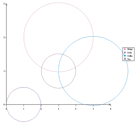
Generated Bubble Chart
Note that the chart created is a default chart without any formatting done to it.
The ColInfo parameters for a High-Low/HLCO chart differ from the parameters of the other chart types. Here the value part of the chart is further subdivided into an open value, a close value, a high value and a low value. The minimum requirements for a High-Low chart are the category, the high value and the low value parameters (for a HLCO, the close value and open value parameters are also required). You can also additionally add in the series and subvalue parameters as well.
For instance, given the data shown below:
| Day | Company | High | Low | Close | Open | Volume |
|---|---|---|---|---|---|---|
| 2001-01-01 | ABC | 1.33 | 1.18 | 1.22 | 1.23 | 43723 |
| 2001-01-01 | DEF | 9.24 | 8.74 | 9.16 | 8.89 | 18478 |
| 2001-01-01 | GHI | 2.20 | 1.82 | 2.14 | 1.97 | 46743 |
| 2001-01-02 | ABC | 1.87 | 0.79 | 1.63 | 1.12 | 33605 |
| 2001-01-02 | DEF | 9.48 | 8.12 | 8.93 | 8.66 | 16758 |
| 2001-01-02 | GHI | 2.47 | 2.32 | 2.44 | 2.34 | 60671 |
| 2001-01-03 | ABC | 2.47 | 0.22 | 0.44 | 0.63 | 45211 |
| 2001-01-03 | DEF | 9.94 | 9.92 | 9.93 | 9.93 | 10697 |
| 2001-01-03 | GHI | 2.48 | 2.40 | 2.46 | 2.44 | 45238 |
| 2001-01-04 | ABC | 1.8 | 1.38 | 1.79 | 1.44 | 50224 |
| 2001-01-04 | DEF | 9.49 | 8.87 | 8.94 | 8.93 | 11868 |
| 2001-01-04 | GHI | 2.06 | 1.45 | 1.96 | 1.46 | 62053 |
| 2001-01-05 | ABC | 1.23 | 0.58 | 0.79 | 0.79 | 37285 |
| 2001-01-05 | DEF | 9.94 | 8.61 | 8.08 | 8.94 | 10476 |
| 2001-01-05 | GHI | 2.8 | 1.58 | 2.45 | 1.96 | 47117 |
Original Data
The following code sets the category to be Column 0 (Day), the series to be Column 1 (Company), the High to be Column 2 (High), the Low to be Column 3 (Low), the Close to be Column 4 (Close), the Open to be Column 5 (Open) and the subvalue to be Column 6 (Volume):
ColInfo colInfo = new ColInfo();
colInfo.category = 0;
colInfo.series = 1;
colInfo.high = 2;
colInfo.low = 3;
colInfo.close = 4;
colInfo.open = 5;
colInfo.subvalue = 6;
The following code demonstrates how to create the aforementioned HLCO chart.
      Component doDataFromArguments(Applet applet) {

            // Do not connect to ERES Server
            QbChart.setEspressManagerUsed(false);

            // Column Mapping
            ColInfo colInfo = new ColInfo();
            ColInfo colInfo = new ColInfo();
            colInfo.category = 0;
            colInfo.series = 1;
            colInfo.high = 2;
            colInfo.low = 3;
            colInfo.close = 4;
            colInfo.open = 5;
            colInfo.subvalue = 6;

            String dataType[] = {"date", "varchar", "double", "double", "double", "double", "integer"};
            String fieldName[] = {"Day", "Company", "High", "Low", "Close", "Open", "Volume"};
            String records[][] = {{"2001-01-01", "ABC", "1.33", "1.18", "1.22", "1.23", "43723"},
                                           {"2001-01-01", "DEF", "9.24", "8.74", "9.16", "1.23", "18478"},
                                           {"2001-01-01", "GHI", "2.20", "1.82", "2.14", "1.23", "46743"},
                                           {"2001-01-02", "ABC", "1.87", "0.79", "1.63", "1.23", "33605"},
                                           {"2001-01-02", "DEF", "9.48", "8.12", "8.93", "1.23", "16758"},
                                           {"2001-01-02", "GHI", "2.47", "2.32", "2.44", "1.23", "60671"},
                                           {"2001-01-03", "ABC", "1.12", "0.22", "0.44", "1.23", "45211"},
                                           {"2001-01-03", "DEF", "9.94", "9.92", "9.93", "9.93", "10697"},
                                           {"2001-01-03", "GHI", "2.48", "2.40", "2.46", "2.44", "45238"},
                                           {"2001-01-04", "ABC", "1.80", "1.38", "1.79", "1.44", "50224"},
                                           {"2001-01-04", "DEF", "9.49", "8.87", "8.94", "8.93", "11868"},
                                           {"2001-01-04", "GHI", "2.06", "1.45", "1.96", "1.46", "62053"},
                                           {"2001-01-05", "ABC", "1.23", "0.58", "0.79", "0.79", "37285"},
                                           {"2001-01-05", "DEF", "9.94", "8.61", "8.08", "8.94", "10476"},
                                           {"2001-01-05", "GHI", "2.80", "1.58", "2.45", "1.96", "47117"}};
            DbData data = new DbData(dataType, fieldName, records);
            QbChart chart = new QbChart
                                                      (applet,              // Applet
                                                      QbChart.VIEW2D,       // Two-Dimensional
                                                      QbChart.HLCO,         // HLCO Chart
                                                      data,                 // Data
                                                      colInfo,              // Column information
                                                      null);                // No specified template
return chart; }When the above code is run as an applet or an application, it will produce a two-dimensional HLCO chart shown below:
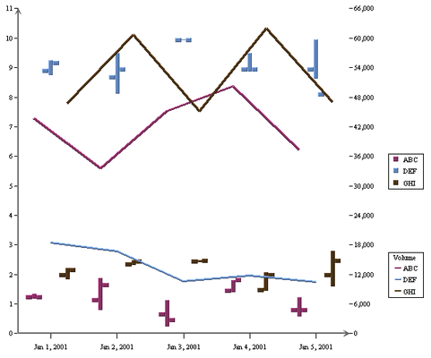
Generated HLCO Chart
Note that the chart created is a default chart without any formatting done to it.
The ColInfo parameters for a Surface chart are similar to those of a three-dimensional Scatter chart. The xvalue, yvalue and zvalue parameters are required to create a surface chart. However, a surface chart does not support the series parameter. For a surface chart, the ColInfo object defined is always the same no matter what the data is.
For instance, given the data shown below:
| 0 | 10 | 20 | 30 | 40 | 50 | 60 | 70 | 80 | 90 | 100 | |
|---|---|---|---|---|---|---|---|---|---|---|---|
| 0 | 0 | 0 | 0 | 0 | 0 | 0 | 0 | 0 | 0 | 0 | 0 |
| 10 | 0 | 0 | 0 | 0 | 0 | 1 | 0 | 0 | 0 | 0 | 0 |
| 20 | 0 | 0 | 0 | 0 | 1 | 2 | 1 | 0 | 0 | 0 | 0 |
| 30 | 0 | 0 | 0 | 1 | 2 | 3 | 2 | 1 | 0 | 0 | 0 |
| 40 | 0 | 0 | 1 | 2 | 3 | 4 | 3 | 2 | 1 | 0 | 0 |
| 50 | 0 | 1 | 2 | 3 | 4 | 5 | 4 | 3 | 2 | 1 | 0 |
| 60 | 0 | 0 | 1 | 2 | 3 | 4 | 3 | 2 | 1 | 0 | 0 |
| 70 | 0 | 0 | 0 | 1 | 2 | 3 | 2 | 1 | 0 | 0 | 0 |
| 80 | 0 | 0 | 0 | 0 | 1 | 2 | 1 | 0 | 0 | 0 | 0 |
| 90 | 0 | 0 | 0 | 0 | 0 | 1 | 0 | 0 | 0 | 0 | 0 |
| 100 | 0 | 0 | 0 | 0 | 0 | 0 | 0 | 0 | 0 | 0 | 0 |
Original Data
The following code sets the mapping for the surface chart. Note that this mapping is constant for surface charts:
int map[] = {0, 2, 1};
ColInfo colInfo = new ColInfo(-1, map);
The following code demonstrates how to create the aforementioned Surface chart.
Component doDataFromArguments(Applet applet) {

	QbChart.setEspressManagerUsed(false);

	int map[] = { 0, 2, 1 };
	ColInfo colInfo = new ColInfo(-1, map);

	String inputFileName = "surface.dat";

	QbChart chart = null;

	try {

		chart = new QbChart(applet, // Applet
				QbChart.VIEW3D, // Three-Dimensional
				QbChart.SURFACE, // Surface Chart
				QbChart.DATAFILE, // Type of text file
				inputFileName, // Data
				false, // Do not transpose data
				colInfo, // Column information
				null); // No specified template

	} catch (Exception ex)
	{
		ex.printStackTrace();
	}

	return chart;

}When the above code is run as an applet or an application, it will produce a three-dimensional Surface chart shown below:
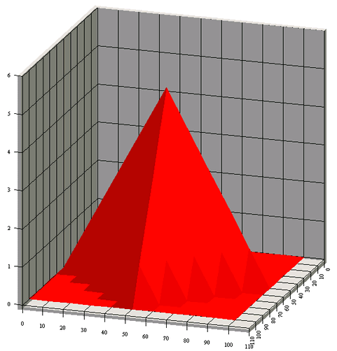
Generated Surface Chart
Note that the chart created is a default chart without any formatting done to it.
The ColInfo parameters for a Gantt chart are similar to those of a High-Low chart. Here the category, high (or start date) and low (end date) parameters are required to create a Gantt chart. You can also add a series parameter if needed.
For instance, given the data shown below:
| Project | Task | Starting Date | Ending Date |
|---|---|---|---|
| Project 1 | Task A | 1998-01-15 | 1998-03-01 |
| Project 1 | Task B | 1998-02-25 | 1998-05-18 |
| Project 1 | Task C | 1998-06-11 | 1998-09-29 |
| Project 2 | Task A | 1998-03-15 | 1998-09-29 |
| Project 2 | Task B | 1998-04-25 | 1998-08-18 |
| Project 2 | Task C | 1998-08-11 | 1998-12-29 |
Original Data
The following code sets the category to be Column 1 (“Task”), the High to be Column 2 (“Starting Date”), the Low to be Column 3 (“Ending Date”) and the series to be Column 0 (“Project”).
ColInfo colInfo = new ColInfo();
colInfo.category = 1;
colInfo.high = 2;
colInfo.low = 3;
colInfo.series = 0;
The following code demonstrates how to create the aforementioned Gantt chart.
Component doDataFromArguments(Applet applet) {

    QbChart.setEspressManagerUsed(false);

    // Column Mapping
    ColInfo colInfo = new ColInfo();
    colInfo.category = 1;
    colInfo.high = 2;
    colInfo.low = 3;
    colInfo.series = 0;

    String dataType[] = {"varchar", "varchar", "date", "date"};
    String fieldName[] = {"Project", "Task", "Starting Date","Ending Date"};
    String records[][] = {{"Project1", "Task A", "1998-01-15","1998-03-01"},
                         {"Project1", "Task B", "1998-02-25","1998-05-18"},
                         {"Project1", "Task C", "1998-06-11","1998-09-29"},
                         {"Project2", "Task A", "1998-03-15","1998-05-08"},
                         {"Project2", "Task B", "1998-04-25","1998-08-18"},
                         {"Project2", "Task C", "1998-08-11","1998-12-29"}};
    DbData data = new DbData(dataType, fieldName, records);
    QbChart chart = new QbChart
                                (applet,              // Applet
                                QbChart.VIEW2D,       // Two-Dimensional
                                QbChart.GANTT,        // Gantt Chart
                                data,                 // Data
                                colInfo,              // Column information
                                null);                // No specified template
    return chart;

}When the above code is run as an applet or an application, it will produce a two-dimensional Gantt chart shown below:
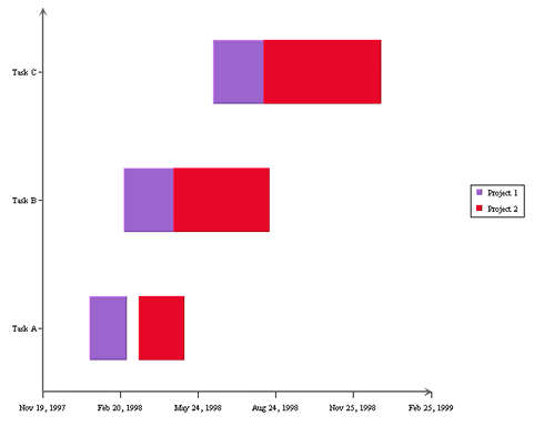
Generated Gantt Chart
Note that the chart created is a default chart without any formatting done to it.
The ColInfo parameters for a Polar chart are similar to those of a Scatter Chart. Here the radius, and angle parameters are required to create a Polar chart. You can also add a series parameter if needed.
For instance, given the data shown below:
| Radius | Angle | Series |
|---|---|---|
| 0 | 2 | A |
| 90 | 4 | A |
| 180 | 6 | A |
| 270 | 8 | A |
| 360 | 10 | A |
| 45 | 3 | B |
| 135 | 5 | B |
| 225 | 7 | B |
| 315 | 9 | B |
Original Data
The following code sets the radius to be Column 0 (“Radius”), the Angle to be Column 1 (“Angle”), and the series to be Column 2 (“Series”).
ColInfo colInfo = new ColInfo(2, new int[]{0, 1});
The following code demonstrates how to create the aforementioned Polar chart.
Component doDataFromArguments(Applet applet) {

    QbChart.setEspressManagerUsed(false);

    // Column Mapping
    ColInfo colInfo = new ColInfo(2, new int[]{0, 1});

    String dataType[] = {"integer", "integer", "varchar"};
    String fieldName[] = {"Radius", "Angle", "Series"};
    String records[][] = {{"0", "2", "A"}, {"90", "4", "A"}, {"180", "6", "A"},
                         {"270", "8", "A"}, {"360", "10", "A"}, {"45", "3", "B"},
                         {"135", "5", "B"}, {"225", "7", "B"}, {"315", "9", "B"}};
    DbData data = new DbData(dataType, fieldName, records);
    QbChart chart = new QbChart
                        (applet,              // Applet
                        QbChart.VIEW2D,       // Two-Dimensional
                        QbChart.POLAR,        // Polar Chart
                        data,                 // Data
                        colInfo,              // Column information
                        null);                // No specified template
    return chart;

}When the above code is run as an applet or an application, it will produce a two-dimensional Polar chart shown below:
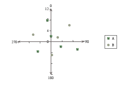
Generated Polar Chart
Note that the chart created is a default chart without any formatting done to it.
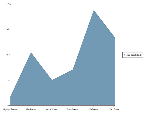
ERES allows date/time based zooming in charts. The date/time based zooming can be applied to the chart of almost any type (except high-low, HLCO, scatter, Surface, Box, Dial, Radar, Bubble and Gantt charts). The only major requirement is that the data along the category axis be of date, time or timestamp type.
Zooming can be achieved by setting the attributes and then refreshing the chart. The attributes are set using the quadbase.util.IZoomInfo interface.
The following example, which can run as example or application, shows a chart that incorporates zooming. Here the default zooming shows 5 days at a time while the maximum zoom-out allowed is 1 month and the maximum zoom-in allowed is 1 day.
// Data passed in an array in memory
DbData chartData = new DbData(dataTypes, fieldNames, data);

// Set Column Mapping
ColInfo colInfo = new ColInfo();
colInfo.category = 1;
colInfo.value = 0;

// Create Chart
QbChart chart = new QbChart(

                    (Applet)null,              // Applet
                    QbChart.VIEW2D,            // Dimension
                    QbChart.COL,               // Chart Type
                    chartData,                 // Data
                    colInfo,                   // Column Mapping
                    null);                     // Template


// Get a handle to the Zooming interface
IZoomInfo zoomInfo = chart.gethZoomInfo();
zoomInfo.setAggregateOperator(IZoomInfo.SUM);  // Specify the aggregation
zoomInfo.setMaxScale(1, IZoomInfo.YEAR);       // Specify max zoom out
zoomInfo.setMinScale(1, IZoomInfo.DAY);        // Specify max zoom in
zoomInfo.setScale(5, IZoomInfo.DAY);           // Specify current zooming
zoomInfo.setLinearScale(true);                 // Turn on Linear Scale
zoomInfo.setZoomEnabled(true);                 // Turn on Zooming

try
{

    chart.refresh();                            // Refresh the chart with zooming

} catch (Exception ex)
{

    ex.printStackTrace();

}
return chart;
When the above code is run as an applet or application, it will produce a top-level chart shown below:
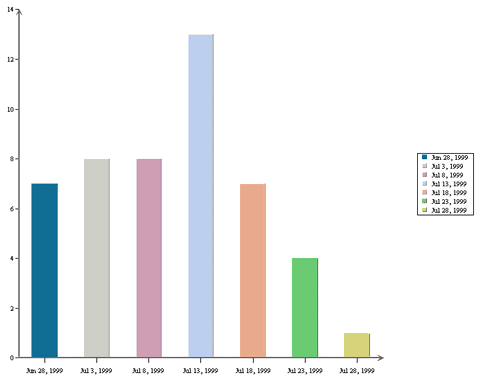
Generated Chart
You can then zoom in or zoom out on this chart, depending on the selections you make in the pop-up menu (which you can see by right-clicking on the chart canvas).
Please note that this is a default chart that is generated without formatting of any kind.
In addition to regular queries, you can pass in queries that has one, or more, parameters and have the chart prompt the user for values for the parameters, before generating the chart. Note that only stand-alone charts can be parameterized.
To use a parameterized query as your data source for your chart, you must create a class that implements IQueryFileInfo (you can use the implementation already provided, SimpleQueryFileInfo) and use that class to pass in the parameter information.
Given below is an example of a chart that uses a parameterized query. The database against which the query is run is WoodView HSQL, so you will need to add database HSQL JDBC driver (hsqldb.jar) to your classpath. The driver is located in the <ERESInstall>/WEB-INF/lib directory. Please note that you have to have ERES server running to run this example.
Component doParameterizedChart(Applet applet) {
// Connect to ERES Server
QbChart.useServlet(true);
QbChart.setServletRunner("http://localhost:8080");
QbChart.setServletContext("ERES/servlet");
// Begin Code : Adding Parameter Info
// SimpleQueryInParam(name of Parameter, String to be displayed, MapToColumn?,
// tableName, ColumnName, SQL Type, DefaultValue, value)
SimpleQueryInParam inParam = new SimpleQueryInParam("param",
"Please select",true, "Categories",
"CategoryName", Types.VARCHAR,
"Arm Chairs", null);
SimpleQueryInParam[] paramSet = {inParam};
SimpleQueryFileInfo chartInfo = new SimpleQueryFileInfo("jdbc:hsqldb:help/examples/DataSources/database/woodview",
"org.hsqldb.jdbcDriver", "sa", "",
"select Products.ProductName, Products.UnitsInStock
from Categories, Products where Categories.CategoryID=Products.CategoryID
and Categories.CategoryName=:param order by Categories.CategoryName,
Products.ProductName;");
chartInfo.setInParam(paramSet);
// End Code : Adding Parameter Info
// Begin Code : Setting up Column Mapping
ColInfo colInfo = new ColInfo();
colInfo.category = 0;
colInfo.value = 1;
// End Code : Setting up Column Mapping
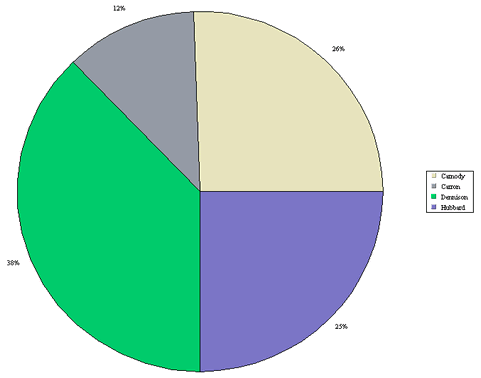
QbChart chart = new QbChart(applet, QbChart.VIEW2D, QbChart.PIE, chartInfo, colInfo, null);
return chart; }When the above code is run as an applet or an application, it will produce a chart (depending on the parameter selected) similar to the one shown below:
Generated Chart
Please note that this is a default chart that is generated without formatting of any kind.
If you add a parameterized chart to a report, then you must link a column from the main report to provide the values for the parameters defined in the chart. You do this by using the following method in ReportChartObject:
public void setParameterMap(String[] columnID);
The string array contains the IDs of the columns that will provide the values for the parameters in the chart.
You can also assign a parameter to have multiple values, for example, in the case where a user wants to check against a range of values rather than just a single value. The range of values is usually specified within the “IN” clause of a SQL query. Note that ERES only considers parameters within the “IN” clause to be multi-value.
To use a multi-value parameterized query as your data source for your chart, you must create a class that implements IQueryFileInfo and use that class to pass in the parameter information.
Given below is an example of a chart that uses a multi-value parameterized query. The database against which the query is run is WoodView HSQL, so you will need to add database HSQL JDBC driver (hsqldb.jar) to your classpath. The driver is located in the <ERESInstall>/WEB-INF/lib directory. Please note that you have to have ERES server running to run this example.
      Component doMultiValueParameter(Applet applet) {

            // Connect to ERES Server
            QbChart.useServlet(true);
            QbChart.setServletRunner("http://localhost:8080");
            QbChart.setServletContext("ERES/servlet");

            // Begin Code : Adding Parameter Info
            SimpleQueryMultiValueInParam inParam = new SimpleQueryMultiValueInParam("param",
                                                      "Please select", true,
                                                      "Categories", "CategoryName", Types.VARCHAR,
                                                      "Arm Chairs", null);

            SimpleQueryMultiValueInParam[] paramSet = {inParam};
            SimpleQueryFileInfo chartInfo = new SimpleQueryFileInfo("jdbc:hsqldb:help/examples/DataSources/database/woodview",
                                                      "org.hsqldb.jdbcDriver", "sa", "",
                                                      "select Products.ProductName,
                                                      Products.UnitsInStock from Categories,
                                                      Products where Categories.CategoryID=Products.CategoryID
                                                      and Categories.CategoryName in(:param)
                                                      order by Categories.CategoryName,
                                                      Products.ProductName;");
            chartInfo.setInParam(paramSet);

            // End Code : Adding Parameter Info

            // Begin Code : Setting up Column Mapping
            ColInfo colInfo = new ColInfo();
            colInfo.category = 0;
            colInfo.value = 1;
            // End Code : Setting up Column Mapping

            QbChart chart = new QbChart(applet, QbChart.VIEW2D, QbChart.PIE, chartInfo, colInfo, null);

            return chart;
      }

}When the above code is run as an applet or application, it will produce a chart (depending on the parameter selected) similar to the one shown below:
Generated Chart
Please note that this is a default chart that is generated without formatting of any kind.
Note that If there are more than one parameters in the IN clause, each of them is considered single-value. For example, in the query:
Select * From Products
Where ProductID IN (:param1, :param2, :param3)
:param1, :param2, and :param3 are all single-value parameters.
Initializing a multi-value parameter is the same as initializing a single-value parameter. The only difference is in the value selection dialog. While single-value parameters will translate into a drop down box, multi-value parameters will be given a multi-selection list box.
ERES supports different drill down capabilities. They are:
Parameter drill down
Data drill down
Dynamic drill down
Like parameterized charts, drill down charts are available only when generating stand-alone charts.
Constructing the different types of drill down charts are described in the sections below.
With the help of parameterized queries, parameter drill down charts can be created. Instead of having a chart with large amounts of data in it, you can show a top level chart showing the minimum data required and then delve deeper on the selected data. For more information on parameter drill down charts, please refer to the Section 3.15.3 - Parameter Drill-Down
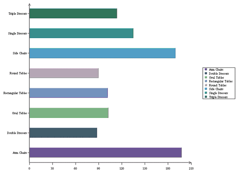
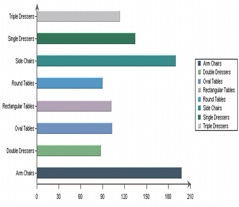
To create a parameter drill down chart, you need to create the various chart objects (please note that all chart objects, other than the root chart object, will have parameterized queries as their data source) and then specify the order of the drill down as well as the column/bar/point/line/slice of the chart to attach the next level of the parameter drill down chart.
Given below is an example of a parameter drill down chart. The database against which the query is run is WoodView HSQL, so you will need to add database HSQL JDBC driver (hsqldb.jar) to your classpath. The driver is located in the <ERESInstall>/WEB-INF/lib directory. Please note that you have to have ERES server running to run this example.
Component doDrillDownChart(Applet applet)  {

   // Connect to ERES Server
   QbChart.useServlet(true);
   QbChart.setServletRunner("http://localhost:8080");
   QbChart.setServletContext("ERES/servlet");

	// Begin Code : Creating Chart 1  - the Root Chart
	DBInfo rootInfo = new DBInfo("jdbc:hsqldb:help/examples/DataSources/database/woodview","org.hsqldb.jdbcDriver",
				     "sa",
				     "",
				     "SELECT Employees.LastName, Count(Orders.OrderID) AS Count_Of_OrderID FROM Employees, Order_Details, Orders WHERE (Orders.EmployeeID = Employees.EmployeeID) AND (Orders.OrderID = Order_Details.OrderID) GROUP BY Employees.LastName");

	ColInfo rootColInfo = new ColInfo(-1, 0, -1, 1);
	QbChart rootChart = new QbChart(applet, QbChart.VIEW2D, QbChart.PIE, rootInfo, false, rootColInfo, null);

	SimpleQueryInParam inParam = new SimpleQueryInParam("LastName", "Please select", true,
							    "Customers", "Company", Types.VARCHAR,
						            "All Unfinished Furniture", null);

	SimpleQueryInParam[] paramSet = {inParam};

	SimpleQueryFileInfo levelChartInfo = new SimpleQueryFileInfo("jdbc:hsqldb:help/examples/DataSources/database/woodview",
								     "org.hsqldb.jdbcDriver", "sa", "",
								     "SELECT Categories.CategoryName, Employees.LastName, Sum(Order_Details.Quantity) AS Sum_Of_Quantity FROM Products, Employees, Categories, Order_Details, Orders WHERE (Orders.OrderID = Order_Details.OrderID) AND (Employees.EmployeeID = Orders.EmployeeID) AND (Products.CategoryID = Categories.CategoryID) AND (Products.ProductID = Order_Details.ProductID) GROUP BY Categories.CategoryName, Employees.LastName HAVING (Employees.LastName =:LastName)");


	levelChartInfo.setInParam(paramSet);

	ColInfo levelOneChartColInfo = new ColInfo(-1, 0, -1, 2);

	try {

		rootChart.createDrillDownChart("TestDrillDownChart", QbChart.VIEW2D,
		QbChart.COL, levelChartInfo, false, null,
		levelOneChartColInfo, null, new int[] {0});
		rootChart.updateDrillDownCharts();

	} catch (Exception ex) { ex.printStackTrace(); }

return rootChart;
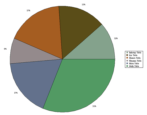
}When the above code is run as an applet or an application, it will produce a top-level chart shown below:
Generated top-level chart
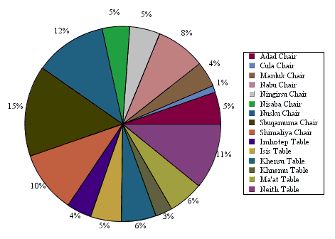
Depending on the link clicked, you will see a chart similar to the one shown below:
Generated chart
Please note that this is a default chart that is generated without formatting of any kind.
When you generate parameter drill down charts without using the ERES Server, you MUST have a sub directory called drillTemplates under the working directory of the .class file.
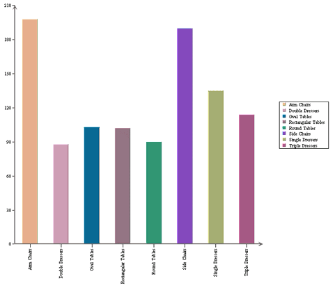
Parameter drill down charts allow charts to be generated from different data sources. With data drill down, the same data source is used throughout the different levels of the charts. The top-level presents a summary of the data. You can click on a data point to bring up another chart showing some detailed information about that particular data point.
Only the column, bar, line, pie, area, overlay, radar, dial, stack column and stack bar supports the data drill down functionality.
To create a data drill down chart, you need to create a chart object first before specifying the drill down properties.
Given below is an example of a data drill down chart. The database against which the query is run is WoodView HSQL, so you will need to add database HSQL JDBC driver (hsqldb.jar) to your classpath. The driver is located in the <ERESInstall>/WEB-INF/lib directory. Please note that you have to have ERES server running to run this example.
Component doDataDrillDownChart(Applet applet) {
// Connect to ERES Server
QbChart.useServlet(true);
QbChart.setServletRunner("http://localhost:8080");
QbChart.setServletContext("ERES/servlet");
// Begin Code : Creating Chart 1 - the Root Chart
DBInfo rootInfo = new DBInfo("jdbc:hsqldb:help/examples/DataSources/database/woodview",
"org.hsqldb.jdbcDriver",
"sa",
"",
"select Categories.CategoryName, Products.ProductName,
Products.UnitsInStock from Categories,
Products where Categories.CategoryID = Products.CategoryID
order by Categories.CategoryName;");
ColInfo rootColInfo = new ColInfo();
rootColInfo.category = 0;
rootColInfo.value = 2;
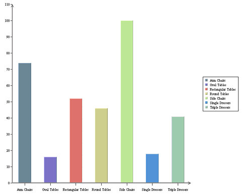
QbChart chart = new QbChart(applet, QbChart.VIEW2D, QbChart.BAR, rootInfo, rootColInfo, null);
// End Code : Creating Chart 1 - the Root Chart
try {
// Begin Code : Creating Chart 2 - the sub Chart
IDrillDown chartDrillDown = chart.gethDrillDown();
chartDrillDown.setAggregateOperator(IDrillDown.SUM); // Set the Aggregation
chartDrillDown.addDrillDown(QbChart.AREA, 1, -1, -1, true); // addDrillDown(chartType, category, series, sumby, is2DChart)
chartDrillDown.setDrillName("DrillDownChart"); // Set the drill template name
} catch (Exception ex)
{
ex.printStackTrace(); }
// End Code : Creating Chart 2 - the sub Chart
return chart;}When the above code is run as an applet or an application, it will produce a top-level chart shown below:
Generated top-level chart
Depending on the link clicked, you will see a chart similar to the one shown below:
Generated chart
Please note that this is a default chart that is generated without formatting of any kind.
In data drill down charts, you have to pre-define the column-to-axis mapping for each drill down level. Dynamic data drill down gives you the flexibility to select the column-to-axis mapping for drill down charts when you are viewing the chart. Only the top-level summary chart needs to be built and the aggregation specified for the drill down.
Only the column, bar, line, pie, area, overlay, radar, dial, stack column and stack bar supports the dynamic data drill down functionality.
To create a dynamic data drill down chart, you need to create a chart object first before specifying the drill down properties.
Given below is an example of a data drill down chart. The database against which the query is run is WoodView HSQL, so you will need to add database HSQL JDBC driver (hsqldb.jar) to your classpath. The driver is located in the <ERESInstall>/WEB-INF/lib directory. Please note that you have to have ERES server running to run this example.
Component doDynamicDataDrillDownChart(Applet applet) {

	//Do not use EspressManager
	QbChart.setEspressManagerUsed(false);

	// Begin Code : Creating Chart 1  - the Root Chart

	DBInfo rootInfo = new DBInfo(
			"jdbc:hsqldb:woodview",
			"org.hsqldb.jdbcDriver",
			"sa",
			"",
			"select Categories.CategoryName, Products.ProductName, Products.UnitsInStock from Categories, Products where Categories.CategoryID = Products.CategoryID order by Categories.CategoryName;");

	ColInfo rootColInfo = new ColInfo();
	rootColInfo.category = 0;
	rootColInfo.value = 2;
	QbChart chart = new QbChart(applet, QbChart.VIEW2D, QbChart.BAR, rootInfo, rootColInfo,
			null);

	// End Code : Creating Chart 1  - the Root Chart

	try {

		// Begin Code : Creating Chart 2  - the sub Chart

		IDrillDown chartDrillDown = chart.gethDrillDown();
		chartDrillDown.setAggregateOperator(IDrillDown.SUM); // Set the Aggregation
		chartDrillDown.setDynamicDrillDown(true); // Turn on dynamic data drill down
		chartDrillDown.setDrillName("DynamicDrillDownChart"); // Set the drill template name

	} catch (Exception ex) {
		ex.printStackTrace();
	}

	// End Code : Creating Chart 2  - the sub Chart

	return chart;
}When the above code is run as an applet or an application, it will produce a top-level chart shown below:
Generated chart
Depending on the link clicked, you will see a chart similar to the one shown below:
Generated chart
Please note that this is a default chart that is generated without formatting of any kind.
A chart can be programmatically added to the report in one of three ways :
Creating a chart template in ERES Designer and adding the template to the report component;
Creating a chart (that uses report data as its data source) using the API and adding that chart to the report component;
Creating a
QbChartobject using the API and adding that object to the report component;
To add a chart, you will need to define a ReportChartObject object. Within the ReportChartObject object, you will have to pass in the location of the template (TPL) file that you are using. You can also specify the dimensions and alignment. If the report is exported to a static format (i.e. DHTML), you can also specify the image type (JPEG, GIF, PNG, etc) of the exported chart. The default alignment is the center of the cell and default image type is JPEG. You can then add the object to the desired location in the report.
![[Note]](../../../images/note.png) | Note |
|---|---|
You can only use a TPL template file and the chart uses report data (even if the template uses an independent data source) as its data source. |
The following example, which can be run as an applet or application, shows how to add an existing chart template to a report:
ReportChartObject chartObject = new ReportChartObject();
String chartLocation0 = new String("../templates/AddingChartTemplate.tpl");
chartObject.setText(chartLocation0);
chartObject.setWidth(7.40);
chartObject.setHeight(4.90);
chartObject.setY(0.10);
chartObject.setImageType(QbReport.PNG);
report.getTable().getFooter().addData(chartObject);
To add a chart using this method, you must create the chart object using the ChartObject class. A ChartObject object contains the chart properties (i.e. the chart mapping, the dimension and chart type). Then a ReportChartObject object is instantiated/created, and the newly created ChartObject object is passed to it using the setChart(IChart) method. The ReportChartObject is then finally added to the desired location in the report.
The following example, which can be run as an applet or application, shows how to add a chart, that uses report data as its data source, to a report:
ColInfo chartColInfo = new ColInfo();
chartColInfo.category = 0;
chartColInfo.value = 1;

ChartObject chartObj = new ChartObject(report, // QbReport

      ChartObject.VIEW2D, // Dimension
      ChartObject.BAR, // Chart Type
      false, // Do Transpose
      null, // Transpose Columns
      chartColInfo, // Chart Mapping
      "AddingChart.tpl"); // Template

ReportChartObject chartObject = new ReportChartObject();
chartObject.setChart(chartObj);
chartObject.setWidth(7.40);
chartObject.setHeight(4.90);
chartObject.setY(0.10);
chartObject.setImageType(QbReport.PNG);
report.getTable().getFooter().addData(chartObject);
To add a chart using this method, you must create the chart object using the QbChart class. A QbChart object contains the chart properties (i.e., the chart mapping, the dimension and chart type). Then a ReportChartObject object is instantiated/created, and the newly created QbChart object is passed to it using the setChart(IChart) method. The ReportChartObject is then finally added to the desired location in the report.
This scenario differs from the one in the previous section in that the data for the chart is not coming from the report. The chart data is independent of the report's.
The following example, which can be run as an applet or application, shows how to add a chart, that uses report data as its data source, to a report:
ColInfo chartColInfo = new ColInfo();
chartColInfo.category = 0;
chartColInfo.value = 1;

// Data Source for chart
String chartQuery = "SELECT ProductName, Sum(Order_Details.Quantity) " +
					"FROM Products, Order_Details " +
					"WHERE (Order_Details.ProductID = Products.ProductID) " +
					"GROUP BY Products.ProductName " +
					"ORDER BY Sum(Order_Details.Quantity) DESC";

DBInfo chartDatabaseInfo = new DBInfo("jdbc:hsqldb:database/woodview", "org.hsqldb.jdbcDriver",
							  "sa", "", chartQuery);

QbChart chartObj = new QbChart((Applet)null, QbChart.VIEW2D, QbChart.COL, chartDatabaseInfo,
					   false, chartColInfo, "AddingChartTemplate.tpl");

// Add ChartObject to report
ReportChartObject chartObject = new ReportChartObject();
chartObject.setChart(chartObj);
chartObject.setWidth(7.40);
chartObject.setHeight(4.90);
chartObject.setReportDataUsed(false);
chartObject.setY(0.10);
chartObject.setImageType(QbReport.PNG);
report.getTable().getFooter().addData(chartObject);