Bar Chart
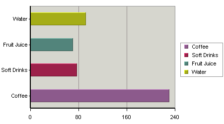
A bar chart is essentially the same as a column chart, except that horizontal bars are drawn in the chart as opposed to the vertical bars which are used in a column chart. In a bar chart, the categories are plotted along the Y-axis and the values along the X-axis.
Just as for a column chart, if a data series has been selected then the entire series for a single category is displayed in the XY plane. If a three-dimensional bar chart is being used, all the horizontal bars in a data series are drawn using the same color. Each category is drawn using a different color. If the data series is not present in the chart, the categories will be represented by the same color by default. Different colors for the categories are possible to set by clicking the ![]() icon on the toolbar (or selecting → ), and unchecking the Single Color For All Categories option.
icon on the toolbar (or selecting → ), and unchecking the Single Color For All Categories option.
Mapping Options for Bar Charts
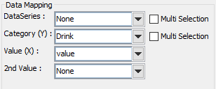
The mapping for this chart type is similar to that of a column chart, except the category (X) and values (Y) under column chart become category (Y) and values (X) respectively. This is because values are represented vertically in a column chart, but horizontally in a bar chart. Please note that the 2nd Series and Combo options are not available for bar charts. This is because the only combination available with bar charts is a line.