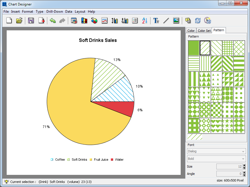
The color, color set, and font panels on the right-hand side of the Chart Designer window allow you to modify the color of any chart object, as well as modify the font size and style for any text/labels in the chart. You can choose not to display these panels by toggling the → option.
You can use the color panel to change the color of any element in the chart. To modify an element's color, first, click on it. The status bar at the bottom of the Chart Designer window will indicate which element has been currently selected. After you have selected the object, click on one of the panels in the color panel and the color of the object will change to reflect the color you selected.
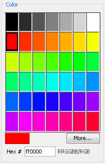
Color Panel
To create a custom color for the object, first select it, then click the button. This will bring up a new dialog allowing you to pick a color from a larger palette or to create a new color.
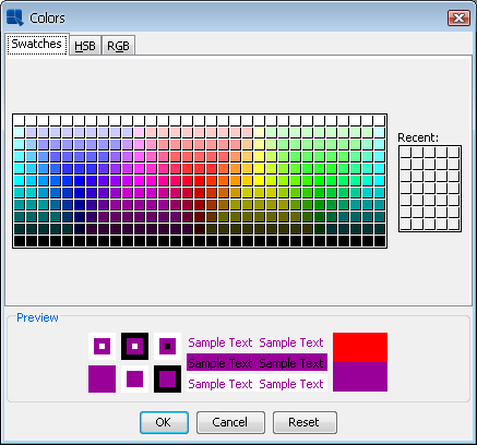
Additional Colors Dialog
From this dialog you can pick a new color from swatches or configure a custom color using HSB values or RGB values.
The color set panel allows you to choose a color scheme for your chart. It contains predefined color sets that can be applied to chart data points on the value or the second value axis.
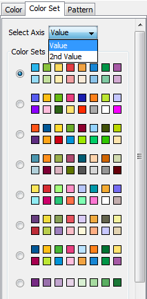
Color Set Panel
In order to change a color set for the value or the second value axis, first select the Color Set tab. Then select the axis (Value or 2nd Value) from the Select Axis select box and click the appropriate color set radio button. After that chart data points will get colors from the selected color set. Note that the Select Axis select box is only visible when the chart has the second value axis. By default, the value axis uses the first color set while the second value axis uses the seventh.
Please note that if you change a color of a data point manually, it will automatically unselect the selected color set. This is because of the color set that no longer corresponds to colors of data points in the chart. It is also important to note that if chart data points have more different colors than there are colors in the color set, it will automatically use colors from the beginning of the next color set, and so on. If there is no next color set available, it will use the first one instead.
Data points colors are closely related to the Save Colors for Categories feature that is available in the Data Properties dialog. The dialog can be opened by clicking the ![]() icon on the toolbar, or by using → . (Please note that this feature is not available for Stack charts and it is disabled if the chart has Single Color for All Categories.) If the feature is turned on, colors of chart data points are assigned to names of categories (or series for charts with series). If such categories (or series) then appear in the chart, it will automatically use their assigned colors. If the feature is turned off (default), colors are assigned by data points order (i.e. the first data point will get the first available color from the color set, the second will get the second color, etc.). Save Colors for Categories setting is automatically saved in the
icon on the toolbar, or by using → . (Please note that this feature is not available for Stack charts and it is disabled if the chart has Single Color for All Categories.) If the feature is turned on, colors of chart data points are assigned to names of categories (or series for charts with series). If such categories (or series) then appear in the chart, it will automatically use their assigned colors. If the feature is turned off (default), colors are assigned by data points order (i.e. the first data point will get the first available color from the color set, the second will get the second color, etc.). Save Colors for Categories setting is automatically saved in the .pac file. The following example shows scenarios with the feature on and off:
Assume that a chart has three categories (“A”, “B”, and “C”) with colors taken from the following color set (blue, green, yellow, red).
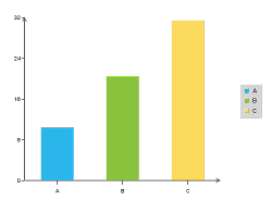
Image 1 - Example Chart
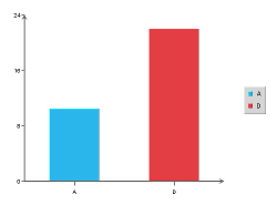
Image 2 - “Save Colors for Categories” Feature On
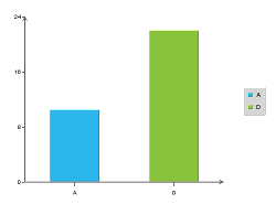
Image 3 - “Save Colors for Categories” Feature Off
- Save Colors for Categories feature on
We saved the chart with the “Save Colors for Categories” feature enabled (see Image 1), so the following categories and colors were saved to the list of saved categories:
category A... blue colorcategory B... green colorcategory C... yellow colorNow if you open the chart and data changes (e.g. there will be only categories
AandDin the data - see Image 2), categories will have the following colors:category A... blue color (categoryAhas blue color, because the category nameAis present in the list of saved categories)category D... red color (categoryDhas the next available color in the color set, because the category nameDisn't present in the list of saved categories. In this case, the category will have red color, because blue, green, and yellow colors are already assigned to categoriesA, B,andC.For this scenario, the color set will not be selected under the Color Set tab because colors of data points do not correspond to the color set.
- Save Colors for Categories feature off
Here is the same situation, but assume that the chart has been saved with the “Save Colors for Categories” feature off (see Image 3). The list of saved categories will be empty this time.
After opening the chart, the categories will have the following colors:
category A... blue color (categoryAhas blue color, as it is the first available color from the color set)category D... green color (categoryDhas the second color from the color set, because the first is already assigned to the categoryA)For this scenario, the color set will be selected under the Color Set tab because colors of data points correspond to the color set.
Unlike color and font panels, the pattern panel can only be applied to data points. There is a predefined pattern palette available for you to use. Similarly to how the color panel is used, you will need to first pick the data point you would like to change and then pick any pattern from the pattern palette. The pattern will be applied to the data point directly.
If a pattern has already been defined for a data point, the user can still change the color by selecting the color panel tab and picking a different color from the color palette. The color on the pattern will be changed to the new color immediately. The patterns shown on the pattern palette will change to the new color as well.
Pattern Example
You can use the font panel to modify the font, the font style, font size, and the font angle for labels, titles, or other text in a chart. To modify the font, you must first select the text object whose font you would like to change by clicking on it. The status bar at the bottom of the Chart Designer window will indicate which is the currently selected object.
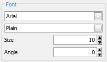
Font Panel
The first drop-down box allows you to select the font that you would like to use. The second drop-down box allows you to select the font style either plain, bold, italic, or bold and italic. The third box allows you to select the font size. The last box allows you to specify the angle of the text.
Certain groups of text (i.e. axis labels or data top labels) will all have the same properties. Hence, if you select one of text and modify the font properties it will apply to all of them.
EspressChart allows you to use the Java graphics libraries to give your text a cleaner appearance. For regular text you can use the chart anti-alias feature by selecting → . For rotated text (i.e. text not a 0 degrees), you can use the Java 2D rotate text feature by selecting → . Note that these methods require Java 1.2 or higher.