EspressChart provides a number of extensive formatting capabilities for the chart axes. Users can customize everything from the axis scale to the way how axis labels should be displayed.
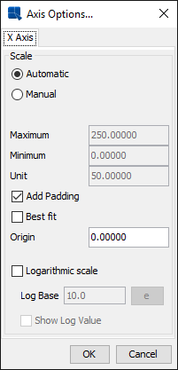
By default, the scale of any value axes in the chart is calculated to provide a 'best fit' for the data being plotted. This is often a useful feature if the data being displayed can change radically. However, you may often want to set the scale of the axes manually. To modify the axis scale, select → , or click the ![]() button on the toolbar. This will bring up a dialog allowing you to format the scale for any value axes in the chart.
button on the toolbar. This will bring up a dialog allowing you to format the scale for any value axes in the chart.
Axis Scale Dialog
The following options are provided:
Automatic: | This turns on automatic scaling for the axis. This is the default option. | ||||
Manual: | This turns on manual scaling, allowing you to set the axis scale to your preference. | ||||
Maximum: | This is the highest value on the axis scale. | ||||
Minimum: | This is the lowest value on the axis scale. | ||||
Unit: | This is the step interval between successive labels. | ||||
Add Padding: | This will raise the highest value of the axis to create a cushion between the max value of the data and the top of the chart. | ||||
Best fit: | This will automatically place the origin of the chart based on the minimum and maximum values of the data. | ||||
Origin: | This allows you to specify where the X and Y axes should intersect. This is usually set to zero. | ||||
Logarithmic Scale: | This option creates a logarithmic scale for the given axis. It's valid only if the axis in question contains positive values.
|
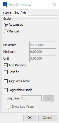
The axis scale dialog will have a tab for each axis in the chart. There's a unique option available for secondary axes which allows you to align the axis scale. It will apply all options from the primary axis to the secondary axis, giving both axes the exact same scale.
Axis Scale Dialog for Secondary Axis
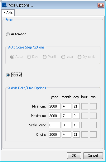
The axis scale dialog is different for a Gantt chart. You can still select the Automatic option to have the scale configured automatically or the Manual option to set the scale manually. The Automatic axis scale has a few Auto Scale Step Options: Auto, Day, Month, Year, and Dynamic. The auto option always finds a best fit. The dynamic option also finds a best fit, but unlike the auto option, it uses standard step intervals only (for example: 1 month, 1 year etc...). When the Manual axis scale is chosen, the Maximum, Minimum, Unit and Origin are replaced with Maximum Date, Minimum Date, Scale Step and Origin Date respectively and these new settings take in a Date/Time (represented by yyyy, MM, dd, hh, mm).
Axis Scale Dialog for Gantt Chart
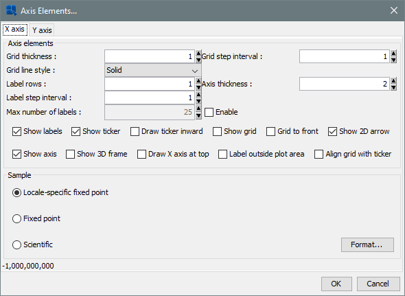
The appearance properties of the axes and the axis labels are controlled through the axis elements dialog. To invoke the axis elements dialog, select → or click the ![]() button on the toolbar. This will bring up the following dialog, allowing you to customize elements in all chart axes. You can also customize the appearance of dial and pie chart labels from this dialog.
button on the toolbar. This will bring up the following dialog, allowing you to customize elements in all chart axes. You can also customize the appearance of dial and pie chart labels from this dialog.
Axis Elements Dialog
A tab will appear in this dialog for each axis in the chart. The dialog allows you to perform the following options. Note that some options are only available for certain chart types, certain data types, and on certain axes.
Grid thickness: | This allows you to specify the thickness of any grid lines along the axis. |
Grid step interval: | This option allows you to set the grid step interval for any grid lines along the axis. |
Grid line style: | This option allows you to select the grid line style (solid, dotted, dash). |
Label rows: | This option allows labels to be displayed in alternating rows. This can prevent overlapping. This option is only available for X-axis. |
Axis thickness: | This option allows you to set the thickness of the axis in pixels. Note that this setting is applied to all axes in the chart. |
Label step interval: | This option allows you to set the label step interval for the data. For example, setting this to 2 will draw the label for every other data point in the chart. |
Label interval unit: | This option allows you to select the unit to be used when sorting and representing time-based data (date, time, or timestamp). Selecting tickers will use the data as it is read by Chart Designer. You can also select Dynamic for time-based data and that will choose an appropriate scale (depending on number of data points and range of data). |
Max number of labels: | This option allows you to select the maximum number of labels and tickers displayed on the axis. If the number of labels exceeds the max count, the label step will be re-calculated. |
Ascending/Descending: | This option allows you to order and filter time-based data. You can sort the data in ascending or descending order, as well as specify the starting (or ending) point for the data. |
Show labels: | This option allows you to remove or display the labels for each axis. |
Show ticker: | This option allows you to remove or display the axis tickers. |
Draw ticker inward: | This option will draw the axis tickers inside the plot area instead of outside (default). |
Show sub-tickers: | This feature is only available for the value axis when the axis scale is set to logarithmic with a log base of 10. This feature will draw interval tickers (non-uniform) between the points on the value axis. |
Show grid: | This option allows you to remove or display the grid for each axis. |
Grid to front: | This option allows you to draw the grid lines on top of the data elements in the chart. By default the data points are drawn on top of the grid. |
Show 2D arrow: | This option allows you to remove or display the arrowhead at the end of the axis. Note that this option applies to all chart axes and it is only available for two-dimensional charts. |
Show axis: | This option allows you to remove or display the axis (for two-dimensional charts) or the wall (for three-dimensional charts). |
Show 3D frame: | This option allows you to remove or display a frame around the chart. Note that this option applies to all chart axes and it is only available for three-dimensional charts. |
Label outside plot area: | This option sets the labels to be placed outside of the plot area, irrespective of where the axis is. This feature can be useful for category axis labels if you're plotting data with both positive and negative values. |
Align grid with ticker: | This option aligns the grid line with the ticker instead of placing it between tickers. This places the ticker and the corresponding grid line along the same line. This option only applies to the category axis of column-type charts. |
Swap Y-axis position: | This option will swap the primary and secondary value axes. This option can only be found under the 2nd Axis tab. |
Draw X-axis at top: | This option allows the X-axis to be positioned at the top of the chart instead of the default bottom position. This option is available for two-dimensional column, bar, scatter, high-low, HLCO, bubble, and Gantt charts. |
The axis elements dialog also allows you to format the appearance of the axis labels, depending on what type of data is plotted on the axis. The Format Options portion of the dialog contains the label formatting dialog.
- Formatting Numeric Data
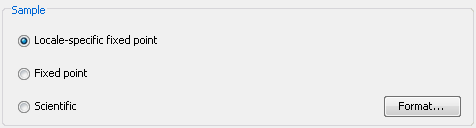
For numeric data there are three primary options for display formatting: locale-specific fixed point, fixed point, and scientific. Additional options will be displayed if you click on the button.
Numeric Data Format Options
Locale-Specific Fixed Point
This will change the format of the data depending on the locale in which it is being viewed. Additional formatting for this option allows you to specify whether the data should be displayed as a number, currency, or percentage. In addition, you can set the maximum and minimum number of integer digits and fraction digits. Other display attributes will vary depending on locale.
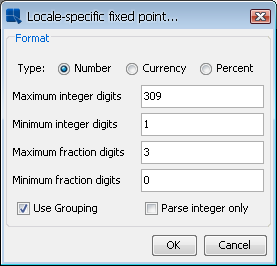
Locale-Specific Formatting Options
Fixed Point:
This will keep the data format consistent, regardless of locale. Additional formatting for this option allows you to set the number of decimals, rounding for digit number, unit symbols, negative sign position, decimal and thousands separator, and enable leading zeros for fractions
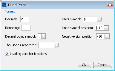
Fixed Point Formatting Options
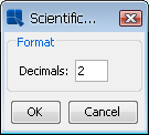
Scientific:
This will display the data in scientific notation. Additional formatting for this option allows you to set the number of decimals.
Scientific Formatting Options
- Formatting Date/Time Data
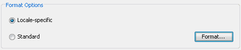
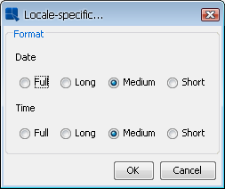
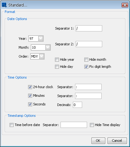
For date/time data there are two primary options for display formatting: locale specific and standard. Additional options will be displayed if you click on the button. The available options will vary depending on the nature of your data. Date, time, and timestamp data will bring up date, time, and date & time options respectively.
Date/Time Data Format Options
Locale-Specific:
This will change the format of the data depending on the locale in which it is being viewed. Additional formatting for this option allows you to select full, long, medium, or short notations for date and time information. Other display attributes will vary depending on locale.
Locale-Specific Formatting Options
Standard:
This will keep the data format consistent, regardless of locale. Additional formatting for this option allows you to select year and month displays, as well as the order in which month, day, and year information is presented. You can also select the characters that you want to be used as separators. Time options allow you to display hours, minutes, and/or seconds and also to select the separators between them. For timestamp data, you can select to display the time before or after the date, as well as the separator to be used between them.
Standard Formatting Options
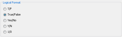
- Formatting Logical Data:
There are five options available for displaying logical or Boolean data: T/F, True/False, Yes/No, Y/N, and 1/0.
Logical Data Formatting Options
Any changes you make to the data formatting will take effect after you click on the button in the axis elements dialog. Note that there are no additional formatting options for string data.