High-Low Chart
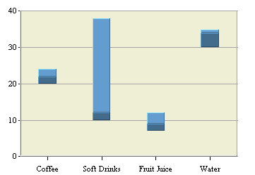
A high-low chart is also a derivative of a column chart, only that instead of one value column it uses two columns for high and low bounds of values. The data for the chart must contain at least three columns: category, high, and low. The category column can contain values of any type, while the high and low columns must be numeric.
Another option for a high-low chart is a data column called the close column. If a close column is also used, then the close value will lie somewhere between the high and low values. The portion of the bar between the low point and the lose point is rendered in a darker form of the same color as the portion between the close point and the high point. As for many other types of charts, a high-low chart may include a data series column.
Mapping Options for High-Low Charts
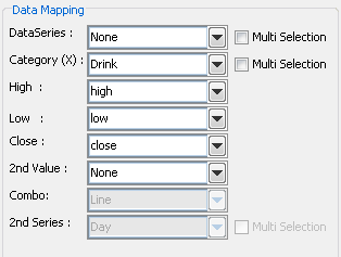
Data mapping for high-low charts is similar to column charts. You can select series and category columns in the same manner. The difference for high-low charts is that you need to specify at least two value columns - a high and a low value. These are the two points that are plotted for each category. A third value called Close can also be specified. Combo options for high-low charts are Line, Column, and Overlay.