The default canvas size for charts is 600 x 500 pixels. To adjust the size of the chart canvas, select Canvas from the Format menu. This will bring up a dialog allowing you to resize the chart canvas in either pixels, inches, or centimeters.
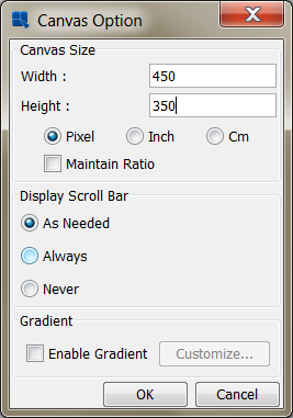
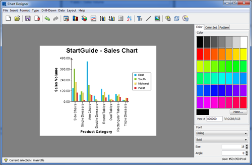
Uncheck the button, change the canvas dimensions to 450 x 350 pixels and click the button. The canvas will now resize in the designer.
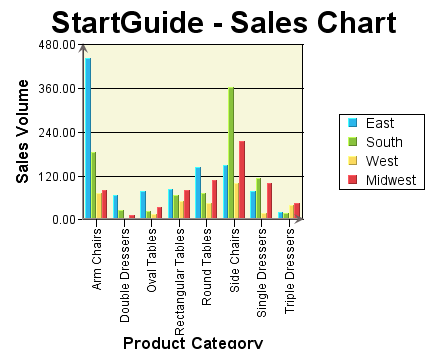
Now that the chart canvas has been shrunk, the chart plot will now appear small and portions of the X-Axis labels may be truncated. This can be adjusted by resizing the chart. You can click and drag on the chart plot to move it and then right-click and drag to resize it. You can also click and drag to move the legend. Use these options to position the chart plot and legend on the canvas.
Next you can modify the format of the axis labels. To do this click the Axis Elements button on the toolbar: ![]() . This will bring up a tabbed dialog allowing you to set different options for each chart axis. Click on the tab to bring up options for the value axis.
. This will bring up a tabbed dialog allowing you to set different options for each chart axis. Click on the tab to bring up options for the value axis.
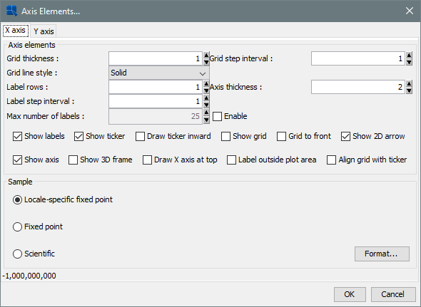
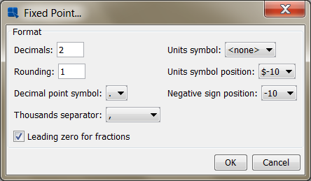
Check the box marked Show grid to add grid lines to the Y-Axis. Then select Fixed point for the data format, and click the button. This will bring up an additional dialog allowing you to set format options for the numeric data. Select the number of decimals as 2 and click .
Click again to dismiss the axis elements dialog and you will see the specified changes reflected in the chart.
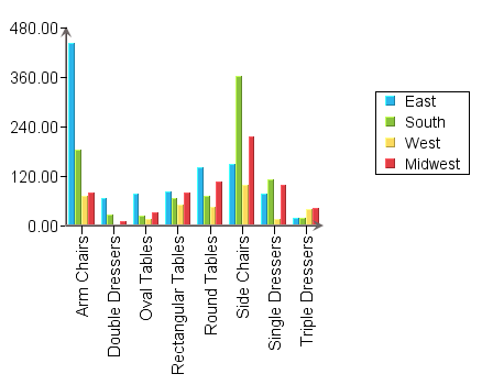
To modify the colors of the chart elements, you can click the button. This will cycle through various color combinations for the data elements. You can also change the color for any element by clicking to select it (the hint at the lower left-hand corner of the design window will indicate the currently selected element) and then picking a new color from the color panel.
Next, you can add titles to the chart. To do this, select → . This will bring up a dialog allowing you to enter titles for the chart as well as each of the axes.
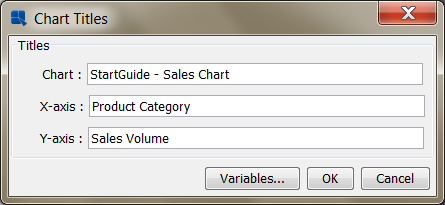
Enter any titles that you would like for the various elements and click . The titles will then be added to the chart. Titles are placed automatically, but you can manually adjust their positions by clicking and dragging the text on the chart canvas.
Finally, you can customize the appearance of the plot area by adding a background and border to the plot. To do this, select Plot Area from the Format menu. This will bring up a dialog allowing you to set display options for the chart plot.
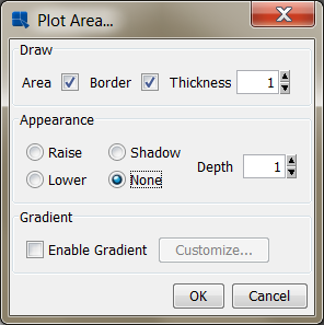
Select to draw both the plot area and the border with a thickness of 1. Specify None for the appearance. Once you have specified the options, click and the plot area for the chart will be modified. You can change the background color of the plot area, by clicking to select it, and then modifying the color in the color panel.