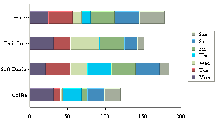
Stack Bar Chart
Like a stack column chart, the stack bar chart displays the chart categories as a sum of different stacked values - the sum-by column in the data source. The difference for a stack bar chart is that the categories are plotted on the Y-axis and the values are plotted along the X-axis.
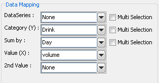
Data Mapping Options for Stack Bar Charts
The mapping for this chart type is similar to that of a stack column chart, except the category (X) and values (Y) under column chart become category (Y) and values (X), respectively. This is because values are represented vertically in a column chart, but horizontally in a bar chart. Please note that the 2nd Series and Combo options are not available for stack bar charts. This is because the only combination available with stack bar charts is a line.