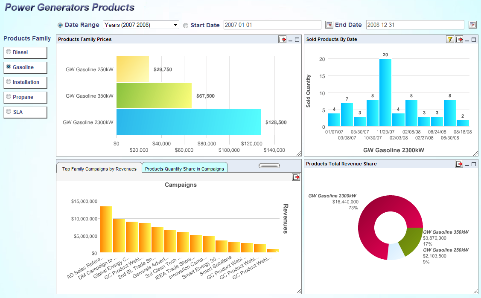
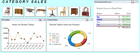
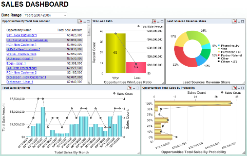
Another way the ERES allows users to publish reports, charts and maps is through dashboards. Dashboards allow users to easily consolidate summarized information in a single page or briefing. Dashboards in ERES require no special skill or administrative support. Simple thin-client interfaces allow all users to easily create customized information presentations.
Here are some sample dashboard presentations.
The top-level or main presentation consists of a set of charts, reports or maps arranged on the page. You can add shared parameters in a panel, or list the values of parameters so that the dashboard users can apply filters to refresh the applicable charts/reports/maps.
Individual options for each chart or report allow users to apply additional filters as well as export the charts, reports and maps to various formats.
Users can also add layers of drilldown to each chart/report/map in the main presentation. The drilldown can point to a report, chart or map. This allows each piece of summarized information in the presentation to be immediately actionable.


