QuickDesigner Reports is a thin-client ad-hoc reporting interface. It provides users a scaled-down design tool to create reports. With QuickDesigner Reports, end users can easily select, filter, and present data without mastering database structures, all with zero client download.
QuickDesigner Reports can be started from the ERES Start page. If you have logged in as a user with design privileges, then you can follow QuickDesigner Reports link to begin using QuickDesigner Reports.
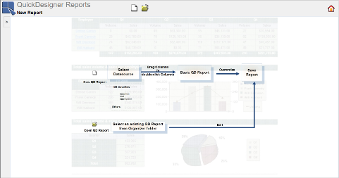
When the QuickDesigner Reports launches, the first page that appears prompts you to select between opening an existing report, or creating a new one.
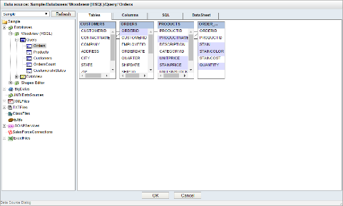
If you want to create a new report, click on the ![]() icon on the toolbar. The Data Source Dialog will appear and prompt you to select data registry and data source you want to use with QuickDesigner Reports. In order to use QuickDesigner Reports, a user must have read privileges to one of the registries defined in the Organizer. For more about creating and managing data registries, please see Section 3.1.1 - Managing Data Registries.
icon on the toolbar. The Data Source Dialog will appear and prompt you to select data registry and data source you want to use with QuickDesigner Reports. In order to use QuickDesigner Reports, a user must have read privileges to one of the registries defined in the Organizer. For more about creating and managing data registries, please see Section 3.1.1 - Managing Data Registries.
Select data registry from the drop-down menu in the upper left corner. The tree-list bellow displays the content of the selected registry. There are all of the data sources that have been defined in the registry that the user has access to. Select a data source you want to use for the report.
Unlike Report Designer or Chart Designer where the user can select to create new data sources or modify the existing ones, the only option is to select a data source for the report. The only exception to this is for Data Views or Data View Queries. If data sources of this type are selected, you will see the DataView Builder on the right side of the Data Source Dialog. The DataView Builder allows you to build or modify queries against the View. For more about managing data sources in QuickDesigner Reports, please see Section 3.2 - Data in QuickDesigners and Maps.
Once you finish selecting a data source, click on the button to close the Data Source Dialog.
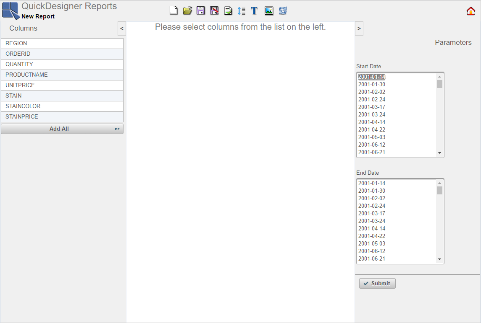
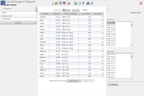
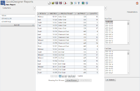
You can see columns of the data source on the left side, the central part for creating reports, and parameters pane on the right side (this pane is visible only if the data source has some parameter(s)).
A lot of formatting actions for reports in QuickDesigner Reports are accessed through the toolbar. The icons perform the following actions:
| Start a new report |
| Open an existing report |
| Save the current report |
| Save report as |
| Export the current report |
| Set style for the report |
| Pagination/Scrolling options |
| Insert/Edit report title |
| Insert report logo |
| Modify DataView Query - This option allows user to modify the DataView and DataView query used for the report. The icon is only visible in toolbar when a DV query is used as data source for the report (otherwise it's hidden). |
| Refresh the report |
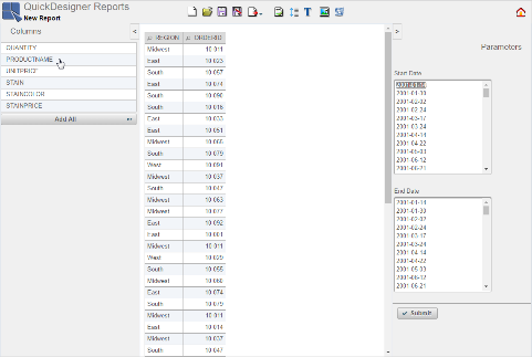
To insert a column to the report, double-click on the column in the left Columns pane, or click on the column and drag it to the report. You can also add all columns to the report in one step by clicking the button.
To remove a column from the report, right click on the column header and select or drag the column back to the Columns pane. The column is removed from the report.

Remove a Column
When you add columns to the report, you can colapse the Columns pane to have more space for designing the report. To do this, click on the ![]() button at the top of the Columns pane. You can also collapse the Parameters pane on the right side (if the report has some parameters).
button at the top of the Columns pane. You can also collapse the Parameters pane on the right side (if the report has some parameters).
You can simply resize a column width to fit the content or to see the whole column header. Move the mouse over the right side of the column header to see double arrow, left click and drag to set the column width.
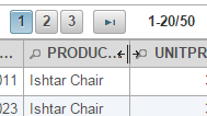
Column Width
You can also reorder the columns. Left click on the column header and drag it. When you see the arrows, release the mouse button.

Column Order
By default, only the first 50 rows will be displayed in the report. You can display more or less rows by clicking on the or buttons under the report.
Show More Rows
When all rows are displayed, you will also see the total number of rows.
Show Less Rows
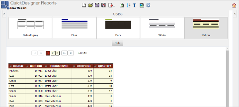
You can choose from five pre-defined report styles. Click on the ![]() icon on the toolbar to open the Styles dialog. Select the style you would like to use and close the Styles dialog by clicking on the button.
icon on the toolbar to open the Styles dialog. Select the style you would like to use and close the Styles dialog by clicking on the button.
Click the icon on the main toolbar ![]() to open the Pagination/Scrolling dialog. You can choose fixed pagination, dynamic pagination that automatically keeps the height of your screen, scrolling, or disable this feature.
to open the Pagination/Scrolling dialog. You can choose fixed pagination, dynamic pagination that automatically keeps the height of your screen, scrolling, or disable this feature.
- Fixed Pagination
For fixed pagination, you can select a number of rows per page and a paginator position on the page.
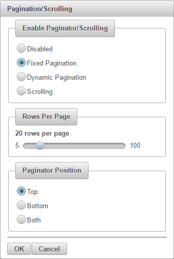
Pagination Dialog
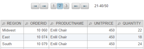
Paginator divides the report data into separate pages. Once you set pagination to be active, you can switch to any page of the report using buttons with page numbers. You can also switch to the first page by clicking on the
 button, to the last page by clicking on the
  button, or to the previous and next page by clicking on the
  and the
  buttons. Next to the buttons you can see which rows are displayed/total number of rows.
- Dynamic Pagination
Dynamic pagination does not require any further setting. It will automatically adjust number of rows per page to the height of your screen. As a result, no scroll bar will appear in QuickDesigner Reports, Dashboard Builder, and Published Files. The number of rows per page may be different for different machines.
- Scrolling
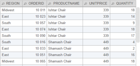
Scrolling allows you to display all the report data on a single page while not taking up too much space. All the displayed data is placed into a scrollable table with scrolling height of your choice. The scrolling height in pixels can be set in the Scroll Height section of the Pagination/Scrolling dialog.
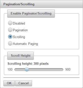
Scrolling Dialog
You can add a report title. Click the ![]() icon on the toolbar, and the Report Title dialog appears. Write a title of the report and click on the
icon on the toolbar, and the Report Title dialog appears. Write a title of the report and click on the ![]() button or press to insert the title.
button or press to insert the title.

Report Title Dialog
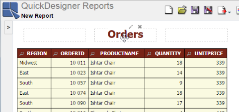
The report title is on the left by default. You can move it to the center or right side of the report. Click on the title, hold down the mouse button and move the mouse slightly. You can see three dashed rectangles that represent three positions of the title - left, center, right. Move the title to the position you want to use and release the mouse button.
You can edit or remove the report title via the pop up ![]() button when the cursor is pointed over the title, or via the
button when the cursor is pointed over the title, or via the ![]() icon on the toolbar. Both will open the Report Title dialog. There you can rewrite the title and apply it with the
icon on the toolbar. Both will open the Report Title dialog. There you can rewrite the title and apply it with the ![]() button, or remove it by clicking on the
button, or remove it by clicking on the ![]() button. Then close the Report Title dialog by clicking on in the upper right corner. You can also remove the report title directly via the pop up button when the cursor is pointed over the title.
button. Then close the Report Title dialog by clicking on in the upper right corner. You can also remove the report title directly via the pop up button when the cursor is pointed over the title.
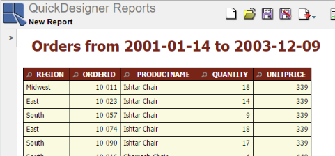
If the data source is parameterized, you can add variables to the report title. Variables display the current parameter value in the report title and change dynamically according to which parameter value is selected.
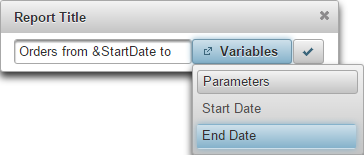
Variables for Report Title
To add a variable, click on the button in the Report Title dialog, select a parameter from the list, then it will be displayed in this format &<parameterName> in the textfield.
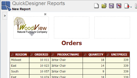
You can add a logo to your report. To do this, click on the ![]() icon on the toolbar to open the Report Logo dialog. This dialog allows you to choose a logo from your local directory. Once a logo is selected, it is inserted to the top left.
icon on the toolbar to open the Report Logo dialog. This dialog allows you to choose a logo from your local directory. Once a logo is selected, it is inserted to the top left.
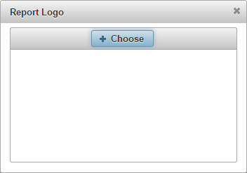
Report Logo Choose
You can move the logo to the center or right side of the report. Click on the logo, hold down the mouse button and move the mouse slightly. You can see three dashed rectangles that represent three positions of the logo - left, center, right. Move the logo to the position you would like to use and release the mouse button.
You can remove the report logo via the pop up ![]() button when the cursor is pointed over the logo. If you want to change the logo, just click on the
button when the cursor is pointed over the logo. If you want to change the logo, just click on the ![]() icon to choose a new image. The new image will replace the old one.
icon to choose a new image. The new image will replace the old one.
If the report uses a parameterized data source, you can see the Parameters pane on the right side of the designer window. You can select parameter(s) value(s) and apply it (them) by clicking on the button.
You can collapse or open this pane by clicking on the ![]() or
or ![]() buttons.
buttons.
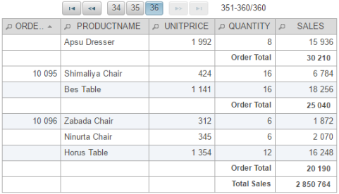
You can add an aggregation or group to each column of the report. To do this, right click on the column header and move the mouse cursor over button. The Aggregation/Group list will appear. Select an aggregation by clicking on it in the list. The aggregation will be assigned to the appropriate column. After you finish this setting, an extra line of the aggregation value will appear after each group (row break) and after the last aggregation value line, an extra line with a grand total value will appear.
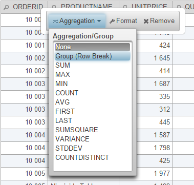
Aggregation/Group Setting
Once the aggregations are set, you can set label for the row break and grand total. The grand total label is called Report Footer label. To set a label, right click on an empty cell next to the value you want to describe and then click on the pop up button.
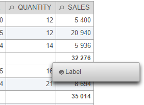
Aggregation Label Button
The Footer Labels dialog will appear. You can insert a text and decide how to align it in a cell - left or right. Then click on the button to apply the label.
To edit or remove a label, right click on it and then click on the pop up button and edit the text or click on the button in the Footer Labels dialog.
The next image shows a sample of the report with Row Break, SUM aggregation, group footer label, and report footer label.
If the data source is parameterized, you can add variables to the footer labels. Variables display the current parameter value in the selected footer label(s) and change dynamically according to the selected parameter value.
To add a variable, click on the button in the Footer Labels dialog and select a parameter from the list. It will be displayed as &<parameterName> in the textfield.

Report Footer Label with Variables
If you add a variable to the label, the text may not fit the cell. In this case it is advisable to use text alignment.
Right click on the column header and select from the pop-up menu.

Format Button
When you select the Format option, the Set Format dialog will appear. The Set Format dialog is dependent on what type of data is present in the selected column: numeric, string, date/time, or logical/boolean.
- Formatting Numeric Data:
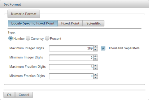
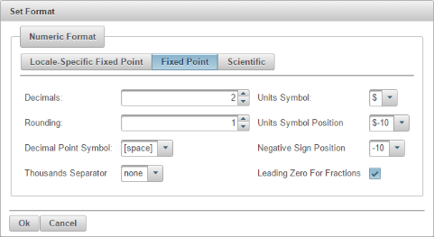
The dialog for numeric data contains three primary options for the data: Locale-Specific Fixed Point, Fixed Point, and Scientific. Each option opens a different tab.
- Locale-Specific Fixed Point:
This will change the format of the data depending on the locale in which it is being viewed. Additional formatting for this option allows you to specify whether the data should be displayed as a number, currency, or percentage. In addition, you can set the maximum and minimum number of integer digits and fraction digits. Other display attributes will vary depending on locale.
- Fixed Point:
This will keep the data format consistent, regardless of locale. Additional formatting for this option allows you to set the number of decimals, rounding for digit number, unit symbols, negative sign position, decimal and thousands separator, and specify leading zeroes for fractions.
- Scientific:
This will display the data in scientific notation. Additional formatting for this option allows you to set the number of decimals.
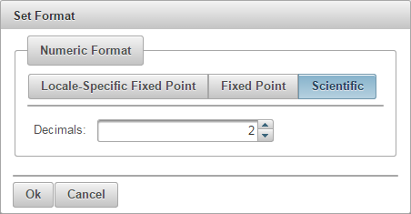
Scientific Formatting
After you finish selecting options, click on the button to apply formatting and close the Set Format dialog.
- Formatting String Data:
In this dialog, you can change maximum characters for the string format. To do this, uncheck the Show Original Text option and then set maximum characters.
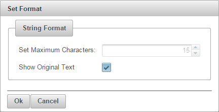
String Data Format
Click on the button to apply changes and close the Set Format dialog.
- Formatting Date/Time Data:
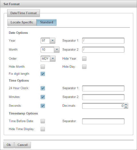
The dialog for date/time data contains two tabs: Locale-Specific and Standard.
- Locale Specific:
This will change the format of the data depending on the locale in which it is being viewed. Additional formatting for this option allows you to select full, long, medium, or short notations for date and time information. Other display attributes will vary depending on locale.
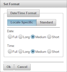
Locale-Specific Formatting
- Standard:
This will keep the data format consistent, regardless of locale. Additional formatting for this option allows you to select year and month displays, as well as the order in which month day and year information is presented. You can also select which characters should be used as separators. Time options allow you to display hours, minutes, and/or seconds, and select the separators between them. For timestamp data, you can select to display the time before or after the date and the separator to be used between them.
After you finish selecting options, click on the button to apply formatting and close the Set Format dialog.
- Formatting Logical Data:
The dialog for Logical or Boolean data contains five options for displaying the data: T/F, True/False, Yes/No, Y/N, and 1/0.
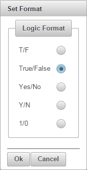
Logic Format
Select a format you want to use and then click on the button to change the data format and close the Set Format dialog.
When you hover your mouse cursor over the column header, you will see a label Sorting: NONE. Left click on the column header to apply the sorting. First click causes ascending sorting, second click causes descending sorting and third click cancels the sorting.

Sorting
Sorted columns have arrow icons on the column header. The ![]() Up Arrow icon indicates ascending order and the
Up Arrow icon indicates ascending order and the ![]() Down Arrow icon indicates descending order.
Down Arrow icon indicates descending order.
Sorting Arrow
You can filter data by clicking on the ![]() icon on the column header. A pop-up dialog will appear, which will allow you to select data for filtering. To select values which you want to be displayed in the report, check off the box next to the desired value(s). You can narrow down the values shown in the Filter dialog or search for particular values by typing them into the text field at the top of the dialog. To select all available values within the column, check the box in the upper left corner (next to the search field). Click on the button to apply the filtering and close the dialog.
icon on the column header. A pop-up dialog will appear, which will allow you to select data for filtering. To select values which you want to be displayed in the report, check off the box next to the desired value(s). You can narrow down the values shown in the Filter dialog or search for particular values by typing them into the text field at the top of the dialog. To select all available values within the column, check the box in the upper left corner (next to the search field). Click on the button to apply the filtering and close the dialog.
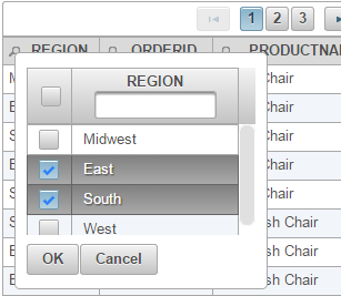
Filter Column
If there are several columns applying data filters, the report will display all filter conditions, i.e. different column filters has “AND” relationship.
You can save the report by clicking on the button on the toolbar ![]() . This will bring up a dialog allowing you to specify a name for the report. Enter a name for the report, select the project where you want to save it and click on the button.
. This will bring up a dialog allowing you to specify a name for the report. Enter a name for the report, select the project where you want to save it and click on the button.
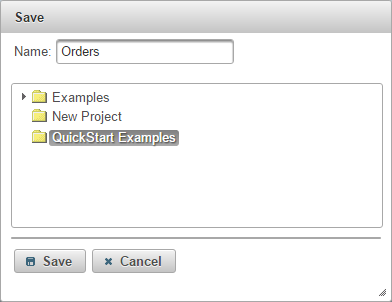
Save Dialog
After saving or opening existing report, the ![]() Save As button allows you to save the existing or modified report under a different name or into a different location.
Save As button allows you to save the existing or modified report under a different name or into a different location.
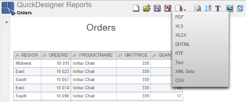
You can also export the report in several file formats. To do so, click on the ![]() icon on the toolbar. A pop-up dialog will appear, prompting you to specify the export format. Available options are PDF, XLS, XLSX, DHTML, RTF, Text, XML Data, and CSV.
icon on the toolbar. A pop-up dialog will appear, prompting you to specify the export format. Available options are PDF, XLS, XLSX, DHTML, RTF, Text, XML Data, and CSV.
Select the format and then you can save the generated file to your local system.
You can open the saved report by clicking on the ![]() icon on the main toolbar. The Open dialog will appear.
icon on the main toolbar. The Open dialog will appear.
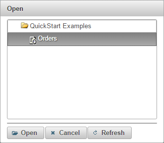
Open the Report
Here you can see all reports from Organizer created in QuickDesigner Reports. Select a report and click on the button to open it.
