Statistics JSP Example
Interactive Line Chart
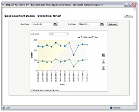
This example illustrates some of the statistical features of EspressChart as well as providing an example of interactive charting in a Web application format. Using a highly interactive interface, the example allows you to modify the date range for a chart, the X axis scaling (aggregated by month or quarter using time-series zooming features), and add statistical control lines and areas. Control lines can show mean and standard deviation for either data set. Users can also set the chart colors by clicking on a line.
This demo launches in a new window. Click the screenshot or the link below to begin.