Heatmap Chart
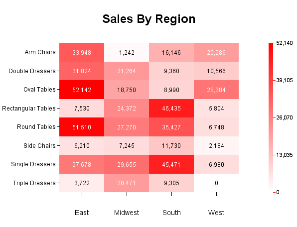
A heatmap is a data visualization tool that uses color to represent the values of a matrix. This method is particularly effective for displaying large amounts of data in a way that is easy to understand at a glance. The colors in a heatmap typically range from light (white) to dark (e.g.,red) along the color gradient, or from cool (e.g., blue) to warm (e.g., red), with each color representing a different value. This visual representation allows for quick identification of patterns, trends, and outliers within the data. A simple example that shows the revenue of certain product category in certain region is presented above. In this case, region is the X axis, product category is the Y axis and the plot is (X,Y, value).
In addition to just plotting (X,Y. value) straight from the input data, there is a correlation option that you can apply to the data. As such, you can easily visualize the correlation coefficients between pairs of columns from the data source, i.e. each entry in the matrix is the correlation coefficient between the corresponding columns on the X axis and the Y axis. Below is an example. In this example, the columns along the X axis are the same as those along the Y axis. But they do not have to be the same.
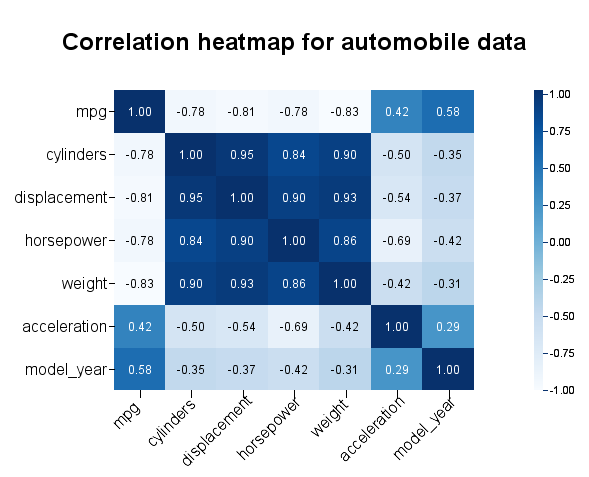
Correlation Heatmap Chart
![[Note]](../../../images/note.png) | Note |
|---|---|
Heatmap chart is available in a two-dimensional form only. |
Data mapping of heatmap without applying the correlation function is straightforward.
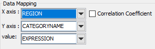
Heatmap data mapping
Data mapping of heatmap with correlation function applied.
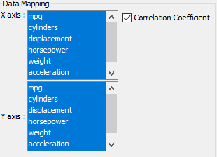
Correlation heatmap data mapping
Note that the “Correlation Coefficient” checkbox is checked, and the X-axis and Y-axis show all the available numeric columns in the data source. You can select multiple columns in each of the axes.
In our earlier example, we selected all the columns for the X axis and all the columns for the Y axis. But you can choose different columns for each axis.