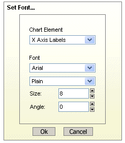
Users can create charts in QuickDesigner in one of two ways. They can create stand-alone charts using data sources defined in the registry or an ad-hoc query, or they can add charts to reports. Depending on the chart creation method, there are two QuickDesigner charting interfaces that are used.
If you have elected to create a stand-alone chart once you have specified the chart type and mapping options as described in Section 3.9.3 - Chart Mapping Options, you will be taken to the full QuickDesigner charting interface.

Chart Designer Interface
If you have elected to add or edit a chart within a report, a limited QuickDesigner charting interface will open in a new window (launched from the add/edit charts dialog as discussed in Section 3.10.2.3.3 - Inserting/Editing Charts). Since charts in reports cannot have their own data sources, the data source options (edit query and change data source) are not available in this interface.
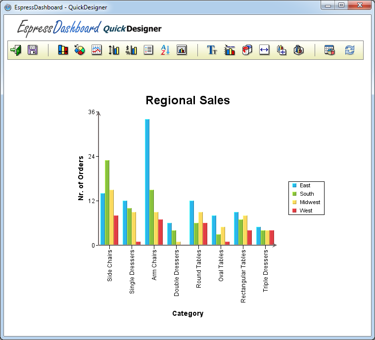
Chart Designer Interface for Charts in Reports
All of the formatting actions for charts in QuickDesigner are accessed through the toolbar. The icons perform the following actions:
| Start a new chart |
| Close the Chart Designer (charts in reports only) |
| Open an existing chart |
| Save the chart |
| Export the chart |
| Set data properties for the chart |
| Chart-specific options |
| Line and point settings |
| Format axis scale |
| Format axis elements |
| Format chart legend |
| Set data point ordering |
| Format plot area |
| Set label/title font |
| Add/Edit chart titles |
| Set chart colors |
| Set chart canvas size |
| Set chart position/size |
| Set 3D chart options |
| Change chart type/mapping |
| Change chart data source |
| Modify chart query |
The toolbar for charts works in the same manner as reports. That is to say, when you make changes to one chart element, using the options in the toolbar, the changes will not be automatically reflected in the chart displayed below. To submit all changes and apply them to the chart, click the button at the end of the toolbar:
The chart will then be re-loaded and will display all of the submitted changes.
There are several options available in the QuickDesigner that allow you to control the size and position of the chart.
The chart canvas size can be adjusted by clicking the  button on the QuickDesigner toolbar. This will bring up a dialog allowing you to specify the size of the chart.

Chart Canvas Dialog
The dialog allows you to specify the width and height of the canvas in pixels, inches, or centimeters. Once you have specified the new dimensions, click and the changes will be saved.
You can set the position and size of the chart within the canvas, by clicking the  button on the toolbar. A dialog will open in a new window.

Chart Position/Size Dialog
Each of the sliders in the dialog can be used to adjust the chart position and size. The first slider allows you to control the X position of the chart. The second allows you to control the Y positions. The third allows you to control the width of the chart and the fourth allows you to control the height. Note that if the chart is three-dimensional, the width and height will size in proportion. The proportions can be changed in the 3D Settings dialog.
The lower portion of the dialog gives a rough preview of how the chart plot will appear in the canvas. Once you have finished settings the size and position, click to save the changes.
Three-dimensional charts have several additional sizing/positioning options. These options can be accessed by clicking the  button in the toolbar. This will open a dialog in a new window.
3D Display Options Dialog
The arrow buttons at the top of the dialog allow you to adjust the viewing angle of the chart. The 3D chart can be rotated horizontally and vertically.
The first three sliders allow you to control the chart scaling of the chart in the X, Y, and Z directions. The scaling features allow you to control the proportion of the chart in each direction. The final slider allows you to control the thickness of the data points.
The remaining options allow you to toggle wire frame mode for the chart, show/hide the border around the chart, and draw the series inline (instead of on the Z axis) for charts with a data series. The last option allows you to enable 3D approximation for the chart. 3D approximation is useful when dealing with charts with a large number of data points. The approximation can improve 3D rendering performance when a lot of data is used. This feature is automatically enabled when the chart contains more than 100 data points.
Once you have finished setting the options, click to save the changes.
The QuickDesigner interface allows you to add/edit chart titles, set title/label font, and chart colors.
To add or edit the chart titles, click the  button on the toolbar. This will bring up a dialog in a new window.

Insert/Edit Titles Dialog
You can add a main title to the chart, as well as one for each of the chart axes. Once you have finished adding titles, click to save the changes.
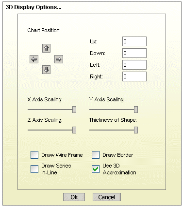
As with the Chart Designer, you can also add text variables that will provide run-time substitution based on certain values in the chart. To bring up a list of variables, click the button in the chart titles dialog. The variables list will open in a new window.
Text Variables Dialog
The following text variables are supported:
&drillInfo | This displays which data point is being drilled on for drill-down charts. This variable does not work for parameter drill-down. |
¶mInfo | This displays the parameter value(s) that were selected. You can use this variable instead of &drillInfo for parameter drill-down charts. |
&date | This displays the date when the chart was last drawn/redrawn. |
&time | This displays the time when the charts were last drawn/redrawn. |
&category | This displays the name of the category column. |
&series | This displays the name of the data series column. |
&sumby | This displays the name of the sum-by column. |
&value | This displays the name of the value column. |
&subvalue | This displays the name of the secondary value column. |
&xaxis | This displays the name of the column that is mapped to the X-axis. This is for charts that map a value instead of a category to the X-axis like scatter or bubble charts. |
&yaxis | This displays the name of the column that is mapped to the Y-axis. This is for scatter, bubble, and surface charts. |
&zaxis | This displays the name of the column that is mapped to the Z-axis. This is for scatter, bubble, and surface charts. |
&<paramName> | If the chart contains a parameter with this name, this will display the value selected for that parameter. |
To add a text variable to a title, select from the list and click the button.
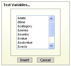
To set the font for chart labels and titles, click the  button on the toolbar. This will open a dialog in a new window.
Font Settings Dialog
To set the font for a title or label, select it in the drop-down list at the top of the dialog. Then select the font face, style, size, and angle using the options in the lower dialog. Once you have finished setting fonts, click to save the changes.
You can set the color for all chart elements by clicking the  button on the toolbar. The chart colors dialog will open in a new window.
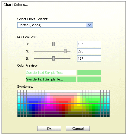
Chart Colors Dialog
To set the color for a chart element, first select it from the drop-down list at the top of the dialog. Then select a new color by clicking one of the swatches, using the sliders, or entering the RGB values for the color. Once you have finished setting colors, click to save the changes.
In QuickDesigner users can perform a number of formatting options for the chart axes. Users can customize the axis scale as well as label/axis appearance options.
By default, the scale of any value axes in the chart is calculated to provide a best fit for the data being plotted. This is often a useful feature if the data being displayed can change significantly. However, there are many times where you may want to manually set the scale of the axes. To modify the axis scale click the  button in the QuickDesginer toolbar. A dialog will open in a new window.

Axis Scale Dialog
You can select the axis for which you would like to set the scale by selecting it in the drop-down list at the top of the dialog. The following scaling options are provided for each value axis:
- Automatic:
This turns on automatic scaling for the axis. This is the default option.
- Manual:
This turns on manual scaling to set the axis scale to the options provided.
- Maximum:
This is the highest value on the axis scale.
- Minimum:
This is the lowest value on the axis scale.
- Add Padding:
This option will add padding to the top of the automatic scale. If this option is disabled, the maximum scale will match the largest data point.
- Origin Value:
This allows you to specify where the X and Y axes should intersect. This is usually at zero.
- Best Fit:
This will automatically place the origin of the chart based on the minimum and maximum values of the data.
Once you have finished specifying axis scale options, click to save the changes.
Additional appearance properties for the axes and axis labels can be set in the Axis Elements dialog. To change these settings, click the  button on the toolbar. This will launch the dialog in a new window.
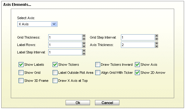
Axis Elements Dialog
To change the settings for an axis, first select it in the drop-down list at the top of the dialog, and then set the available options below. The dialog allows you to perform the following options. Note that some options are only available for certain chart types, certain data types, and on certain axes.
- Grid thickness:
This allows you to specify the thickness of any grid lines along the axis.
- Grid step interval:
This allows you to set the grid step interval for any grid lines along the axis.
- Label rows:
This allows labels to be displayed in alternating rows. This can prevent overlapping. This option is only available for the X-axis.
- Axis thickness:
This allows you to set the thickness of the axis in pixels. Note that this setting is applied to all axes in the chart.
- Label step interval:
This allows you to set the label step interval for the data. For example setting this to 2 would draw the label for every other data point in the chart. This option is not available for any Y axes.
- Label interval unit:
This allows you to select the unit to be used when sorting and representing time-based data (date, time, or timestamp). Selecting tickers will use the data as it is read by Chart Designer.
- Ascending/Descending:
This option allows you to order and filter time-based data. You can sort the data in ascending or descending order, as well as specify the starting (or ending) point for the data.
- Show labels:
This option allows you to remove or display the labels for each axis.
- Show ticker:
This option allows you to remove or display the axis tickers.
- Draw ticker inward:
This option will draw the axis tickers inside the plot area instead of outside (default).
- Draw sub-tickers:
This feature is only available for the value axis, when the axis scale is set to logarithmic with a log base of 10. This feature will draw interval tickers (non-uniform) between the points on the value axis.
- Show grid:
This option allows you to remove or display the grid for each axis.
- Grid to front:
This option allows you to draw the grid lines on top of the data elements in the chart. By default, the data points are drawn on top of the grid.
- Show 2D arrow:
This option allows you to remove or display the arrowhead at the end of the axis. Note that this option applies to all chart axes and is only available for two-dimensional charts.
- Show axis:
This option allows you to remove or display the axis (for two-dimensional charts) or the wall (for three-dimensional charts).
- Show 3D frame:
This option allows you to remove or display a frame around the chart. Note that this option applies to all chart axes and is only available for three-dimensional charts.
- Label outside plot area:
This sets the labels to be placed outside of the plot area, irrespective of where the axis is. This feature can be useful for category axis labels if you are plotting data with both positive and negative values.
- Align grid with ticker:
This aligns the grid line with the ticker instead of placing it between tickers. This places the ticker and corresponding grid line along the same line. This option only applies to the category axis of column-type charts.
- Swap Y-axis position:
This will swap the primary and secondary value axes. This option will be found only under the 2nd Axis tab.
- Draw X-axis at top:
This allows the X-axis to be positioned at the top of the chart instead of the default bottom position. This option is available for two-dimensional column, bar, scatter, high-low, HLCO, bubble, and Gantt charts.
The axis elements dialog also allows you to format the appearance of the axis labels, depending on what type of data is plotted on the axis. The Data Format portion of the dialog contains the label formatting dialog.
Formatting Numeric Data:
For numeric data there are three primary options for display formatting: locale specific fixed point, fixed point, and scientific. You can select the option you want and then click the button for additional options.

Numeric Data Format Options
- Locale-Specific Fixed Point:
This will vary the format of the data depending on the locale in which it is being viewed. Additional formatting for this option allows you to specify whether the data should be displayed as a number, currency, or as a percentage. In addition, you can set the maximum and minimum number of integer digits and fraction digits. Other display attributes will vary depending on locale.
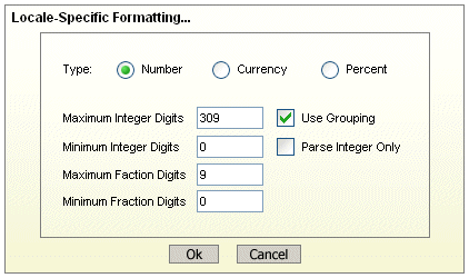
Locale-Specific Formatting Options
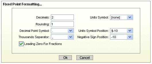
- Fixed Point:
This will keep the data format consistent, regardless of locale. Additional formatting for this option allows you to set the number of decimals, the digit number to round to, unit symbols, negative signs, decimal and thousands separator, and specify leading zeros for fractions.

Fixed Point Formatting Options
- Scientific:
This will display the data in scientific notation. Additional formatting for this option allows you to set the number of decimals.
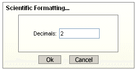
Scientific Formatting Options
Formatting Date/Time Data:
For date/time data there are two primary options for display formatting: locale specific and standard. You can select the option you want and then click the button for additional options. The available options will vary depending on the nature of your data. Date, time, and timestamp data will bring up date, time, and date & time options respectively.

Date/Time Data Format Options
- Locale-Specific:
This will vary the format of the data depending on the locale in which it is being viewed. Additional formatting for this option allows you to select full, long, medium, or short notations for date, and time information. Other display attributes will vary depending on locale.

Locale-Specific Formatting Options
- Standard:
This will keep the data format consistent, regardless of locale. Additional formatting for this option allows you to select year and month displays, as well as the order in which month, day, and year information is presented. You can also select the characters to be used as separators. Time options allow you to display hours, minutes, and/or seconds, and select the separators between them. For timestamp data, you can select to display the time before or after the date and the separator to be used between them.
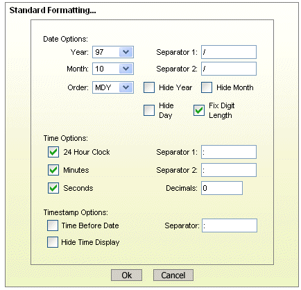
Standard Formatting Options
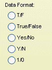
Formatting Logical Data:
There are five options available for displaying logical or Boolean data. They are: T/F, True/False, Yes/No, Y/N, and 1/0.
Logical Formatting Options
In QuickDesigner there are a number of ways that users can configure how data points are drawn, as well as the chart plot itself.
Many of the data display options are controlled through the data properties dialog. From this dialog you can control the size of bars/columns, set display options for null values, and specify options for data labels. To invoke this dialog, click the  button on the QuickDesigner toolbar. The dialog will open in a new window.

Data Properties Dialog
This data properties dialog contains the following options:
- Column width:
This specifies the ratio of the bar/column width with respect to the gap between successive bars in the chart. Each unit represents 1/10th of the space between data points. Therefore, entering
9would leave 10% of the space between data points blank, while10would eliminate all space between bars/columns. This option only pertains to two-dimensional bar, column, stack bar, stack column, high-low, HLCO, and Gantt charts. To control the column thickness in three-dimensional charts, you can use the thickness of shape slider in the navigation panel.- Show data for nulls:
This will connect lines when null data is present. For example if you have three points and the value of point 1 is 4, point 2 is null, and the value of point 3 is 6, then a line will be drawn from 4 to 6 for the three points. This property is only available for line charts, or other two-dimensional charts with lines. All other chart types will not plot data for nulls.
- Use dotted lines for nulls:
Instead of drawing a complete line through null values in the chart, you can use this option to specify a dotted line where the values are not present. Like the show data for nulls option, this property is only available for lines.
- Draw from end to end:
This option allows you to draw two-dimensional line and area charts across the entire plot area, rather than offsetting to the first and last data points on the chart.
- Show shadow on line:
This option specifies whether to show shading on two-dimensional lines. In order for shading to apply, the line must be thicker than one pixel.
- Set translucent:
This will draw all of the data points in translucent color, allowing overlapped elements to be visible. This option is useful for radar charts, and two-dimensional area charts with a data series. The option is also available for bubble and Gantt charts. Note that because this feature requires Java 1.2 or higher the translucent elements will not display if you are deploying charts in applets and the client is not using the Java plug-in.
- Show primary:
This will display data top labels for the primary values in the chart.
- Show secondary:
This will display data top labels for the secondary values in the chart.
- Show stack section:
This will display individual labels for each stack section for stack bar, stack column, and stack area charts.
- Top label position:
This allows you to specify where the data top labels should be drawn. By default, they are drawn above data points if they are positive and below data points if they are negative. Using the other options here, you can force the data points to always draw to the positive or negative side of the data.
- Label Alignment:
This option allows you to set the alignment for the data top labels. You can draw them at the top, bottom, or middle of the data points. In addition, you can select to draw the label inside the data point at the top or bottom. An additional option for stack charts allows you to set the alignment for stack section labels.
Once you have finished setting the options, click to save the changes.
For any two dimensional chart type, you can choose to display lines and points for all the data points in the chart. Note that some chart types already use this representation (i.e. line or scatter charts). Line and point settings can be adjusted by clicking the  button on the QuickDesigner toolbar. The dialog will open in a new window.

Line and Point Dialog
The first three options allow you to specify whether you would like to show lines, points, and a points border for the chart. For radar charts you also have the option of showing areas. The remaining options allow you to customize the line and point displays for each element in the data series.
For each data series element, you can specify the point shape that you would like to use. You can also control the size of the points. The default point size is 0. You can specify point sizes of -1, -2, & -3 which represent sizes of 0.75, 0.5, and 0.25 respectively. At -3 (0.25), the point will be drawn as a dot regardless of the selected point shape.
For lines you can specify the line thickness, as well as customize a dash pattern. The dash pattern is created by specifying the number of filled pixels and the number of empty pixels (between 0 and 255). The line is then drawn by dividing into segments - the number of filled pixels followed by the number of empty pixels. Setting 0 for both will result in a solid line. Setting 255 for both will result in no line being drawn.
Once you have finished settings the options, click to save the changes.
QuickDesigner allows you to change order that the category and series elements are drawn in the chart. To modify the ordering, click the  button in the toolbar. The dialog will open in a new window.
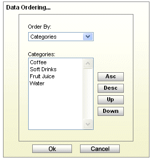
Data Ordering Dialog
The drop-down list at the top of the dialog allows you to select ordering for the categories, series, and based on the value axis. For the category and series elements you have the following options:
- Asc:
This will arrange the categories/series elements in ascending order. For example, if the category elements are strings, they will be arranged alphabetically.
- Desc:
This will arrange the categories/series elements in descending order.
- Up:
This allows you to create a custom order, by moving the selected category/series element up one place in the list.
- Down:
This allows you to move the selected category/series element down one place in the list.
You can also sort the category elements based on their corresponding values. To do this, select the Values option in the drop-down list at the top of the dialog.
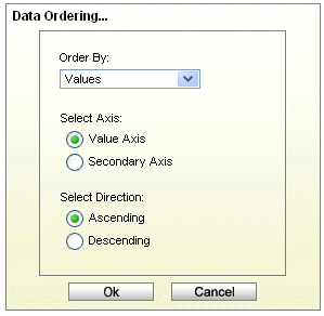
Value Data Ordering Dialog
From this dialog you can specify to sort the category elements based on their corresponding values in the value or secondary value axis. You can also specify whether to sort them in ascending or descending order.
Once you have finished settings the options, click to save the changes.
Please note that any sorting set will be re-applied if the chart is refreshed and/or if the data changes.
The plot area is the plane on which the data points are drawn for two-dimensional charts. You can customize the appearance of the plot area by clicking the  button on the QuickDesigner toolbar. A dialog will open in a new window.
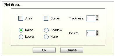
Plot Area Dialog
This dialog allows you to draw a border around the plot area or to fill it in order to provide a background color. If you fill the area, you can also specify certain three-dimensional effects either raising, lowering, or drawing a shadow.
Once you have finished settings the options, click to save the changes.
You can control and modify the display of the chart legend by clicking on the  button on the toolbar. This will bring up the following dialog in a new window.
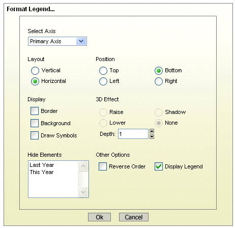
Format Legend Dialog
The drop-down list at the top of the dialog allows you to select which legend (primary or secondary) you would like to modify. The formatting options are as follows:
- Display:
These options allow you to turn on or off the legend border and background. This also allows you to display the point symbols instead of lines or blocks in the legend.
- 3D Effect:
This allows you to add a three-dimensional effect to the legend. You can raise it, lower it, or draw a shadow.
- Layout:
This allows you to change the legend from vertical to horizontal layout.
- Hide Elements:
This allows you to select certain category/series elements to hide in the legend.
- Other Options:
This allows you to choose whether or not to display the legend, or to draw the legend in reverse order.
Once you have finished settings the options, click to save the changes.
There are a number of formatting options that are unique to certain chart types. These options can be modified by clicking the  button on the toolbar. This will bring up a new dialog that varies depending on the type of the current chart. Some chart types have no additional options.
For dial charts the following dialog is opened:
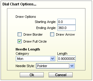
Dial Chart Options Dialog
The following options are available for dial charts:
- Starting Angle:
This specifies the angle where the first axis label is to be set. The angle is represented in degrees and is 0 by default. Assuming the dial chart is a clock face, 0 degrees is 12 o'clock.
- Ending Angle:
This specifies the angle where the last axis label should be set. The angle is represented in degrees and is 360 by default. Hence, by default the labels (and data points) encompass the entire circumference for the dial.
- Draw Border:
This specifies whether or not to draw a border around the dial.
- Draw Arrow:
This specifies whether or not to draw arrowheads at the end of the dial hands.
- Draw Full Circle:
This specifies whether to draw the dial as a complete circle (360 degrees) or only draw the portion of the circle determined by the starting and ending angles.
- Needle Options:
This specifies the distance of the hand, for each needle (if multiple needles exist) from the center of the dial. The range is from 0 (center of the dial) to 1 (the end of the dial). You can adjust the needle length for each of the categories by selecting the category from the drop-down list. The Needle Style refers to the style of the needle you wish to display. The default is a Pointer needle.
The following dialog is opened for pie charts:
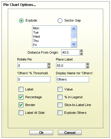
Pie Chart Options Dialog
Different options will appear in this dialog depending on whether the pie chart is two-dimensional or three-dimensional and whether or not it has a series. The following options are available for pie charts:
- Explode:
This allows you to pick one or more category/series elements whose sections are to be drawn at a certain distance away from the center of the pie.
- Sector Gap:
This allows you to pick one or more category/series elements whose sections are drawn at a certain distance away from the center of the pie and still maintain the same distance between pie slices and a circular boundary.
- Distance from origin:
This allows you to specify how far the exploded/sector gap sections are to be drawn away from the center. This number, represented as a percentage of the radius, indicates the distance between the center and the tip of the pie slice to be exported.
- Rotate pie:
This allows you to specify the number of degrees that the chart should be rotated in a clockwise direction. Available values are between 0 and 360
- Place label:
This indicates the distance of the labels from the center of the pie.
- 'Others' % Threshold:
This feature use useful for pie charts that have a large number of small categories. Rather then draw a slice for each category, users can select a threshold value. Any category whose percentage of the value column is less than the threshold value will be lumped into an “Others” slice.
- Display Name for 'Others':
This option allows you to set the display name for the “Others” slice that is created for categories that fall below the supplied threshold value. This label will appear in the legend and/or for the slice label.
- Pie sectors:
This indicates the number of sectors that comprise the pie. The resolution is adjusted by increasing or decreasing the number of pie sectors. For example, the higher the number, the greater the resolution. You can specify the number of pie sectors drawn ranging from 24 to 180. This option is only available for three-dimensional pie charts.
- Label:
This determines whether a category/series label should be drawn for each pie slice. By default, these only appear as legend items.
- Value:
This allows you to specify whether to display the actual value of each pie slice.
- Percentage:
This allows you to display the percentage for each pie slice. The percentages are calculated by dividing the value of each section by the sum of all the values.
- % in legend:
This allows you to display the percentage represented by each slice in the pie in the legend. If the pie slices can become very thin, this can be a preferable presentation. This option is only available if the pie chart does not have a data series.
- Border:
This specifies whether to draw a border around each pie slice. This option is only available for two-dimensional pie charts. For three-dimensional pies you can use the border drawing option on the navigation panel.
- Slice-to-Label Line:
This will draw a line from any label(s) to its corresponding pie slice.
- Label at Side:
This will place the labels for the pie chart away from the plot around the outside of the chart. When used with the "Slick-to-Label Line" option, it gives users a way to display the pie labels for charts with many small categories without any text overlapping.
- Explode Others:
Draw the “others” segment at a certain distance from the center of the pie chart.
- Best Fit:
This will arrange the multiple pies in the best configuration to fit the chart canvas. This is for pies with a data series only.
- Draw Linearly:
This will arrange the multiple pies in a straight horizontal line. This is for pies with a data series only.
- Number of Pies Per Row:
This allows you to create a custom arrangement of multiple pies, by specifying the number of pies to draw in each row of the arrangement.
- Gap between pies:
This allows you to specify the gap between the multiple pies. The number is a multiple of the pie radius, so the gap will adjust with the size of the chart plot.
The following dialog is opened for HLCO charts:
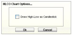
HLCO Chart Options Dialog
The Draw Hi-Low As Candle Stick option will turn the HLCO chart into a candle representation. A candle HLCO chart blends the high, low, close, and open data into a single object that resembles a candlestick.
The following dialog is opened for Gantt charts:
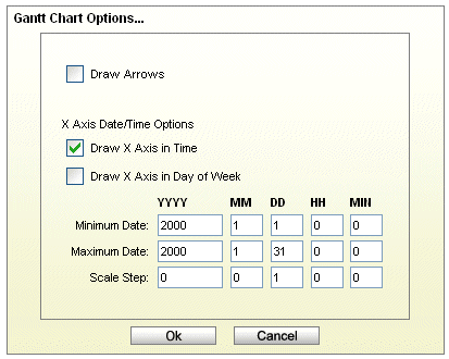
Gantt Options Dialog
The following options are available for Gantt charts:
- Draw Arrows:
This will draw connecting arrows between the category elements of the Gantt chart. This allows you to illustrate a sequence between scheduled events. The arrows are drawn in the order the category elements appear in the data source.
- Display X-Axis in Time:
This shows the ticker labels as time values instead of numeric values for the X-axis.
- Display X-Axis in Day of Week:
This shows the ticker labels as days of the week with the date for each Sunday shown as well.
- Minimum Date:
This specifies the beginning date for the X-axis. The format is year, month, day, hour, and minute.
- Maximum Date:
This specifies the ending date for the X-axis. The format is year, month, day, hour, and minute.
- Scale Step:
This specifies the scale step for the X-axis. The format is year, month, day, hour, and minute.
For polar charts the following dialog is opened:
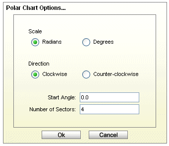
Polar Chart Options Dialog
The following options are available for polar charts:
- Input Data Angle Units:
This option allows you to specify whether the input data for the angle (θ) portion of the data points is in radians or degrees. The chart will always display angles from 0 to 360. If the input data is in radians, it will be displayed as degrees.
- Direction:
This option allows you to specify whether the circular plot should be drawn clockwise or counter clockwise.
- Start Angle:
By default the top of the polar chart plot is 0 degrees. This option allows you to specify a different angle for the top of the plot. The argument for this angle is supplied in degrees or radians, depending on the scale you have chosen.
- Number of Sectors:
This option allows you to select the number of sectors you would like to show in the chart. Sectors are created by drawing additional polar axis lines at specified angle intervals. By default, four sectors are shown.