Once you have selected the data that you would like to use for the chart, the next step in the Chart Wizard is to select the chart type that you would like to use. You will be presented with a dialog that allows you to specify the chart type.
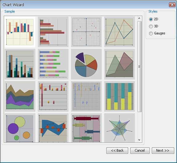
Two-Dimensional Chart Types Selection Dialog
Each chart type represents a different way in which the data points are plotted to give a pertinent representation to all kinds of data. The different types of charts are broken down by dimension. In addition to basic chart types, users can create many different types of composite/combination charts by adding secondary values/series to the chart. You can toggle between the chart categories by selecting either 2D, 3D or Gauges in the right-hand side of the chart types dialog.
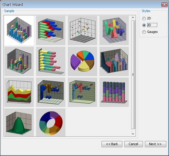
Three-Dimensional Chart Types Selection Dialog
This dialog enables you to select your chart type by either selecting the image and clicking or by double clicking on the chart image. You can select from one of the following chart types:
Column
Bar
XY(Z) Scatter
Line
Stack Column
Stack Bar
Pie
Area
Stack Area
High Low
HLCO
Percentage Column
Doughnut
Surface (Three-Dimensional Only)
Bubble (Two-Dimensional Only)
Overlay (Two-Dimensional Only)
Box (Two-Dimensional Only)
Radar (Two-Dimensional Only)
Dial (Two-Dimensional Only)
Gantt (Two-Dimensional Only)
Polar (Two-Dimensional Only)
Circular Gauge
Square Gauge
Semi Circular Gauge
Square Gauge
Quarter Circular Gauge
Each of the chart types is described in detail later in this chapter, starting with Section 3.4.2 - Column Charts
For information on gauges, see Section 3.4.20.2 - Gauges
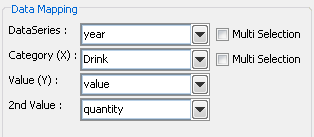
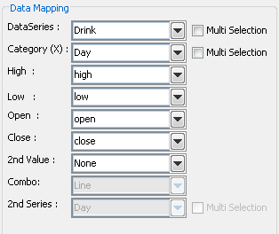
After you have selected the chart type, the next step is to specify the data mapping for the chart. Data mapping is the way that the selected data source is rendered in the chart. The basics of data mapping are described in Section 3.2.2 - Basic Data Mapping. The data mapping screen in the Chart Wizard allows you to set the mapping options and also preview the results.
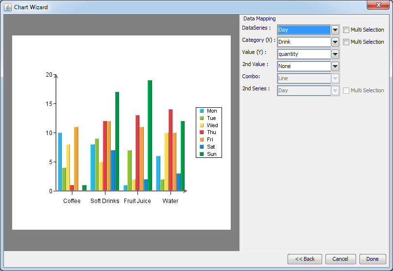
Data Mapping Dialog
The left-hand side of the dialog shows a preview of your chart. The right-hand side shows which columns from your data source have been selected to plot in the different chart elements (series, category, value, etc). By default, EspressReport will select the first available columns, based on the data type, to plot. Changing the data mapping is easy - click on the down-facing arrow next to a data field and select a different field. The chart preview in the left-hand part of the data mapping dialog will be updated immediately.
The specific mapping options vary for each chart type and are discussed later in this chapter starting with Section 3.4.2 - Column Charts.
You can also set data transposing from the data mapping dialog. Transposing allows you to plot multiple data source columns in one chart without modifying the data source.
For example, we have a data source that looks like this:
Example Data Source
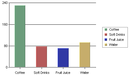
We would like to plot data from all regions in one chart. The default mapping without data transposing does not allow us to do that. We would have to plot only one region in the chart or modify the data source, so we will have to transpose the data source.
Default Chart Data Mapping
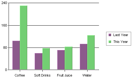
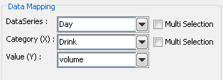
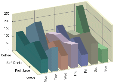
To transpose the data, select the Multi Selection option next to the Data Series field. The field will change to a list allowing us to select several column at the same time. We will just select all region columns and the chart will look like this:
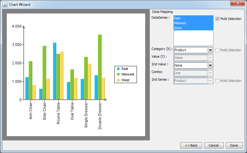
Default Chart Data Mapping
![[Note]](../../../images/note.png) | Note |
|---|---|
Only one chart element (such as data series, category, value, or second series) can be transposed at a time. If you select the Multi Selection checkbox for one chart element, the Multi Selection checkboxes will be deactivated for other chart elements. |
Transposing is not available for drill-down charts.
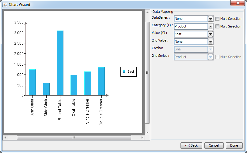
Column Chart (Without Data Series)
A column chart displays each row in the data table as a vertical bar (or column). The categories are listed along the X-axis and the values plotted along the Y-axis. Column charts are good for comparing discrete values for different groups. Each group is represented by a different color.
In a two-dimensional chart, if a data series has been selected then the entire series for a single category will be displayed in the XY plane. If a three-dimensional column chart is being used then all the vertical bars in a given data series are drawn using the same color along the Z-axis. If a data series is not present in the chart, the categories will be represented by different colors.
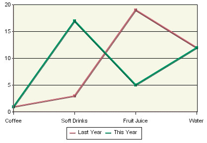
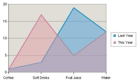
In the examples given, we have chosen Drink as the category variable and Value as the value variable (most examples use the Sample.dat file included in the EspressReport installation). Year has been selected as the data series variable for the chart below. Therefore, each name has two columns shown: one for last year and one for this year which are the only two values present in the data series column.
Column Chart with Data Series
Data mapping for column charts is fairly straightforward. It is similar to the examples first presented in Section 3.2.2 - Basic Data Mapping. For column charts, the following options are available:
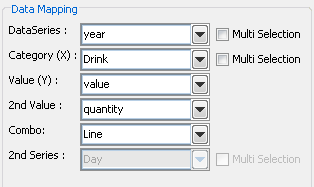
Mapping Options for Column Charts
Data Series: | Choose a data column whose distinct values will determine the number of data series in the chart. Each element in a data series is drawn using the same set of colors and other attributes. |
Category (X): | Choose a data column whose distinct values will determine the categories. |
Value (Y): | Choose a data column to provide values for each category. |
2nd value: | Add a second value to create a combination chart. |
2nd Series: | Choose another column to be series for the secondary chart. This option is applicable only if the secondary chart is an overlay chart. |
Combo: | Choose the chart type for the secondary chart. For column charts the combo options are Line and Overlay. |
The data mapping also allows you to transpose the data (in other words: to select several columns for a single category). To learn more about data transposition, please see Section 3.4.1.1 - Data Transposition.
The last three data mapping options allow you to add a second value to the chart. ChartDesigner supports secondary values for all chart types except pie, radar, bubble, dial, surface, and scatter charts. In the example below, a second value of Quantity has been added to our column chart.
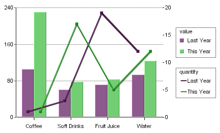
Column Chart With 2nd Value
As you can see, the second axis labels are drawn on the right-hand side of the plot area (you can choose to make this axis visible). Usually, the second value will share the same categories and series as the primary value. However, for two-dimensional column, stack column, stack area, high low, HLCO, and percentage column charts you can specify an overlay combination, which allows you to specify a second series. For more on overlay charts, please see Section 3.4.17 - Overlay Charts.
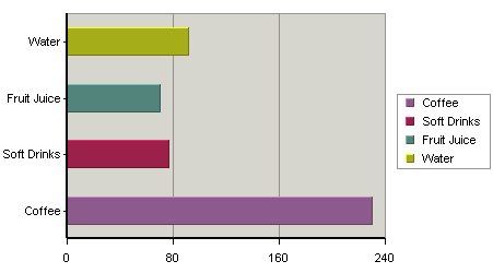
Bar Chart
A bar chart is essentially the same as a column chart, except that horizontal bars are drawn in the chart as opposed to the vertical bars which are used in a column chart. In a bar chart, the categories are plotted along the Y-axis and the values along the X-axis.
Just as for a column chart, if a data series has been selected then the entire series for a single category is displayed in the XY plane. If a three-dimensional bar chart is being used, all the horizontal bars in a data series are drawn using the same color. Each category is drawn using a different color. If the data series is not present in the chart, the categories will be represented by different colors.

Mapping Options for Bar Charts
The mapping for this chart type is similar to that of a column chart, except the category (X) and values (Y) under column chart become category (Y) and values (X) respectively. This is because values are represented vertically in a column chart, but horizontally in a bar chart. Please note that the 2nd Series and Combo options are not available for bar charts. This is because the only combination available with bar charts is a line.
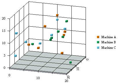
XY(Z) Scatter Chart
In an XY(Z) scatter chart, each selected row in the data table defines a point in two or three-dimensional space. Thus each column must contain either numeric or date/time values. A marker represents each point. The data columns that are in each row of the data table determine the spatial position of the marker.
Optionally, another data table column can be chosen to separate the markers into groups. Elements of each group have the same value on this column which is referred to as the data series column. Markers in the same group are drawn using the same drawing attributes; in other words, using the same shapes and colors. The X-axis scale of a scatter chart is linear. This means that unlike other chart types, the data points may or may not be evenly spaced along the X-axis.
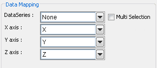
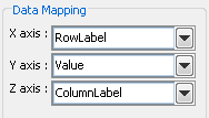
Mapping Options for Scatter Charts
In a scatter chart, the X-axis, Y-axis, and Z-axis values determine the X, Y, and Z coordinates of a point respectively. The data series box allows you to choose a data column whose distinct values will determine the number of data series in the chart. Each element in a data series is drawn using the same set of drawing attributes( e.g., colors and markers).
Line Chart
Line charts present data in a manner similar to column charts. For a two-dimensional line chart, a marker denotes a data point for each category. The value column, which must be numeric, determines the height of a marker. Each marker is joined with a line. If the chart has a data series, a separate line is drawn for each element in the series.
ChartDesigner allows 2D line charts to be displayed vertically in addition to the default horizontal setting. To use this feature in Chart Designer, create a line chart and then select → . Next, select Vertical. The chart is rotated clockwise 90 degrees.
Vertical Line Chart
A three-dimensional line chart is an extension of its two-dimensional counterpart. It contains no additional information. The markers disappear and thicker lines, spaced apart on the Z-axis, replace the thin lines.
Mapping Options for Line Charts
Data mapping for line charts is almost exactly the same as for column charts (discussed in Section 3.4.2.1 - Data Mapping). Line charts, however, do not have the 2nd Series and Combo options. This is because the only combination available with line charts is a line. To create line combinations with other chart types (bar, column, stack column, etc) select the other chart type as the primary chart, and select Line as the Combo option.
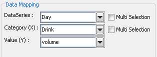
Stack Column Chart
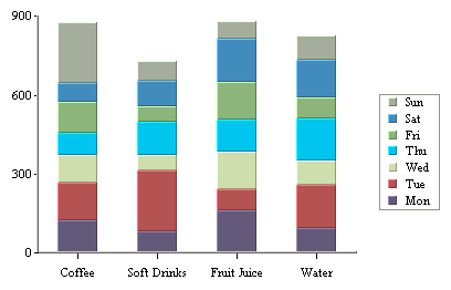
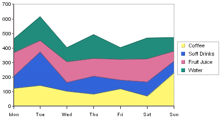
A stack column chart is a derivative of a column chart in which each vertical column comprises a stack of bars. Each selected row in the data table is represented by a component of a chart column. For a two-dimensional stack column chart, the categories are plotted on the X-axis and the values on the Y-axis. The value column, which must be numeric, determines the length of each bar component. A third column, known as the sum-by column, represents a group of values for each category. A stack for a given category value is built up stacking the sum-by values for that category value. Each stack component of a chart column has a distinct sum-by value denoted by a distinct color. Each row in the data table must have a unique pair of values on both the category and sum-by columns. Components with negative values are separated from components with positive values and they are stacked up in the “negative” direction below the X-axis.
In our example above, we have chosen types of drink as category value and day representing the sum-by values. Another independent category (to be displayed on the Z-axis) may be optionally specified based on a fourth column as a data series. In such a case, each row in the data table must have a unique triplet of values on the category, sum-by and data series columns. In a two-dimensional chart, the entire data series for a single category is displayed side-by-side in the XY plane. In a three-dimensional stack column chart, the data series is displayed along the Z-axis.
In stack column charts, each category is further subdivided into components. Hence, there is an additional sum-by option used to determine the sum-by values for the chart.
Mapping Options for Stack Column Charts
The data mapping options are as follows:
Data Series: | Allows you to choose a data column whose distinct values will determine the number of data series in the chart. Each element in a data series is drawn using the same color. |
Category (X): | Allows you to choose a data column whose distinct values determine the categories. Values from this data column are used to calibrate the X-axis. Each category in a data series is drawn as a distinct column in the chart. |
Sum-by: | Allows you to choose a data column whose distinct values determine the components in each category. Each distinct value in this column determines a distinct stack component of a column. |
Value (Y): | Choose a data column to provide values for each category. |
2nd value: | Add a second value to create a combination chart. |
2nd Series: | Choose another column to be series for the secondary chart. This option is applicable only if the secondary chart is an overlay chart. |
Combo: | Choose the chart type for the secondary chart. For stack column charts the combo options are Line, Stack Area, and Overlay. |
The data mapping also allows you to transpose the data (in other words: to select several columns for a single category). To learn more about data transposition, please see Section 3.4.1.1 - Data Transposition.
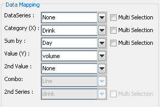
Stack column charts have a unique combination option which allows users to plot a second value as a stack area chart. Both values share the same category and sum-by values. This chart can compare component based categories for different values in the data.
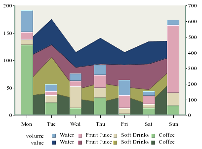
Stack Column-Stack Area Combination Chart
With this combination chart you can specify to hide particular sum-by component in the chart to achieve a strip area effect.
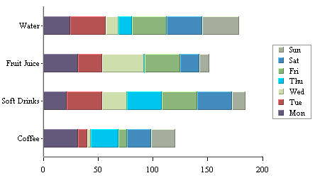
Stack Bar Chart
Like a stack column chart, the stack bar chart displays the chart categories as a sum of different stacked values - the sum-by column in the data source. The difference for a stack bar chart is that the categories are plotted on the Y-axis and the values are plotted along the X-axis.
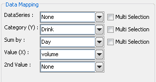
Data Mapping Options for Stack Bar Charts
The mapping for this chart type is similar to that of a stack column chart, except the category (X) and values (Y) under column chart become category (Y) and values (X), respectively. This is because values are represented vertically in a column chart, but horizontally in a bar chart. Please note that the 2nd Series and Combo options are not available for stack bar charts. This is because the only combination available with stack bar charts is a line.
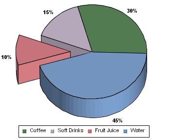
Pie Chart
In a pie chart, each row in the data is represented as a pie sector. The pie chart requires a category column and a value column. The value column must be numeric. The number of distinct values in the category column determines the number of pie sectors in the chart. All the values are summed up and each slice is assigned an angle according to its share in the total. Thus, the value column for each category determines the size of the slice representing that category.
A three-dimensional pie chart is simply an extension of its two-dimensional counterpart and contains no extra information.
Pie charts can also have a data series. If you specify a series in the data mapping, a separate pie will be drawn for each category element and it will be comprised of the series elements. A pie chart with a data series is displayed below:
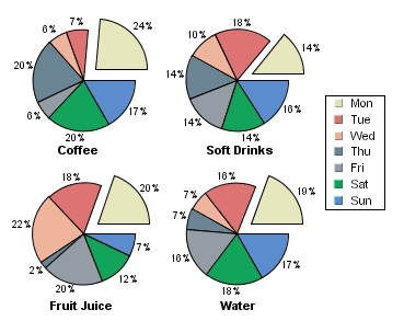
Pie Chart With Data Series
When a series is present, all the separate pies are drawn on a single plot area and re-sized in proportion with the plot. You have the option of stacking the different pies or of drawing them in a line.
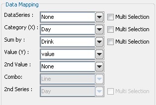
Mapping Options for Pie Charts
For pie charts the mapping is as follows:
Data Series | Allows you to choose a data column whose distinct values will determine the number of data series in the chart. Each element in a data series is drawn using the same color. |
Category (X) | Allows you to choose a data column whose distinct values determine the various categories. |
Value (Y) | Allows you to choose a data column to provide values for each category. |
There is no 2nd Value option, as you cannot make any combination charts with a pie chart.
The data mapping also allows you to transpose the data (in other words: to select several columns for a single category). To learn more about data transposition, please see Section 3.4.1.1 - Data Transposition.
Three-Dimensional Area Chart
A three-dimensional area chart may be viewed as a derivative of a column chart. A three-dimensional area chart may be constructed from a three-dimensional column chart in the following manner. For each data series (Z-axis) value, the tops of all the columns are joined together by a thick line. The columns are then removed and the area (in the XY plane) under each line is filled with a distinct color.
Two-Dimensional Area Chart
A two-dimensional area chart is essentially a projection of its three-dimensional counterpart viewed along the Z-axis. As a result, a two-dimensional area chart may sometimes hide a data series value altogether. Therefore, it must be used with caution. The chart above illustrates this point: in a two-dimensional display some parts of each series are concealed by a series in front. To ameliorate this problem, you can change the ordering of the data series (see Section 3.5.8.3 - Data Ordering) or set the area translucent (see Section 3.5.1.3 - Format Menu) as in the example above.
Mapping Options for Area Charts
Data mapping for area charts is almost exactly the same as for column charts (discussed in Section 3.4.2.1 - Data Mapping). However, area charts do not have the 2nd Series and Combo options. This is because the only combination available with area charts is a line.
Stack Area Chart
A two-dimensional stack area chart may be viewed as a derivative of a two-dimensional stack column chart but without a data series. This chart may be constructed from a stack column chart as follows: The tops of each stack component having the same color are joined together by lines. The stack columns are removed and the area between each set of lines is filled with a distinct color.
A three-dimensional stack area chart can have a data series and can also be derived from a three-dimensional stack column chart using the process stated above. In this case, the stack columns for each distinct data series value (a fixed Z-axis value) are joined separately, giving rise to multiple stacks.
Both two-dimensional and three-dimensional stack area charts may be constructed using a similar set of data as needed for their respective stack column chart counterparts. Note, as stated earlier, that a two-dimensional stack area chart cannot have a data series.
Mapping Options for Stack Area Charts
Data Mapping for stack area charts is almost exactly the same as for stack column charts (covered in Section 3.4.6.1 - Data Mapping). However, two-dimensional stack charts cannot have a data series, and the combo options are Line and Overlay.
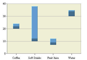
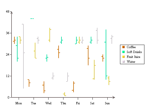
High-Low Chart
A high-low chart is also a derivative of a column chart, only that instead of one value column it uses two columns for high and low bounds of values. The data for the chart must contain at least three columns: category, high, and low. The category column can contain values of any type, while the high and low columns must be numeric.
Another option for a high-low chart is a data column called the close column. If a close column is also used then the close value will lie somewhere between the high and low values. The portion of the bar between the low point and the lose point is rendered in a darker form of the same color as the portion between the close point and the high point. As for many other types of charts, a high-low chart may include a data series column.
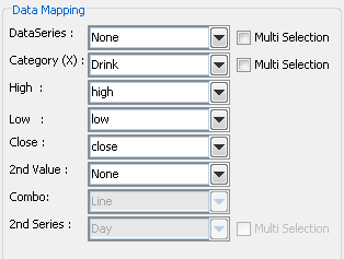
Mapping Options for High-Low Charts
Data mapping for high-low charts is similar to column charts. You can select series and category columns in the same manner. The difference for high-low charts is that you need to specify at least two value columns - a high and a low value. These are the two points that are plotted for each category. A third value called Close can also be specified. Combo options for high-low charts are Line, Column, and Overlay.
HLCO Chart
A HLCO (High Low Close Open) chart is similar to the high-low chart described above, except that it also contains an open column. It is useful in presenting data that fluctuates over discrete periods of time, such as stock prices or inter-day temperatures. The HLCO chart can also be displayed in a Candlestick format for both 2D and 3D charts. This feature is described in Section 3.5 - The Designer Interface.
Mapping Options for HLCO Charts
Data mapping for HLCO charts is similar to that for High-Low charts. The only difference is that instead of specifying two different value columns, you must specify four different columns - the High, Low, Open, and Close columns. Combo options are Line, Column, and Overlay.
A common kind of chart is one that plots both a stock price and a trading volume in the same chart. This can be accomplished using an HLCO-column combination in ChartDesigner.
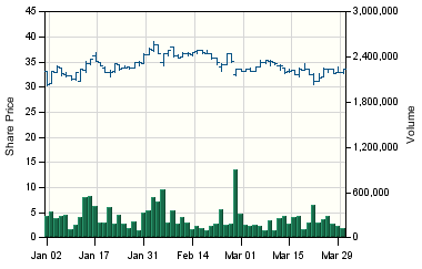
HLCO-Column Combination Chart
This example plots stock price and volume data over a three month period.
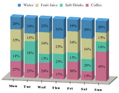
Percentage Column Chart
A percentage column chart may be viewed as a derivative of pie and column charts together. Each column in the chart corresponds to one pie. A percentage column chart has a category column corresponding to the X-axis value. A sum-by column represents the category in this case and the value column is the same as that of a pie chart.
Mapping Options for Percentage Column Charts
Data mapping for percentage column charts is the same is for stack column charts (covered in Section 3.4.6.1 - Data Mapping). The only difference is that the sum-by components are plotted as a percentage of the Value column instead of as discrete values. Combo options for percentage column charts are Line and Overlay.
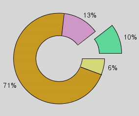
Doughnut Chart
A doughnut chart is the same as a pie chart, except for the “hole” that appears in the center.
Just as for a pie chart, if a data series is selected, a separate doughnut will be drawn for each category element and each doughnut will be comprised of the series elements. When a series is present, all the separate doughnuts are drawn on a single plot area and re-size in proportion with the plot. You have the option of stacking the different doughnuts or of drawing them in a line.
Mapping Options for Doughnut Charts
Data mapping for doughnut charts is exactly the same as for pie charts (discussed in section Section 3.4.8.1 - Data Mapping).
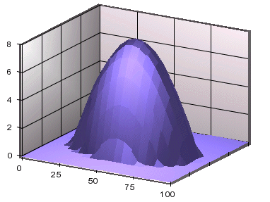
Surface Chart
A 3D surface chart is a scientific/business chart, which uses three sets of numeric data values to form a smooth surface in a three dimensional space. For each data point, two of the three values represent the coordinates on the horizontal plane and the third value is used to determine the vertical position of a data point. Input data can be in the form of a rectangular matrix (as shown below) or arranged in three columns where each column represents an axis. In the following sample data, the top row (column header) and the left column (row header) represent the coordinate values of the axes that form the plane on which the surface will be drawn. When the chart is viewed from above the plane, you can see a grid formed by joining every four adjacent points together. A given set of data cannot plot a surface chart if this grid cannot be drawn.
Sample surface chart data:
| 0 | 20 | 40 | 60 | 70 | 80 | 100 | |
| 20 | 0 | 0 | 0 | 0 | 0 | 0 | 0 |
| 30 | 0 | 10 | 10 | 10 | 10 | 10 | 10 |
| 40 | 0 | 10 | 25 | 25 | 25 | 2 | 10 |
| 80 | 0 | 10 | 25 | 30 | 30 | 30 | 25 |
| 90 | 0 | 10 | 25 | 30 | 30 | 30 | 25 |
| 100 | 0 | 10 | 10 | 25 | 25 | 25 | 10 |
The values of the column header and the row header are not required to be equally separated because a surface chart can properly scale the horizontal distances. This data set will create a distorted inverted cone.
A surface chart uses a set of X, Y, and Z coordinates to plot a 3D chart. The vertical axis is called Y-axis and each Y value is represented by a function of X and Z, f(X, Z). Data on XY plane (horizontal plane) simply looks like a square matrix. Surface charts do not support data series and cannot be changed into a 2D chart.
Mapping Options for Surface Charts
The data mapping for a surface chart is similar to a three-dimensional scatter chart; the X-axis, Y-axis, and Z-axis values determine the X, Y, and Z co-ordinates of a point respectively. However, unlike a scatter chart, surface charts do not support data series and cannot be converted to a two-dimensional chart.
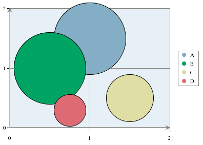
Bubble Chart
A bubble chart is used to represent data wherein the size of the bubble also provides information. A data point is represented by an XY coordinate and a third point, which is the radius of a circle or bubble.
This chart is available in a two-dimensional form only. Fore more information about bubble charts and their display options, please see Section 3.5.9.1 - Bubble Charts.
The data mapping for bubble charts is similar to three-dimensional scatter charts; however, instead of plotting a Z-axis position, the third value determines the size of the bubble (specifically the radius).
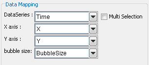
Mapping Options for Bubble Charts
Note that like a scatter chart, the columns have to be numeric in order to be mapped successfully.
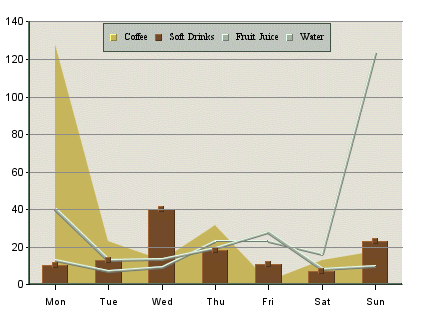
Overlay Chart
ChartDesigner supports a special chart type called overlay chart, which allows you to super-impose more than two charts with a common category axis. A different chart can be used to represent each element of a data series. This allows for more freedom while creating the chart and also allows more information to be represented. The chart types supported in an overlay chart are column, area, and line charts. Only two-dimensional charts can be included in an overlay chart.
Mapping Options for Overlay Charts
The data mapping for an overlay chart is similar to that of a column chart (covered in Section 3.4.2.1 - Data Mapping), except the overlay chart plots each element in the data series as a separate chart. Please note that the 2nd Value, 2nd Series, and Combo options do not apply for overlay charts. Overlay charts do not support secondary values. However, the different series elements can be plotted on different axes. For more on plotting options for overlay charts, see Section 3.5.9.3 - Overlay Charts.
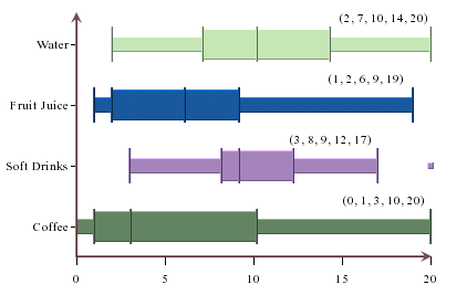
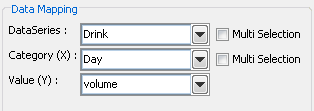
Box Chart
ChartDesigner provides a statistical chart type, the Box Chart, also known as Box and Whiskers Chart. Essentially, box chart provides a quick visual realization of summary statistics. A histogram shows the distributions of observed values such that you can identify the peak(s), minimum, maximum values and clustering of data. A box chart, on the other hand, displays a summary of data distribution in quarterly percentiles (Minimum data point, 25th percentile, median, 75th percentile, and Maximum data point).
The middle line in the box represents the median. The other lines in each direction represent the 25th percentile increment (decrement). The minimum and maximum points are the observed minimum and maximum which are not outliers. The lines that extend from the edge of the box to the minimum/maximum are sometimes called whiskers. Hence, the name box and whisker chart. Outliers are any values that are 1.5 times (or more) the length of the box, that being the difference between the 75th and 25th percentiles. Outliers are calculated and shown as dots away from the box. The other nice feature about box plot is that you can stack up the boxes in one chart to compare summaries of different data sets.
ChartDesigner allows box charts to be displayed vertically in addition to the default horizontal setting. To use this feature in Chart Designer, create a box chart and then select → , and select Vertical.
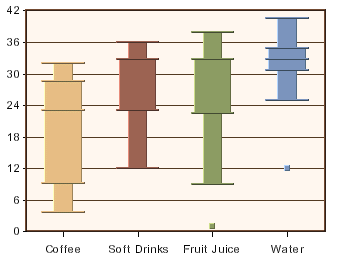
Vertical Box Chart
This chart is available in two-dimensional form only.
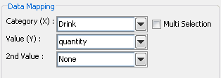
Mapping Options for Box Charts
For box charts the mapping is as follows:
Category (X): | Allows you to choose a data column whose distinct values determine the various categories. |
Value (Y): | Allows you to choose a data column to provide values for each category. These values are used to calculate the minimum data point, the 25th percentile, the median, the 75th percentile, and the maximum data point. |
2nd value: | Add a second value to create a combination chart. |
Please note that the 2nd Series and Combo options are not available for box charts. This is because the only combination available with box charts is a line.
The data mapping also allows you to transpose the data (in other words: to select several columns for a single category). To learn more about data transposition, please see Section 3.4.1.1 - Data Transposition.
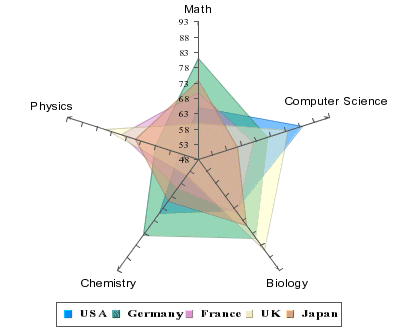
Radar Chart
Radar charts are useful when you need to compare performance/measurement results, statistics, etc from different sources. For example, we can compare median test scores of children in the industrial nations on subjects such as math, computer science, and biology. A radar chart has multiple axes along which data can be plotted. Each axis is a category. The data is shown as points on the axis. The points belonging to one data series can be joined or area so enclosed is filled. A point close to the center on any axis indicates a low value while a point near the end represents a high value. In some applications, low values may be more desirable than high values, e.g. price/earning, price/sales, price/book of stocks.
This chart is available in a two-dimensional form only.
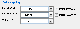
Mapping Options for Radar Charts
For radar charts the mapping is as follows:
Data Series | Allows you to choose a data column whose distinct values will determine the number of data series in the chart. Each element in a data series is drawn using the same color along each axis. |
Category (X): | Allows you to choose a data column whose distinct values determine the categories. The number of unique elements in this column determines the number of axes in the radar chart. |
Value (Y): | Allows you to choose a data column to provide the numeric value to plot against the category. |
Please note that the 2nd Value, 2nd Series, and Combo options do not apply for radar charts. Radar charts do not support secondary values.
The data mapping also allows you to transpose the data (in other words: to select several columns for a single category). To learn more about data transposition, please see Section 3.4.1.1 - Data Transposition.
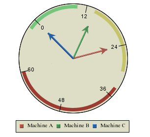
Dial Chart
Dial Charts are used to build circular charts (such as temperature gauges, speedometers, and clocks), create dashboards, or balanced scorecard applications. Here the data is represented as a “hand” on a “dial”. The whole dial can be used (for instance for a clock) or just part of the dial (a semi- circular chart such as a gasoline gauge). Dial Charts support pop-up labels, drill-down, and user interactions such as rotating the hands or sectors of a dial.
This chart type is available in a two-dimensional form only.
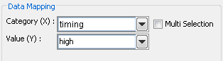
Mapping Options for Dial Charts
The data mapping of a dial chart is the similar to a pie chart (detailed in Section 3.4.8.1 - Data Mapping). However, instead of pie wedges, the categories become dial hands. Also, dial charts do not support data series or secondary values.
Gauges are special types of dial charts containing a plot background image and/or plot foreground image. To create a new gauge, select the Gauges radio button on the Chart Type Selection dialog.
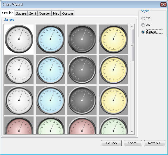
Selecting a Gauge Template
You can also create your own gauge by creating a template, saving the tpl file in the <EspressReport Install>/gauges/templates/Custom/ folder (please note that the Custom folder is not created automatically by the EspressReport installator so you will have to create it manually in your favorite file manager). To add this template to the Custom tab, you will also need to provide two images, a screenshot of the template placed in <EspressReport Install>/gauges/screenshots/selected/Custom/, and a dimmer version of the same template placed in <EspressReport Install>/gauges/screenshots/unselected/Custom/. An easy way to create the screenshot is to export the template to gif for the regular screenshot and resize it to 100px by 100px. Then change the background to a darker color, export and resize again for the dimmer version.
It is also possible to apply a gauge template onto an existing dial chart. Selecting apply template when the current chart is a dial chart will display the gauge tabs just like when creating a new chart.
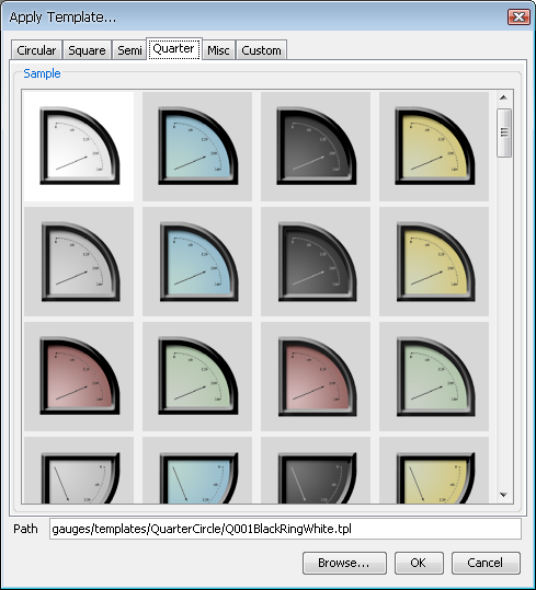
Applying a Gauge Template
For more information regarding the dial background and foreground images, see Section 3.5.9.2 - Dial Charts.
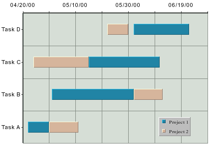
Gantt Chart
A Gantt or time chart is used to represent data where a time factor is being measured. This is often used in project or time management situations. A Gantt chart resembles a bar chart with the category axis on the Y-axis and the value axis on the X-axis. The value axis uses date, time, or timestamp data (numeric values can also be used). Each data point has a start and end time associated with it.
This chart type is available in a two-dimensional form only.
The data mapping for Gantt charts is similar to high-low charts. However, instead of selecting a column for the high and low values, you select the start and end values.
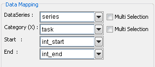
Mapping Options for Gantt Charts
The mapping is as follows:
Data Series: | Allows you to choose a data column whose distinct values will determine the number of data series in the chart. |
Category (X): | Allows you to choose a data column whose distinct values will determine the categories. |
Start: | Allows you to choose a data column whose distinct values represent the starting time interval for the category. |
End: | Allows you to choose a data column whose distinct values represent the ending time interval for the category. |
The data mapping also allows you to transpose the data (in other words: to select several columns for a single category). To learn more about data transposition, please see Section 3.4.1.1 - Data Transposition.
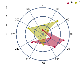
Polar Chart
Like a two-dimensional scatter chart, a polar chart plots points on a plane. However, instead of rectangular coordinates, a polar chart plots points using polar coordinates (r, θ), where r represents the distance from the center of the circular plot and θ represents the angle of a ray emanating from the center of the plot and passing through the point. Like scatter charts, the data for polar chart coordinates must be numeric. The θ values can be supplied in degrees or radians. A third data series column can be used to separate the data points into groups.
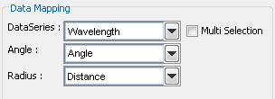
Mapping Options for Polar Charts
The data mapping for polar charts is similar to scatter charts. The angle and radius options allow you to select the columns whose values will make up the polar coordinates. These must both be numeric. The data series box allows you to choose a data column whose distinct values will determine the number of data series in the chart. Each element in a data series is drawn using the same set of drawing attributes, e.g., colors and markers.
Once you have finished setting the mapping options you will be taken to the main Chart Designer interface. Once you are in the Chart Designer you can return to the Data Mapping window by selecting → . This will return you to the data mapping screen, allowing you to adjust the mapping for the chart.
If your chart uses a different data source than the report, you can also change the charts data source from the Chart Designer interface. Once you are in the Chart Designer, select Modify Data Source from the Data menu. This will return you to the Data Source Manager window and allow you to pick a new data source for the chart. Note that this option is not available if you select to use the report data as the data source. Also, if you change your data source, you will need to perform data mapping again.