Once you have finished specifying all the mapping options, you will be taken to the main QuickDesigner interface. The interface shows the generated report on the bottom and a toolbar with formatting options on the top. If you have selected to create a chart, you will be taken to the QuickDesigner charting interface. For more information about this, see Section 3.22 - Charts in QuickDesigner.
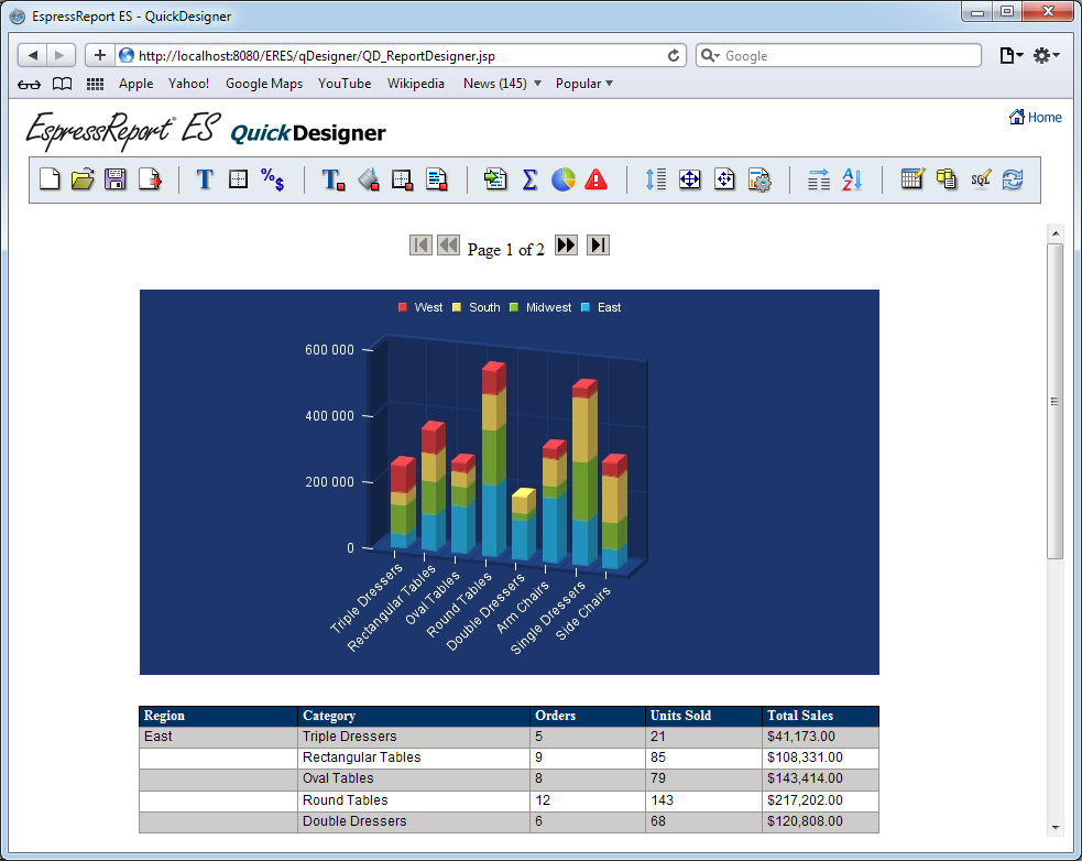
The QuickDesigner Interface
All of the formatting actions for reports in QuickDesigner are accessed through the toolbar.
| Start a new report |
| Open an existing report |
| Save the current report |
| Export the current report |
| Set font and alignment options |
| Set font color for report elements |
| Set background color for report elements |
| Set border thickness for report elements |
| Set border color for report elements |
| Set dual colors for the report |
| Set data formatting for report elements |
| Insert elements into the report |
| Add/Edit aggregations/grouping in the report |
| Add/Edit charts in the report |
| Inserts/Edits Alerts for report elements |
| Set dynamic height for report elements |
| Set bounds for report elements |
| Set page properties for the report |
| Set Page Display options for report |
| Change the column order in the report |
| Set sorting for the report |
| Change the report's mapping or grouping |
| Change the report's data source |
| Modify the report's query |
There are a number of options in the QuickDesigner toolbar that allow you to apply formats or add/remove elements from the report (specific options are discussed later in this chapter). However, when you make a change to a report element the changes are not automatically reflected in the report in the lower portion of the screen.
In order to improve performance the report will only be updated by user direction. To update the report and see any changes that you have implemented in the report, click the button on the end of the toolbar.
This will re-load the report with any changes that you have specified.
When you first get to the QuickDesigner interface, a version of your report will be created (either unformatted or using the selected style). You can use toolbar options to add or modify elements in the report.
QuickDesigner allows you to change font, color, and border properties for report elements.
- Font Style and Alignment:
You can modify the font style and alignment for report elements by clicking the
 button on the toolbar. This will bring up a dialog in a new window.
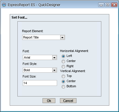
Font Style and Alignment Dialog
The drop-down list at the top of the dialog contains all the different report elements whose font can be set: column headers, columns, labels, and formulas. To set the font for a particular element type, select it from the list and use the other options in the dialog to set the font face, the font style, and the size. In addition, you can use the radio buttons to indicate the horizontal and vertical text alignment.
- Font Color:
You can modify the font color of report elements by clicking the
 button on the toolbar. This will bring up a dialog in a new window.
Font Color Dialog
The drop-down list at the top of the dialog contains all the different report elements whose font color can be set: column headers, columns, labels, and formulas. To set the font color for a particular element type, select it from the list, and click on a swatch. You can also manually specify the RGB value for the color.
- Background Color:
You can modify the background color of report elements by clicking the
 button on the toolbar. This will bring up a dialog in a new window.
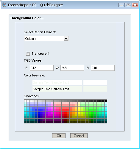
Background Color Dialog
The drop-down list at the top of the dialog contains all the different report elements whose background color can be set: column headers, columns, labels, and formulas. To set the background color for a particular element type, select it from the list and click on a swatch You can also manually specify the RGB values for the color. Background colors can also be rendered transparent by clicking the checkbox marked Transparent.
- Dual Colors:
You can specify alternating color for report columns by clicking the
 Dual Colors button on the toolbar. This will bring up a dialog in a new window.
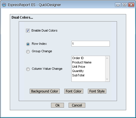
Dual Colors Dialog
In this dialog you can turn on or off dual colors, as well as specify the number of rows between color changes. In addition, you can set dual colors group changes to highlight changes in groups of data, or set dual colors to change for changes in any column value in a report.
The buttons at the bottom of the dialog allow you to set the font, font color, and the background color for the alternate rows. Changes to the dual color settings will automatically be applied to all the columns in the report.
- Border Thickness:
You can specify the thickness of cell borders by clicking the
 button on the toolbar. This will bring up a dialog in a new window.
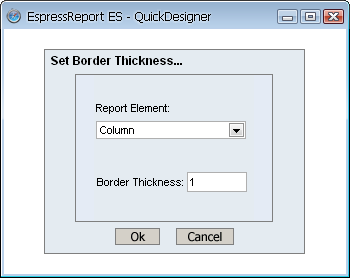
Border Thickness Dialog
The drop-down list at the top of the dialog contains all the different report elements whose border thickness can be set: column headers, columns, labels, and formulas. To set the border thickness for a particular element type, select it from the list and enter the thickness in the dialog. Setting the border thickness as
0will turn off cell borders.- Border Color:
You can modify the border color of report elements by clicking the
 button on the toolbar. This will bring up a dialog in a new window.
Border Color Dialog
The drop-down list at the top of the dialog contains all the different report elements whose border color can be set: column headers, columns, labels, and formulas. To set the border color for a particular element type, select it from the list, and click on a swatch. You can also manually specify the RGB values for the color. Border colors can also be rendered transparent by clicking the checkbox market Transparent.
Like with Report Designer, you can set the data formatting for formulas and column fields in the QuickDesigner. To bring up the data formatting dialog, click the  Icon on the toolbar. The dialog will open in a new window.
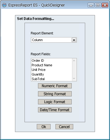
Data Format Dialog
The drop-down list at the top of the dialog allows you to select data formatting for columns or formulas. Each of the buttons on the dialog allows you to select formatting for the different data types either numeric, string, logical (Boolean), or date/time.
- Formatting Numeric Data:
If you select the button a new dialog opens with three primary options: locale specific fixed point, fixed point, and scientific. You can select the option you want and then click on format for additional options.
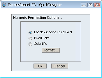
Numeric Format Dialog
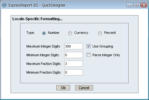
- Locale Specific Fixed Point:
This will vary the format of the data depending on the locale in which it is being viewed. Additional formatting for this option allows you to specify whether the data should be displayed as a number, currency, or as a percentage. In addition, you can set the maximum and minimum number of integer digits and fraction digits. Other display attributes will vary depending on locale.
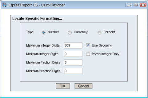
Locale-Specific Formatting
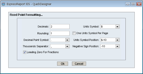
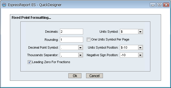
- Fixed Point:
This will keep the data format consistent, regardless of locale. Additional formatting for this option allows you to set the number of decimals, the digit number to round to, unit symbols, negative signs, decimal and thousands separator, and specify leading zeroes for fractions.
Fixed Point Formatting
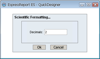
- Scientific:
This will display the data in scientific notation. Additional formatting for this option allows you to set the number of decimals.
Scientific Formatting
After you finish selecting additional options, click on to return to the main dialog box. Click on and the data format will be saved.
- Formatting String Data:
If you select the button a new dialog opens allowing you to format the appearance of the string. The checkbox labeled Show Original Text controls whether the complete string for each data entry will be displayed. If you uncheck it, you can then specify the maximum number of characters to be displayed.

String Data Format
- Formatting Logical Data:
If you select the button, a dialog box will open containing five options for displaying the Boolean data. They are: T/F, True/False, Yes/No, Y/N, and 1/0. Select the format you would like to use and click on to change the data format.

Boolean Data Format
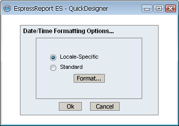
- Formatting Date/Time Data:
If you select the button a new dialog opens with two primary options for the data: locale-specific and standard. You can select the option you want and click on for additional options.
Date/Time Data Format
- Locale Specific:
This will vary the format of the data depending on the locale in which it is being viewed. Additional formatting for this option allows you to select full, long, medium, or short notations for date, and time information. Other display attributes will vary depending on locale.

Locale-Specific Formatting
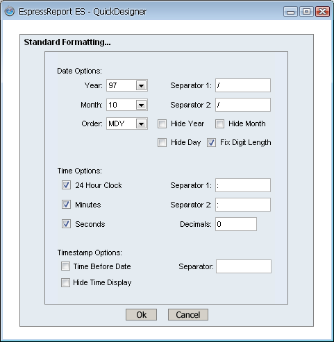
- Standard:
This will keep the data format consistent, regardless of locale. Additional formatting for this option allows you to select year and month displays, as well as the order in which month day and year information is presented. You can also select the characters to be used as separators. Time options allow you to display hours, minutes, and/or seconds, and select the separators between them. For timestamp data, you can select to display the time before or after the date, and the separator to be used between them.
Standard Formatting
After you finish selecting additional options, click on to return to the main dialog box. Click on and the data format will be saved.
QuickDesigner allows you to add a number of different elements into the report. Most are accessed from the insert elements dialog. To access this dialog, click the  button on the toolbar. The dialog will open in a new window.

Insert Elements Dialog
The following elements can be added/modified from this dialog:
- Report Title:
You can add title text for a report. To do this, click the Add Report Title checkbox and enter the title text in the dialog. Other options allow you to set font style and size options for the title, as well as to set the alignment in the report. The title can be centered or left/right aligned.
- Page Number:
You can add a page number to a report. To do this, click the Add Page Number checkbox. Two additional options allow you to specify the format of the page number and the location in the report in which it should be placed.
- Date:
You can add the current date to a report. To do this, click the checkbox. Two additional options allow you to specify the date format and the location in the report in which it should be placed.
- Group Footer Label:
This option allows you to add a label that appears alongside intermediate summaries in the report. To add a group footer label, check the option and enter the label text in the dialog. An additional option allows you to position the label. It can be placed to the left-hand side of the report or to the immediate left of the first summary field.
- Report Footer Label:
This option allows you to add a label that appears alongside total summaries in the report. To add a report footer label, check the option and enter the label text in the dialog. An additional option allows you to position the label. It can be placed to the left-hand side of the report, or to the immediate left of the first summary field.
ERES allows you to specify certain variables within text that allow for run time substitution based on certain values/objects in the chart. For example, if your chart uses a parameterized query as the data source, you could use the &<parameterName> variable to display which parameter value(s) were selected at runtime.
To insert a variable to a report, click on the icon. Place the text cursor to the place where you want put the variable (report title, report footer, or group footer text field) to and then click on the button. This will bring up a dialog with a list of variables you can use and allow you to select one to add to the title or one of the two footers.

Insert Elements Dialog
The following text variables are supported:
- &date
This displays the date when the report was last refreshed/exported/opened.
- &time
This displays the time when the report was last refreshed/exported/opened.
- &<paramName>
If the report contains a parameter with this name, this will display the value selected for that parameter.
QuickDesigner allows you to specify column aggregation and grouping options for the report when you first create it. For more about this option, see Section 3.19.1 - Report Mapping Options. In addition, you can also set and edit the column aggregations and grouping from the toolbar. To do this, click the  button on the QuickDesigner toolbar and the grouping dialog will open.
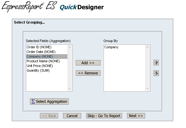
Grouping Dialog
This left side of the dialog lists all of the report columns with their selected aggregation. The right side contains the currently selected grouping (row break) columns. You can add or remove grouping using the buttons in the dialog, as well as change the nesting order using the up or down arrows.
To set column aggregation, click the button below the column list on the left-hand side. This will open a new dialog allowing you to select the aggregation for the columns in the report.
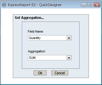
Column Aggregation Dialog
The top drop-down list contains all the columns in the report. The lower list contains all the available aggregation options. To set the aggregation for a column, select it in the upper list, and set the desired aggregation in the lower list. Once you have finished, click and the dialog will close. The new aggregations will be reflected in the column list.
Once you have finished specifing all grouping/aggregation changes, click in the grouping dialog and the changes will be saved.
In addition to creating stand-alone charts, the QuickDesigner interface allows you to add charts to report. Charts added to reports in QuickDesigner can only share the same data source as the report, they cannot have an independent data source. To add or edit charts in a report, click the  button on the toolbar. A dialog will open allowing you to specify options for the report's charts.

Insert/Edit Charts Dialog
The left side of the dialog contains a list of all the charts currently defined in the report. The following options can be set for each of the charts, by selecting it in the list, and manipulating the other elements in the dialog:
- Report Section:
This option allows you to select into which report section the chart should be placed. Users have the option of placing the chart in the Table Header/Footer section, or any of the Group Header/Footer sections if the report uses grouping. For more information about report sections, see Section 3.3.1 - Report Sections.
- Include Section Data:
This option allows you to use group aggregations as data in your chart. The aggregations available for use depend on which report section the chart is placed. You will be able to use any group aggregation located in the same section as the chart or any inner sections. For more information about including section data, see Section 3.3.7.1 - Inserting Elements.
- Chart Position:
If more than one chart is placed in a report section, this option allows you to select which position a specific chart could occupy. Charts in the same section are always placed side-by-side, so position number 1 refers to the far left-hand side of the section, while each subsequent number refers to the position directly to the right of the previous chart.
- Space Between Charts:
If more than one chart is placed in a report section, this option allows you to define how much space (in in or cm) should be placed in between of the charts. This argument will apply to all sections of the report, it cannot be set for individual charts.
You can create a new chart by clicking the button in the dialog. This will open the chart mapping dialog in a new window, allowing you to select the type, dimension, and mapping options for the new chart. For more information about chart mapping, see Section 3.19.3 - Chart Mapping Options.
You can edit any chart in the report by selecting it in the list and clicking the button. This will open QuickDesigner charting interface in a new window. For more information about editing charts, see Section 3.22 - Charts in QuickDesigner.
Once you have finished editing the chart options, click to save them back to the report.
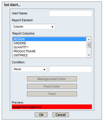
Quick Designer includes options that allow you to set up an alert on a column or formula. An alert in the report when published in a dashboard will make the report highlighted when the condition is triggered. A report with alert also allows you to set up alert monitoring, which will check the condition periodically and email users when the condition is triggered.
To create an alert, click on the  icon.
icon.

Insert/Edit Alert Dialog
In this dialog you can create additional alerts or edit existing ones. To add a new alert, click on the button.
Add New Alert Dialog
Here you can create a new alert for your report. First, give the alert a name, this name will be used in the dashboard alert options and the monitoring tool to help you identify the alert. Next, select a column or formula you would like to apply the alert on. You can apply alerts to multiple columns, but each column can only have one alert applied. If you try to apply a new alert to a column which already contains an alert, there will be a message notifying you that this is not possible. Depending on the data type of the column or formula you selected, there will be different conditions available to you. For text fields, you can select from the following list:
Equal
Not Equal
Contain
Not Contain
For numeric fields, the following options are available.
Equal
Not Equal
Greater Than
Greater Or Equal
Lesser Than
Lesser Or Equal
Between
For datetime fields, the following options are available.
Equal
Before
After
Between
For logical fields, the following options are available.
Is True
Is False
For most conditions, a single text box is available to the right of the condition allowing you to type in the value to compare against. However, logical conditions will not have any text box because the conditions already contains the values and Between conditions will provide two text boxes instead of one for the begin and end comparison values.
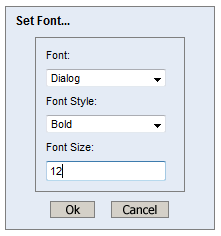
After specifying the condition, you can configure the appearance of the field when the alert is triggered by choosing the background color, font color, and font. Click on each button to open the configuration pop up.
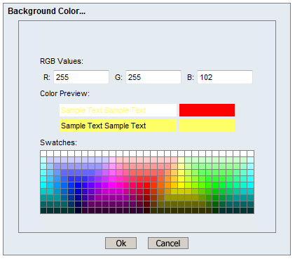
Set Background Color Dialog
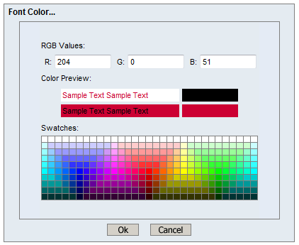
Set Font Color Dialog
Set Font Color Dialog
As you change the appearance, the preview bar at the bottom of the alert dialog will change to reflect the current settings.

Alert Preview
Once you are satisfied with the appearance you can click on another column to add additional conditions or click to create the alert. The Manage Alerts dialog should now have one or more alerts listed. The dialog will show alert names in black at the top of each section. The fields attached to this alert are displayed with two dashes in front and are colored by their type of field. Column fields will be shown in blue, while formula fields will be shown in green.
If you created a new alert that has the same name as an existing alert, the new alert will be merged with the existing alert and you will see a single entry for the alert name followed by the combination of the fields from the new and existing alerts.

Manage Alert Dialog After Adding Alert
On this dialog, you can also edit existing alerts by selecting the alert or field to edit and clicking on the button. In the edit dialog, you can change the conditions on any existing field, as well as add new fields to an alert.
You can also delete alerts or fields by selecting the undesired alert or field and clicking on the button. If you select a field, only the field will be deleted, the rest of the alert will remain. Once you are done working with alerts, click the button to return the report designer. If any fields trigger the alert, you will see the appearance changed immediately.
Report with Formula Alerts Triggered
The QuickDesigner includes several options allowing you to control the size of various elements in the report. To set the element sizes, click the  button on the toolbar. A dialog will open in a new window.
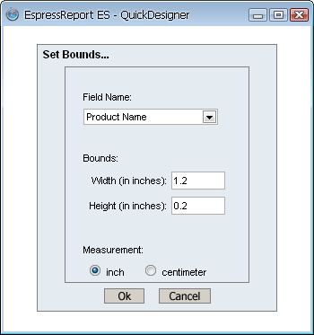
Set Bounds Dialog
The drop-down list at the top of the dialog contains a list of all the columns in the report. To set the bounds for a column, select it in the list and enter the new dimensions in the dialog. When you have finished, click and the new dimensions will be saved.
![[Note]](../../../images/note.png) | Note |
|---|---|
Dimension changes will be applied to the column, the column header, and any summaries for that column. |
Often, you may have a column field that contains data of varying length. In this case, the data may be truncated or there may be a great deal of blank space within the cell when the field is short. To alleviate this problem, you can set the element to resize dynamically to encompass its contents. To do this click  button on the toolbar. A dialog will open in a new window.
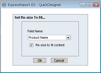
Re-size to Fit Content Dialog
The drop-down list at the top of the dialog contains a list of all the columns in the report. To set a column to have variable height, select it from the list and click the Re-size checkbox. Click to close the dialog and save the settings.
QuickDesigner provides several features that allow you to change the ordering, sorting, and sort direction for fields in the report.
QuickDesigner allows you to change the order that column fields appear in the report. To change the column order, select the  button on the toolbar. A dialog will open in a new window.

Column Order Dialog
The dialog contains a list of all the columns in the report. To change the column order, select a column in the list and click on the up or down arrow buttons to change the order. The order from top to bottom in the dialog represents the column order from left to right in the report. It is recommended to modify column order prior to creating charts. If you intend to change the column order after charts have been added to the report, you would need to modify the data mapping for the charts as well.
QuickDesigner also allows you to change the sorting in the report. To set sorting options click the  button on the toolbar. A dialog will open in a new window.
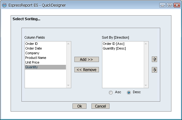
Sorting Dialog
The left-hand side of the dialog contains all the columns in the report. To sort by a column, select it in the left-hand side and click the button. You can control the sort priority by selecting a sort-by column in the right-hand side and clicking the up or down arrow buttons to change its position. You can control the direction of the sort by selecting a sort-by column in the right-hand side and clicking the Asc or Desc radio buttons to indicate the direction.
If you have specified levels of grouping in the report and have selected to sort by ungrouped columns, the sorting will happen within the groups in the report.