EspressChart provides a number of ways to customize and configure the way data points are drawn and annotated on the chart, as well as the chart plot itself.
Many of the data display options are controlled through the data properties dialog. From this dialog you can control the size of bars/columns, set display options for null values, and specify options for data labels. To invoke the data properties dialog, select → or click the ![]() button on the toolbar. This will bring up the following dialog:
button on the toolbar. This will bring up the following dialog:
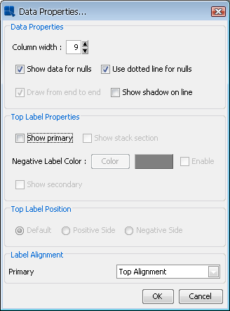
Data Properties Dialog
This data properties dialog contains the following options:
- Column width:
This specifies the ratio of the bar/column width with respect to the gap between successive bars in the chart. Each unit represents 1/10th of the space between data points. Therefore, entering
9would leave 10% of the space between data points blank, while10would eliminate all space between bars/columns. This option only pertains to two-dimensional bar, column, stack bar, stack column, high-low, HLCO, and Gantt charts. To control the column thickness in three-dimensional charts, you can use the thickness of shape slider in the navigation panel.- Show data for nulls:
This option will connect lines when null data is present. For example, if you have three points and the value of point 1 is 4, point 2 is null, and point 3 is 6, then a line will be drawn from 4 to 6. This option is only available for line charts and other two-dimensional charts with lines. All other chart types will not plot null data.
- Use dotted lines for nulls:
You can use this option to replace the full line with a dotted line. Like the show data for nulls option, this property is only available for lines.
- Draw from end to end:
This option allows you to draw two-dimensional line and area charts across the entire plot area, rather than offsetting to the first and last data points on the chart.
- Show shadow on line:
This option allows you to use shading on two-dimensional lines. However, the line must be thicker more than one pixel.
- Show primary:
This option will display data top labels for the primary values in the chart.
- Show stack section:
This option will display individual labels for each stack section for stack bar, stack column, and stack area charts.
- Negative Label Color:
This option will display the top labels with a value smaller than that of the origin in a different color that can be selected using the button after enabling the feature.
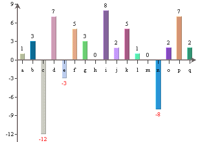
Chart with Colored Negative Top Labels
- Show secondary:
This option will display data top labels for the secondary values in the chart.
- Top label position:
This option allows you to specify where the data top labels should be drawn. By default, they are drawn above data points if they are positive and below data points if they are negative. Other options allows you to draw the labels to either positive or negative side.
- Label Alignment:
This option allows you to set the alignment for the data top labels. You can draw them at the top, bottom, or middle of the data points. In addition, you can select to draw the label inside the data point at the top or bottom. An additional option stack charts offers you to set the alignment for stack section labels.
For charts displaying date or time data on the category axis, EspressChart provides a unique feature allowing users to perform date/time based zooming. Using this feature, you can group the category elements into user-defined intervals and aggregate the points in each group. You can also filter the data by specifying upper and lower bounds for the results.
For example, suppose your data contains daily sales volume for the past two years. Using zooming, you could aggregate the data to look at average volume per month, quarter, or year. Using the upper and lower bounds, you could narrow the range to look at weekly sales volume within a specific quarter.
Zooming is available for all chart types except scatter, surface, box, dial, polar, radar, bubble, and Gantt.
When you create a new chart with date, time, or timestamp data in the category axis, you can specify zooming options by selecting → .
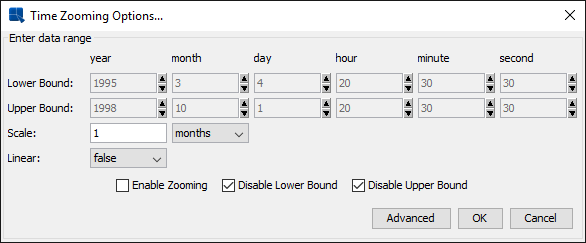
Zoom Options Dialog
This dialog allows you to specify a lower and upper bound for the data, as well as the interval by which you would like to group the data. The scale specified here must be within the maximum and minimum scale specified in the aggregation options dialog.
This dialog also allows you to preserve a linear scale for the chart. By setting the Linear option to true, the chart will always display points for the grouped intervals, even if there is no data associated with a particular group. For example, say again that you are measuring sales volume over a three month period - April, May, and June. If the input data has no records for May and you set the Linear option to true, a point will be drawn for May with a value of zero. If you set the option to false, the data point for April will be immediately followed by June.
You can disable/enable zooming, as well as the lower and upper bound restrictions by using the checkboxes at the bottom of the dialog.
If you enable zooming (if you check Enable Zooming option), the dialog Aggregate Options will appear, prompting you to specify aggregation options for the grouped data points.
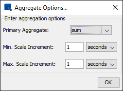
Aggregation Options Dialog
In this dialog, you can specify the Primary Aggregation, as well as the maximum and minimum scale increments that can be used when zooming the data. After you have specified your desired options, click on the button to return to zooming options.
Once you have finished specifying all the options, click on the button and the zooming will be applied to the chart.
When deploying charts using Chart Viewer, end users can perform dynamic zooming. To perform a time-series zoom in the Chart Viewer, Ctrl+Click on a point on the chart and drag it to another point in the chart. This will automatically zoom in based on the lower and upper bounds selected using the mouse. The aggregation is performed according to the options that were set during design time. You can undo the zoom by Ctrl+Right-Click.
The scale interval is chosen automatically, depending on the data and chosen bounds (as long as minimum 2 data points can be shown). The scale interval can also be changed in the Chart Viewer by pressing Alt+Z. This will bring up a dialog allowing the user to change the zoom settings.
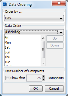
EspressChart allows you to change the order of the category and series elements. To modify the ordering, select → or click the ![]() button on the toolbar. This will bring up the following dialog:
button on the toolbar. This will bring up the following dialog:
Data Ordering Dialog
There is an Order By list which contains category element, series element, and an option marked VALUES. You have the following options for the category and series elements:
DataSource Order: | This option turns the ordering off. The categories/series order will depend on the data source only and will not be altered by the EspressChart at all. |
Ascending: | This option will arrange the categories/series elements in ascending order. For example, if the category elements are strings, they will be arranged alphabetically. |
Descending: | This option will arrange the categories/series elements in descending order. |
Customize: | This option allows you to customize the categories/series order. To customize the order, select an item from the list of Categories/Series items and then move it upwards or downwards in the list by clicking on the or button (the buttons are inactive until you select the Customize option). |
You can also sort the category elements based on their corresponding values. To do this, select the VALUES option in the data ordering dialog.
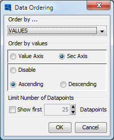
Value Data Ordering Dialog
If you choose the VALUES option, the entire dialog changes. From this dialog, you can specify to sort the category elements based on their corresponding values in the value, or secondary value axis. You can also specify whether to sort them in ascending or descending order. This type of ordering is called a Pareto chart and is often used in process control applications.
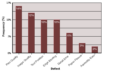
Pareto Chart
Please note that any sorting set will be re-applied if the chart is refreshed and/or if the data changes.
Sometimes you want to plot only a few highest or lowest values. To do that, you can use the Top/Bottom N function.
To enable this feature, choose → , or click the ![]() button on the toolbar.
button on the toolbar.
If the chart doesn't have any data series, the Ordering dialog will show the Limit Number Of DataPoints option.
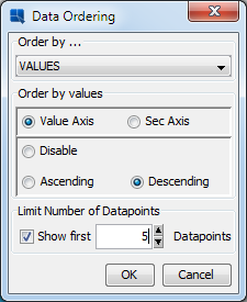
This option can only be enabled if you sort the chart by categories or values, or by the values in ascending or descending order. If you have such chart, you can enable this function by selecting the Show first option. Then you can specify the maximum number of items that will be shown in the chart. If the data source returns more items than you specify in this option, excessive items will not be shown in the chart as if they didn't exist.
Histogram is a useful analysis tool that allows you to track how often events occur and when and how a set of data falls into specific ranges. EspressChart allows you to plot histograms based on the category elements in a chart. You can plot histograms for all category data types except time-based data (date, time, or timestamp).
Histograms are calculated by counting data points or instances of each category element. For numeric categories, you can further specify upper and lower bounds, as well as the number of bins or bin width to create ranges for the frequency counts.
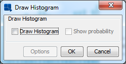
To create a histogram, you must start with a 2D column chart, bar chart, line chart or area chart. In the Data Mapping dialog, make sure DataSeries is set to and the field you want to plot in the histogram is set in the Category axis. Once you click in the Data Mapping dialog and the chart is shown on the canvas, select → . A dialog will appear allowing you to select a histogram plot. By default, the histogram is displayed as frequency count. You can choose to change it to display probability by checking the check box.
Select Histogram Dialog
If the values in the Category axis is numeric, you will see that the button is enabled. When you click Options button, another dialog will appear, allowing you to specify options for the histogram plot.
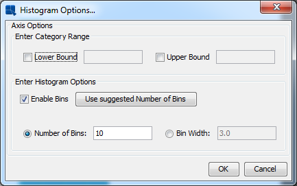
Histogram Options Dialog
From this dialog, you can set a lower or upper bound for that data being plotted. When you place bound restrictions, the histogram will not count data that falls outside of the range specified by the upper and lower bounds. If you select , you can specify the number of bins or set width of each bin. The default number of bins is 10. You can also click if you wish to use a value calculated by the system. If is deselected, the frequency count will be performed on each Category value instead of a range of values for a bin.
If you enable scale, you can specify the number of bins or set width of each bin.
The plot area is the plane on which the data points are drawn for two-dimensional charts. You can customize the appearance of the plot area by selecting → . Assuming the current chart is a two-dimensional chart, the following dialog will appear.
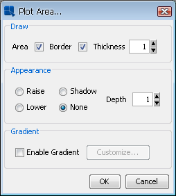
Plot Area Dialog
This dialog allows you to draw a border around the plot area, or fill it with a background color. If you fill the area, you can also specify certain 3D effects like raising, lowering or shadow.
On this dialog, you can also set up gradient background for the plot area. The gradient settings are the same as in the Rendering options described in the Section 6.1.3 - Format Menu.
You can control and modify the display of the chart legend either by selecting → , or by clicking on the ![]() button on the toolbar, or by selecting Legend properties from legend pop-up menu (which pops up when you right-click on the legend). This will bring up the following dialog, allowing you to customize the legend properties.
button on the toolbar, or by selecting Legend properties from legend pop-up menu (which pops up when you right-click on the legend). This will bring up the following dialog, allowing you to customize the legend properties.
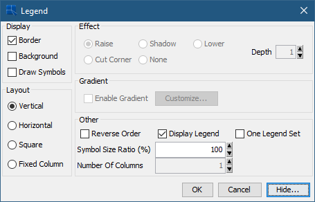
Format Legend Dialog
The dialog contains the following options:
Display: | These options allow you to turn on or off the legend border and background. This also allows you to display the point symbols instead of lines or blocks in the legend. |
Effect: | This allows you to add a 3D effect to the legend. You can raise it, lower it, or draw a shadow. In addition to the 3D effects, you can also display the legend with cut corners. |
Layout: | This allows you to change the legend from vertical, horizontal, square, or fixed column layout. |
Gradient: | Allows you to configure gradient for the legend background. The gradient settings are the same as in the Rendering options described in the Section 6.1.3 - Format Menu. |
Other: | This allows you to choose whether or not to display the legend, or to draw the legend in reverse order. You can set the fixed number of columns in legend in the Number of columns field. This field will be active only if you choose the Fixed columns layout option in the Layout section. You can set trend/control lines and chart data legend drawn as One Legend Set. You can also change the size of the symbols in the legend. |
Additionally, you can remove specific category/series elements from the legend by clicking on the button. This will bring up a list of the legend items, where you can select which elements you would like to hide.
EspressChart renders three-dimensional charts in true 3D, allowing light source modification, panning, zooming, and rotation. However, 3D rendering can be very memory and CPU intensive. When charts have a lot of data points (like 3D scatter and surface charts), it's possible to run out of memory when generating the chart. To solve this problem, a rendering approximation feature is provided. Using this algorithm the chart is not rendered perfectly, but it's usually acceptable when a lot of points have to be shown.
By default, approximation is turned on at a threshold value of 100 points. This means that if a 3D chart has more than 100 data points, the approximation will be used. You can turn this feature off, or change the threshold value by selecting → . This will bring up the following dialog.
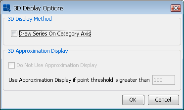
3D Display Options Dialog
The two options for 3D approximation allows you to turn on/off the approximation and set the threshold value. The other option in this dialog allows you to draw the series in-line (the same option is in navigation panel).
For column, bar, stack column, stack bar and HLCO charts, EspressChart allows you to configure a border around the columns. To set the border option, select → . This will bring up a dialog allowing you to set border options.
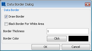
IData Border Dialog
The first option allows you to turn on/off the data border. The second option allows you to set a black border for any white areas in the chart. Please note that the border is black only if the first option is unchecked and will only appear around white areas in the chart. The third and fourth options allows you to set border thickness and border color. If you click on the button, a new dialog will appear allowing you to select or enter a new color.
EspressChart allows you to aggregate data if there is more than one data point associated to a given category (and its series and/or stack, if a series and/or stack is present). This allows for a broader look at the data rather than just a single data point (out of many).
To aggregate the data, select → . A dialog will appear allowing you to enable aggregation.
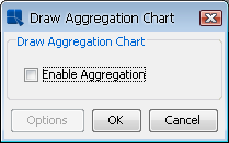
Select Aggregation Dialog
When you select , a second dialog box will appear, asking you which type of aggregation should be applied. You can choose from minimum, maximum, average, sum, count, first, last, sumsquare, variance, stddev, and countdistinct for the aggregates. You can specify a primary aggregate (aggregate applied to the column mapped to the primary axis) as well a secondary aggregate (aggregate applied to the column mapped to the secondary axis), if a secondary axis exists.
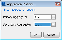
Aggregate Options Dialog