Once you have completed all the steps in the Wizard, the main Chart Designer interface will appear. Here you can customize and modify the appearance of the chart by changing properties and adding new elements.
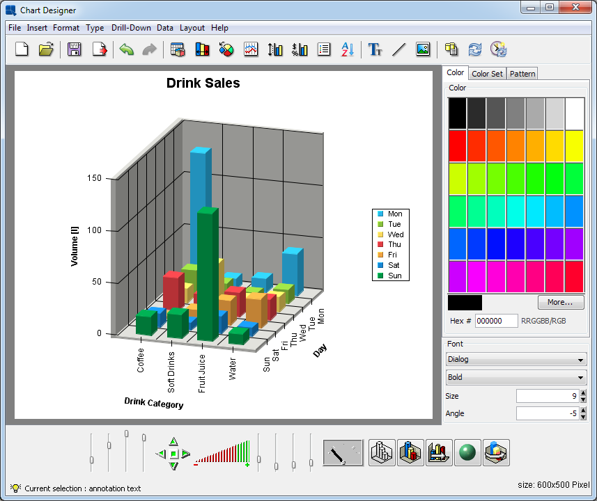
Chart Designer Interface
Most of Chart Designer's functions can be controlled from the menu bar at the top of the designer window. This section provides a brief overview of the available options. All of the features here are discussed later in this chapter.
This menu performs basic file operations such as opening, closing, and saving files. For more information about file options, please see Chapter 8 - Saving & Exporting Charts.
- New:
This will return you to the Data Source Manager to begin creating a new chart. If you have not saved your current chart, you will be prompted to do so.
- Open:
This allows you to open a saved chart definition. Files that can be loaded by Chart Designer include
.cht,.tpl, and.xmlchart definition files.- Close:
This closes the current chart.
- Apply Template:
This option allows you to apply a template to the current chart. You can apply any chart template in either .tpl or .xml format. For more information about working with chart templates, please see Section 8.1.1 - Working with Templates.
- Save:
This saves the current chart.
- Save As:
This allows you to save the current chart. You can save the chart as a
.cht, .pacor.tpl(a chart, a complete packed chart or a template file). TheCreate XML
check-box allows you to create an XML chart definition file.
- Export:
This allows you to export the chart to a number of static image formats. The chart data can also be exported as XML file.
- Exit:
This closes the Chart Designer with the possibility to save the current file.
This menu allows you to add various elements to a chart.
- Titles:
This option allows you to automatically add titles to the chart. A main title can be specified as well as titles for each of the axes. Unlike annotation text, titles will size and position automatically with the chart.
- Text:
This allows you to add text or annotation to a chart. Text can be added anywhere on the chart and can have a number of different formatting properties. Variables can be added to the text for run-time substitution. For more on adding text to charts, see Section 6.6.1 - Adding Text
- Background:
This allows you to select an image to use as the chart background. Background images can be tiled, centered, or stretched to fit the entire canvas.
- Dial Foreground:
This option is only available for dial charts. This allows you to select an image to use as the dial chart foreground. The image can be stretched.
- Dial Background:
This option is only available for dial charts. This allows you to select an image to use as the dial chart background. The image can be stretched.
- Link:
This allows you to add a hyperlink to a data point or a collection of data points in a chart. To use hyperlinks in a chart, you will need to export a map file along with the image.
- Line:
This allows you to add an arbitrary floating line to a chart. These lines can be placed anywhere and can be used to draw enclosed shapes as well. Floating lines are often used as pointers and can be generated with arrowheads.
- TrendLine:
This allows you to add a trend line to the chart. EspressChart allows you to draw many different types of trend lines including: linear, a polynomial of any degree, a power, exponential, logarithmic, a moving average, exponential moving average, triangular moving average, cubic B-spline, and a normal distribution curve.
- Horz/Vert Line:
This allows you to add a fixed horizontal or vertical line to a chart. You have the choice of either adding a constant line (one that draws at a fixed value on the X or Y-axis) or a control line (draws lines based on a certain value range either average, minimum, maximum, or multiples of standard deviation).
- Control Area:
This allows you to draw a fixed area (either on the plot area of a 2D chart or on the face of a dial chart) to compare against the data values of the chart.
This menu allows you to edit and modify the properties of many different chart components.
Undo: | Cancels the last operation performed in the designer and reverts back to the previous state. The designer will remember the last 10 actions made. | ||||||||
Redo: | Reverses the action of the undo command. For example, if you change the font color from black to red, you can undo this command to change it back to black, and then redo this command to have it change to red again. | ||||||||
Data Properties: | This option allows you to control several options for how the data is displayed. You can control the thickness of columns/bars, how null data is displayed, whether to draw data top labels or not, as well as enable and select a color for negative top labels. | ||||||||
Histogram Options: | This allows you to specify if you want to draw the chart as a histogram and display additional options to specify the frequency count. | ||||||||
Aggregation Options: | This allows you to specify whether to aggregate the data before drawing the chart and display additional options to specify type of aggregation. | ||||||||
Zoom Options | This allows you to enable/disable and set options for time based zooming. This option only applies if you have date/time data mapped to the category axis. | ||||||||
3D Display Options: | This allows you to set several options that control the display of 3D charts. You can specify an inline series for 3D column (or similar) charts, as well as specify rendering approximation for 3D scatter and surface charts. (This improves performance for charts with a lot of data points.) | ||||||||
Rendering Options: | This allows you to specify various rendering options for the chart for a better presentation. 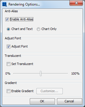 Rendering Options Dialog Among the options available are:
| ||||||||
Font Mapping: | This allows you to map system (true type) font files for the PDF export. For more information about this feature, please see Section 8.2.1 - PDF Font Mapping | ||||||||
Chart Options: | This brings up some specific options for the chart type that you are using. Options vary depending on chart type. | ||||||||
Axis Scale: | This allows you to adjust the scale for any value axes. Automatic (best fit) scaling is used by default. | ||||||||
Axis Elements: | This allows you to modify the appearance of the axes and axis labels. Options here include axis thickness, grid lines, label steps, and data formatting. | ||||||||
Canvas: | This allows you to adjust the background canvas size. You can also specify whether to use scroll bars when the canvas size exceeds the view port. | ||||||||
Data Border: | Add a border to data elements (columns, bars, etc). 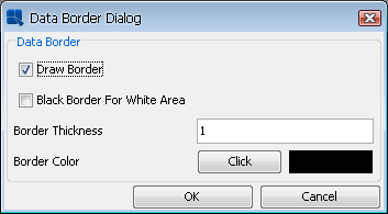 Data Border Dialog If you select the Draw border option, the Border thickness, and the Border color fields will be enabled allowing you to configure the border properties. The Black border for white area option can be selected even when the Draw border is disabled. If you do so, a simple black border will be added only to white data elements. 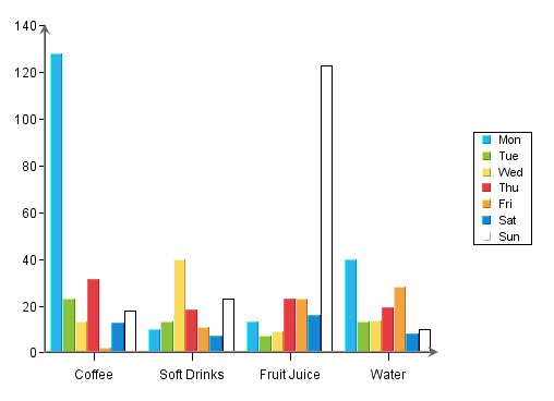 Column chart with the “Black border for white area” enabled
| ||||||||
Legend: | This allows you to modify the display properties of the chart legend. | ||||||||
Lighting Model: | This allows you to modify some of the lighting options for three-dimensional charts. You can modify both the light ambient color and the intensity. | ||||||||
Line and Point: | This allows you to modify the display properties of any lines in a chart. For two-dimensional charts you can choose to display lines and points for any dataset as well as customize their appearance. You can also use this menu item to modify the display properties for any trend, floating, or horizontal/vertical lines. | ||||||||
Plot Area: | This option allows you to customize appearance of the area bounded by the X and Y axes for two-dimensional charts. | ||||||||
No Data To Plot Message: | This option allows you to set a message that appears if there is insufficient data to plot the chart. By default, the “No Data To Plot” message appears. | ||||||||
Flash Hintbox Customization: | This option allows you to specify the font properties as well as the border and background color for the hint box in the flash export. | ||||||||
NULL Data Properties: | This option allows you to show any category axis point that contains Null data and replace it with a different string. By default, any Null data category point is skipped. | ||||||||
Table: | This allows you to add and configure a table displaying the chart data. | ||||||||
Text Properties: | This option allows you to set a resize ratio for any text in the chart. From this option you can also specify to use Java 2D rotate text. This option gives rotated text a cleaner appearance. You can also specify any text replacement options. | ||||||||
Viewer Options: | This menu item allows you to specify some configuration options for the Chart Viewer JNLP (More about Applets in JNLP: Section 2.6 - Run Applets in WebStart with JNLP file) when the chart is viewed. You can control what options are available in the Viewer pop-up menu. These options can also be controlled through HTML parameters. |
![[Note]](../../../images/note.png)
This menu allows you to change the current chart and its dimension. You can switch between 2D and 3D for chart types that support representations in each dimension. You can also change chart types. Note that as you switch between chart types, some formatting information will be lost. Also, you cannot switch between Gantt charts and other chart types.
This menu contains options allowing you to add and navigate drill-down layers in a chart. The drill-down features are explained in Chapter 7 - Drill-Down
Add: | This allows you to add a layer of data drill-down. |
Remove This: | This removes the current level of data drill-down. |
Remove All: | This removes all levels of data drill-down. |
Previous | This navigates to the previous layer of data drill-down. |
Next: | This navigates to the next layer of data drill-down. |
Go To Top Level: | This navigates to the top-level chart for data drill-down. |
Dynamic: | This allows you to enable dynamic data for drill-down. |
Parameter Drill-Down: | This brings up the parameter drill-down navigation window allowing you to edit, add, and remove layers of parameter drill-down. |
This menu contains options that allows you to refresh, re-order or completely change the chart data.
- Modify Data Mapping:
This will bring back the Data Mapping Window, allowing you to change the data mapping for the chart.
- Modify Data Source:
This will take you back to the Data Source Manager, allowing you to select a new data source for the chart.
- Modify Database:
If the chart uses a database as the data source, this option allows you to modify the database connection that the chart uses. For more on this feature, please see Section 4.2.5 - Editing Database Connections.
- Modify Query:
If the chart uses a database as the data source for the chart, this option allows you to modify the query used to retrieve the chart data. For more on this feature, please see Section 4.2.4 - Editing Queries.
- Query Parameters:
This will allow you to re-initialize query parameters and change parameter values for the current chart. This option is only available if the chart uses a parameterized query as the data source.
- Ordering:
This option allows you to re-order the data points in a chart. You can arbitrarily change the order of any of the category elements or you can sort the categories by value.
- Refresh:
This will update the current chart with the latest data. The original data source must be available for this option to work.
- Schedule Refresh:
This allows you to set a schedule to refresh the data. This option is for deploying charts in the Chart Viewer JNLP (More about Applets in JNLP: Section 2.6 - Run Applets in WebStart with JNLP file). You can set a periodic refresh interval so that the chart will update itself with the latest data.
- View Table:
This option will bring up a window containing the data table from which the current chart is generated. The table will initially display only the first 20 records. Clicking on the Show All Records checkbox will display all of the records.
- View Chart Data:
Rather than viewing the entire data table you can just view the data points plotted in the current chart.
- View Data Source Info:
If the chart contains an independent data source, this option will bring up a dialog containing information about the data source that was used to create the chart. The data source type and location are displayed.
- Go Back:
This will go back to the original chart if you have traversed a link.
This menu allows you to view a version of the program and to open a documentation.
- About:
This shows you information about the version of the program.
- Contents:
This opens the EspressChart User's Guide.