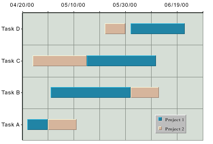
Gantt Chart
A Gantt or time chart is used to represent data where a time factor is being measured. This is often used in project or time management situations. A Gantt chart resembles a bar chart with the category axis on the Y-axis and the value axis on the X-axis. The value axis uses date, time, or timestamp data (numeric values can also be used). Each data point has a start and end time associated with it.
This chart type is available in a two-dimensional form only.
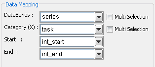
The data mapping for Gantt charts is similar to high-low charts. However, instead of selecting a column for the high and low values, you select the start and end values.
Mapping Options for Gantt Charts
The mapping is as follows:
Data Series: | Allows you to choose a data column whose distinct values will determine the number of data series in the chart. |
Category (X): | Allows you to choose a data column whose distinct values will determine the categories. |
Start: | Allows you to choose a data column whose distinct values represent the starting time interval for the category. |
End: | Allows you to choose a data column whose distinct values represent the ending time interval for the category. |
The data mapping also allows you to transpose the data (in other words: to select several columns for a single category). To learn more about data transposition, please see Section 5.1.1 - Data Transposition.