Once you have selected the data that you would like to use for the chart, the next step in the Chart Wizard is to select the chart type that you would like to use. You will be presented with a dialog that allows you to specify the chart type.
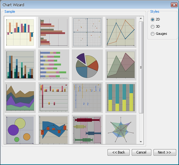
Two-Dimensional Chart Types Selection Dialog
Each chart type represents a different way in which the data points are plotted to give a pertinent representation to all kinds of data. The different types of charts are broken down by dimension. In addition to basic chart types, users can create many different types of composite/combination charts by adding secondary values/series to the chart. You can toggle between the chart categories by selecting either 2D, 3D or Gauges in the right-hand side of the chart types dialog.
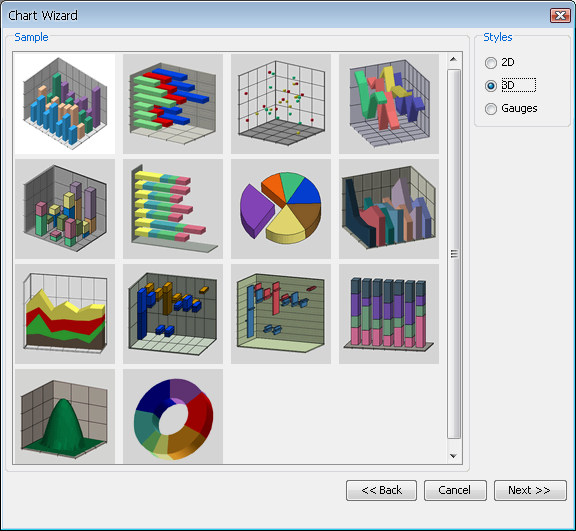
Three-Dimensional Chart Types Selection Dialog
This dialog enables you to select your chart type by either selecting the image and clicking or by double clicking on the chart image. You can select from one of the following chart types:
Column
Bar
XY(Z) Scatter
Line
Stack Column
Stack Bar
Pie
Area
Stack Area
High Low
HLCO
Percentage Column
Doughnut
Surface (Three-Dimensional Only)
Bubble (Two-Dimensional Only)
Overlay (Two-Dimensional Only)
Box (Two-Dimensional Only)
Radar (Two-Dimensional Only)
Dial (Two-Dimensional Only)
Gantt (Two-Dimensional Only)
Polar (Two-Dimensional Only)
Circular Gauge
Square Gauge
Semi Circular Gauge
Square Gauge
Quarter Circular Gauge
Each of the chart types is described in detail later in this chapter, starting with Section 5.2 - Column Charts
For information on gauges, see Section 5.20.2 - Gauges
After you have selected the chart type, the next step is to specify the data mapping for the chart. Data mapping is the way that the selected data source is rendered in the chart. The basics of data mapping are described in Section 3.2 - Basic Data Mapping. The data mapping screen in the Chart Wizard allows you to set the mapping options and also preview the results.
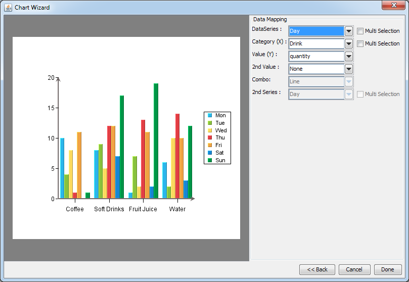
Data Mapping Dialog
The left-hand side of the dialog shows a preview of your chart. The right-hand side shows which columns from your data source have been selected to plot in the different chart elements (series, category, value, etc). By default, EspressChart will select the first available columns, based on the data type, to plot. Changing the data mapping is easy - click on the down-facing arrow next to a data field and select a different field. The chart preview in the left-hand part of the data mapping dialog will be updated immediately.
The specific mapping options vary for each chart type and are discussed later in this chapter starting with Section 5.2 - Column Charts.
You can also set data transposing from the data mapping dialog. Transposing allows you to plot multiple data source columns in one chart without modifying the data source.
For example, we have a data source that looks like this:
Example Data Source
We would like to plot data from all regions in one chart. The default mapping without data transposing does not allow us to do that. We would have to plot only one region in the chart or modify the data source, so we will have to transpose the data source.
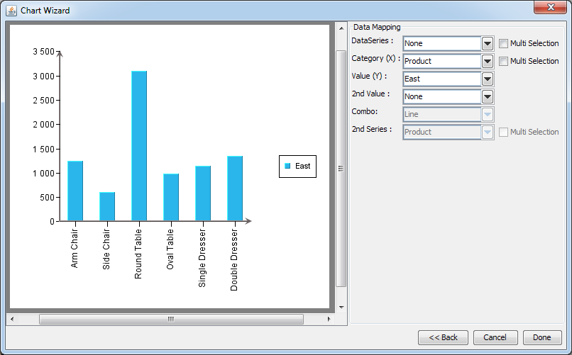
Default Chart Data Mapping
To transpose the data, select the Multi Selection option next to the Data Series field. The field will change to a list allowing us to select several columns at the same time. We will just select all region columns and the chart will look like this:
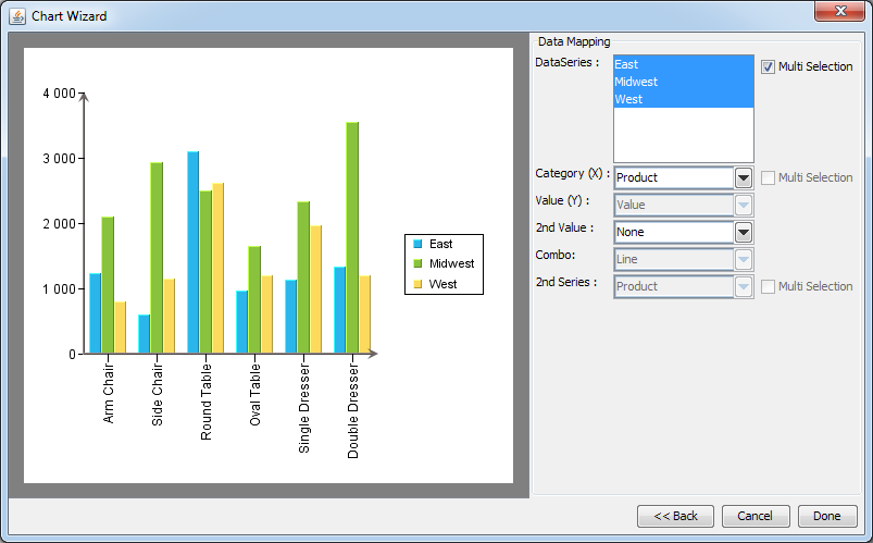
Default Chart Data Mapping
![[Note]](../../../images/note.png) | Note |
|---|---|
Only one chart element (such as data series, category, value, or second series) can be transposed at a time. If you select the Multi Selection checkbox for one chart element, the Multi Selection checkboxes will be deactivated for other chart elements. |
Transposing is not available for drill-down charts.