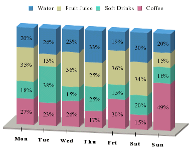
Percentage Column Chart
A percentage column chart may be viewed as a derivative of pie and column charts together. Each column in the chart corresponds to one pie. A percentage column chart has a category column corresponding to the X-axis value. A sum-by column represents the category in this case and the value column is the same as that of a pie chart.
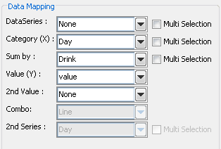
Mapping Options for Percentage Column Charts
Data mapping for percentage column charts is the same as for stack column charts (covered in Section 5.6.1 - Data Mapping). The only difference is that the sum-by components are plotted as a percentage of the Value column instead of discrete values. Combo options for percentage column charts are Line and Overlay.