Stack Column Chart
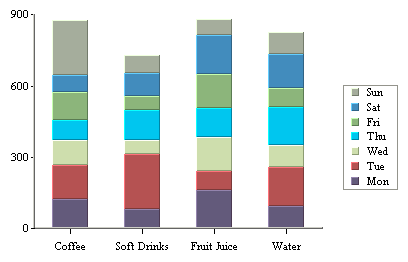
A stack column chart is a derivative of a column chart in which each vertical column comprises a stack of bars. Each selected row in the data table is represented by a component of a chart column. For a two-dimensional stack column chart, the categories are plotted on the X-axis and the values on the Y-axis. The value column, which must be numeric, determines the length of each bar component. A third column, known as the sum-by column, represents a group of values for each category. A stack for a given category value is built up stacking the sum-by values for that category value. Each stack component of a chart column has a distinct sum-by value denoted by a distinct color. Each row in the data table must have a unique pair of values on both the category and sum-by columns. Components with negative values are separated from components with positive values and they are stacked up in the “negative” direction below the X-axis.
In our example above, we have chosen types of drink as category value and day representing the sum-by values. Another independent category (to be displayed on the Z-axis) may be optionally specified based on a fourth column as a data series. In such a case, each row in the data table must have a unique triplet of values on the category, sum-by and data series columns. In a two-dimensional chart, the entire data series for a single category is displayed side-by-side in the XY plane. In a three-dimensional stack column chart, the data series is displayed along the Z-axis.
In stack column charts, each category is further subdivided into components. Hence, there is an additional sum-by option used to determine the sum-by values for the chart.
Mapping Options for Stack Column Charts
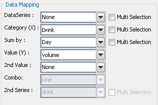
The data mapping options are as follows:
Data Series: | Allows you to choose a data column whose distinct values will determine the number of data series in the chart. Each element in a data series is drawn using the same color. |
Category (X): | Allows you to choose a data column whose distinct values determine the categories. Values from this data column are used to calibrate the X-axis. Each category in a data series is drawn as a distinct column in the chart. |
Sum-by: | Allows you to choose a data column whose distinct values determine the components in each category. Each distinct value in this column determines a distinct stack component of a column. |
Value (Y): | Choose a data column to provide values for each category. |
2nd value: | Add a second value to create a combination chart. |
2nd Series: | Choose another column to be series for the secondary chart. This option is applicable only if the secondary chart is an overlay chart. |
Combo: | Choose the chart type for the secondary chart. For stack column charts the combo options are Line, Stack Area, and Overlay. |
The data mapping also allows you to transpose the data (in other words: to select several columns for a single category). To learn more about data transposition, please see Section 5.1.1 - Data Transposition.
Stack column charts have a unique combination option which allows users to plot a second value as a stack area chart. Both values share the same category and sum-by values. This chart can compare component based categories for different values in the data.
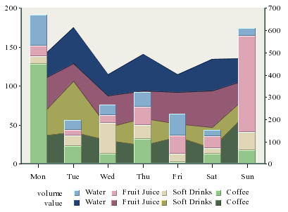
Stack Column-Stack Area Combination Chart
With this combination chart you can specify to hide particular sum-by component in the chart to achieve a strip area effect.