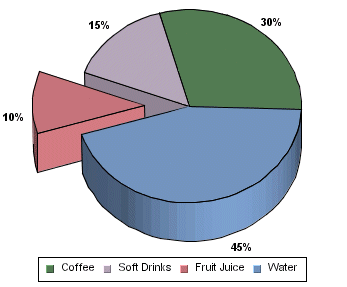
Pie Chart
In a pie chart, each row in the data is represented as a pie sector. The pie chart requires a category column and a value column. The value column must be numeric. The number of distinct values in the category column determines the number of pie sectors in the chart. All the values are summed up and each slice is assigned an angle according to its share in the total. Thus, the value column for each category determines the size of the slice representing that category.
A three-dimensional pie chart is simply an extension of its two-dimensional counterpart and contains no extra information.
Pie charts can also have a data series. If you specify a series in the data mapping, a separate pie will be drawn for each category element and it will be comprised of the series elements. A pie chart with a data series is displayed below:
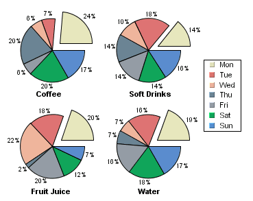
Pie Chart With Data Series
When a series is present, all the separate pies are drawn on a single plot area and resized in proportion with the plot. You can choose to either stack the different pies or draw them in a line.
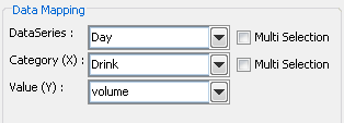
Mapping Options for Pie Charts
For pie charts, the mapping is as follows:
Data Series: | Allows you to choose a data column whose distinct values will determine the number of data series in the chart. Each element in a data series is drawn using the same color. |
Category (X): | Allows you to choose a data column whose distinct values determine the various categories. |
Value (Y): | Allows you to choose a data column to provide values for each category. |
There is no 2nd Value option, as you cannot make any combination charts with a pie chart.
The data mapping also allows you to transpose the data (in other words: to select several columns for a single category). To learn more about data transposition, please see Section 5.1.1 - Data Transposition.