Radar Chart
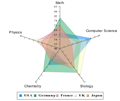
Radar charts are useful when you need to compare performance/measurement results, statistics, etc from different sources. For example, we can compare median test scores of children in the industrial nations on subjects such as math, computer science, and biology. A radar chart has multiple axes along which data can be plotted. Each axis is a category. The data is shown as points on the axis. The points belonging to one data series can be either joined or the enclosed area filled. A point close to the center on any axis indicates a low value while a point near the end represents a high value. In some cases, low values may be more desirable than high values, e.g. price/earning, price/sales, price/book of stocks.
This chart is available in a two-dimensional form only.
Mapping Options for Radar Charts
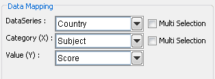
For radar charts the mapping is as follows:
Data Series: | Allows you to choose a data column whose distinct values will determine the number of data series in the chart. Each element in a data series is drawn using the same color along each axis. |
Category (X): | Allows you to choose a data column whose distinct values determine the categories. The number of unique elements in this column determines the number of axes in the radar chart. |
Value (Y): | Allows you to choose a data column to provide the numeric value to plot against the category. |
Please note that the 2nd Value, 2nd Series, and Combo options do not apply for radar charts. Radar charts do not support secondary values.
The data mapping also allows you to transpose the data (in other words: to select several columns for a single category). To learn more about data transposition, please see Section 5.1.1 - Data Transposition.