This section covers some of the basics of charts including the different parts of a chart and the way in which tabular data either from the report or another data source is mapped to a chart.
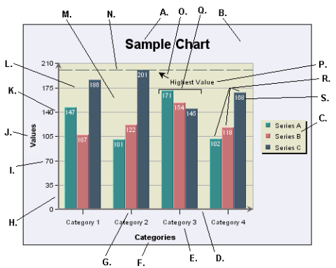
The following diagram illustrates the various components that make up a chart. Also, this diagram refers to various terms that will be used throughout this guide.
- A. Main Title
This is the main title for the chart.
- B. Chart Canvas
This is the background on which the chart is drawn. The canvas serves as the size/boundary for the chart and it is generally the same size as any exported image. You can modify the canvas color or place/add an image file as a background.
- C. Legend
This is the chart legend. The legend shows your category or series names along with a color point. Secondary values, as well as added trend/control lines and control areas, can also be displayed in the legend.
- D. Category (X) Axis
This is the X or category axis of the chart. Generally, the category axis plots the distinct entries from the dataset for which you want to plot values in the chart. (The values are generally plotted on the Y-axis.) Certain chart types such as bar and Gantt reverse this by drawing the categories on the Y-axis, and plotting the values on the X-axis. Other chart types like scatter and bubble plots, plot values on each axis to create a point in 2D or 3D space.
- E. X-Axis Labels
These are the labels for the X-axis elements or categories.
- F. X-Axis Title
This is the X-axis title.
- G. X Ticker
These are the X-axis tickers. By default the tickers match each data point in the chart.
- H. Value (Y) Axis
This is the Y or value axis of the chart. Generally, the Y-axis plots the values for each of the categories. By default the scale of the Y axis is generated to provide a best fit for the dataset; however, it can be manually adjusted. For combination charts, the second value axis is drawn at the right-hand side of the plot.
- I. Y-Axis Labels
These are the labels for the Y-axis values.
- J. Y-Axis Title
This is the Y-axis title.
- K. Y-Axis Ticker
These are the Y-axis tickers.
- L. Y Grid
These are grid lines drawn along each scale step in the Y-axis. Grid lines can also be drawn for the points on the X-axis (and Z-axis for 3D charts).
- M. Plot Area
This is the area, bounded by the axes, where all the data points are plotted. You can fill the area with color and/or draw a border around the area, along with other options. The plot area can be moved and resized on the chart canvas.
- N. Control Line
This is one of the special types of lines that can be added to a chart. In this instance, it is a control line that follows the highest value in a series. Control lines can also be drawn for averages and multiples of standard deviation. Users can also add a variety of trend lines to charts.
- O. Floating Line
A floating line is an arbitrary line added to a chart. In this case it is being used as a pointer with an arrow. Floating lines move in relative position with the chart plot. They can also be used to create filled shapes.
- P. Annotation Text
This is a piece of arbitrary text added to a chart (not labels or titles). You can place text anywhere in the chart canvas. Like floating lines, annotation text moves in relative position to the chart plot.
- Q. Category Elements
This is the plot for a category element. There are three points plotted for each category because this chart has a data series.
- R. Data Series Elements
These are the individual points that make up a category. A series allows groups of data to be plotted on a single chart. For more about information about categories and series, see Section 3.2.2 - Basic Data Mapping
- S. Data Top Labels
These are labels placed at each data point in the chart that display the exact value for each point.
Data mapping is the way that raw data is rendered in the chart. Although data can be drawn from many sources, a chart looks for the basic structure of the data to be in the form of a table. Hence, data passed in as arguments, from the report or from XML files is converted to a table structure before mapping.
A basic set of data might look something like this:
| Product | Sales |
|---|---|
| Chair | 362 |
| Table | 862 |
| Dresser | 1052 |
| Cabinet | 1211 |
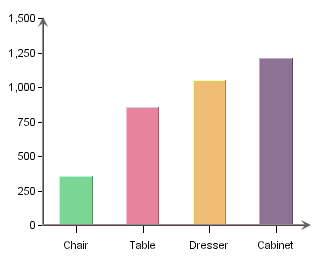
To plot this data in a chart, you would want to plot the Sales value for each entry in the Product column. Hence, the products are your category and the sales numbers are your values. In a chart you would map the Product column to the X (category) axis and the Sales column to the Y (value) axis. The resulting plot would look like this in a column chart:

Here, a column is drawn to show the value for each distinct element in the category column. On top of the basic category values, additional information can be displayed in the form of a data series. For example, say that there is another element to our data that shows sales data not only for product, but also over a sales region. Our adjusted table would look like this:
| Product | Region | Sales |
|---|---|---|
| Chair | East | 114 |
| Chair | Midwest | 131 |
| Chair | West | 117 |
| Table | East | 231 |
| Table | Midwest | 187 |
| Table | West | 444 |
| Dresser | East | 327 |
| Dresser | Midwest | 469 |
| Dresser | West | 256 |
| Cabinet | East | 422 |
| Cabinet | Midwest | 386 |
| Cabinet | West | 403 |
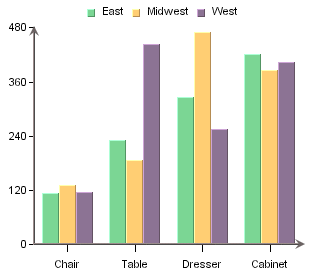
In order to show the value for each region per product we could add the Region column to the data mapping as a data series. Doing this gives us the following chart:

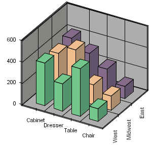
Now each category has three data points, one for each region. For two-dimensional charts the series is always displayed in-line. In three-dimensional charts, the series is drawn on the Z-axis by default, although it can be drawn in-line as well. Below, is the same chart show in 3D.

In this chart, the data series is drawn along the Z-axis. Note that the order of the categories has been changed to provide a better view of the data. This is the basic concept behind data mapping. Most chart types use this mapping technique or mapping options similar to this. Detailed data mapping instructions for each chart type are available in Section 3.4 - Chart Types and Data Mapping.
