After setting up data sources and creating queries, the next step to creating charts and reports is to take the results of the data source and map them to the report and chart. This section only covers basic charting from mapping the data to modifying the look and feel. For more information, please refer to Section 3.3 - Chart Types and Data Mapping for chart mapping.
This section will look at several ways that data can be mapped to charts. This section will use the text file data source that was setup in section Section Q.3.1.4 - Setup a Text Data Source.
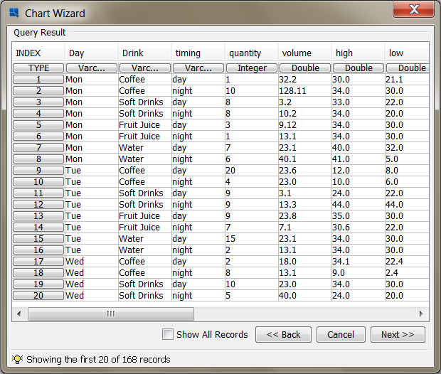
Column charts are a good starting point as the mapping for column charts is very similar to that of bar, area, and line charts. To begin creating a chart, click the button in the Organizer toolbar. ![]() This will launch the Chart Designer interface, and open your data registry. In the Data Source Manager, select the node for your text data source and click the button. A dialog will open with a table containing the contents of the text file (first 20 records).
This will launch the Chart Designer interface, and open your data registry. In the Data Source Manager, select the node for your text data source and click the button. A dialog will open with a table containing the contents of the text file (first 20 records).
Contents of Text File
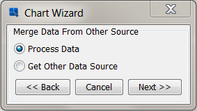
At the bottom of the dialog, click the button. A dialog will open asking you if you would like to select an additional data source for the chart.
Add Data Source Dialog
Select the Process Data option and click . You will then be taken to a dialog prompting you to select which type of chart you would like to create.
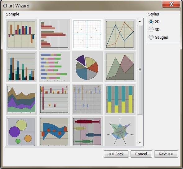
Chart Types Dialog
From this dialog, select a two-dimensional column chart as the data type and click . You will then be taken to the Data Mapping dialog, which allows you to map columns from the data source to chart elements.

Chart Data Mapping Dialog
In the mapping dialog, set the Data Series to None, the Category to Drink and the Value to Value. Click to close the dialog. Now click in the mapping window to finish the wizard and go to the Chart Designer interface.
If the generated chart does not fit in the viewport of the Chart Designer, select Canvas from the format menu. This will bring up a dialog allowing you to set the size of the chart.
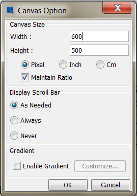
Chart Canvas Dialog
Enter a smaller size for the chart canvas and click to close the dialog. You should now see the whole chart in the viewport.

Chart Designer Showing Column Chart
Notice that the column chart contains a column for each distinct value in the Drink column and shows the corresponding value for each day.
At this point, the column chart only contains data points for the categories Drink column. However, EDAB supports adding another dimension to this data by way of a series. To add a series to the column chart, click the button in the toolbar. ![]() This will return you to the Data Mapping window.
This will return you to the Data Mapping window.
In the Mapping window, click the button. In the dialog that opens, change the Data Series option from None to Day and click the button. After you finish changing the mapping, click to return to the Chart Designer.
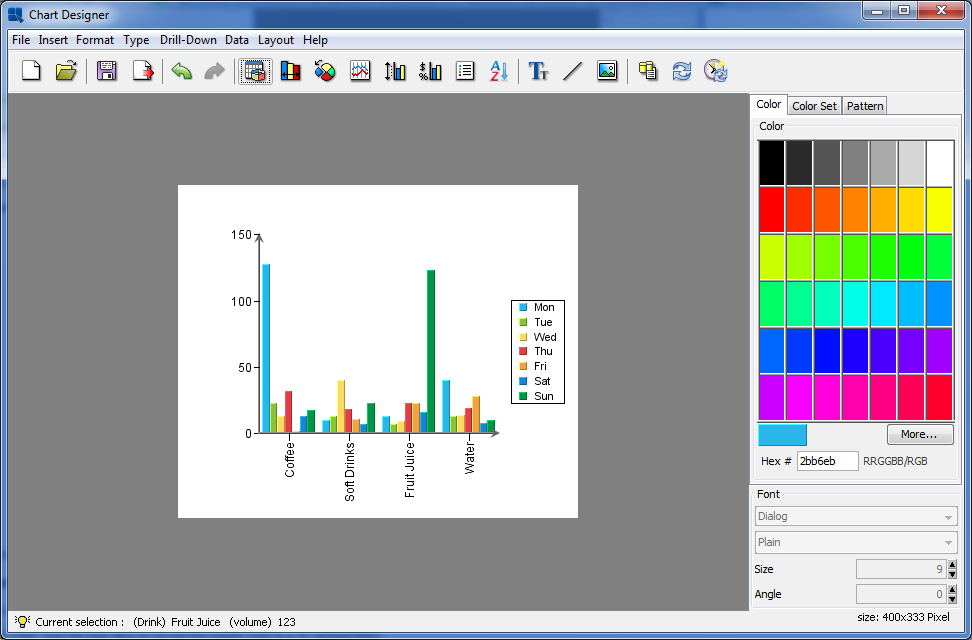
Chart Designer Showing Column Chart with Series
Notice now that instead of a single data point for each Drink, the column for each drink is now comprised of seven small columns, one showing the data point for each day.
In a two-dimensional chart, the data series is represented in-line along the X axis. However, a three-dimensional representation provides another axis to work with.
In the Chart Designer select from the type menu to convert the column chart to a 3D representation.
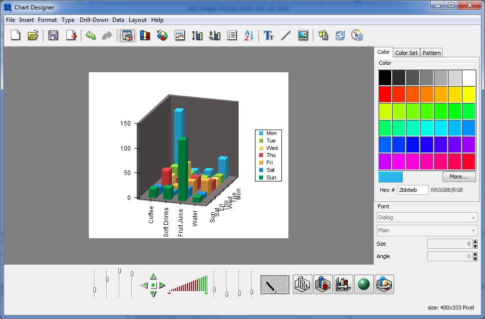
Chart Designer Showing 3D Column Chart
With the chart converted to 3D the 3D toolbar will appear at the bottom of the Chart Designer. The chart may appear squished when you convert it. You can use the sliders next to the zoom function to change the X, Y, and Z scaling for the 3D chart. You can also use the navigation buttons to position the chart in space. For more information about 3D features, see Section 3.4.4 - The Navigation Panel.
Notice that with the chart in 3D, the data series is now moved to the Z axis of the chart by default.
Pie charts are another commonly used chart type that shows values as a percentage of a whole. To convert your chart to a pie chart, first go to the Type menu and select 2D Chart to convert your column chart back to two-dimensional form. Then select from the Type menu. The chart will then be converted to a pie representation.

Chart Designer Showing Pie Chart with Series
Because you have a data series defined for the chart, multiple pies are drawn, one for each category. Each categories is broken down showing percentage contribution for the series elements.
To turn the chart into a single pie, we will remove the series. Click the button on the toolbar, to open the data mapping window.
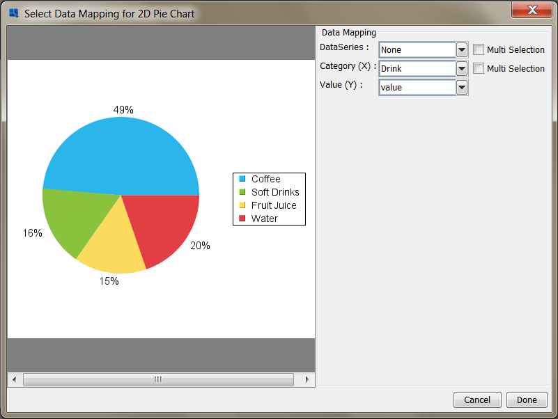
Data Mapping Options for Pie Charts
Change the Data Series option to None and click . Now in the Chart Designer you will see a single pie made up of your Drink categories.
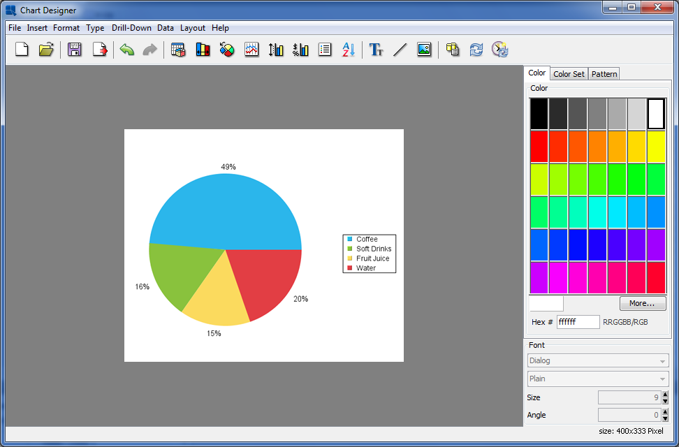
Chart Designer Showing Pie Chart
Another way to display multi-dimensional data is to use a stack type representation to show contributions to a total. To convert your pie chart into a stack column chart, first, select from the Type menu (pie charts cannot be directly converted to stack charts). The warning saying that the attributes of the current chart may be lost will be shown. Click . Once you have changed the chart to a columnar representation, select from the Type menu. Chart Designer will ask whether you want to re-do data mapping for the new chart type. Click and confirm the change by clicking in the Select Data Mapping for 2D Stack Column Chart dialog. The chart will then be converted to a stack column layout.
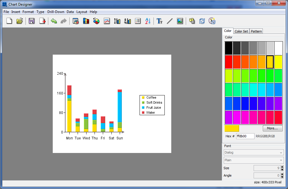
Chart Designer Showing Stack Column Chart
Notice that the chart now shows the columns as stacks made up of the values for each day. Now click the button on the toolbar. In the Data Mapping window there is a new option called SumBy. This is set to the Day column. The sum by column provides the individual stacks in these types of charts. Click to return to the Chart Desinger.
Now that you have finished designing a chart, click the ![]() button on the Toolbar. A dialog will open prompting you to specify a location and file name for the chart.
button on the Toolbar. A dialog will open prompting you to specify a location and file name for the chart.
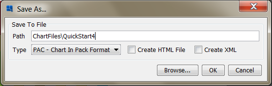
Save As dialog
Enter a file name, and elect to use either a CHT or TPL format. For more about chart formats, see Section 3.13.1 - Saving Charts. By default, the chart will be saved in the ChartFiles directory under the EDAB installation. You will then be prompted to add the file to the Organizer. Click . Close the Chart Designer.
In this section, we will use some of the basic formatting features in the Chart Designer to change the look and feel of an unformatted chart.
Right click on the QuickStart42.tplfile (which you added earlier in the Section Q.2.2.3 - Inserting a File chapter) and select from the pop-up menu. This will open the chart in the Chart Designer. As you can see, it is relatively un-formatted.
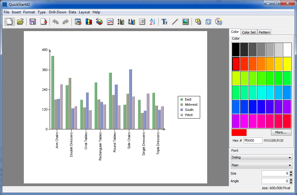
Unformatted Chart in Designer
Many chart appearance options are controlled using the Axis Elements dialog. To bring up this dialog, click the button on the toolbar. ![]() This will bring up a tabbed dialog allowing you to set different options for each chart axis. Click on the Y Axis tab to bring up options for the value axis.
This will bring up a tabbed dialog allowing you to set different options for each chart axis. Click on the Y Axis tab to bring up options for the value axis.
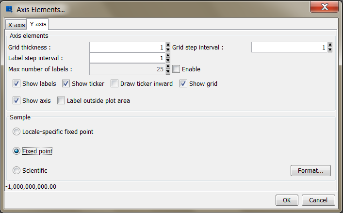
Axis Elements Dialog
Check the box marked Show grid to add grid lines to the Y-Axis. Then select Fixed point for the data format and click the button. This will bring up an additional dialog allowing you to set format options for the numeric data. Select the number of decimals as 2 and click .
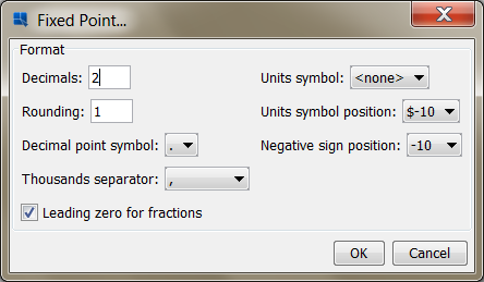
Numberic Format Dialog
Click again to dismiss the axis elements dialog and you will see the specified changes reflected in the chart.
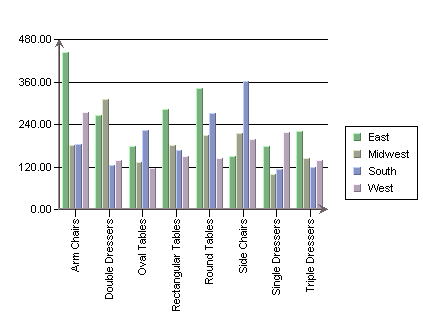
Chart with new Axis Formatting
Chart colors can be selected individually or they can be generated randomly. In Chart Designer, click the button. Notice how new colors are assigned to each of the series. Hit the button several more times until you find a color combination you like.
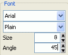
Now click on one of the X-axis (category) labels. The lower-left hand corner of the Design window will reflect your selection. In the font dialog on the lower right-hand side, change the angle of the labels from 90 to 45 degrees.
Font Panel
The chart labels will then rotate. You may need to adjust the position of the labels slightly. To do this click and drag on a label. All the X axis labels will follow your cursor around the chart canvas.

Chart with rotated labels
Next, we will add titles to the chart. To do this, select from the Insert menu. This will bring up a dialog prompting you to enter a main title for the chart, as well as titles for each of the axes.

Chart Titles Dialog
Enter any titles that you would like for the various elements and click . The titles will then be added to the chart. Titles are placed automatically, but you can manually adjust their positions by clicking and dragging the text on the chart canvas.
If you do not see chart titles, click and drag on the chart plot to move the chart. You should then be able to see the titles. You can adjust the font and font size of the chart titles by clicking them and changing the settings in the font panel.

Chart With Titles
You can also customize the plot of two-dimensional charts, creating a separate background for the data points. To do this, select from the Format menu. This will bring up a dialog allowing you to set display options for the chart plot.
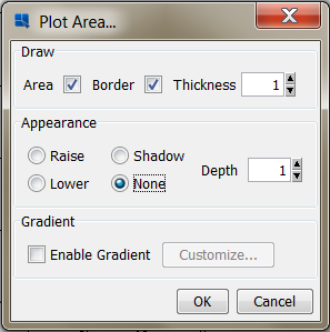
Plot Area Dialog
Select to draw both the plot area and the border with a thickness of one. Specify None for the appearance. Once you have specified the options, click , and the plot area for the chart will be modified. You can change the background color of the plot area by clicking to select it, and then modifying the color in the color panel.
Chart With Colored Plot Area
Now save the changes you have made to the chart and exit the Chart Designer.
In this section we will use some of the charting features in EDAB to provide a chart that quickly conveys salient information to the viewer. For defailed information about the features discussed in this section, and other charting features, please see Section 3.4 - The Chart Designer Interface.
Following the same procedure shown earlier, add the QuickStart43.tpl file under help/quickstart/templates into your project in the Organizer. Then rightclick on the entry for this file in Organizer and select from the pop-up menu. This will open the chart in Chart Designer.

QuickStart43.tpl in Chart Designer
The chart shows hourly defect counts for a manufacturing process. Since the chart shows three days worth of data, it is difficult to make out the individual points, and the X-axis labels are not legible as they are drawn on top of each other.
One way to improve the chart, is to use the time series zooming feature to aggregate the data into fewer data points. In this instance, let's look at the total number of defects for each eight hour shift, instead of plotting the data for each hour.
To turn on zooming, select from the Format menu. This will bring up the following dialog.

Zoom Options Dialog
In this dialog, set the scale to be eight hours and elect to preserve a linear scale by setting that option to true. Leave the Disable Upper Bound and Disable Lower Bound options checked. Then check the Enable Zooming option. This will bring up a new dialog prompting you to select the aggregation for the zooming.
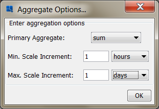
Aggregation Options Dialog
In this dialog, set the primary aggregate to be sum, the minimum scale to be one hour, and the maximum scale to be one day. Then click to return to the zoom options dialog, and 'Ok' again to return to apply the zoom setting. The chart now shows the total number of defects for each eight hour period.

Chart With Zooming Applied
Next, we will use the control area feature to highlight any shift where there were more than twenty defects.
To add a control area, select from the Insert menu. This will bring up a dialog allowing you to select options for the new control area.
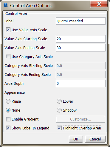
Control Area Dialog
In this dialog, enter a name for your control area. Then check the option marked Use Value Axis Scale, and enter 20 for the starting scale, and 30 for the ending scale. Then at the bottom of the dialog check the options marked Show Label in Legend and Highlight Overlap Area. Then, click to apply the control area. Notice how only the areas where the number of defects is colored. You can set the color by selecting the overlapped area and selecting a new color from the palette on the right-hand side.
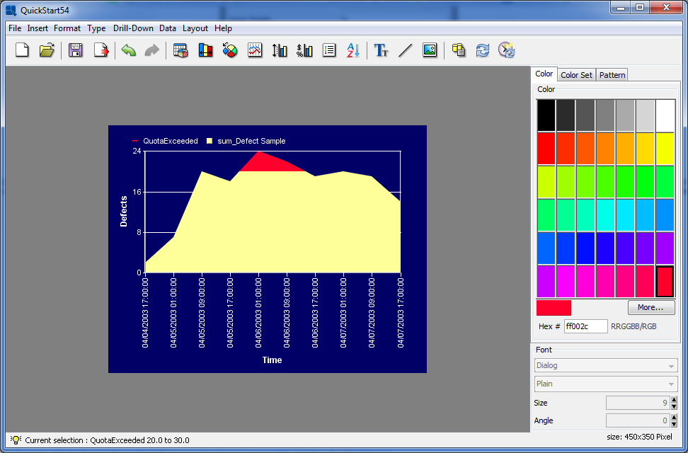
Chart With Control Areas Applied
Once you have finished modifying the chart, click the button on the toolbar to save the changes you have made, and close the Chart Designer.