EspressReport supports five basic report types: simple columnar, summary break, crosstab, master & details, and mailing label. Each of the report types has slightly different mapping options and can be used to generate several different styles of report.
The simple columnar report is the most basic of all the types supported by EspressReport. It presents columnar data in a single table without any grouping or breaks.
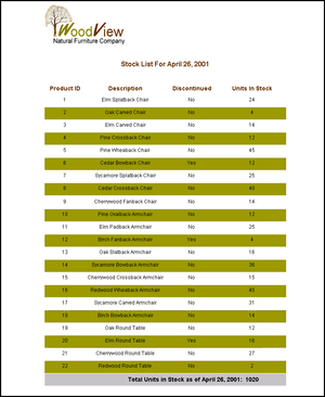
Simple Columnar Report
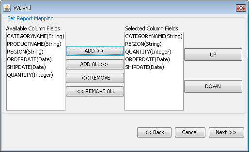
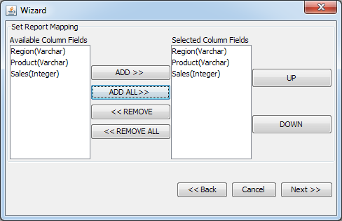
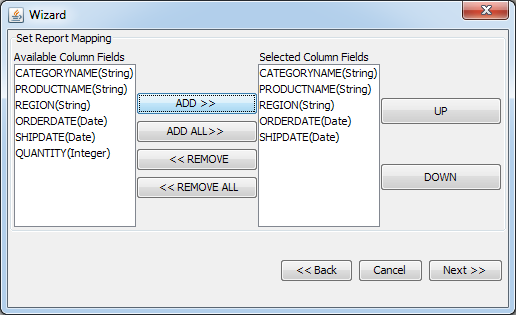
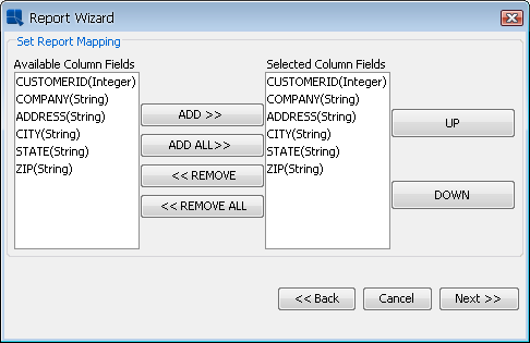
The first step in data mapping for this type is to select the columns you want to include in your report from the set mapping window in the Report Wizard. The left side of the window lists all of the available columns from your query or data file and the right side lists the columns to be included in the report. Click on a column name with the mouse to select it (Shift+Click for multiple selections) and press the or buttons to add it or to remove it from the report. The order in which you select columns in this window is the order in which they will appear in your report. You can change the order of the selected columns by highlighting the column you would like to move and clicking the or buttons. Fields can also be moved by clicking and dragging the selected field.
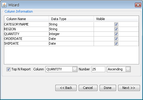
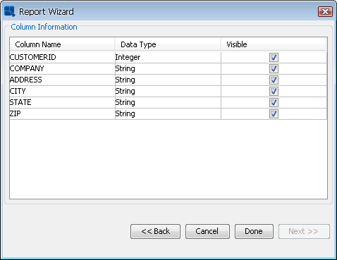
The second step for report mapping is to set the column options. For simple columnar reports there is only one available option. The window displays a table showing all of the columns you have selected for the report and the available options. The first field displays the column names. The second field displays the data type. The third field displays a check box marked visible. Checking or un-checking this box will make the column visible or invisible within the body of the report. (By default all columns are visible).
Simple Columnar Report Mapping
You can also create a Top N report using the columnar format. A Top N report will order and show you to highest set of values based on a particular column in the report. For example, you may want to show the top five customers based on total sales. To do this, check the Top N Report checkbox at the bottom of the data mapping window. You can then specify which column you would like to use as the measure (for the above example, it would be a total sales column), the number that you would like to retrieve (i.e. 10 or 20, etc), and whether you would like to show the columns in ascending or descending order. The columnar report will then return the number of records specified sorted by the highest value for the specified column.
Like the simple columnar report, the summary break report type takes columnar data and presents it in a tabular form. However, unlike the simple columnar report, it allows you to break data into sections and insert summary fields.
Summary Break Report
The first step in data mapping for this type is to select the columns you want to include in your report from the Set mapping window in the Report Wizard. The left side of the window lists all of the available columns from your query or data file and the right side lists the columns to be included in the report. Click on a column name with the mouse to select it (SHIFT+Click for multiple selections) and press the or buttons to add it or remove it from the report. The order in which you select columns in this window is the order in which they will appear in your report. You can change the order of the selected columns by highlighting the column you would like to move and clicking the or buttons. Fields can also be moved by clicking and dragging the selected field.
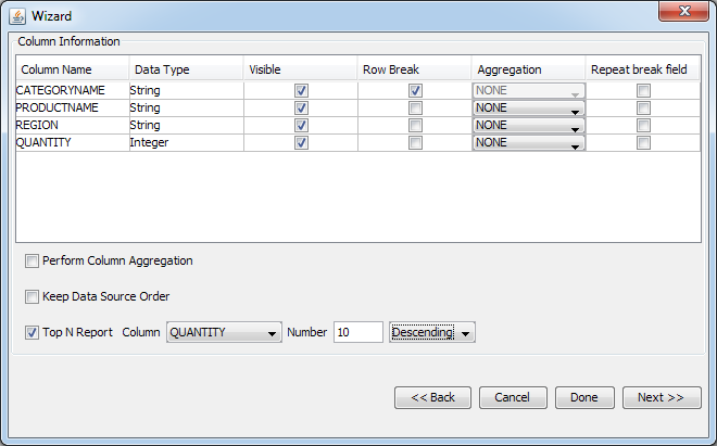
The second step in data mapping is to set column options. There are five column options available for summary break reports. The window displays a table showing all of the columns that you have selected for your report and the available options. The first field displays the column names. The second field displays the data type. The third field displays a check box marked visible. Checking or un-checking this box will make the column visible or invisible within the body of the report. (By default all columns are visible). The fourth field is the row break field. Checking this box indicates that the report will break and insert column summaries every time the selected column field changes. By default the first column selected for the report is the break field. The fifth field allows you to select aggregation. If the Perform Column Aggregation checkbox at the bottom of the window is checked, then the selected aggregation will be performed on the entire column and the report will only contain summarized data. If the box is not checked, the report will display all of the data and only insert aggregations as summaries after each row break.
The drop-down menu allows you to select the aggregation operation to be performed for that column. The aggregation operations that can be performed are: none, sum, maximum, minimum, count, average, first, last, sum of squares, variance, standard deviation, and count distinct. If you select to perform column aggregation, you must select an aggregation option for each column. Columns selected as row break fields cannot be aggregated.
For example, suppose we have the following data table:
| Order# | Product | Quantity |
|---|---|---|
| 12 | Chair | 2 |
| 12 | Table | 3 |
| 14 | Cabinet | 2 |
| 14 | Table | 5 |
Setting Order # as the row break field, and the aggregation on Quantity to Sum without checking Perform Column Aggregation will produce the following report:
| Order# | Product | Quantity |
|---|---|---|
| 12 | Chair | 2 |
| Table | 3 | |
| 5 | ||
| 14 | Cabinet | 2 |
| Table | 5 | |
| 7 |
However, selecting Perform Column Aggregation and changing the Product aggregation to Count would produce the following report:
| Order# | Product | Quantity |
|---|---|---|
| 12 | 2 | 5 |
| 14 | 2 | 7 |
| 2 | 5 |
The sixth field allows you to select whether to repeat a break field or not. By default, a row break column will only print each distinct value in the column once (i.e. once for each group). Selecting this option will cause the break fields to repeat for each row of data in the group.

Summary Break Report Mapping
Summary Break Report Mapping
If you want to keep the data ordering specified in the data source, select the Keep Data Source Order option. To learn more about this feature, see Section 1.4.9 - Keep Data Source Order.
You can also create a Top N report using the summary break format. A Top N report will order and show you to highest set of values based on a particular column in the report. For summary break reports you can also specify to show the highest values for each group. For example, you may want to show the top five customers in each region based on total sales. To do this, check the Top N Report checkbox at the bottom of the data mapping window. You can then specify which column you would like to use as the measure (for the above example, it would be a total sales column), the number that you would like to retrieve (i.e. 10 or 20, etc), and whether you would like to display the columns in ascending or descending order. The summary break report will then return the number of records specified (or number of records specified for each row break) sorted by the highest value for the specified column.
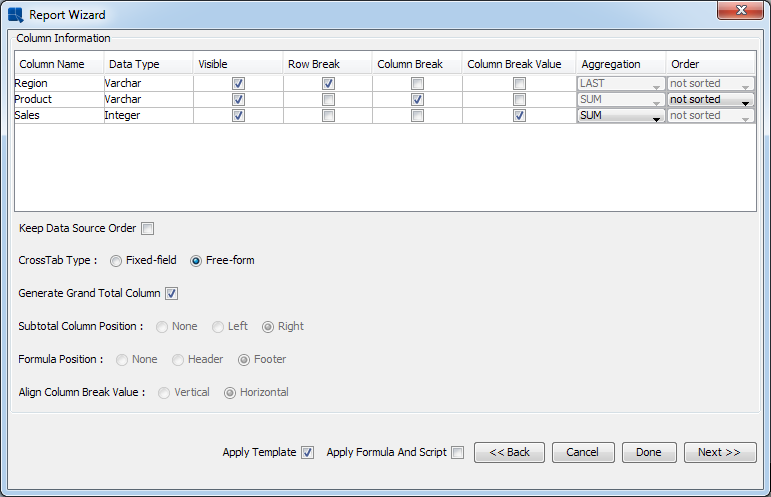
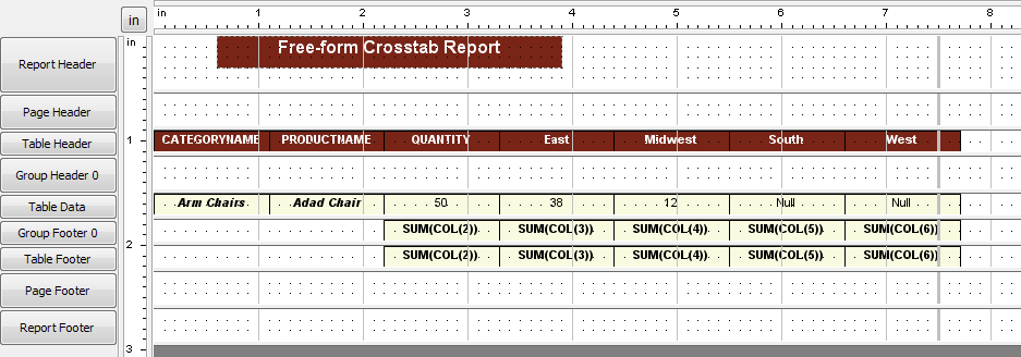
A crosstab report is a report format that shows and summarizes columnar data in a matrix-like form. Crosstab reports often resemble spreadsheets. Both rows and columns are summarized, allowing multi-dimensional data to be displayed in a two-dimensional format.
Crosstab Report
Report mapping for crosstab reports is more complicated than the other report types and may require some planning to be able to execute it correctly.
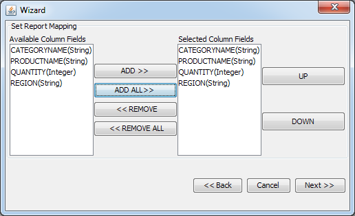
The first step in data mapping for this type is to select the columns you want to include in your report from the set mapping window in the Report Wizard. The left side of the window lists all of the available columns from your query or data file and the right side lists the columns to be included in the report. Click on a column name with the mouse to select it (Ctrl+click for multiple selections) and press the or buttons to add it or remove it from the report. The order in which you select columns in this window is the order in which they will appear in your report.
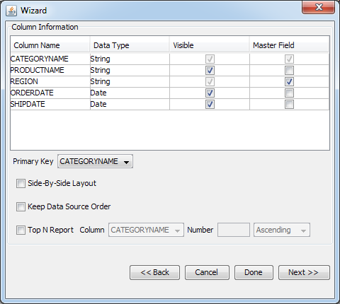
The second step in data mapping is to set column options.
The top of the column options window displays a table showing all of the columns that you have selected for your report and the available options.
The first field displays the column names.
The second field displays the data type.
The third field displays a check box marked visible. Checking or un-checking this box will make the column visible or invisible within the body of the report.
The fourth field is the row break field. Selecting a column as the row break field will cause the report to insert a new crosstab row for each unique entry in the selected column.
The fifth field is the column break field. Selecting a column as a column break field will cause the report to create a new column for each unique entry in the database.
The sixth field is the column break value field. Columns that you select as column break values become the fields that are summarized in the report.
The seventh field allows you to select column aggregation. A drop-down menu allows you to select the aggregation to be performed for that column. The aggregation operations that can be performed are: sum, maximum, minimum, count, average, first, last, sum of squares, variance, standard deviation, and count distinct. Columns that have been selected as row break or column break fields cannot be aggregated.
The eighth field allows you to specify ordering for the column break column. This order will determine how the crosstab columns are drawn from left to right. Ordering options are no order, ascending, and descending.
Cross-Tab Type: Change the behavior of the cross-tab report. If you choose the Fixed-field report type, more options become available on this dialog. See the Section 1.4.3.3 - Fixed-Field Crosstab Report to learn more.
Generate Grand Total Column: If this option is enabled a column will be added into the report. Each row of the column will aggregate all values from the corresponding row into a single value.
![[Note]](../../../images/note.png) | Note |
|---|---|
The aggregation that will be performed depends on the aggregation of the Column Break Value column(s). For example: if you use the MAX aggregation, the greatest value from the row will be displayed in the Grand Total column. |
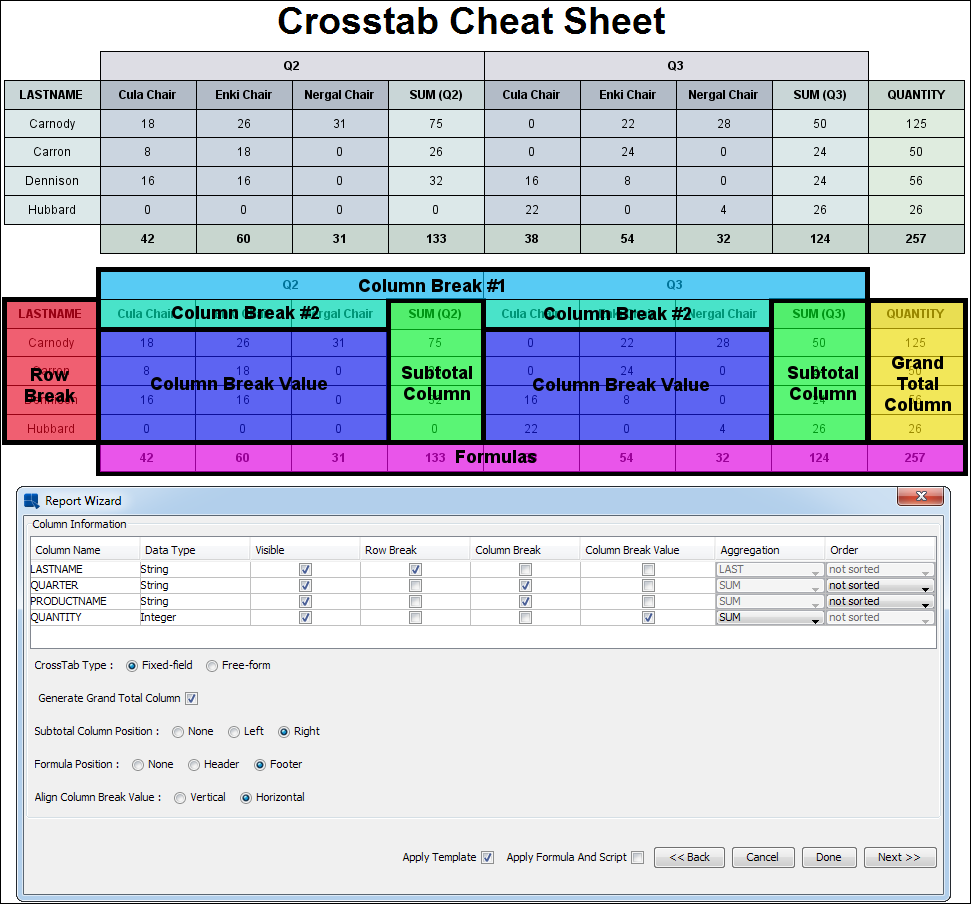
CrossTab Mapping - Cheat Sheet
For example, suppose we have the following data table:
| Region | Product | Sales |
|---|---|---|
| East | Chair | 14500 |
| Midwest | Chair | 13250 |
| South | Chair | 15252 |
| East | Table | 10550 |
| Midwest | Table | 9150 |
| South | Table | 11250 |
Setting Product as a column break field, Sales as a column break value field with an aggregation of Sum, and Region as a row break field with the Generate Grand Total Column option enabled will produce the following report:
| Region | Chair | Table | Sales |
|---|---|---|---|
| East | 14500 | 10550 | 25050 |
| Midwest | 13250 | 9150 | 22400 |
| South | 15252 | 11250 | 26502 |
| 43002 | 30950 | 73952 |
Crosstab Report Mapping
CrossTab Mapping - Column Information Dialog
If you want to keep the data ordering specified in the data source, select the Keep Data Source Order option. To learn more about this feature, see Section 1.4.9 - Keep Data Source Order.
The crosstab report also provides a unique feature that allows users to create a transposed report. Data transposition allows users to create a report presentation where the input data is essentially rotated 90 degrees. The columns become rows and the rows become columns. For example, say you have a set of data that looks like the following:
| Region | Forcast | Sales |
|---|---|---|
| East | 24100 | 25050 |
| Midwest | 23110 | 22400 |
| South | 22300 | 26500 |
| West | 18750 | 19220 |
The data transposition feature can be used to create a report that looks like the following:
| East | Midwest | South | West | |
|---|---|---|---|---|
| Forcast | 24100 | 23110 | 22300 | 18750 |
| Sales | 25050 | 22400 | 26500 | 19220 |
To transpose the data, click the Transpose Data option at the bottom of the result screen that first appears when you select a data source for the report. The following dialog shows the initial result set from the sample data in the example above.
Data Table Dialog
When you check the option at the bottom, a new dialog will appear allowing you to select the columns that you would like to transpose. In this example, you would select the Forecast and Sales columns. Note that in order to perform transposition, the selected columns must have the same data type.
Select Transpose Dialog
After making your selections, click to apply the changes. You will see the transposition in the data table dialog. The Sales and Forecast headers are transposed into a column called ColumnLabel and their values are merged into a column called Value. Now you can map this result set using a crosstab report where ColumnLabel is the Row Break, Region is the Column Break, and Value is the Column Break Value to create the final transposed report layout.
Data After Transposition
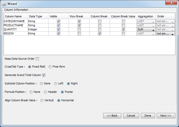
The fixed-field crosstab option improves some of the limitations of the free-form crosstab implementation by making it easier for users to design crosstab reports that can expand and contract with changing data.
The key difference between a fixed-field and a free-form crosstab is that in the Design view, you are not able to position or control the individual columns for the crosstab report. Instead, you can set formats for groups of elements (row breaks, headers, footers, and formulas). The actual report is only constructed during running or preview. Since the crosstab table is essentially constructed from scratch every time the report is run, it is easier to create a smoothly contracting and expanding crosstab table.
Data mapping options is essentially the same for a free-form crosstab. You can still select Row Break, Column Break, and Column Break Value columns (along with aggregation). For more information about Crosstab Report Data Mapping, see Section 1.4.3.1 - Data Mapping.
You can select the fixed-field layout using the Crosstab type radio button in the mapping dialog. When you select the Fixed-field crosstab type, the following options become available:
- Subtotal Column Position:
Subtotal column is very similar to the Grand Total column, except it doesn't aggregate the whole row, but each one of the Column Break group. This option allows you to disable the subtotal column, or set it's position (right or left to the Column Break group).
- Formula Position:
This is also very similar to the Grand Total column. The main difference is that this option doesn't aggregate rows, but columns. Also, it doesn't add a column to the report, but it adds a row instead. Use this options to disable the Formulas row, or to adjust it's position (on top of the table or below the table).
- Align Column Break Value:
If you have selected more than one Column Break Value columns, use this option to choose whether the values will be aligned in rows, or in columns.
For example, assume we have following fixed-field crosstab mapping:
Crosstab Fixed-Field Mapping
Setting CategoryName and ProductName as row break fields, Quantity as a column break value field with an aggregation of Sum, and Region as a column break field with the Generate Grand Total option enabled will produce the following report in the Design view. Instead of individual cells in the free-form layout, there are only cells that represent each element of the crosstab.
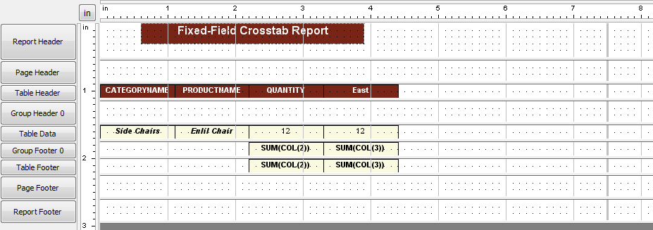
Fixed-Field Layout
The following image shows the same report in the free-form layout:
Free-Form Layout
You can easily change the fixed-field crosstab settings using the Change Data Mapping option under the Data menu. This will open the crosstab report mapping dialog again allowing.
The following table shows various formatting in fixed-field crosstab reports:
| Summary Column Position | Formula Position | Align Column Break Value | Template | |
|---|---|---|---|---|
| Report A | Right | Footer | Horizontal | Template A |
| Report B | Right | Header | Horizontal | Template B |
| Report C | Left | Footer | Horizontal | Template C |
| Report D | Left | Header | Vertical | Template D |
| Report E | Left | None | Vertical | Template E |
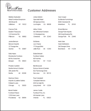
A Master & Details report is a set of tabular data that is grouped according to a master field. This report type is most commonly used when you have fields in your data table that have a one to many relationship. A good example of this is an invoice. For each order number in a database there will be customer information and several items with pricing information. A Master & Details report would be used to group the information according to order number.
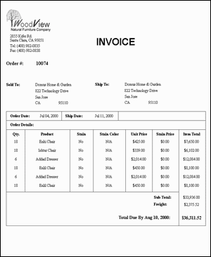
Master & Details Report
The first step in data mapping for this type is to select the columns you want to include in your report from the set mapping window in the Report Wizard. The left-side of the window lists all of the available columns from your query or data file, and the right-side lists the columns to be included in the report. Click on a column name with the mouse to select it (Ctrl+click for multiple selections) and press the or buttons to add it or remove it from the report. The order in which you select columns in this window is the order in which they will appear in your report.
The second step in data mapping is to set the column options. There are three column options available for Master & Details reports. There is a drop-down menu at the bottom of the column options window. It is labeled primary key. The drop-down menu contains all of the columns that you have selected for the report. Selecting a column as the primary key will group the report according to that column. A new group will be created every time the value in the selected column changes.
The top of the column options window displays a table showing all of the columns that you have selected for your report and the available options. The first field displays the column names. The second field displays the data type. The third field displays a check box marked visible. Checking or un-checking this box will make the column visible or invisible within the body of the report. The fourth field is the Master field field. Selecting a column as a Master field will place the column value in the column header instead of the data section of the report.
A checkbox at the bottom of the data mapping window allows you to change the layout of the report. Checking the Side-By-Side Layout box will arrange the report so that the master section is displayed next to the details section, rather than above it.
For example, suppose we have the following data table:
| Order # | Customer Name | Product | Unit Price | Quantity |
|---|---|---|---|---|
| 12 | Paul Campbell | Chair | $24.95 | 4 |
| 12 | Paul Campbell | Table | $127.50 | 1 |
| 14 | Sally Hayes | Cabinet | $227.25 | 2 |
| 14 | Sally Hayes | Chair | $24.95 | 2 |
| 14 | Sally Hayes | Table | $127.50 | 1 |
Setting Order # as the primary key, and Customer Name as a Master field, without using side-by-side layout would produce the following report:
| Order # | 12 | |
|---|---|---|
| Customer Name | Paul Campbell | |
| Product | Unit Price | Quantity |
| Chair | $24.95 | 4 |
| Table | $127.50 | 1 |
| Order # | 14 | |
| Customer Name | Sally Hayes | |
| Product | Unit Price | Quantity |
| Cabinet | $227.25 | 2 |
| Chair | $24.95 | 2 |
| Table | $127.50 | 1 |
However, the same report with side-by-side layout would look like the following:
| Product | UnitPrice | Quantity | ||
|---|---|---|---|---|
| Order #: | 12 | Chair | $24.95 | 4 |
| Customer Name: | Paul Campbell | Table | $127.50 | 1 |
| Order#: | 14 | Cabinet | $227.25 | 2 |
| Customer Name: | Sally Hayes | Chair | $24.95 | 2 |
| Table | $127.50 | 1 |
Master & Details Report Mapping
Master & Details Report Mapping
If you want to keep the data ordering specified in the data source, select the Keep Data Source Order option. To learn more about this feature, see Section 1.4.9 - Keep Data Source Order.
You can also create a Top N report using the Master & Details format. A Top N report will order and show you to highest set of values based on a particular column in the report. For Master & Details reports you can also specify to show the highest values for each group. For example, you may want to show the top five customers in each region based on total sales. To do this, check the Top N Report checkbox at the bottom of the data mapping window. You can then specify which column you would like to use as the measure (for the above example it would be a total sales column), the number that you would like to retrieve (i.e. 10 or 20, etc), and whether you would like to display the columns in ascending or descending order. The master & details report will then return the number of records specified (or number of records specified for each row break) sorted by the highest value for the specified column.
A mailing label report is similar to a simple columnar report; however, it pre-arranges data in a manner that allows you to create mailing labels. Data is arranged within the data table vertically and is wrapped automatically, making it easy to create a report showing an address list for mailing labels.
Mailing Label Report
Data Mapping for this type is exactly the same as for a simple columnar report. The first step is to select the columns you want to include in your report from the set mapping window in the Report Wizard. The left side of the window lists all of the available columns from your query or data file, and the right side lists the columns to be included in the report. Click on a column name with the mouse to select it (SHIFT+Click for multiple selections) and press the or buttons to add it or remove it from the report. The order in which you select columns in this window is the order in which they will appear in your report.
The second step for data mapping is to set the column options. For mailing label reports there is only one available option. The window displays a table showing all of the columns you have selected for the report and the available options. The first field displays the column names. The second field displays the data type. The third field displays a check box marked visible. Checking or un-checking this box will make the column visible or invisible within the body of the report. (By default all columns are visible).
Mailing Label Report Mapping
Mailing Label Report Mapping
After you have finished specifying mapping options, you can dismiss the Wizard and begin editing/modifying the report. To exit the Wizard, click the button in the last data mapping window. This will take you to the main designer window where a blank (unformatted) report will be generated based on your mapping specifications.
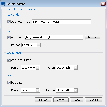
Instead of generating an unformatted report, EspressReport also provides several additional options in the Wizard, that allow you to automatically place some elements in the report, as well as provide a default style for the report elements. To continue on in the Wizard, click the button in the last data mapping window. This will bring up a dialog prompting you to add several elements to the report.
Add Elements Dialog
This dialog allows you to specify a report title and a logo for the report header. If you select to add a report title, you will be able to type in the title text. If you specify to add a logo, you can specify the location of the image file either using a file or URL path. You can also specify whether to place the logo in the upper right or upper left hand side of the page.
You can also specify to add page numbers and the date to the page headers and footers. You can select the format and the position of the elements either in the page header or footer and align them to the right, left, or center of the page.
After you have finished specifying which elements to add, you can again click to dismiss the Wizard, and begin editing/modifying the report with the added elements. If you click you will be taken to the last dialog in the Report Wizard. This dialog allows you to select a style for the report.
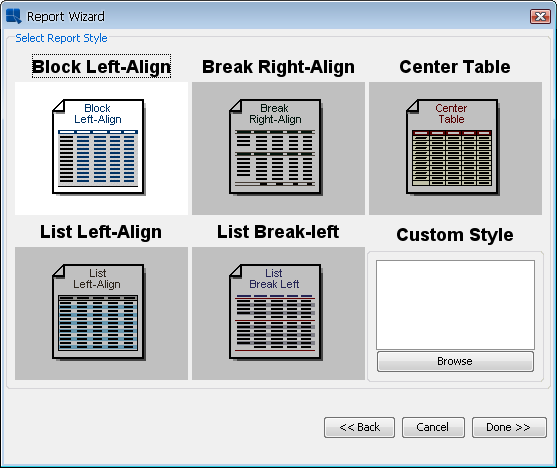
Report Style Dialog
From here you can pick a pre-defined style or a custom style that you would like to use for the report. Selecting a style will apply formats to the report elements, as well as change the default attributes of new report elements. Below are examples of each of the pre-defined report styles when applied to the same summary break report:
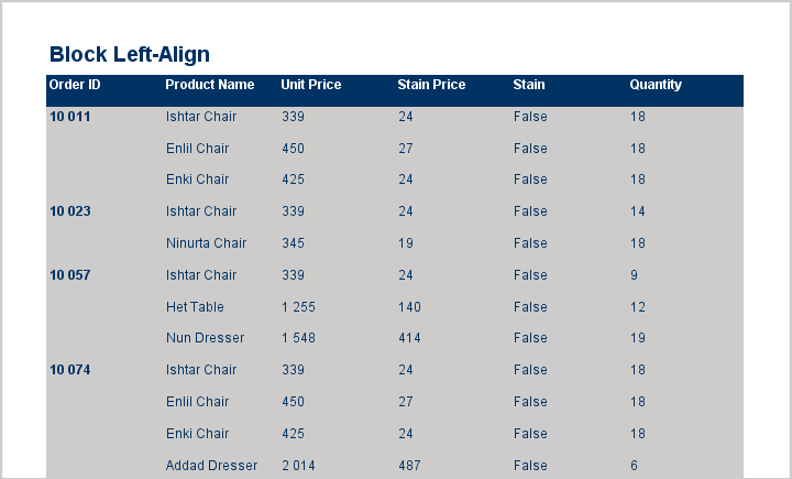
Block Left-Align
This style sets text alignment to the left and draws the report on a gray background with blue headers.
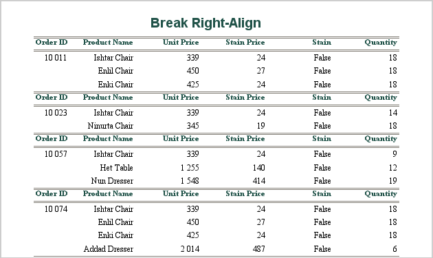
Break Right-Align
This style sets text alignment to the right and draws lines to demarcate the headers

center Table
This style centers text and draws table borders around the report cells.
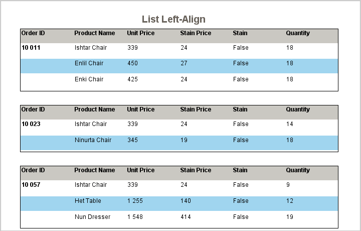
List Left-Align
This style sets text alignment to the left and draws alternating color for each row.
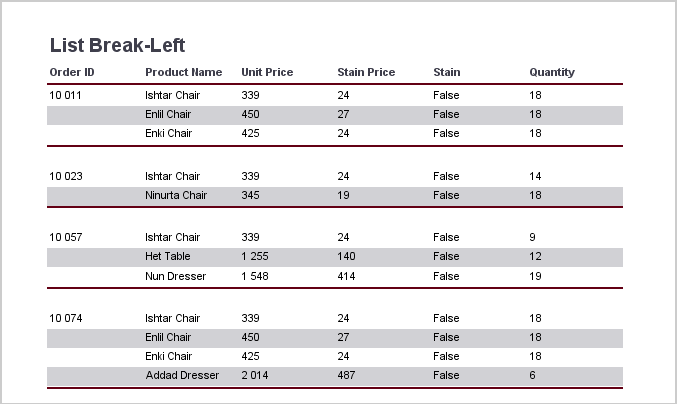
List Break-Left
This style sets text alignment to the left, adds lines to demarcate column headers, and draws alternating color for each row.
Report styles will only effect the appearance properties of the report elements and will not change the report type or data mapping options that were selected earlier. Once you have specified a style, click the button to dismiss the Wizard and go on to the main designer window.
In addition to the five pre-defined styles included with EspressReport, users can create their own style definitions. Style definitions are special versions of report templates that are saved with a .stl extension. Users can create a style definition using any report template.
The first step in creating a custom style is to set the global formats. This allows you to control the default look and feel for all elements the user inserts into the report. For more information about global formats, see Section 1.5.9.1 - Global Formatting.
The second step in creating a custom style is to select the look and feel for the elements in each section of the report. To do this, select the report element, whose formats you would like to apply to all elements in the section when the style is applied and select Set Attributes as Section Style from the pop-up menu.
Once you have finished setting the attributes, select to save the report template as a custom style by checking the Create Style option in the save as dialog.
To select a custom style when creating a report, check the Use Custom Style option in the report style dialog and then specify the style (.stl) file that you would like to use. When the style is applied the global formats will be applied, and the attributes defined for each section will be applied to the elements in the corresponding section in your new report. In addition, any lines and/or images defined in the style will be applied to the new report as well.
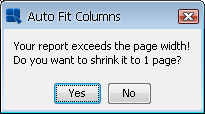
Often when you finish with the Report Wizard, you will have created a report that is wider than the default page width (8.5"). If this is is the case, you will be presented with a warning.
Auto-Fit Columns Dialog
The dialog gives you an option, to shrink the report to fit within the page. If you select then all of the columns will automatically shrink to fit them within the width of the page. The page boundary is indicated by a vertical bar within the design window. If you elect to keep the columns overlapping the page boundary, the overflow will be printed on a new page when you preview the report. You can auto-fit the columns anytime you are editing the report by selecting Auto Fit Columns from the Format menu. The page width can also be adjusted by selecting Page Setup from the Option menu.
Once you have completed data mapping a rough version of the report will be generated. If it is not correct, you can change the data mapping by selecting Change Data Mapping from the Data menu, or clicking the Change Data Mapping button on the toolbar. This will take you back to the Report Wizard (starting with data mapping), allowing you to go back to change report type, and data mapping.
When you change data mapping there are two checkboxes at the bottom of the last screen in the Report Wizard. One is marked Apply Template, and the other Apply Formula and Script. Checking the first box will retain the formatting of your report; however, the labels and formulas may no longer be correct. Un-checking this box will create a blank report with the new data mapping. If you have not formatted many of the report objects, it is recommended that you un-check this box. This will ensure that the new data mapping is completely accurate. The second box allows you to include functions and scripts placed in the data table section to be applied (formulas and scripts in other sections are always applied), when you select the Apply Template option. Please note that if you have changed the number of columns, or the data types of certain columns, the functions and/or scripts may no longer work.
Summary Break, Cross-tab and Master&Details reports use memory-optimized query processing which can unfortunately change the order of the data. In other words: the data in the report may be displayed in different order than the data in the data source. To prevent this from happening, choose the Keep Data Source Order option in the report mapping dialog. This will disable the memory-optimized query processing which means that the data will be passed to the report without any optimalization (i.e. the original data ordering will be preserved).

Keep Data Source Order option
| Note |
|---|---|
If you choose the Keep Data Source Order option, the Top N Report option for Master&Details and Summary Break reports will be disabled. |