Users who have some familiarity with other report writers will recognize the banded-style interface of the Report Designer. Report elements can be added and modified within the Designer window and then the resulting report can be previewed in the preview window.
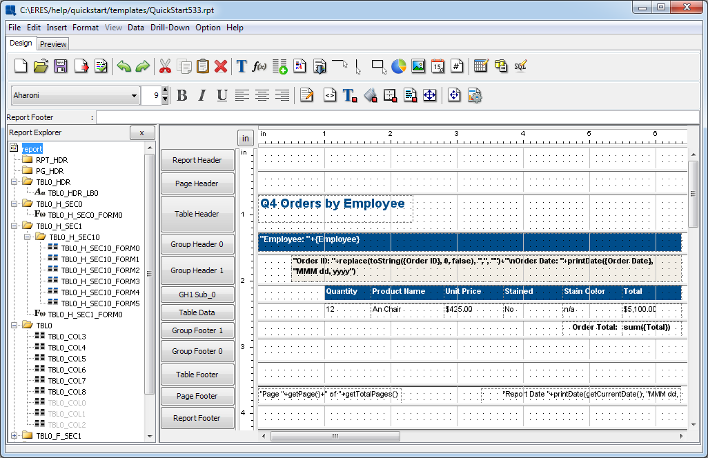
Report Designer Interface
Each of the bands within the designer interface represents a different report section. The section names are listed on the buttons to the left of each report band.
- Report Header:
This section is like the title of the report. It appears only once at the top of the report.
- Page Header:
Any element placed in this section will appear at the top of every page of the report.
- Table Header:
This section serves as a header to the detail or data section of the report. By default it only appears once in the report.
- Group Header:
This section appears in reports with grouped data (i.e. master & details report), or data with row breaks inserted (i.e. summary break report). It repeats at the top of each grouping within the report.
- Table Data:
This is the main section of the report that contains most of the data. Data columns that have been selected for the report are placed in this section and are repeated for each entry in the column.
- Group Footer:
This section appears on reports with grouped data (i.e. Master & Details report), or data with row breaks inserted (i.e. summary break report). It repeats at the bottom of each grouping within the report.
- Table Footer:
This section serves as the footer to the detail or data section of the report. By default, it appears only once in the report.
- Page Footer:
Any element placed in this section will appear at the bottom of every page of the report.
- Report Footer:
This is the last summary or footer section of the report. It only appears once at the end of the report.
There can also be nested sections in addition to the Report Header, Table Header, Group Header, Group Footer, Table Footer, and Report Footer sections. Nested sections are useful for placing sub-reports and rich text fields with variable lengths. This allows these type of elements to re-size without overlapping any elements below. Nested sections inherit most of the section options from their parent sections, including page-breaking and repeating options.
To add a nested section select Insert Section from the section options pop-up menu for the parent section. For more on section options see Section 1.5.3 - Section Options. Note that if you select to insert a section from a nested section, it will inherit the same parent section (i.e. nested sections cannot be a parent).
To resize section height, place the mouse over the section divider within the design window. The pointer will change to a resize pointer. Click and drag the mouse to expand or decrease the section height.
There are several formatting and display options available for each report section. You can access the section options menu by clicking on the button with the section name at the left-hand side of the Designer, or by right clicking on a blank portion of the section field.
- Background Color:
This option is available for every section of the report. This option allows you to set the background color for the entire section. Selecting this option will bring up a dialog box prompting you to specify whether or not to set the background transparent. If you do not want a transparent background, uncheck the checkbox, and click the button. This will bring up a dialog prompting you to specify the background color. You can select font color from swatches, or enter the HSB or RGB values. You can also directly enter a HEX color value to the Hex # field.
![[Note]](../../../images/note.png)
Note If there are no elements placed in a section, that section will not display. Hence, changing a section background color will have no effect on the finished report if the section is blank.

Background Color Dialog
- Section Height:
This option is available for every section of the report. It allows you to set the section height. It has the same effect as dragging the section's bottom edge, but unlike the drag&drop method, this option allows you to set the section height precisely in inches.
- Insert Section:
This option is available for the Report Header, Table Header, Group Header, Group Footer, Table Footer, and Report Footer sections. Selecting this option will add a nested section to the currently selected report section.
- Remove Section:
This option is only available for nested sections that you have added to the report. (Regular sections can only be rendered invisible.) This option will remove the nested section from the report and delete its contents.
- Repeat On Every Page:
This option is available for the Table Header and Group Header sections. Selecting this option causes the section to repeat again after every page break. (Group headers will only repeat if the data for that group exceeds one page.)
- Print On a New Page:
This option is available for the Table Header, Group Header, Table Data, Group Footer, Table Footer, and Report Footer sections. For the Table Data section, a new dialog will pop up allowing you to select the number of rows to display on each page. This number will be set as a new maximum of table data rows for the page. After this amount of rows a page break will be inserted. This count does not include any formulas in the footer sections will not be counted. For example, if the report contained row breaks and an aggregation calculated for each group, this element will not count towards the number of rows. :
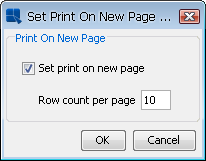
Print on New Page Dialog.
Selecting this option for any other section inserts a page break each time the section appears.
- New Excel Sheet:
This option is only available for the Group Header section(s). Selecting this option causes each group to be printed on a separate worksheet when the report is exported to Excel (XLS) or Excel 2007 (XLSX) format.
- Reset Page Number:
This option is only available for the Group Header section(s). Selecting this option causes the report pagination to reset each time the section is run. Hence, each time the Group Header section runs, the current page number goes to 1. Note that setting this option will automatically enable the print on a new page option.
- Fit Group On Page:
This option is only available for the Group Header section(s). It allows you to control some of the pagination for grouped data. Selecting this option, will cause EspressReport to try to fit the entire group on a page. If the entire group cannot print on a page, then it will print on a new page. If the group cannot fit on any page, (the fields are longer than the page height), then it will be broken up into multiple pages.
- Skip First Value:
This option is available for the Table Header, Group Header, Group Footer, and Table Footer sections. This option is a subset of the print on a new page option. Selecting this option will ignore the page break for the very first time a section is run. For example, setting this option on the Group Header section, will cause the report not to insert a page break for the first time the section is run. The page break occur will only occur when the report runs the Group Header for a second time.
- Skip First Group Value:
This option is only available for the Group Header section. This option is a subset of the print on a new page option. Selecting this option will ignore the page break for the first value of each group of data. This option is used for nested grouping in a report where more than one group is set to print on a new page. To prevent a blank page for records where more than one grouped column value changes, the 'Skip First Group Value' can be set for the inner Group Header section.
- Resize Cells Proportionally:
This option only applies if you have set cells within the section to resize to fit content. If this option is selected, all of the cells in the section will re-size with the variable height cells.
- Invisible:
This option is available for every section of the report. Selecting this option hides the section. To render the section visible again, click on the Format menu at the top of the designer, and select the Make Section Visible option.
- HTML Border:
This option is available for every section and only takes effect if the report is exported to HTML. Since tabular HTML (not DHTML CSS formatting) does not allow selective cell borders within a table, users can elect to turn on or off a border for all cells in a section when the report is rendered in HTML. If you select this option, the following dialog will appear allowing you to set options for the HTML border:
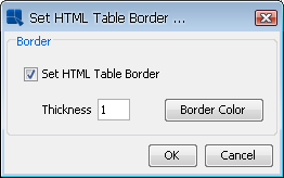
HTML Border Options
In this dialog, you can set the thickness of the border and set the border color, by clicking the button. This will open the color palette dialog allowing you to pick a color for the HTML border.
- Scripting:
This option will bring up the scripting interfaces allowing you to write, modify, or apply a script to dynamically modify certain section attributes. For more on this feature, please see Section 1.9.2.7 - Section Scripts.
The Report Designer has two rulers at the top and left-hand edge of the Design window. The rulers measure how the report will look in terms of the physical page dimensions. Please note, the dimensions do not include the page margins. The rulers allow you to get a good idea of how the printed report would look. You can also use the rulers to adjust the bounds of elements in your report. The selected elements' bounds will appear as shaded areas within the rulers and can be adjusted by clicking on and dragging the markers.
Rulers and in/cm button
The button in the upper left-hand corner of the Design window allows you to toggle between inches and centimeters for the report measurements. By default, EspressReport uses inches for measurement. Depressing the button will change the ruler measures to centimeters. If centimeter is selected all of the manually entered values like element bounds and page margins will also be entered and displayed in centimeters.
You can set Report Designer to run with metric (cm) measurements as the default. To do this, specify an additional command line argument - metricSystem:true/false when executing the ReportDesigner.bat/.sh file. For example: ReportDesigner -metricSystem:true will launch Report Designer with metric measurements. You can also add this argument in the batch file itself.
If you are running Report Designer through an applet, you will need to add the following parameter to the applet HTML page: <PARAM NAME=metricSystem VALUE="true">.
Most of the Report Designer's features can be controlled by using the drop-down menus at the top of the designer.
This menu performs most of the file operations.
- New:
Creates a new report.
- Open:
Opens an existing report (
.pak/.rpt/.xml/.stlformat).- Close:
Closes the current report.
- Apply Template:
Imports and applies a template (
.pack/.rptor.xml) file to the current report. All of the report attributes are changed to those of the template.- Save:
Saves the current report
- Save As:
Allows you to name and save the current report as a template (
.pak) file. A checkbox within the Save As window allows you to generate an applet page with the Report Viewer embedded, as well as generate an XML template.- Export:
This option exports the report to a selected format. Options include DHTML, PDF, CSV (data file), Excel (XLS), Excel 2007 (XLSX), RTF, TXT, XML, and VIEW.
- Print:
Prints the current report. This option is not available when running through a browser.
- Exit:
Closes the application.
This menu allows you to edit and cut/paste report elements
- Undo:
Cancels the last operation performed in the Designer and reverts back to the previous state. The Designer will remember the last 10 actions made.
- Redo:
Reverses the action of the undo command. For example, if you change the font color from black to red, you can undo this command to change it back to black and then redo this command to have it change to red again.
- Edit:
This option is available for labels, formulas, images, and charts. For labels it will prompt you to change the label text. For formulas, it will prompt you to change the formula. For images, it will prompt you to change the image file URL. For charts, it will bring up Chart Designer to edit your chart.
- Copy:
This makes a copy of the selected element and places it on the clipboard.
- Cut:
This removes the selected element, and places it on the clipboard.
- Paste:
This pastes the current clipboard element into the report.
- Selection Box:
Allows you to draw a selection box around a group of elements, to move, resize, or format them.
- Delete:
This will delete the selected element, except for elements in the Table Data section. It will not delete these, but render them invisible.
- Remove Sub-Report:
Removes a sub-report from the current report.
This menu allows you to insert elements into the current report.
- Insert Label:
Inserts a label element into the current report.
- Insert Formula:
Inserts a formula element into the current report.
- Insert Column Field:
Inserts a column field into the report from the available fields. (Available fields are those that have been selected for the report. See data mapping: Section 1.4 - Report Types and Data Mapping).
- Insert Database Field:
This option is only available if the template's data source is a database. It allows you to insert a field from the database that may not have been part of the original query.
- Insert Column Header:
Inserts a column header for one of the report fields.
- Insert Parameter Value:
Inserts a formula that returns the supplied value for a report parameter.
- Insert Chart:
Inserts a new chart into the current report.
- Insert Image:
Inserts an image from a file into the report. Images can be in JPEG, GIF, or PNG format.
- Insert Rich Text Field:
Inserts a new rich text into the current report.
- Insert Table of Contents:
Inserts a table of contents into the report.
- Insert Line:
Inserts a vertical or horizontal line into the report.
- Insert Rectangle:
Inserts a grid rectangle.
- Insert Guideline:
Inserts a guideline in the report. Guidelines can help you move and position elements in the report. For more on guidelines, please see Section 1.5.7.14 - Guidelines.
- Today's Date:
Inserts the current date into the report in one of three ways:
Date,Date & Time, orTime. The date function is actually a formula and the format can be adjusted after it is inserted. See section on formula formatting, Section 1.5.7.3 - Data Formatting for Formulas and Column Fields.- Page Number:
Inserts the page number into the report in one of two ways: Page Number or Page Number of Total Pages (i.e. page X of Y). The page number function is actually a formula and it can be formatted after it is inserted. See section on formula formatting Section 1.5.7.3 - Data Formatting for Formulas and Column Fields.
- Insert Sub-Report:
Inserts a new or pre-existing sub-report into the current report. For more on sub-reports, see Section 1.11 - Sub-Reports.
The format menu contains the formatting options for the currently selected element within the report. Some menu options will not work depending on the type of element which is currently selected.
- Data Format:
This option is available for formulas and column fields. It will bring up the data format editor for the data type of the selected element, either
string,numeric,date/time, orBoolean.- Chart Export Format:
This option is only available for charts. When reports are exported to DHTML format, charts are converted to static images. This option allows you to specify the image properties for the chart upon export.
- Font Style and Size:
This option is available for labels, formulas, and column fields. It brings up a dialog box prompting you to change the font appearance of the selected element.
- Font Color:
This option is available for labels, formulas, and column fields. It allows you to adjust the font color of the selected element.
- Background Color:
This option is available for labels, formulas, and column fields. It allows you to adjust the background color of the selected element.
- Dual Colors:
This option is only available for elements in the Table Data section of the report. It allows you to specify alternating background colors, font colors, and font styles for the selected column, as well as the number of rows between changes or on which column field to base the change.
- Line Thickness:
This option is only available for lines. It allows you to set the thickness for the selected line(s).
- Line Color:
This option is only available for lines. It allows you to set the thickness for the selected line(s).
- Border Thickness:
This option is available for every report element. It allows you to specify the thickness (in pixels) of the border drawn around the selected element. The border thickness can be set individually for the each side of the element.
- Border Color:
This option is available for every report element. It allows you to specify the color of the selected element's border.
- HyperLink:
This option is available for all elements, except column fields. It allows you to hyperlink an element to a web page or another report.
- Scripting:
This option is available for all labels, formulas, and column fields. It allows you to create a script and apply conditional formatting to the selected element.
- Rotation:
This option is available for all labels, formulas, and column fields. Allows you to rotate the element 90 degrees clockwise or counter-clockwise.
- Z-Index:
This option allows you to set the z index for the selected report element. The z index controls how report elements behave (i.e. which one appears first) when placed on top of each other.
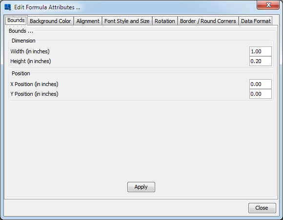
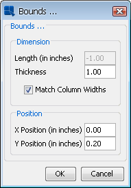
- Bounds:
This option is available for every report element. This feature allows you to manually enter the boundaries of an element. The measurements will be in inches or centimeters depending on which unit is selected with the toggle button at the upper left-hand corner of the Designer window where the rulers meet.
- Alignment:
This option is available for labels, formulas, and column fields. It allows you to align the selected element horizontally to the left, center,right, as well as vertically to the top, middle,or bottom.
- Resize To Fit Content:
This option is available for labels, formulas, and column fields. It causes the height of the selected element to adjust dynamically to fit its content.
- Wordwrap:
This option is available for labels, formulas, and column fields. It allows users to enable or disable word wrapping within report elements.
- Make Column Visible:
This option is only available if you have deleted an element in the Table Data section, or if you selected a data column as invisible from the column options screen of the Report Wizard. It allows you to render any invisible column visible.
- Make Section Visible:
This option is only available if you have rendered a report section invisible (See Section 1.5.3 - Section Options). It will render the section visible again.
- Invisible:
This option is available for elements in the Table Data section or for report sections. It will render the selected element invisible.
- Column Wrap:
This option allows column fields to be wrapped, so rather than breaking to the next page at the end of the page, they will continue next to the original column field within the current page.
- Auto Fit Columns:
This option will shrink all of the elements within the report to fit the report within the page width.
- Swap Columns:
This option allows the position of two elements to be swapped in the report. elements must first be selected using CTRL+Click.
The view menu contains options allowing you to navigate through the report in the Preview window and sort the data. It is only active when you are previewing the report.
- First Page:
This option will navigate to the first page of the report within the Preview window.
- Previous Page:
This option will scroll back one page within the Preview window.
- Next Page:
This option will scroll forward one page within the Preview window.
- Last Page:
This option will navigate to the last page of the report within the Preview window.
- Go To Page...:
This option will prompt you to enter a page number and then navigate to that page of the report within the Preview window.
- Sort by (ascend):
This opens up a second menu allowing you to select one of the report columns to sort the report by in ascending order (either numeric or alphabetical).
- Sort by (descend):
This opens up a second menu allowing you to select one of the report columns to sort the report by in descending order (either numeric or alphabetical).
- Sort by...
This opens a dialog which allows you to select nested sorting in a report (by more than one column). The direction of the sorting can be set for each column.
- Launch Page Viewer:
This will load the entire report in the page viewer window. For more information about this feature see Section 1.6.2.4 - Using Page Viewer.
The data menu contains options that allow you to see and manipulate the data used in the current report and its properties.
- Refresh:
This option will re-query the data source used for the current report and then update the report.
- Change Data Mapping:
This will re-open the Report Wizard, allowing you to change data mapping for the current report.
- Change Data Source:
This will re-launch the Data Source Manager, allowing you to modify or change the report's data source.
- Modify Database:
If the report uses a database as the data source, this option allows you to modify the connection information that the report uses to connect to the database. For more on this feature, please see Section 1.3.2.5 - Editing Database Connections.
- Modify Query:
If the report uses a database as the data source, this option allows you to modify the query used to retrieve the report data. For more on this feature, please see Section 1.3.2.4 - Editing Queries.
- View Column Mapping:
This option will bring up a window that displays the column mapping for the current report. The window displays the column index, name, data type, options, and whether it is currently visible or invisible.
- View Table:
This option will bring up a window containing the data table from which the current report is generated. The table will initially display only the first 20 records. Clicking on the Show All Records checkbox will display all of the records in the data table.
- View Data Source Info:
This option will bring up a window containing information about the data source that was used to create the template. The data source type, location, and the data registry location are displayed.
- Sub-Report Parameter Sharing:
This allows you to link parameters defined within sub-reports to parameters in the main report or to the parameters defined in other sub-report. With this feature enabled, reports can share a user supplied parameter value automatically without having to pass the value to each sub-report. For more on sub-report, see Section 1.11 - Sub-Reports.
- Sub-Report Parameter Mapping:
This allows you to link parameterized sub-reports to column fields in the primary report. For more on sub-reports, see Section 1.11 - Sub-Reports.
- Chart Parameter Mapping:
This allows you to link parameterized charts (with an independent data source) to column fields in the report. For more on this features, see Section 3.3.1.1 - Chart Parameter Linking.
- Select Multiple Drill Down Values:
This option is only available when you are previewing a multi-value drill down report. It allows you to select values to use when drilling to the next level. For more information about drill down reports, please see Section 1.10 - Drill Down.
- Security:
This will bring up the security settings dialog for the currently selected cell. For more information about template security, please see Section 1.12 - Template Security.
- Cell Properties:
This option is available for all elements in the report. It will bring up a window displaying the properties of the selected element including its ID value, as well as column index, name, and data type for column fields.
- Set Preview Security Level:
This option allows you to specify which defined security level you would like to use when previewing the template. For more information about template security, please see Section 1.12 - Template Security.
- Set Preview Data Options:
This option allows you to turn on/off live data for the preview window as well as set the maximum number of records that should be returned when previewing the report.
- Secured Query Parameters:
This will bring up the parameter security dialog, allowing you to assign parameter values to security levels. For more information about template security, please see Section 1.12 - Template Security.
- Preview Parameter Prompt:
This option allows you to enable/disable parameter prompting when you preview the report.
The drill-down menu contains options that allow you to add, remove, and navigate layers of drill down within the report. For more on drill-down, please see Section 1.10 - Drill Down.
- Navigate:
This brings up the drill-down navigation window allowing you to edit, add, and remove layers of drill down.
- Drill Down Link:
This allows you to link the currently selected element to a drill down layer.
This menu contains display and printing options
- Report Explorer:
This option turns on/off the report explorer display. For more information about the explorer interface, see Section 1.5.8 - The Report Explorer.
- Page Setup:
This option allows you to customize the page size and margins. The measurements will be in inches or centimeters depending on which unit is selected with the toggle button at the upper left-hand corner of the designer window where the rulers meet.
- HTML Page Title:
This option allows you to specify the page title that is generated when the report is exported to DHTML format.
- Background Color:
This option allows you to set the page background color for the report. Specifying a color here will color the entire page in Report Viewer, and when exporting to DHTML, or PDF. Any non-transparent section color or report element background color will draw over the background color.
- Background Image:
This option allows you to specify a background image for the report.
- Snap to grid:
This option allows you to control the settings for the snap to grid feature. You can turn the feature on/off, as well as control the step size.
- Font Mapping:
This allows you to map system (true type) font files for the PDF export. For more information about this feature, please see Section 1.7.2.1 - PDF Font Mapping.
- Viewer Font Setup:
This option allows the font size for text in the Report Designer and Report Viewer to be relative to the screen resolution. Turned on by default, this feature allows for more precise conversions of reports to various export formats and between installations.
- Export Style Sheet:
This option allows you to export the style sheet (.css) file with the style definitions for the elements in the report. This style sheet file can be used to apply the DHTML export settings onto other reports. For more information about working with CSS, please see Section 1.7.2.2 - CSS Options.
- Show Cell Outline:
This option draws the outline for all the elements in the report. It allows you to see the boundaries of all the elements, as well as see elements where the text may not be visible.
- Shift On/Off:
This option allows you to turn the cell shifting mode on or off. If shift mode is on, resizing and moving report elements will cause the surrounding elements to shift: accommodating the resized or repositioned element.
- Show Formula Name:
This option allows you to enable/disable displaying the function name, rather then the text of the function in the Design window. For more on working with formulas, see Section 1.8 - Using Formulas & the Formula Builder.
- Global Format:
This option allows you to set formatting for each of the different types of report elements. It will apply changes to elements currently in the report, as well as change the default properties.
- Null Data Handler:
This option allows you to specify the treatment of null data within the report.
The toolbar at the top of the designer offers easy access to EspressReport's most commonly used features. The first row of buttons perform the following functions:
| Start a new report |
| Open an existing report |
| Save the current report |
| Export the current report |
| Apply a template to the current report |
| Undo the latest change |
| Re-do the latest undone change |
| Cut the selected element and place it on the clipboard |
| Copy the selected element |
| Paste the current clipboard object into the report |
| Delete the selected element |
| Insert a label |
| Insert a formula |
| Insert a column field |
| Insert a rich text field |
| Insert a sub-report |
| Insert a horizontal line |
| Insert a vertical line |
| Insert a grid rectangle |
| Insert a chart |
| Insert an image |
| Insert the current date |
| Insert page number |
| Change Data Mapping |
| Change Data Source |
| Edit Query |
The first two boxes in the second row of the toolbar allow you to select the font face and size for the currently selected element. The buttons in the second row perform the following functions:
| Set the font style to bold |
| Set the font style to italic |
| Underline the text |
| Set the horizontal alignment to left |
| Set the horizontal alignment to center |
| Set the horizontal alignment to right |
| Edit the selected element |
| Apply a script to the current element |
| Set the font style, size and color for the current element |
| Set the background color for the current element |
| Set the border thickness, color and corner rounding for the current element |
| Set dual colors for the current element |
| Set bounds for the current element |
| Page setup |
| Limit preview display rows |
When you finish with the Report Wizard, a rough version of your report will be generated based on the mapping and it will display the options you selected. To polish the report, you may want to insert new report elements, as well as format the existing elements.
- Labels:
You can insert a label in one of two ways: by selecting Insert Label from the Insert menu or by clicking on the
 button on the toolbar. After you have selected the option, a small box will follow your mouse pointer around the Design window. Position the box where you would like to insert the label and click. A dialog box will then appear, prompting you to enter the label text. Click on and the label will appear in your report.
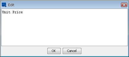
Insert Label Dialog
- Formulas:
You can insert a formula in one of two ways: by selecting Insert Formula from the Insert menu or by clicking on the
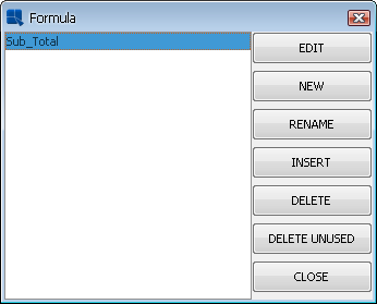
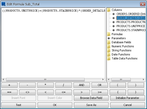
 button on the toolbar. After you have selected the option, a dialog box will open allowing to select a formula to insert. To insert a formula, select a formula from the list, and click the button. A small box will then follow your mouse pointer around the Design window. Position the box where you would like to insert the formula and click. The formula will then be added. You can use an existing formula or create a new one. To create a new formula, click the button in the formula list dialog. This will then open the Formula Builder window, allowing you to construct the formula. (See Section 1.8 - Using Formulas & the Formula Builder for more information on using the formula builder, and formula syntax). Any formula is automatically anchored to the report section in which it is inserted. This means that the formula will reset each time the section repeats.
Note Only the text of the formula will appear in the design window (unless the formula is inserted in the Table Data section). You can choose to display the formula names instead of the text by selecting Show Formula Name from the Option menu.
Formula List
Formula Editor
- Column Fields:
You can insert a column field in one of two ways: by selecting Insert Column Field from the Insert menu or by clicking on the
 button on the toolbar. After you have selected the option, a dialog box will appear with two drop-down menus. The first allows you to select the column field you would like to insert into the report. The second allows you to select aggregation (if any) for the column field. After you select the desired column field click on , and a small box will follow your mouse pointer around the design window. Position the box where you would like to place the column field and click. The column field will appear in the report. The column field is automatically anchored to the report section in which it is inserted. This means that each time the section repeats, the column field will display the next row in the data column.
Note The column value will not appear in the Design window (unless it is placed in the Data Table section). All that will show is the column name
{name}. You can see the column field value in the preview window.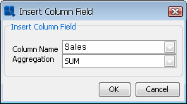
Insert Column Field
- Database Field:
This option is only available if the current report uses a database as the data source. It allows you to add a field from the database into the report that may not have been initially selected by the query or as part of the data mapping. To insert a database field, select Insert Database Field from the Insert menu. This will open a dialog with all of the tables you have included in your query and their respective fields, allowing you to select the field that you would like to add. Another option allows you to select the aggregation (if any) that you would like to perform on the field
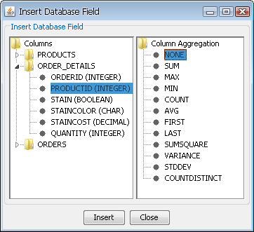
Insert Database Field Dialog
Note If the template's query contains aggregation or a
Group byclause, a third option will appear in the dialog, prompting you to selectDatabase Aggregationfor the field. This can either be group by or any aggregation supported by the database.- Column Header:
Column headers are a unique report element that will dynamically display the column header from the data source. You can add a column header by selecting Insert Column Header from the Insert menu. This will bring up a dialog prompting you to select the column for which you would like to retrieve the header.
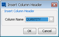
Insert Column Header Dialog
Select the column that you would like and click . A box will then allow you to position the header where you would like in the report. Click to add the column header.
- Parameter Values:
You can insert the user supplied values to query or formula parameters directly into the report. To insert a parameter value, select Insert Parameter Value from the Insert menu. This will bring up a dialog prompting you to select which parameter you would like to display the value for.
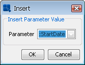
Insert Parameter Value Dialog
Parameter values are also accessible through formulas. For more about formulas, please see Section 1.8 - Using Formulas & the Formula Builder.
- Images:
You can insert an image in one of two ways: by selecting Insert Image from the Insert menu or by clicking on the
 button on the toolbar. After you select this option, a small box will follow your mouse pointer around the Design window. Position the box where you would like to place the image and click. A new window will appear prompting you to enter the URL of the image you would like to insert.
There are two ways of inserting background images: either locate the image on the hard drive or retrieve it from an URL.
To locate an image on the hard drive, click on the button. If you want to insert an image from your hard drive, place the image somewhere in the EspressReport installation directory. If you want to use an image from a different location, insert its URL.
To retrieve image from an URL, enter the URL in the Image URL text field. After that, click on the button to verify the URL. If the image from the URL appears in the Preview section, the URL is correct.
Note You have to insert complete URL with protocol (e.g.
http://) etc...If you save the report as PAK, the image will be stored in the PAK file along with the report.
If you want to re-open a RPT file (from an older EspressReport version) with a background image, please note that the image itself is not stored with the report. Only the path or URL is saved. If you move a RPT report, you need to be sure that it can still access the image along the path specified.
You can manually set the image dimensions in pixels, inches, or millimeters in the Dimension section.
Note If the image dimension exceeds the page dimension, the image will not be shown (although space will be allocated for that image).
EspressReport also supports database images. You can add images from the database (BLOB format) by selecting the BLOB field as part of the query for the report. The images will be added as a column in the report. You can also retrieve images in the Table Data section via URL instead of using a BLOB field. For more on this, please see Section 1.5.7.3 - Data Formatting for Formulas and Column Fields.
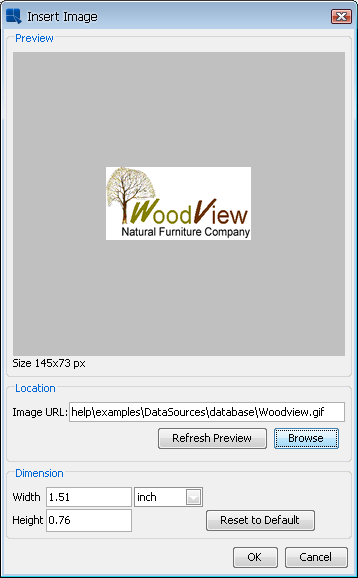
Insert Image Dialog
- Background Images:
EspressReport allows you to add background images to a report. Background images will underlay all other report elements and will repeat on every page. To add a background image, select Background Image from the Option menu. This will bring up a dialog prompting you to specify the location of the image, as well as several display options.
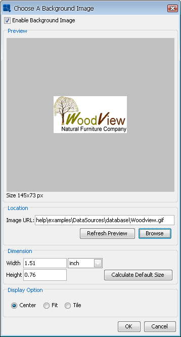
Background Image Dialog
To insert a new image, select the Enable Background Image option. If you want to remove an existing background image and use simple background color instead, unselect this option.
This dialog also allows you to choose one of the Display options (Center, Fit and Tile).
The rest of this dialog is the same as the Insert image dialog described in the previous section.
- Lines/Rectangles:
To insert a line or a grid rectangle, select either Insert Line or Insert Rectangle from the Insert Menu. If you select line, you can further select whether you want to insert a vertical or horizontal line. You can also select the corresponding icons on the toolbar. After you select line or rectangle, a cross, or a box will follow the mouse pointer around the Design window. Position the cross or box where you would like to insert the line/grid and click. A line or grid will then be inserted into the report.
Note The line or grid will appear thicker than it actually is in the Design window.
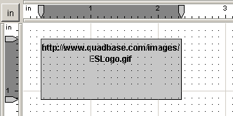
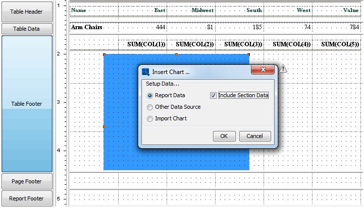
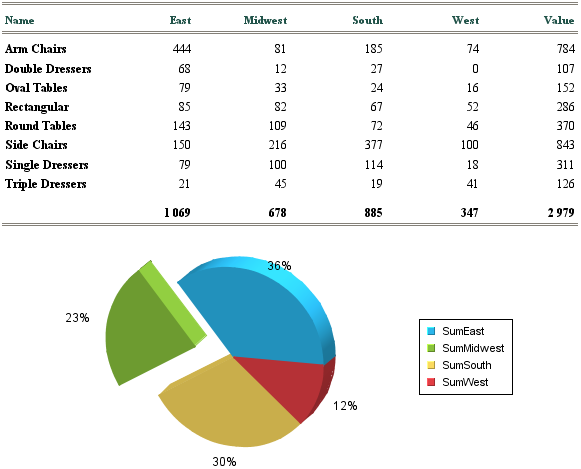
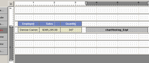
You can insert a chart in one of two ways: by selecting Insert Chart from the Insert menu or by clicking on the  button on the toolbar. After you select this option a small box will follow your mouse pointer around the design window. Position the box where you would like to place the chart and click. You will see the following dialog box:
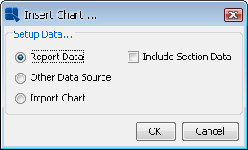
Insert Chart Dialog
You have the option to use data from the current report or use an external data source. If you choose to use the data from the report, you will be shown a preview of your dataset and be taken directly to the chart selection window in the Chart Designer. Otherwise, you will be given the chance to select a different data source for your chart or you can import a chart file created before.
Once you have selected your options, the Chart Designer will open in a new window, allowing you to design and customize your chart. Please see the Chapter 3 - Charting Guide for about using the Chart Designer.
| Note |
|---|---|
The actual chart will not appear in the Design window. Instead, you will see a gray rectangle with the chart URL. You can see the actual chart in the preview window. |
If your report contains grouping (Summary Break, CrossTab, or Master & Detail Reports), you also have the option to Include Section Data. If you select this option, you will be able to use group aggregations that are located within any section that the chart encompasses. This means that you can create charts using data from any aggregation located in the same section as the chart or in any inner sections.
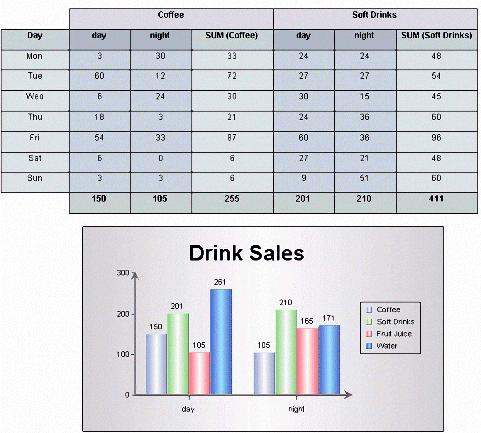
For example, if you were to create a Summary Break Report with two row break columns, this will result in two group header and two group footer sections. Let us also suppose that you have a group aggregation for a column in your report. The report might look like the following:
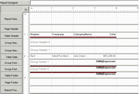
Summary Break Report with Two Row Break Columns
If you position the chart in the inner group header (Group Header 1) or inner group footer (group footer 1), you will only be able to use the group aggregation for the inner section in your chart (the aggregation in Group Footer 1). If you positioned the chart in the outer group header (Group Header 0) or outer group footer (Group Footer 0), you will be able to use the aggregation for the outer section as well as the inner section in your chart because the outer section encompasses the inner section. Positioning the chart in the table header or table footer sections will allow you to use any group aggregation in the report.
Suppose you moved the column headers to Group Header 1 and positioned the chart in Group Header 0 as shown below.
Insert Chart in Outer Group Header
When you see the data mapping window in Chart Designer, you will be able to use the summary data from both Group Footer 0 (TBL0_F_SEC0_FORM0) and Group Footer 1 (TBL0_F_SEC1_FORM0).
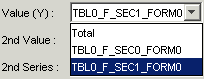
Chart Mapping with Section Data
To make the aggregation easier to recognize, you can use Custom IDs. For more information on using Custom IDs, see Section 1.8.2.1 - Using Column Field Data.
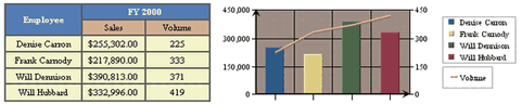
The resulting report looks like the following, notice that the chart plots the aggregation for each company. If you used the aggregation from Group Footer 0, the chart would have shown the aggregation for each region instead.
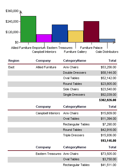
Report with Chart Using Section Data (East)
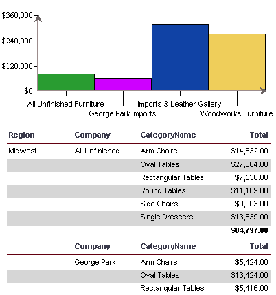
Since the chart is placed in Group Header 0, a new chart will be displayed for every region. The above image shows the chart for the East region only, but the report will contain charts corresponding to each of the other regions as well. Here is the chart for the Midwest region:
Report with Chart Using Section Data (Midwest)
Keep in mind that if you select the Include Section Data option, the data available to the chart will vary between sections, so moving the chart between sections is not recommended. If you must move the chart after it is made, make sure that the data mapped to the chart is also available from the location where you are moving the chart to.
Here is another example using Include Section Data. Suppose you had the following CrossTab report and you wanted to use the aggregation for each column as data points in your chart.
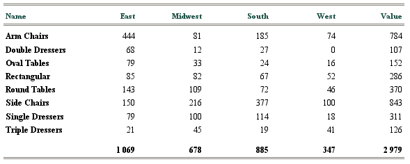
CrossTab Report with Group Aggregation
To make the aggregations easier to use later, give each group aggregation a Custom ID that match their column header. For example, give SUM(COL(1)) the ID SumEast, give SUM(COL(2)) SumMidwest, and so on. For more information on Custom IDs, see Section 1.8.2.1 - Using Column Field Data. Then insert the chart in the Table Footer Section using Report Data and Include Section Data.
Insert Chart in Table Footer
The formulas with custom IDs will be visible in the data source preview (if you selected the Include section data option).
Data source preview with section data
Since the data points are in different aggregations, you will need to use the transpose feature. To learn more about data transposition in charts, see the Section 3.4.1.1 - Data Transposition chapter.
In the data mapping window, select the Multi Selection option for the Category (X). This option allows you to select multiple columns for the category. Select all the formulas with custom IDs. The Value (Y) should be automatically set to Value.
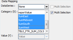
Chart Mapping for Transposed Data
Depending on the type of chart you select, the finished report might look like the following:
Report with Chart Using Section Data
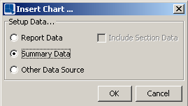
You can also insert summary charts into fixed-fields crosstab reports. A summary chart is a type of chart that is created from summarized data of a fixed-field crosstab report. For more information about fixed-field crosstab reports, please see Section 1.4.3.3 - Fixed-Field Crosstab Report.
When you are going to insert a chart into a fixed-field crosstab report, you will still have the option to use data from the current report or TO use an external data source. Otherwise, you will be given the chance to select a summary data source for your chart or you can import a chart file created before. Note that a summary chart can only be inserted into the Table Header/Footer sections, dependently on the Formula Position. For example, if you have created a fixed-field crosstab report with the formula position set to be drawn in the Header section, you can only insert a summary chart into the Table Header section. If you try to insert chart to other report sections, the summary data option will not be available in the Insert Chart dialog.
Insert Chart Dialog
For example, say we have the following data mapping for a fixed-field crosstab report:
Data Mapping
We selected Day as a row break field, Drink and timing as column break fields, quantity as a column break value field with an aggregation of Sum. We also chose the Formula Position to be drawn in the Table Footer section of the report, which means we have to insert the summary chart into the Table Footer section in which data will be summarized.
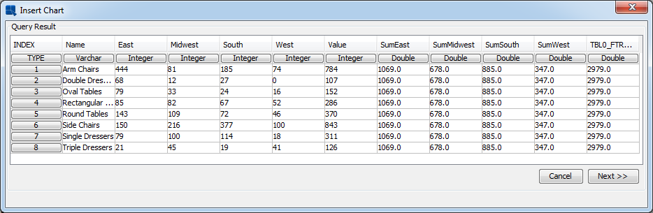
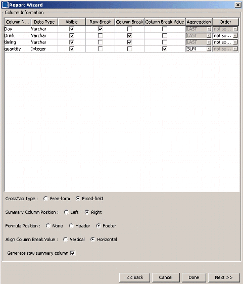
Inserting a summary chart into the table footer section and selecting the Summary Data as datasource in the Insert Chart dialog will show the following Query Result dialog. The dialog shows data that will be used for a summary chart.
Query Result
Depending on the type of chart and formatting you select, the finished report might look like the following:
Report Preview
Generally, when elements are inserted into a report section, they will repeat each time that the report section repeats. However, this does not apply when certain elements are inserted into the Table Data section. Charts, images, and sub-reports when inserted into the Table Data section, do not repeat for each row of data (labels, column fields, and formulas do). This allows you to design a report in a side-by-side configuration where you might have a chart or in sub-report placed next to a data table as pictured below.
Side-by-Side Data Table & Chart
Normally, when you insert a chart, image, or sub-report into a report section you will want to re-size the section so that the entire element fits within the section (otherwise it is truncated). This is not the case for charts, images, or sub-reports inserted into the Table Data section. In this situation, you will want to keep the section the same height as your column fields regardless of the size of the element you're placing in the section.
Side-By-Side Data Table & Chart (Designer)
You can size the element in the Table Data section, using the rulers, or by temporarily re-sizing the section to adjust the element size.
You can edit elements in one of four ways: by selecting Edit from the Format or Edit menu, clicking on the  button in the toolbar, right clicking on the element, and then selecting Edit from the pop-up menu, or by double clicking on the element.
- Editing Labels:
When you select the Edit option for a label a dialog box will appear prompting you to change the label text. Click on and the label will be changed.
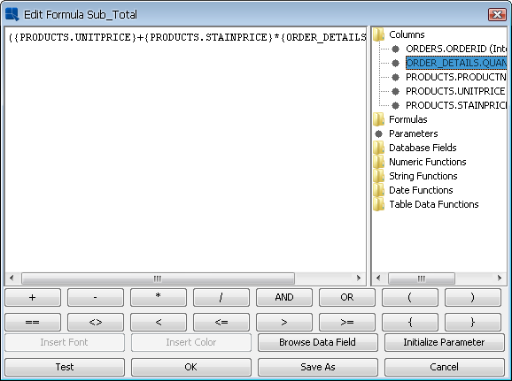
- Editing Formulas:
When you select the Edit option for a formula the Formula Builder will appear, prompting you to change the formula. Make any changes you would like, then click on OK, and the formula will be changed.
Note If you use the same formula in more than one place in the report, modifying the formula will change it everywhere. You can avoid this by clicking the button in the Formula Builder. This will allow you to specify a new name for the modified formula and modify it only for the particular element.
- Editing Charts:
When you select the Edit option for a chart the Chart Designer will open, allowing you to edit and format the chart.
- Editing Images:
When you select the Edit option for an image, a new window appears prompting you to select a new image, or directory URL. After selecting the new image, click on , and the new image will replace the old one.
- Editing Column Headers:
Column headers are a unique type of report element that are generated when you first create the report. By default, column headers are dynamic and will display the name of the column, even when the column changes (by changing data mapping, source, or applying a template). When you select to edit a column header, a dialog box will appear prompting you to change the text of the header.
Edit Column Header Dialog
When you edit the header, the new text will be displayed. However, the header will no longer be dynamic. You can return the header to displaying the (dynamic) column name by right clicking, and selecting Original Column Header from the pop-up menu.
You can also copy and paste cell attributes between report elements. This will apply all attributes including data formatting (assuming the data types are the same), alignment, font, color, and border attributes, as well as the bounds of a cell.
To copy the attributes of an element, right click on the element and select Element Appearance from the pop-up menu. This will expand in to two additional choices. Select Copy from the second menu. To apply the copied attributes to another cell, repeat the same steps as before and select Paste from the secondary menu.
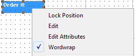
In addition to directly editing an element, you can directly access all of an element's attributes by right clicking on an element and selecting Edit Attributes from the pop-up menu. This will bring up a tabbed dialog that allows you to set a number of properties for the element at once.
Multi-Attribute Editing Dialog
The options will vary depending on what type of element you select. For each tab in the dialog, you can set the option that you would like and then click the button to set the changes for that attribute.
By default, any text within report elements, including labels, formulas, and columns will wrap to the next line if the cell boundaries are not wide enough to fit the text. However, this behavior can be disabled. To set text wrapping, select an element and select → , or right click on an element and select the option from the pop-up menu. This will disable/enable text wrapping.
Word Wrapping Dialog
To disable word wrapping, un-check the option. Note that when word wrapping is disabled the entire contents of the cell will be printed regardless of the cell boundaries. This can overlap and obscure other report elements. Also, word wrapping cannot be disabled for rich text fields, and the rich text and Excel-based exports will still display the wrapped text.
As noted in Section 1.4.4 - Master & Details Report of this guide, you can specify a side-by-side layout for master & details reports. This will print the master field (group header) next to the details section (table data), rather than its traditional position above the details section. When you select this report format, the master section will appear as a gray rectangle next to the column fields within the table data section of the report.
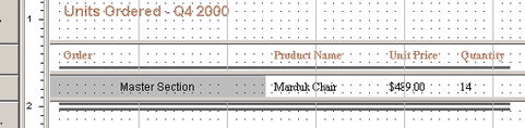
Side-by-Side Master & Details
The master section can be moved in free-form like any other report element. You can edit the contents of the master field in one of three ways: by selecting it and clicking the button on the toolbar, by right clicking it and selecting Edit from the pop-up menu, or by double clicking it. The master section will then open in a new window, allowing you to modify its contents.
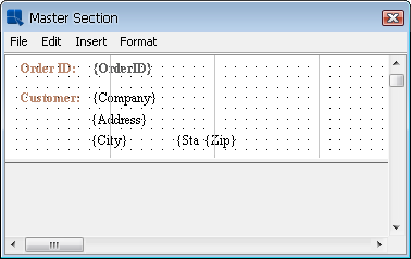
Edit Master Section Dialog
The elements in this section can be moved, resized, and edited in the same manner as other elements in the report. The master section acts the same as a group header section. It repeats for each unique value in the primary key column. After you have finished editing the contents of the master section, it can be closed by selecting Close from the File menu.
| Note |
|---|---|
After you finish editing the master section, it will automatically resize to fit its contents. |
You can change the output of formulas and column fields in one of two ways: by selecting Data Format from the Format menu, or by right clicking on a formula or column field and selecting Edit Attributes from the pop-up menu. When you select the format option, a dialog box will appear (or the format tab of the multi-attribute editing dialog). The box that appears is dependent on what type of data is present in the selected element: numeric, string, date/time, or logical/Boolean.
- Formatting Numeric Data:
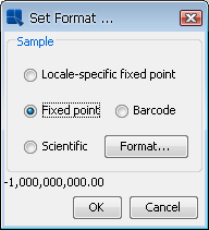
The dialog box for numeric data contains four primary options for the data: locale specific fixed point, fixed point, bar code, and scientific. You can select the option you want and then click on format for additional options.
Numeric Format Dialog
- Locale Specific Fixed Point:
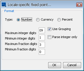
This will vary the format of the data depending on the locale in which it is being viewed. Additional formatting for this option allows you to specify whether the data should be displayed as a number, currency, or as a percentage. In addition, you can set the maximum and minimum number of integer digits and fraction digits. Other display attributes will vary depending on locale.
Locale-Specific Formatting
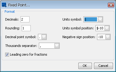
- Fixed Point:
This will keep the data format consistent, regardless of locale. Additional formatting for this option allows you to set the number of decimals, the digit number to round to, unit symbols, negative signs, decimal and thousands separator, and specify leading zeroes for fractions.
Fixed Point Formatting
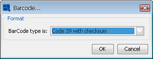
- Bar Code:
This will convert the data into a bar code. Additional formatting for this option allows you to select the symbology to use for the bar code. Supported symbologies are Code 39 with/without checksum, Interleave 2 of 5, UPC A, EAN 13, EAN 128, Standard 2 of 5 with/without check digit, Code 128, Code 128A, Code 128B, Code 128C, USD 3 with/without checksum, Code 3 of 9 with/without checksum, Global Trade Item Number, Random Weight UPCA, SCC 14 Shipping Code, Shipment Identification Number, SSCC 18, and US Postal Service.
Bar Code Formatting
- Scientific:
This will display the data in scientific notation. Additional formatting for this option allows you to set the number of decimals.
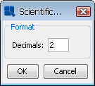
Scientific Formatting
After you finish selecting additional options, click on to return to the main dialog box. Click on and the data format will be changed.
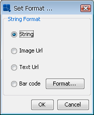
- Formatting String Data:
The dialog box for string data contains four primary options: string, image URL, text URL, and bar code. You can select the option you want and in the case of string or bar code, click for additional options.
String Data Format
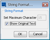
- String:
This dialog allows you to format the appearance of the string. The checkbox labeled Show Original Text controls whether the complete string for each data entry will be displayed. If you un-check it, you can then specify the maximum number of characters to be displayed. Click on to return to the previous dialog.
String Formatting
- Image URL:
This will convert the string into an image. This is used in situations where instead of storing an image as an object in a database (BLOB) you have stored URLs that point to image files on a server. Selecting this option will read the URL and retrieve the images to be placed in the report.
- Text URL:
This will convert the string into a large text object. This is used in situations where instead of storing a large text file as an object in a database (CLOB) you have stored URLs that point to files on a server. Selecting this option will read the URL and retrieve the text files to be placed in the report.
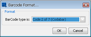
- Bar Code:
This will convert the data into a bar code. Additional formatting for this option allows you to select the symbology to use for the bar code. Available symbologies for string data are Code 2 of 7 (Codabar), Codabar, EAN 128, Code 128, Code 128A, Code 128B, Code 128C, Global Trade Item Number, Monarch, NW 7, SCC 14 Shipping Code, Shipment Identification Number, SSCC 18, US Postal Service, and USD 4.
Bar Code Formatting
Note Codabar will not accept start/stop characters in the data. If the input data is incorrect, the bar code may not be readable.
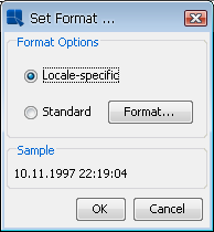
- Formatting Date/Time Data:
The dialog box for date/time data contains two primary options for the data: locale-specific and standard. You can select the option you want and click on for additional options. The available additional options will vary depending on the nature of your data. Date, time, and timestamp data will bring up date, time, and date & time options respectively.
Date/Time Data Format
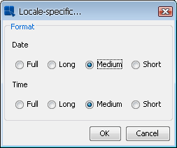
- Locale Specific:
This will vary the format of the data depending on the locale in which it is being viewed. Additional formatting for this option allows you to select full, long, medium, or short notations for date and time information. Other display attributes will vary depending on locale.
Locale-Specific Formatting
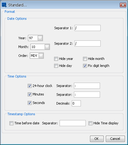
- Standard:
This will keep the data format consistent, regardless of locale. Additional formatting for this option allows you to select year, and month displays, as well as the order in which month day and year information is presented. You can also select the characters to be used as separators. Time options allow you to display hours, minutes, and/or seconds, and select the separators between them. For timestamp data, you can select to display the time before or after the date and the separator to be used between them.
Standard Formatting
After you finish selecting additional options, click on to return to the main dialog box. Click on and the data format will be changed.
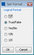
- Formatting Logical Data:
The dialog box for Logical or Boolean data contains five options for displaying the data. They are: T/F, True/False, Yes/No, Y/N, and 1/0. Select the format you would like to use and then click on to change the data format.
Boolean Data Format
By default null data will display in a report as Null. You can change the appearance of null data by selecting Null Data Handler from the Option menu. This will bring up a dialog, prompting you to specify a string to be displayed for nulls.
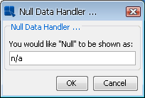
Null Data Handler
Enter the value that you would like, and click . All the null values in the report will display as the value you specified.
You can format the appearance of lines and rectangles in the report by right clicking on a line or rectangle element. The pop-up menu will contain a list of available options.
- Lines:
There are three formatting options for lines. 'Line Color' allows you to select the color of the line. 'Set Bounds' allows you to specify the length, and width of the line, as well as the X and Y coordinates of its origin. 'Line Style' allows you to select the style of line either solid, dotted, or double. In addition, you can set the width of horizontal lines to match the aggregate width of columns in the report. This feature is useful for crosstab reports where the number of columns can vary and also for user-defined report styles.
Bounds Dialog for Horizontal Lines
Note For vertical lines, setting the length as
-1will cause the line to be the same height as the section in which it is placed.- Rectangles:
There are four formatting options for grid rectangles. Border allows you to set the border width and color for the grid rectangle. Background allows you to set a background color for the fill area of the rectangle. Set Bounds allows you to specify the width and height of the grid rectangle, the X and Y coordinates of its origin, as well as the degree of rounding for the corners. Border Style allows you to select the line style of the border, either solid, dotted, or double.
This option allows you to specify the attributes for charts exported to DHTML. You can format the chart export properties by selecting Chart Export Format from the Format menu or by right clicking on a chart and selecting Export Format from the pop-up menu. When you select this option a dialog box will appear. You can select GIF, PNG, JPEG, or FLASH for the image type and set some options for each type. For GIF images you can set the background to be transparent. For PNG images you can set the compression. For JPEG images you can set the quality (Image quality is directly proportional to file size). For FLASH images, you can enable animation and set the frame count and frame rate.
You can also specify to create an image map when the report is exported. If you create an image map, the hyperlinks defined in the chart will be active when the report is exported. If no hyperlinks are defined then the map will contain display pop-up labels for the chart containing data point information. Note that FLASH images do not support image maps.
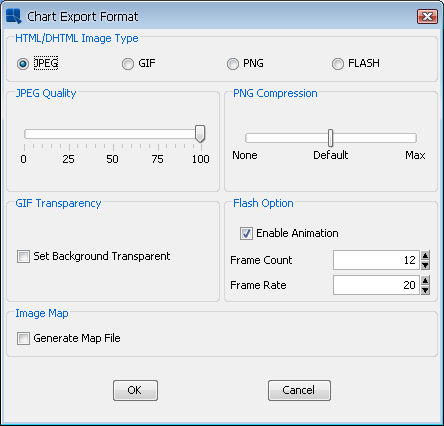
Chart Export Format
You can change the appearance of report elements by changing the font, color, and border properties.
- Font Style and Size:
The font style and size can be adjusted for labels, formulas, and column fields in one of three ways. You can directly modify the font style and size using the options in the Report Designer toolbar. In addition, you can also select Font Style and Size from the Format menu or right click on a report element and select Edit Attributes from the pop-up menu. The latter two options will invoke a separate dialog prompting you to select the font style and font size or in the attribute editing dialog, where font options can be set in the 'Font Style and Size' tab.
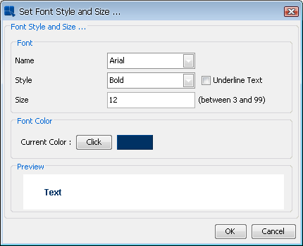
Font Style and Size Dialog
Note You can use any fonts from the system when designing a report. However, those fonts may no longer be present when you move reports between platforms. Also you will have to explicitly map font files (.ttf) to font styles when exporting a report to PDF. For more on this, please see Section 1.7.2.1 - PDF Font Mapping.
- Alignment:
The alignment for labels, formulas and column fields can be adjusted in one of three ways. You can directly adjust the horizontal alignment for an element by selecting the option(s) from the toolbar. You can also select Alignment from the Format menu, or right click on the element and select Edit Attributes from the pop-up menu. The latter two options also allow you to select vertical as well as horizontal alignment for the element text.
- Font Color:
The font color can be adjusted for labels, formulas, and column fields in one of three ways: by selecting Font Style And Size from the Format menu, by clicking the
 Font Style And Size button on the tool bar, or by right clicking on the element and selecting Edit Attributes from the pop-up menu. Selecting this option will bring up a dialog box (or the multi-attribute editing dialog where options can be set in the Font Style And Size tab). To change the font color, click on the button next to the Current Color: field. The Set Font Color dialog will appear allowing you to select font color from swatches. You can also enter the HSB, HEX, or RGB values.
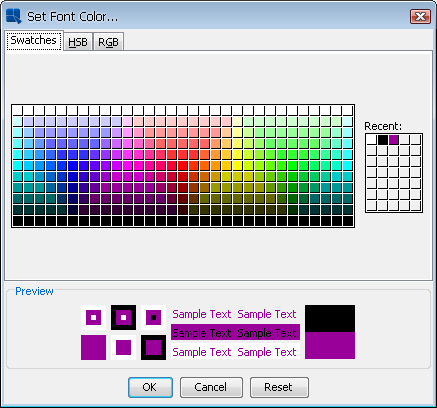
Font Color Dialog
- Background Color:
The background color can be adjusted for labels, formulas, and column fields in one of three ways: by selecting Background Color from the Format menu, by clicking the
 button on the tool bar, or by right clicking on the element and selecting Edit Attributes from the pop-up menu. Selecting this option will bring up a dialog box (or the multi-attribute editing dialog where options can be set in the Background Color tab) prompting you to specify whether or not to set the background transparent. If you do not want a transparent background, uncheck the checkbox and click the button. This will bring up a dialog prompting you to specify the background color. You can select font color from swatches, or enter the HSB or RGB values. You can also directly enter a HEX color value to the Hex # field.
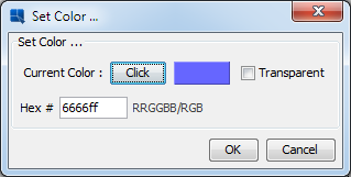
Background Color Dialog
- Dual Colors:
You can specify alternating color for labels, formulas, or column fields that are in the data table section of the report in one of three ways: by selecting Dual Colors from the Format menu, by clicking the
 button on the toolbar, or by right clicking on the element and selecting Edit Attributes from the pop-up menu. Selecting this option will bring up a dialog box (or the multi-attribute editing dialog where options can be set in the Dual Colors tab), allowing you to specify the number of rows between alternating colors. Instead of specifying alternate row numbers, you can also set dual colors to change on the row break (for summary break or crosstab reports) or as a particular column value changes. Using this feature, you can set the cell attributes to change when you reach a new group in a summary break report.
For alternate rows you can set the background color, the font color, as well as the font style and size. Set the primary attributes as you would for any other report element.
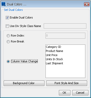
Dual Colors Dialog
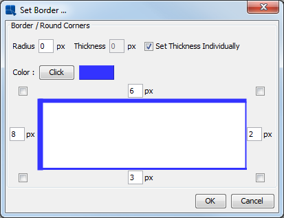
- Border:
You can specify the thickness and color of the border to be drawn around any report element in one of three ways: by selecting Borders from the Format menu, by selecting the
 button on the toolbar, or by right clicking on the element and selecting Edit Attributes from the pop-up menu. Selecting this option will bring up a dialog box (or the multi-attribute editing dialog where options can be set in the Border/Round Corners tab) prompting you to enter the border thickness in pixels and to choose a color. Entering
 0as the border thickness value will remove a border.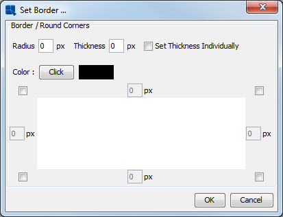
Border Dialog
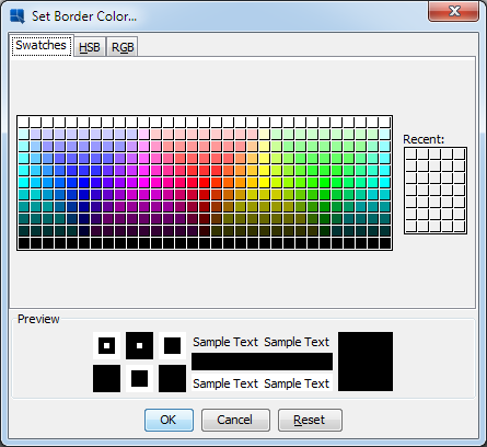
To change the border color, click on the button next to the Current Color: field. The Set Border Color dialog will appear allowing you to select border color from swatches. You can also enter the HSB, HEX, or RGB values.
Border Color Dialog
To set the border thickness of the each side of the report element check the Set Thickness Individually option. Then type the thickness (in pixels) in the text fields near the sides of the rectangle represents a selected element.
Border / Individual Thickness
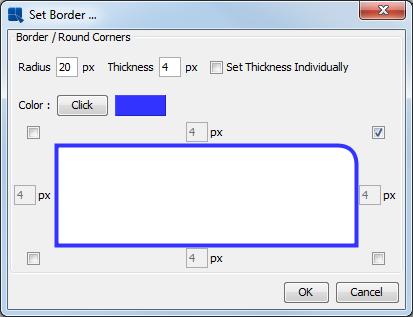
To set round corners to an element, the elements needs to have either non-transparent background color or a visible border. Otherwise, you would not see any changes. There are four checkboxes near the corners and each checkbox represents an element corner. To make a corner round, check its checkbox (you can also select several corners at once). Then type a radius (in pixels) in the Radius text field.
Border / Round Corners Dialog
Note If you plan on exporting reports with round corners, please note that round corners are available for DHTML and PDF export formats only.
Sometimes you may want to show the boundaries or borders of report elements in the Design window, without actually turning on the borders. This is especially important if you have blank place-holder cells or columns where the first record is empty. To turn on the cell boundaries, select Show Cell Outline from the Option menu. This will draw a gray dotted border around each report element in the Design window.
One of the common reporting needs is the ability to create form letters or other blocks of formatted text to a report and merge in data fields and functions. This functionality is available using rich text fields. Rich text fields, unlike labels or string function fields, allow for complex paragraph, font, and color formatting within the cell. They also allow the ability to embed column fields and functions directly in the text flow.
To add a rich text field to a report, select Insert Rich Text Field from the Insert menu, or click the  Rich Text Field button on the toolbar. After you have selected this option, a small box will follow your mouse pointer around the design window. Position the box where you would like to insert the field, and click. A new window will open, allowing you to enter the rich text field.
Rich Text Editor
The rich text editor works like a small word processor. The first drop-down box allows you to select the font and the font size. The three buttons allow you to specify bold, italic, or underlined text. The next drop-down-box allows you to specify font color. The last one allows you to select function or column field formats.
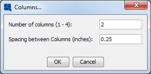
You can specify a columnar layout for the text by selecting Columns from the Option menu. This will bring up a dialog allowing you to specify the number of columns for the rich text field, as well as the spacing between the columns.
Rich Text Column Options Dialog
You can add in-line images to the text flow in rich text fields as well. To add an image, select Insert Image from the File menu. This will bring up a dialog prompting you to specify the image file that you would like to import. After you have specified the file that you would like to import, a new dialog will open, allowing you to specify the size for the in-line image in pixels. After you set the size, click and the image will be added to the rich text field.
You can import any rich text file (.rtf format) into a rich text field. To do this select Import from the File menu in the editor. This will bring up a dialog prompting you to specify the file you would like to import.
| Note |
|---|---|
Certain paragraph settings will be lost when you import a rich text file. |
You can add any formula directly into the text flow in a rich text field. It is also possible to add column fields and parameter values. To insert a formula, column field or a parameter value, click on the Insert menu, select a category (column, formula or parameter), and choose an item from the list of all available fields/parameters/formulas. The following syntax will be added into the text: <% formula name/parameter name/column field name %>.
The → list contains all formulas from the report. You can also create a custom formula directly in the rich text. To do so, simply type the <%Formula Syntax%> syntax (replace the Formula Syntax by the actual formula syntax). For more information about formula syntax, please see Section 1.8 - Using Formulas & the Formula Builder. This approach is recommended for simple formulas only. If you want to insert a more complex formula, you can create it in the report using the Formula Builder and then add it to the rich text field by selecting it from the → menu. See Section 1.8 - Using Formulas & the Formula Builder chapter to learn how to create formulas in the Formula Builder.
To format formulas and column fields, you must first pre-define a format. To do this select New from the editor Format menu and select the data type for which you would like to create a format. This will bring up the formatting dialog for that data type, allowing you to define the format. After you close the formatting dialog, you will be prompted to specify a name for the formatting. For example, you could define a format called Currency that uses locale-specific currency formatting for numbers.
To apply a pre-defined format of a formula, select the formula and then select the format that you would like to apply from the drop-down box on the right-hand side of the rich text editor.
You can apply a hyperlink to any report element except column fields. To apply a hyperlink to an element, select it and then select HyperLink from the Format menu or right click on the element and select HyperLink from the pop-up menu. A dialog box will then pop-up asking you to enter the link, hint, and target. You can enter any URL as the link or another .pak file. The hint will display text in a hint box on mouse over when the report is viewed.
If you are running EspressReport in stand-alone mode, then hyperlinks to URLs will not work from the Preview window. If you export to DHTML or PDF, links to .pak files will no longer work.
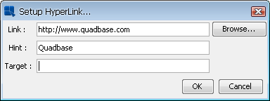
Hyperlink Dialog
You can also apply dynamic hyperlinks to report elements, including column fields, by using cell scripting. For more about cell scripting, please see Section 1.9 - Scripting.
This feature is useful for reports that have few or narrow columns of data that are longer than one page. Rather than have the data take up only a portion of the page width and extend over multiple pages in length, you can 'wrap' the columns so that they will continue to the right of the original columns on the first page of the report.
For example, say you have the following report listing product names, and the number of units ordered:
| Product Name | Units Ordered |
|---|---|
| Adad Chair | 4 |
| Addad Dresser | 5 |
| Amon Table | 2 |
| An Chair | 5 |
| Anahita Dresser | 3 |
| Anubis Table | 7 |
| Apep Table | 10 |
| Apsu Dresser | 3 |
| Asherat Dresser | 2 |
| Atun Table | 4 |
| Bast Table | 4 |
| Bes Table | 3 |
| Cula Chair | 10 |
| Enki Chair | 12 |
| Enlil Chair | 7 |
| ... | ... |
| ... | ... |
Assuming this report is long enough to encompass multiple pages, it is ideal to use column wrapping because it uses fewer pages and fills the blank space in the page width. The report would look the following with column wrapping:
| Product Name | Units Ordered | Product Name | Units Ordered |
|---|---|---|---|
| Adad Chair | 4 | Bast Table | 4 |
| Addad Dresser | 5 | Bes Table | 3 |
| Amon Table | 2 | Cula Chair | 10 |
| An Chair | 5 | Enki Chair | 12 |
| Anahita Dresser | 3 | Enlil Chair | 7 |
| Anubis Table | 7 | ... | ... |
| Apep Table | 10 | ... | ... |
| Apsu Dresser | 3 | ||
| Asherat Dresser | 2 | ||
| Atun Table | 4 |
Column wrapping is available for simple columnar and summary break report types. To implement column wrapping, select Column Wrap from the Format menu. A gray vertical bar will be drawn across the middle of the Design window indicating the column wrapping placement.
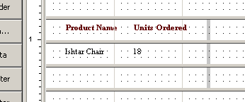
Column Wrapping in Design Window
Column wrapping begins immediately to the right of the bar, so be sure to allow adequate space. Also, anything to the right of the column wrap bar will be truncated.
You can edit the column wrap properties by first selecting the column wrap bar and then selecting Column Wrap from the Format menu. You can also right click on the column wrap bar and then select Column Wrap from the pop-up menu. A dialog box will then appear allowing you to edit the properties of the column wrapping.
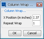
Column Wrapping Options
From this dialog you can specify the X position of the column wrapping, as well as the number of times you would like the columns to wrap in the page. The X position is the distance (in inches or centimeters) from the right hand side of the page, where column wrapping is to begin. By default, column wrapping occurs once. Setting Repeat Wrap to -1 will cause the wrapping to occur as many times as can fit within the page width.
| Note |
|---|---|
You can not specify column wrapping to occur more times than can fit within the page width. For example, if you specify three times, and the resultant report would be wider than the page, it will only repeat the wrapping twice. |
EspressReport has the ability to generate a table of contents for your report. The table of contents can either show the defined groups in the report, or a list of user-defined bookmarks. The TOC will display in Report Viewer, Page Viewer, DHTML, and PDF exports.
To add a table of contents to a report, select Insert Table of Contents from the Insert menu. Your cursor will turn into a cross. Click to place the table of contents in either the Report Header or Table Header sections. You can not add it to any other section. A dialog will open asking you if you would like to use groups or bookmarks for the table of contents.
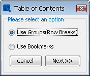
TOC Type Dialog
If you select to use groups the table of contents will generate an entry for each group (and sub-group) in the report. In order to use this option, your report must contain grouped data (i.e. summary break, crosstab, master & details reports) with detail records. A crosstab report with one row break or a summary break report with column aggregation may be grouped, but because there are no detail records you cannot create a table of contents for this presentation. If you select to use bookmarks, a one-level table of contents will be generated for each bookmark that is defined in the report. Bookmarks are defined using cell scripts. For more information about setting bookmarks, please see Section 1.9.2.1 - Formatting Actions.
The next dialog that appears allows you to specify options for the table of contents.
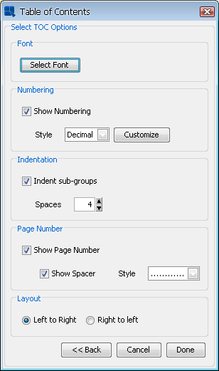
TOC Options Dialog
The first option in this dialog allows you to set the font for each level of the table of contents. When you click the button, a new dialog will open that allows you to specify font options.
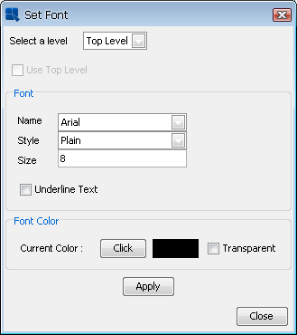
TOC Font Dialog
For each level you can set the font face, style, size, and color. Note that a level corresponds with a level of nested grouping in the report. If you have selected to create a report with bookmarks, only the top level will be available. Sub-levels can inherit the font from the parent level. After you have made changes for the font for a particular level, click the button to save the changes.
The next option allows you to select whether to show numbering for the table of contents and the style to use. You can customize some options for each style by clicking the button. The following styles are supported:
- Decimal:
This will use a numbered configuration for the table of contents entries with whole numbers for the outermost group and decimals for each sub-group. If you click the 'Customize' button for this option, the following dialog will appear:
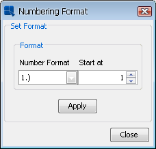
Customization Options for TOC Decimal Format
The first drop-down list allows you to select how the number should be formatted. The second option allows you to select the starting number. Once you have made your choices, click to apply the changes.
- Outline:
This will use an outline format allowing you to select numbers, letters, or Roman numerals for each level of the table of contents. If you click the 'Customize' button for this option, the following dialog will appear:
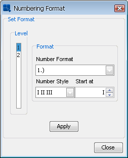
Customization options for TOC Outline Format
The list on the left-hand side allows you to select the level for which you would like to apply formatting. The first drop-down allows you to select the number format (this will apply whether you select numbers letters or Roman numerals for the level). The second drop-down allows you to pick the format for that level either numbers, capital letters, lower-case letters, capital Roman numerals, or lower-case Roman numerals. The last option allow you to select the starting point for the selected style. Once you have made your choices, click to apply the changes.
- Bulleted:
This will use bullets for each entry. There are now additional customization options for this format.
The next option allows you to specify indentation for sub-groups. You can turn on/off the indentation and specify the number of spaces to use.
The next option allows you to specify whether to show the page number in the table of contents and whether to draw a spacer to the page number. You can draw a dotted line or a solid line for the spacer.
The last option in the dialog allows you to set the layout for the table of contents, either right to left, or left to right. Once you have finished setting options for the table of contents, click and it will be added to the report.
In the report, the table of contents will appear as a small grey rectangle. By default, the resize to fit content option will be turned on, but the width of the table of contents will be based on whatever size you allot for it in the section. Generally, you want to make this at least as wide as your report.
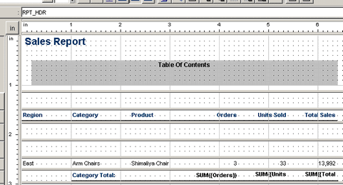
TOC in Design Window
You can see the complete table of contents when you preview the report. The table of contents is only supported for the DHTML and PDF exports. It will not appear if you export the report to other formats.
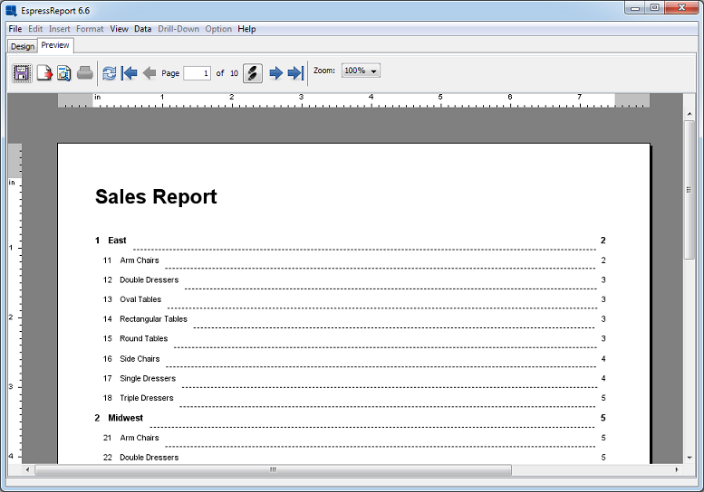
TOC in Preview Window
There are several ways to move and re-size report elements. You can use the rulers, the mouse, or you can manually enter the element bounds.
- Rulers:
You can re-size and move elements using the rulers located at the top and left-hand sides of the Design window. When you select a report element by clicking on it with the mouse, a shaded area will appear on each ruler, marking the elements horizontal and vertical bounds.
On the ruler at the top of the Design window, clicking and dragging the left-hand marker will move the element horizontally. Clicking and dragging the right-hand marker will stretch the element horizontally.
On the ruler at the left-hand side of the Design window, clicking and dragging the top marker will move the element vertically. Clicking and dragging the bottom marker will stretch the element vertically.
- Mouse:
You can re-size and move elements using the mouse. To move an element, simply click and drag it. To re-size an element, click and drag on any of the sizing handles that appear around the edge of an object when it is selected. You can also right click and drag within the cell to re-size it.
- Manually Set Bounds:
You can manually set the bounds for any report element by selecting Bounds from the Format menu. A dialog box will appear prompting you to enter the new element bounds. The measurements will be in inches or centimeters depending on which unit is selected with the toggle button at the upper left-hand corner of the designer window where the rulers meet. The X and Y coordinates are for each specific report section. The point that marks an element's X and Y position in the upper left-hand corner of the element.
From the same dialog, you can also set round corners for the selected element. To learn more about round corners, please see Section 1.5.7.6 - Font, Color, and Border Options
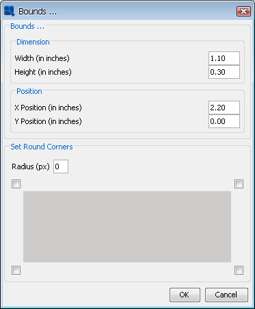
Set Bounds Dialog
- Resizing To Fit Contents:
Often, you may have a column field that contains data of varying length. In this case the data may be truncated, or there may be a great deal of blank space within the cell when the field is short. To alleviate this problem, you can set the element to resize its height dynamically to encompass its contents. To do this, first select the cell that you would like to resize, and then select → . The element will then dynamically resize to fit its content. Note that only the height of the cell will resize. The width will remain the same.
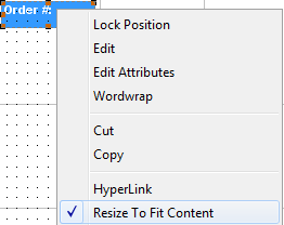
Dynamic Resize Dialog
You can also invoke the section option called Resize Cells Proportionally to cause all of the other cells in the section to adjust their height with the resized cell. For more about section options, please see Section 1.5.3 - Section Options.
- Group Move/Resize:
You can move or resize a group of elements by first selecting the elements. Multiple elements in a report can be selected by drawing a selection box around them or by selecting them using CTRL+Click. You can draw a selection box by selecting Selection Box from the Edit menu, clicking the button on the toolbar, or by clicking and dragging on empty space in a report section. Once the elements have been selected, click and drag on any element in the group to move that group. Click and drag on one of the re-sizing handles to adjust the size of elements in the group.
- Group Alignment:
You can align a group of elements to the left-hand side, right-hand side, top, or bottom of a group. Select a group of elements and then right click. The Group Edit dialog box will appear giving you the option to align the group. Select Group Left Alignment, Group Right Alignment, Group Top Alignment, or Group Bottom Alignment and click . All of the elements in the group will snap to the left, top, or bottom edge of the group. You can also select the center Across Page option. This will take the selected group of cells and center them in the page.
Group Options/Alignment Pop-up Dialog
- Moving Elements Between Sections:
You can move a single element or group of elements between report sections, by dragging them over the section boundaries. Note that elements cannot be dragged into the Table Data section.
- Column Swap:
You can swap the position of two elements within a report section. This is primarily used to rearrange the position of column fields in the report. To swap two elements, select the elements using CTRL+Click or the selection box and then select Swap Columns from the Format menu. The positions of the two elements will be switched and the surrounding elements will be moved to accommodate the swap.
- Rotate:
Text elements like labels, formulas,column headers, and column fields can be rotated 90 degrees clockwise or counter-clockwise. There are two ways to rotate elements. The first way to rotate an element is to right click on it, then move the mouse pointer over the Rotation option. A sub-menu should pop-up containing three options - None, Clockwise and CounterClockwise. The second way to rotate an element is to select the element and then choose the Rotation option from the Format menu.
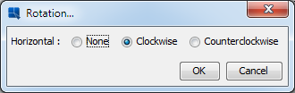
Rotation dialog
Note Text rotation is available for DHTML, PDF, XSLX, and XLS export formats only.
In EspressReport, each element in a report has an associated Z index. This Z index number determines how elements behave when placed in the same space (on top of each other). When elements are placed in the same space, the element with the highest Z index will appear on top, and subsequent elements with the lower Z indexs will be drawn successively below each other. To set the Z index for a report element, right click on the element and select Set Z-Index from the pop-up menu. This will bring up a dialog allowing you to specify a number for the index of that element.
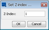
Z Index Dialog
| Note |
|---|---|
Certain export formats that require a tabular layout, like HTML and Excel, may not appear correctly if the report has elements that overlap each other. |
In Report Designer, you can lock a cell position by right clicking on the element and selecting Lock Position from the pop-up menu. When this feature is enabled, the report element cannot be moved either with the mouse, the rulers, or with any of the group formatting or alignment features. The element can only be moved after the lock position option is turned off.
By default, Report Designer operates in Snap to Grid mode. This forces report elements to move only in set increments. The grid layout is represented by small dots drawn in the Design window. By default, the grid step size is 0.1 in or 0.25 cm (depending on which measurement is selected)
To modify any of the snap to grid options, select Snap To Grid from the Option menu. A dialog will open allowing you to set grid properties.
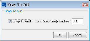
Snap To Grid Options
In this dialog, you can select to change the grid step size or disable the snap to grid feature. If you disable snap to grid, the report elements can be moved in free-form around the Design window.
Shift mode is toggled on and off by selecting Shift On/Off from the Option menu. When shift mode is enabled, report elements will move to accommodate changes in other report elements. Hence, if you resize the width of one report element from 1" to 2", then the elements next to the current element will shift to the right. If shift mode is not selected, other report elements will not move, even if the resized element ends up overlapping another.
| Note |
|---|---|
Shift mode works best if you are only resizing elements or moving them only a small amount. If you move elements a pronounced distance with shift mode enabled, it will displace the other report elements a pronounced distance as well, giving the report an odd appearance. |
Another way to position and move groups of elements is to use guidelines. Guidelines allow you to place arbitrary position lines within the Design window and snap report elements to those lines. Guidelines allow you to precisely line up and position the report elements without worrying about performing precise movements.
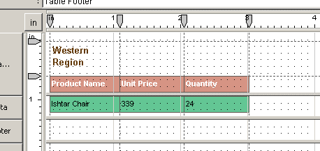
Elements Positioned with Guidelines
You can insert both horizontal and vertical guidelines by selecting Insert Guideline from the Insert menu. This option will open a sub-menu, prompting you to select whether you would like a vertical or horizontal guideline. After you select which option you would like, click in the design panel where you would like the guideline to be drawn. The guideline will appear as a dotted line with a marker in the upper or left-hand ruler. You can move the guideline by clicking and dragging the marker in the ruler.
You can remove any guideline from a report by right clicking on the guideline (or the guideline marker in the ruler) and selecting Delete from the pop-up menu.
| Note |
|---|---|
Horizontal guidelines cannot be moved between report sections. If you wish to move your guideline to a new report section, you will need to insert a new guideline. |
There are two ways in which objects can be snapped to guidelines. The first option is to snap all the elements that are near the guideline. To do this, right click on the guideline (or the guideline marker in the ruler) and select Snap Elements in Range. You can then further select to snap the cells left edge, right edge, or center. This will snap all the cells that are up to 0.1 inches away from the guideline.
The other option is to selectively snap elements to guidelines. To do this, first select the elements you would like to snap to the guideline using CTRL+Click (you can select only one element, but you must use CTRL+Click to select it), then right click on the guideline (or the guideline marker in the ruler) to which you would like to snap it. For both horizontal and vertical guidelines, you can specify to snap the cell's left edge, right edge, or center to the guideline. Select the option you would like from the pop-up menu and the cell(s) will snap to the guideline.
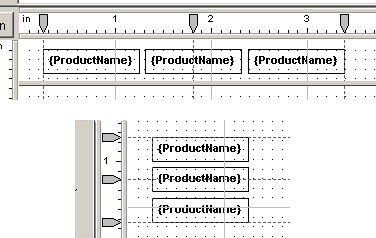
Guideline Positioning Options
Once an element is attached to a guideline, moving the guideline will cause the element to move as well. You can also snap an element to multiple guidelines. Snapping an element to two guidelines, will cause it to stretch to fit.
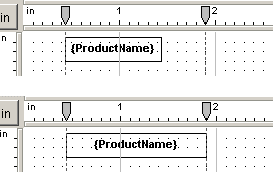
Element Snapped to Two Guidelines
When you have an element attached to two guidelines, moving either guideline will cause the element to resize (either stretch or shrink).
To release an element from a guideline, right click on the element and select Separate From Guidelines from the pop-up menu. This will release the element from any guidelines to which it is attached. You can also release all of the elements attached to a guideline by right clicking on the guideline (or the guideline marker in the ruler) and selecting Separate All from the pop-up menu.
In addition to the main Design window, EspressReport provides another interface to select and edit the elements in a report, the Report Explorer. The Report Explorer presents all of the elements in the report using a tree structure that is shown in the left-hand side of the Designer. The Explorer can be turned on and off by selecting Report Explorer from the Option menu.
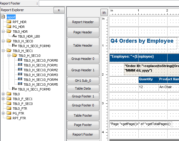
Report Explorer Window
Each parent node in the tree represents a section in the report. Inside each section, an icon indicates the element type and the element ID is displayed. If you have specified a custom ID for the element, it will display instead. For more information about custom IDs, see Section 1.8.2.1 - Using Column Field Data.
You can also edit report elements from within the Explorer. When you select an element in the tree, the element will also be selected in the Design window and the Design window will scroll to bring that element into view on the screen. You can then use the toolbars, menus, or pop-up menu to set any of the element properties. The pop-up menu can also be activated by right clicking on the element in the tree.
To this point you have seen how to edit and format the properties of individual report elements. Often, in the name of time and consistency, you will want to format many elements at once. To accomplish this, you can use global formatting, group formatting, and templates.
The global formatting feature allows you to give all of the elements in your report a consistent look and feel. To set the global formats, select Global Format from the Option menu. This will bring up a second menu with each of the different report element types listed: chart, column, formula, image, label, line, grid, and column header. Selecting one of these will bring up a tabbed dialog box prompting you to set the formats for those elements. Each tab contains formatting options for an element attribute. The formatting options are as follows:
- Chart:
border color, border thickness, set bounds.
- Column:
data format, font style and size, font color, background color, border color, border thickness, dual colors, set bounds, alignment, script.
- Formula:
data format, font color, font style and size, background color, border color, border thickness, set bounds, alignment, script.
- Image:
border thickness, border color, set bounds.
- Label:
font color, font style and size, background color, border color, border thickness, set bounds, alignment, script.
- Line:
line color, set bounds, set line style.
- Rectangle:
border color, set grid style, set bounds.
- Column Header:
font color, font style and size, background color, border color, border thickness, set bounds, alignment, script.
- Title:
font color, font style and size, background color, border color, border thickness, set bounds, alignment.
At the bottom of each tab is a checkbox marked Apply Property. Checking this box will apply the property to the global formats when you click OK. The box automatically becomes checked when you change a property. After you have made all of the property changes you would like, clicking will cause the properties you selected to change for all elements of that type in the report. It will also become the default attribute for any additional elements placed in the report.
| Note |
|---|---|
You have the option to insert images in the original size (default attribute). This is selected by using the checkbox marked Default Size in the Set Bounds tab of the image global format dialog. |
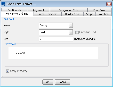
Global Format Dialog
You can pass global formats from one report to another using the Import/Export feature. You can export global formats by selecting the Export from the Global Format sub-menu. This will bring up a dialog box prompting you to specify a file name. The global formats will then be saved as an XML file. You can load a global format XML file by selecting the Import option from the Global Format sub-menu. This will bring up a dialog box prompting you to specify the XML file that you would like to import. Click on and the formats stored in the XML file will be applied to the current report.
Global formatting is very important when dealing with crosstab reports. Due to the nature of the report, the number of columns can increase or decrease depending on changes in the data, data source, or filtering criteria. When new columns are generated in a crosstab report they will take on whatever default formatting is specified. In order to control the appearance of new columns in a crosstab report, you will need to set the default formatting using global formats.
Global formatting is also important because it will control the intervals that new columns appear in the report. New columns will appear in intervals defined by the column width in the global formats. Therefore, if you set the default width to be inch, new columns in the crosstab report will appear at one inch intervals. Because of this, it is recommended that you maintain consistent widths for the data columns in a crosstab report. Setting different widths can result in unexpected behavior when new columns are added to the report.
To apply formatting to a group of elements, first, select a group of elements by either drawing a selection box around them or by using CTRL+Click. You can insert a selection box by either selecting Selection Box from the Edit menu, by clicking on the selection box button on the toolbar, or by clicking and dragging in an empty portion of a report section. You can also select a row or column of cells by right clicking on a cell and selecting the Select Column or Select Row option from the pop-up menu. If you want to move or resize the group, you must use one of these two options. If you merely want to format properties, then you can select multiple elements by pressing CTRL+Click.
Once you have selected the group, format the properties as you would for a single element. Formatting will only take effect on elements where it is applicable. For example, if you select four elements, two labels, a formula, and a chart, and then change the font size, it will have no effect on the chart.
The features and elements of any report (.rpt or .xml) file can be applied to another report. This is accomplished using the apply template feature. To apply a template to the current report select Apply Template from the File menu or click on the apply template button on the tool bar. A dialog box will appear prompting you to select the file that you would like to apply. When you apply a template, all of the elements and their respective formatting will be applied to the current report. Only the data source information is not carried over (this includes functions and scripts in the table data section of the report).
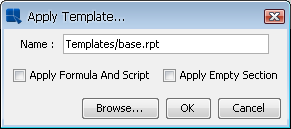
Apply Template Dialog
There are two additional options available in the dialog.
- Apply Formula and Scripts:
This will apply the formulaic columns and cell scripts from the template onto the report. By default, they do not apply. Note that formulas and scripts from the template may not work correctly if the data types of the columns in the new report are different from those in the template.
- Apply Empty Section:
This indicates whether or not to apply the blank sections from the template to the report. If you apply blank sections, they will overwrite sections in your report, essentially removing any elements you may have in the section. This option is generally used if you want to completely replicate the template that you are applying with the new report. If you do not apply blank sections then those sections in your report will not be overwritten. Only the sections in the template with elements in them will be applied to your new report. This feature can be used if you have a certain default layout (headers/footers) that you want to pass among a group of reports. You can define a template where only the page headers/footers have defined elements and apply those headers/footers to other reports by electing not to apply empty sections.
If you would like to have a report that merely has the same look and feel as another without replacing the labels, formulas, etc, you can accomplish this by using the global format import/export feature rather than applying a template.
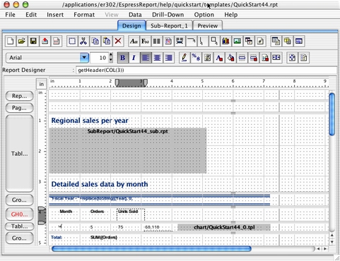
Report Designer in OS X
When running Report Designer in OS X most of the controls are the same as for Windows or Unix/Linux, with two exceptions:
- Multiple Select:
Instead of CTRL+Click to select multiple report elements or list box options, use Command+Click.
- right click:
To invoke pop-up menus, and re-size report elements, use CTRL+Click instead of right click when running in OS X.
EspressReport also works well with Apple's WebObjects® . For more details about developing and deploying using EspressReport in a WebObjects application, see Section 2.6 - Working with WebObjects.