Once you have completed all the steps in the Wizard, the main Chart Designer interface will appear. Here you can customize and modify the appearance of the chart by changing properties and adding new elements.
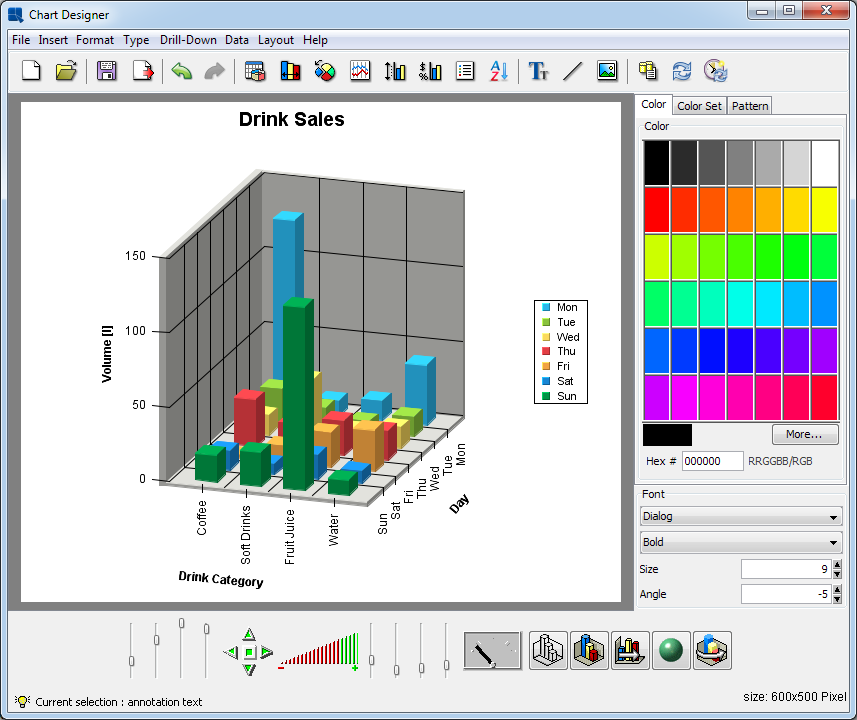
Chart Designer Interface
Most of Chart Designer's functions can be controlled from the menu bar at the top of the designer window. This section provides a brief overview of the avaliable options. All of the features here are discussed later in this chapter.
This menu performs the basic file operations including opening, closing, and saving files. Note that saving and opening options are not available when you use the report data as the data source for an embedded chart. For more information about file options, please see Section 3.16 - Saving & Exporting Charts.
- New:
This will return you to the Data Source Manager to begin creating a new chart. If you have not saved your current chart, you will be prompted to do so.
- Open:
This allows you to open a saved chart definition. Files that can be loaded by Chart Designer include
.cht,.tpl,.pac, and.xmlchart definition files.- Close:
This closes the current chart.
- Apply Template:
This option allows you to apply a template to the current chart. You can apply any chart template in either .tpl or .xml format. For more on working with chart templates, please see Section 3.16.2.1 - Working with Templates.
- Save:
This saves the current chart.
- Save As:
This allows you to save the current chart. You can save the chart as a
.cht, .pacor.tpl(a chart, a complete packed chart or a template file). Other options allow you to create an XML chart definition file or to create an HTML page that embeds the Chart Viewer applet.- Export:
This allows you to export the chart to a number of static image formats. The chart data can also be exported in text of XML format.
This menu allows you to add various elements to a chart.
- Titles:
This option allows you to automatically add titles for the chart. A main title can be specified as well as the titles for each of the axes. Unlike annotation text, titles will size and position automatically with the chart.
- Text:
This allows you to add text or annotation to a chart. Text can be added anywhere on the chart and can have a number of different formatting properties. Variables can be added to the text for run-time substitution. For more on adding text to charts, see Section 3.14.6.1 - Adding Text
- Background:
This allows you to select an image to use as the chart background. Background images can be tiled, centered, or stretched to fit the entire canvas.
- Link:
This allows you to add a hyperlink to a data point or a collection of data points in a chart. To use hyperlinks in a chart, you will need to export a map file along with the image.
- Line:
This allows you to add an arbitrary floating line to a chart. These lines can be placed anywhere and can be used to draw enclosed shapes as well. Floating lines are often used as pointers and can be generated with arrowheads.
- TrendLine:
This allows you to add a trend line to the chart. ChartDesigner allows you to draw many different types of trend lines including: linear, a polynomial of any degree, a power, exponential, logarithmic, a moving average, exponential moving average, triangular moving average, cubic B-spline, and a normal distribution curve.
- Horz/Vert Line:
This allows you to add a fixed horizontal or vertical line to a chart. You have the choice of adding a constant line (one that draws at a fixed value on the X or Y-axis) or a control line (draws lines based on a certain value range either average, minimum, maximum, or multiples of standard deviation).
- Control Area:
This allows you to draw a fixed area (either on the plot area of a 2D chart or on the face of a dial chart) to compare against the data values of the chart.
This menu allows edit and modify the properties of many different chart components.
Undo: | Cancels the last operation performed in the designer and reverts back to the previous state. The designer will remember the last 10 actions made. | ||||||||
Redo: | Reverses the action of the undo command. For example, if you change the font color from black to red, you can undo this command to change it back to black, and then redo this command to have it change to red again. | ||||||||
Data Properties: | This option allows you to control several options for how the data is displayed. You can control the thickness of columns/bars, how null data is displayed, whether to draw data top labels or not, as well as enable and select a color for negative top labels. | ||||||||
Histogram Options: | This allows you to specify whether to draw the chart as a histogram and presents additional options to specify the frequency count. | ||||||||
Aggregation Options: | This allows you to specify whether to aggregate the data before drawing the chart and presents additional options to specify type of aggregation. | ||||||||
Zoom Options | This allows you to enable/disable and set options for time based zooming. This option only applies if you have date/time data mapped to the category axis. | ||||||||
3D Display Options: | This allows you to set several options that control the display of 3D charts. You can specify an inline series for 3D column (or similar) charts, as well as specify rendering approximation for 3D scatter and surface charts. (This improves performance for charts with a lot of data points.) | ||||||||
Rendering Options: | This allows you to specify various rendering options for the chart for a better presentation. 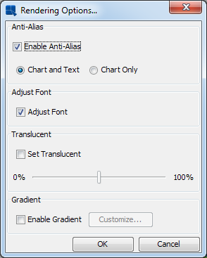 Rendering Options Dialog Among the options available are:
| ||||||||
Font Mapping: | This allows you to map system (true type) font files for the PDF export. For more information about this feature, please see Section 3.16.3.1 - PDF Font Mapping | ||||||||
Chart Options: | This brings up some specific options for the chart type that you are using. Options vary depending on chart type. | ||||||||
Axis Scale: | This allows you to adjust the scale for any value axes. Automatic (best fit) scaling is used by default. | ||||||||
Axis Elements: | This allows you to modify the appearance of the axes and axis labels. Options here include axis thickness, grid lines, label steps, and data formatting. | ||||||||
Canvas: | This allows you to adjust the background canvas size. You can also specify whether to use scroll bars when the canvas size exceeds the view port. | ||||||||
Data Border: | Add a border to data elements (columns, bars, etc).  Data Border Dialog If you select the Draw border option, the Border thickness, and the Border color fields will be enabled allowing you to configure the border properties. The Black border for white area option can be selected even when the Draw border is disabled. If you do so, a simple black border will be added only to white data elements.  Column chart with the “Black border for white area” enabled
| ||||||||
Legend: | This allows you to modify the display properties of the chart legend. | ||||||||
Lighting Model: | This allows you to modify some of the lighting options for three-dimensional charts. You can modify both the light ambient color and the intensity. | ||||||||
Line and Point: | This allows you to modify the display properties of any lines in a chart. For two-dimensional charts you can choose to display lines and points for any data set, as well as, customize their appearance. You can also use this menu item to modify the display properties for any trend, floating, or horizontal/vertical lines. | ||||||||
Plot Area: | This option allows you to cutomize the appearance of the area bounded by the X and Y axes for two-dimensional charts. | ||||||||
No Data To Plot Message: | This option allows you to set the message that appears if there is insufficient data to plot the chart. By default, the “No Data To Plot” message appears. | ||||||||
Flash Hintbox Customization: | This option allows you to specify the font properties as well as the border and background color for the hint box in the flash export. | ||||||||
NULL Data Properties: | This option allows you to show any category axis point that contains Null data and substitute another string in its place. By default, any Null data category point is skipped. | ||||||||
Table: | This allows you to add and configure a table displaying the chart data. | ||||||||
Text Properties: | This option allows you to set a re-size ratio for any text in the chart. From this option you can also specify to use Java 2D rotate text. This option gives rotated text a cleaner appearance. You can also specify any text replacement options. | ||||||||
Viewer Options: | This menu item allows you to specify some configuration options for the Chart Viewer applet when the chart is viewed. You can control what options are available in the Viewer pop-up menu. These options can also be controlled through HTML parameters. |
This menu allows you to change the current chart and dimension. You can switch between 2D and 3D for chart types that support representations in each dimension. You can also change chart types. Note that as you switch between chart types, some formatting information will be lost. Also, you cannot switch between Gantt charts and other chart types.
This menu contains options allowing you to add and navigate drill-down layers in a chart. The drill-down features are explained in Section 3.15 - Chart Drill-Down. Note that drill down is only available (functional) when charts are deployed independently from reports.
Add: | This allows you to add a layer of data drill-down. |
Remove This: | This removes the current level of data drill-down. |
Remove All: | This removes all levels of data drill down. |
Previous | This navigates to the previous layer of data drill-down. |
Next: | This navigates to the next layer of data drill-down. |
Go To Top Level: | This navigates to the top-level chart for data drill down. |
Dynamic: | This allows you to enable dynamic data-drill down. |
Parameter Drill-Down: | This brings up the parameter drill-down navigation window allowing you to edit, add, and remove layers of parameter drill-down. |
This menu contains options that allow you to refresh the chart data, re-order the data, or change the data entirely.
- Modify Data Mapping:
This will bring back the Data Mapping Window, allowing you to change the data mapping for the chart.
- Modify Data Source:
This will take you back to the Data Source Manager, allowing you to select a new data source for the chart.
- Modify Database:
If the chart uses and independent data source that is from a database, this feature, like in Report Designer, will allow you to modify the database connection that the chart uses. For more on this feature, please see Section 2.4.3.5 - Editing Database Connections.
- Modify Query:
If the chart uses an independent data source that is from a database, this feature, like in Report Designer, will allow you to modify the query that retrieves the chart data. For more on this feature, please see Section 2.4.3.4 - Editing Queries.
- Query Parameters:
This will allow you to re-initialize query parameters and change parameter values for the current chart. This option is only available if the chart uses a parameterized query as the data source.
- Ordering:
This option allows you to re-order the data points in a chart. You can arbitrarily change the order of any of the category elements or you can order the categories by value.
- Refresh:
This will update the current chart with the latest data. The original data source must be available for this option to work.
- Schedule Refresh:
This allows you to set a schedule to refresh the data. This option is for deploying charts in the Chart Viewer applet. You can set a periodic refresh interval so that the chart will update itself with the latest data.
- View Table:
This option will bring up a window containing the data table from which the current chart is generated. The table will initially display on the first 20 records. Clicking on the Show All Records checkbox will display all of the records.
- View Chart Data:
Rather than viewing the entire data table you can just view the data points plotted in the current chart.
- View Data Source Info:
If the chart contains an independent data source, this option will bring up a dialog containing information about the data source that was used to create the chart. The data source type and location are displayed.
- Go Back:
This will go back to the original chart if you have traversed a link.
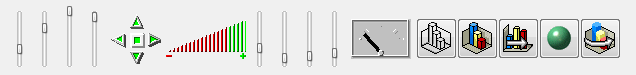
The toolbar at the top of the Chart Designer window offers easy access to the Chart Designer's most commonly used features and functions. The buttons perform the following functions:
| Start a new chart |
| Open an existing chart |
| Save the current chart |
| Export the current chart |
| Undo the latest change |
| Re-do the latest undone change |
| Change data mapping for the current chart |
| Modify data display properties |
| Modify chart-specific options |
| Modify line and point attributes |
| Change axis scale |
| Modify axis elements/display properties |
| Modify legend display |
| Change data ordering |
| Insert annotation text |
| Insert floating line |
| Add/change background image |
| Modify/change chart data source |
| Refresh chart data |
| Schedule periodic data refresh |
The color, color set, and font panels on the right-hand side of the Chart Designer window allow you to modify the color of any chart object, as well as modify the font size and style for any text/labels in the chart. You can choose not to display these panels by toggling the → option.
You can use the color panel to change the color of any element in the chart. To modify an element's color, first, click on it. The status bar at the bottom of the Chart Designer window will indicate which element has been currently selected. After you have selected the object, click on one of the panels in the color panel and the color of the object will change to reflect the color you selected.

Color Panel
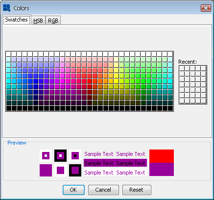
To create a custom color for the object, first select it, then click the button. This will bring up a new dialog allowing you to pick a color from a larger palette or to create a new color.
Additional Colors Dialog
From this dialog you can pick a new color from swatches or configure a custom color using HSB values or RGB values.
The color set panel allows you to choose a color scheme for your chart. It contains predefined color sets that can be applied to chart data points on the value or the second value axis.
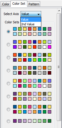
Color Set Panel
In order to change a color set for the value or the second value axis, first select the Color Set tab. Then select the axis (Value or 2nd Value) from the Select Axis select box and click the appropriate color set radio button. After that chart data points will get colors from the selected color set. Note that the Select Axis select box is only visible when the chart has the second value axis. By default, the value axis uses the first color set while the second value axis uses the seventh.
Please note that if you change a color of a data point manually, it will automatically unselect the selected color set. This is because of the color set that no longer corresponds to colors of data points in the chart. It is also important to note that if chart data points have more different colors than there are colors in the color set, it will automatically use colors from the beginning of the next color set, and so on. If there is no next color set available, it will use the first one instead.
Data points colors are closely related to the Save Colors for Categories feature that is available in the Data Properties dialog. The dialog can be opened by clicking the  icon on the toolbar, or by using → . (Please note that this feature is not available for Stack charts and it is disabled if the chart has Single Color for All Categories.) If the feature is turned on, colors of chart data points are assigned to names of categories (or series for charts with series). If such categories (or series) then appear in the chart, it will automatically use their assigned colors. If the feature is turned off (default), colors are assigned by data points order (i.e. the first data point will get the first available color from the color set, the second will get the second color, etc.). Save Colors for Categories setting is automatically saved in the
 .pac file. The following example shows scenarios with the feature on and off:
Assume that a chart has three categories (“A”, “B”, and “C”) with colors taken from the following color set (blue, green, yellow, red).
Image 1 - Example Chart

Image 2 - “Save Colors for Categories” Feature On

Image 3 - “Save Colors for Categories” Feature Off
- Save Colors for Categories feature on
We saved the chart with the “Save Colors for Categories” feature enabled (see Image 1), so the following categories and colors were saved to the list of saved categories:
category A... blue colorcategory B... green colorcategory C... yellow colorNow if you open the chart and data changes (e.g. there will be only categories
AandDin the data - see Image 2), categories will have the following colors:category A... blue color (categoryAhas blue color, because the category nameAis present in the list of saved categories)category D... red color (categoryDhas the next available color in the color set, because the category nameDisn't present in the list of saved categories. In this case, the category will have red color, because blue, green, and yellow colors are already assigned to categoriesA, B,andC.For this scenario, the color set will not be selected under the Color Set tab because colors of data points do nott correspond to the color set.
- Save Colors for Categories feature off
Here is the same situation, but assume that the chart has been saved with the “Save Colors for Categories” feature off (see Image 3). The list of saved categories will be empty this time.
After opening the chart, the categories will have the following colors:
category A... blue color (categoryAhas blue color, as it is the first available color from the color set)category D... green color (categoryDhas the second color from the color set, because the first is already assigned to the categoryA)For this scenario, the color set will be selected under the Color Set tab because colors of data points correspond to the color set.
Unlike color and font panels, the pattern panel can only be applied to data points. There is a predefined pattern palette available for you to use. Similarly to how the color panel is used, you will need to first pick the data point you would like to change and then pick any pattern from the pattern palette. The pattern will be applied to the data point directly.
If a pattern has already been defined for a data point, the user can still change the color by selecting the color panel tab and picking a different color from the color palette. The color on the pattern will be changed to the new color immediately. The patterns shown on the pattern palette will change to the new color as well.
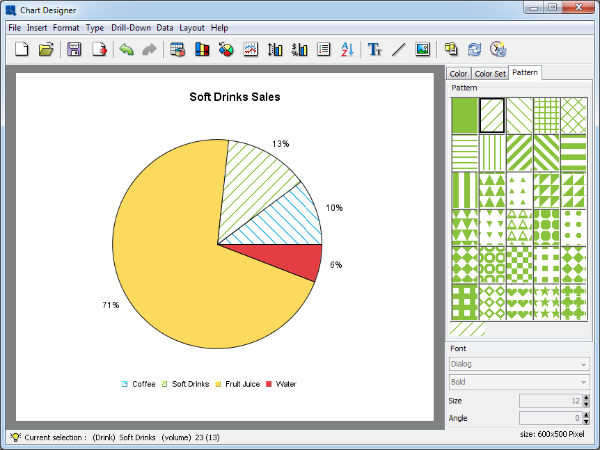
Pattern Example
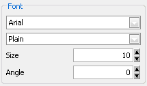
You can use the font panel to modify the font, the font style, font size, and the font angle for labels, titles, or other text in a chart. To modify the font, you must first select the text object whose font you would like to change by clicking on it. The status bar at the bottom of the Chart Designer window will indicate which is the currently selected object.
Font Panel
The first drop-down box allows you to select the font that you would like to use. The second drop-down box allows you to select the font style either plain, bold, italic, or bold and italic. The third box allows you to select the font size. The last box allows you to specify the angle of the text.
Certain groups of text (i.e. axis labels or data top labels) will all have the same properties. Hence, if you select one of text and modify the font properties it will apply to all of them.
ChartDesigner allows you to use the Java graphics libraries to give your text a cleaner appearance. For regular text you can use the chart anti-alias feature by selecting → . For rotated text (i.e. text not a 0 degrees), you can use the Java 2D rotate text feature by selecting → . Note that these methods require Java 1.2 or higher.
The navigation panel provides options for controlling a number of the properties specific to three-dimensional charts. It does not appear for two-dimensional charts and it can be hidden for three-dimensional charts by toggling the → option.
Navigation Panel
There are six controls and five buttons in the Navigation panel. Starting from the left, the six controls are step size, light position for X, Y and Z axes, navigation, zoom, scale and navigation speed. The buttons on the right control wire frame/solid mode, on/off border drawing, on/off inline series (for columnar and bar charts with series), on/off Gouraud shading, and on/off animation.
- Step size:
This slide bar allows you to set the incremental amount used by the navigation control to rotate or move the 3D chart. The higher the position of the horizontal bar, the larger is the increment for each step.
- Light position for X, Y, and Z:
User-defined light position is useful to control the position of the light and therefore the direction from which it will shine on each axis.
- Navigation:
This control allows you to rotate or translate the chart. The center button is a toggle switch. When it is in a depressed state (denoted by the red color of the button), clicking on any of the four triangular buttons moves the chart in the direction indicated by that button. When the center button is in an elevated state, clicking on any of the four triangular buttons rotates the chart in the direction indicated by that button. The speed of navigation may be controlled by the Navigation Speed control.
- Zoom:
This control allows you to effectively move the chart closer to or farther away from the viewer. To operate, you point the mouse to the control and click on the left mouse button. Then, while holding down the button, you drag the mouse to the left or right. When you drag the mouse to the right, the red area is extended to the right, and the chart will appear to be closer to you (zoom in to blow up the chart). When you drag the mouse to the left, the red area will move to the left, and the chart will appear to move farther away from you (zoom out to shrink the chart).
- Scale:
This is a set of four slide bars. The first three bars allow you to change the scale factors for the X, Y, and Z axes respectively. The fourth bar determines the thickness of a three-dimensional column, bar, line, or pie (depending upon the chart type). The higher the position of the horizontal bar, the larger the value. For two-dimensional charts, you can adjust the bar width for bar, column, stack bar, stack column, high-low, and HLCO charts by selecting → .
- Animation speed:
This allows you to set the speed for chart navigation. This control is useful with the Navigation control and the Animation On/Off switch. It determines how fast the chart moves or rotates. To operate, click and drag the indicator needle to the desired position. Moving the indicator needle to the right will speed up the translation or rotation and moving the needle to the left will slow it down.
In addition, the five buttons do the following:
| Wire frame/ solid mode On/Off: This toggle switch allows you to view the three-dimensional chart as a wire frame when the switch is on or as a solid object when the switch is off. |
| Border Drawing On/Off: This toggle switch will draw a black outline on each edge of the chart when the switch is on. |
| Inline Series On/Off: This toggle switch will draw the series column in the same XY plane. This option is only available for columnar and bar charts with a data series and it does not appear on the navigation panel if the chart type is not applicable. |
| Gouraud Shading On/Off: Gouraud shading is a sophisticated and very realistic shading feature for three-dimensional charts. When the switch is on it will begin rendering the chart to shade each individual surface. |
| Animation On/Off: This toggle switch allows you to start/stop the animation of a three-dimensional chart. The speed of animation may be set using the Navigation Speed control. During animation, all panel controls except the animation speed control are disabled. |
The viewport compromises the central portion of the Chart Designer window. Within the viewport you can select, move, and size all of the various chart elements on the canvas.
The chart canvas is the background on which all of the chart elements are drawn. Its dimensions are the size of the finished chart. You can modify the size of the chart canvas by selection → . This will bring up a dialog prompting you to specify the new canvas dimensions.

Canvas Formatting Dialog
You can specify the canvas size in pixels, inches, or centimeters. From this dialog you can also specify when to use scroll bars in the viewport. By default the viewport will display scroll bars when the canvas is larger than the window. When the canvas is smaller than the viewport window, a dark gray area will appear around it.
If you're creating an embedded chart in a report, the canvas will re-size to match the space that you have defined for the chart in the Report Designer. For example, if you set the space in the report to be 3 inches by 4 inches, the next time you edit the chart, the canvas will automatically size to 3 inches by 4 inches.
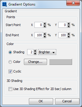
On this dialog, you can also set up gradient background for the canvas. The gradient settings are the same as in the Rendering options described in the Section 3.14.1.3 - Format Menu.
You can add an image as the background of the chart instead of having a plain or a colored canvas.

Radar Chart with Background Image
You can add a background image by selecting → or by clicking the  button on the toolbar. This will bring up a dialog allowing you to specify the background image for the chart.
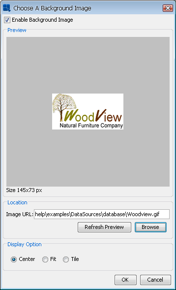
Add Background Image Dialog
To insert a new image, select the Enable Background Image option. If you want to remove an existing background image and use simple background color instead, unselect this option.
There are two ways of inserting background images: either locate the image on the hard drive or retrieve it from an URL.
To locate an image on the hard drive, click on the button.
![[Note]](../../../images/note.png) | Note |
|---|---|
If you want to insert an image from your hard drive, place the image somewhere in the ERES installation directory. If you want to use an image from a different location, insert its URL. |
To retrieve image from an URL, enter the URL in the Image URL text field. After that, click on the button to verify the URL. If the image from the URL appears in the Preview section, the URL is correct.
| Note |
|---|---|
You have to insert complete URL with protocol (e.g. |
If you add a background image and save the chart as TPL or CHT, the image itself is not stored with the chart. Only the path or URL is saved. If you move a TPL or CHT chart, you need to be sure that it can still access the image along the path specified. If you save the chart as PAC, the background image will be stored in the PAC file along with the chart.
You can select any element in the chart by clicking on it. The status bar at the bottom of the Chart Designer window will indicate which object has been currently selected. Clicking and dragging on an object will move it around the chart canvas. Note that some objects like axis or data top labels move in tandem, while other objects like legends move independently.
You can move the entire chart plot by clicking in the plot area and dragging the mouse. This will move the entire chart around the canvas. To re-size a chart click the plot area and 8 points will appear in the corners and on the sides of the plot area. Drag any of those points using the mouse to enlarge or shrink the plot area. You can also re-size three-dimensional charts by using the zoom control in the navigation panel.
In addition to the default chart elements, ChartDesigner provides a number of additional elements that you can add to a chart.
There are two ways to add text to a chart: as titles or as plain text elements.
- Adding Titles:
To add titles to a chart, select → . This will bring up a dialog prompting you to enter titles for the chart.
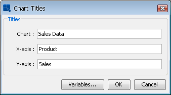
Add Titles Dialog
The dialog allows you to specify a main title for the chart and a title for each of the axes. Pie and dial charts, which do not have axes, prompt you for the chart title only. After you have finished specifying the titles click and they will be added to the chart. Titles are placed and sized automatically. However, they can be moved and the fonts can be changed.
- Adding Text:
To add individual text fields to the chart, select → or click the
 button on the toolbar. This will bring up a dialog prompting you to add text to the chart.
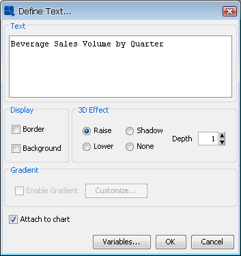
Add Text Dialog
From this dialog you can specify the text and configure some display options. You can specify whether to draw a border around the text or around a background. You can also specify what effect you want to apply to the background.
On this dialog, you can also set up gradient background for the text label. The gradient settings are the same as in the Rendering options described in the Section 3.14.1.3 - Format Menu.
Once you have finished specifying the text, click . You will then be able to place the text in the chart. A small rectangle will follow your pointer around the chart canvas. Click the mouse where you would like to place the text.
- Annotation Text:
ChartDesigner also supports annotation. Annotation allows you to attach labels or text fields to a particular element, such as a line or the chart plot. For example, you can insert a control line showing the maximum value to a chart and attach a text label called
MAXto this control line. Then every time the maximum value changes, the label will adjust its position along with the control line. For more on control lines, please see Section 3.14.6.2.3 - Fixed Horizontal/Vertical Lines.You can specify text to be annotation in two ways. To attach the text to the chart plot, select the Attach to Chart option when adding text. To attach the text to a specific object like a control line, first select the object, and then select → or click the
button on the toolbar. The option for Attach to selected object will be automatically checked. Leave it checked and any text you add will automatically be attached to the object.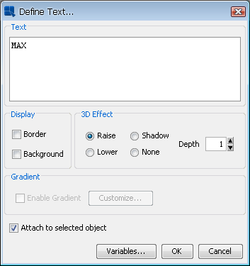
Add Text (Annotation) Dialog
ChartDesigner allows you to specify certain variables within text that allow for run time substitution based on certain values/objects in the chart. For example, if your chart uses a parameterized query as the data source, you could use the ¶mInfo variable to display which parameter value(s) were selected at runtime.
Both the insert titles dialog and the add text dialog have a button marked at the bottom. This will bring up a dialog with a list of variables you can use and it will allow you to select one to add to the title or to the text.
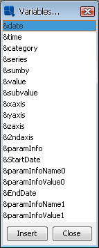
Variables Dialog
The following text variables are supported:
&drillInfo: | This displays which data point is being drilled on for drill-down charts. This variable does not work for parameter drill-down. |
¶mInfo: | This displays the parameter value(s) that were selected. You can use this variable instead of &drillInfo for parameter drill-down charts. |
&date: | This displays the date when the chart was last drawn/redrawn. |
&time: | This displays the time when the charts were last drawn/redrawn. |
&category: | This displays the name of the category column. |
&series: | This displays the name of the data series column. |
&sumby: | This displays the name of the sum-by column. |
&value: | This displays the name of the value column |
&subvalue: | This displays the name of the secondary value column |
&xaxis: | This displays the name of the column that is mapped to the X-axis. This is for charts that map a value instead of a category to the X-axis like scatter or bubble charts. |
&yaxis: | This displays the name of the column that is mapped to the Y-axis. This is for scatter, bubble, and surface charts. |
&zaxis: | This displays the name of the column that is mapped to the Z-axis. This is for scatter, bubble, and surface charts. |
&2ndaxis: | This displays the name of the column that is mapped to the 2nd-axis. |
¶mInfoName<index>: | If the chart contains parameters, this displays the name of the parameter for the selected index. |
¶mInfoValue<index>: | If the chart contains parameters, this displays the supplied parameter value for the selected index. |
&<paramName>>: | If the chart contains a parameter with this name, this will display the value selected for that parameter. |
ChartDesigner allows you to overwrite a particular piece of text in a chart. This can be useful if the data source does not use particularly intuitive column names. Note that this feature will replace all instances of the text. For example, if you have a column chart without a series that displays a column name for both the X-axis label and the legend item, you cannot use text replacement to change only the label and not the legend item. The text replacement feature will also change only whole strings and not instances where there is a partial match.
To use text replacement, select → . This will bring up a dialog allowing you to specify replaced text.

Text Properties Dialog
Please note that when making successive changes to the same text, the original text must be used. For example, assume you replaced the word “coffee” with “water”. Now if you want to change “water” to “soft drink” the text replacement should have the original text, which is “coffee” and then “soft drink” as the replacement. To remove any text replacement, simply replace the original string with itself. Hence, using the same example, you would replace “coffee” with “coffee”.
You can see a list of all the original text and the replacements by clicking on the button. This will bring up a dialog listing all of the text replacement in the chart.

Replaced Text List
From this dialog you can select any of the replaced text and modify or undo the replacement by clicking the buttons at the bottom of the dialog.
ChartDesigner has the ability to automatically adjust the font size of the text in a chart as it is re-sized. This is useful if you're using the same chart template to produce a number of charts in different sizes. You can specify a ratio for the font size to adjust based on changes in the chart canvas. To specify a re-size ratio, select → .
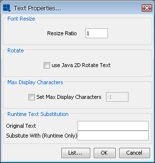
Text Properties Dialog
The ratio dictates the relative percent that the font should re-size in regards to the canvas. For example, say you re-size a chart from 500 x 500 pixels to 250 x 250. With a re-size ratio of 1 then text with 12 point font would decrease to 6 point, decreasing by the same percent as the canvas. However, with a re-size ratio of 0.5 the font would decrease half as much as the canvas so our 12 point font would only decrease to 9 point.
Long labels or text in a chart can sometimes take up too much space in the chart plot, leaving little room for the actual chart. For situations like this, ChartDesigner offers a text cropping feature for chart text. Text that is longer than a user-supplied threshold will be truncated with “...”. The hint box for the chart will show the whole label. To specify text cropping, select → .

Text Properties Dialog
To enable text cropping, check the Set Max Display Characters option and specify the maximum character length in the dialog. Any text longer than the specified number of characters will be truncated.
ChartDesigner allows you to add and format a number of different types of lines for charts.
You can choose to display lines and points for all the data points in the chart for any two dimensional chart type. Note that some chart types already use this representation (i.e. line or scatter charts).
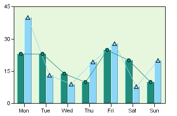
Column Chart with Lines and Points Defined
Line and point display is controlled by selecting → , or click the  button on the toolbar. This will bring up a dialog presenting several options.
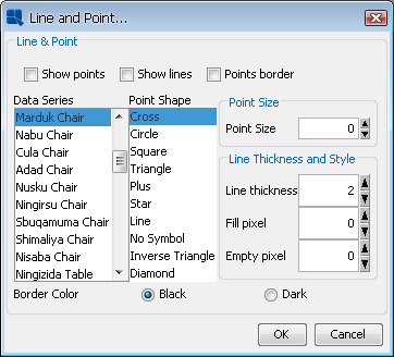
Line and Point Dialog
The first three options allow you to specify whether you would like to show lines, points, and a points border for the chart. For radar charts you also have the option of showing areas. The remaining options allow you to customize the line and point displays for each element in the data series.
For each data series element, you can specify the point shape that you would like to use. You can also control the size of the points. The default point size is 0. You can specify point sizes of -1, -2, & -3 which represent sizes of 0.75, 0.5, and 0.25 respectively. At -3 (0.25), the point will be drawn as a dot regardless of the selected point shape.
For lines you can specify the line thickness, as well as customize a dash pattern. The dash pattern is created by specifying the number of filled pixels and the number of empty pixels (between 0 and 255). The line is then drawn by dividing into segments - the number of filled pixels followed by the number of empty pixels. Setting 0 for both will result in a solid line. Setting 255 for both will result in no line being drawn.
The last option allows you to change data point symbol border color to black or darker shade of symbol color.
Floating lines are free-form lines that can be arbitrarily added to any place on the chart canvas. Often floating lines are used to point to a specific element in a chart. To add a floating line select → , or click the  button on the toolbar.
When you select this option your mouse pointer will change to a cross. Click within the chart canvas where you would like the line to begin. Each additional click will add a point to the line, allowing you to add another segment. This way you can use floating lines to draw shapes as well. Once you have finished, right-click to stop drawing. The line will then be added.
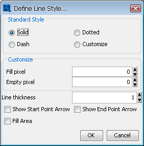
Once a line has been placed on the canvas it cannot be moved individually. It will move with the chart plot, like annotation text. To specify options for a floating line, first select it, and then select → or click the button on the toolbar. This will bring up a dialog allowing you to format various properties for the floating line.
Line and Point Dialog for Floating Lines
The dialog allows you to specify a standard line style or to create a custom dash pattern in the same manner as line and point formatting. You can also specify the line thickness in pixels. The checkboxes at the bottom of the dialog allow you to place an arrowhead at the start and/or end of the line, as well as fill the area enclosed by the line to create a solid shape.
Floating lines can be deleted by selecting them and hitting the delete key.
Fixed horizontal or vertical lines are lines that are drawn on one of the chart axes. These lines can also be drawn on three-dimensional charts where they appear as planes. There are two types of fixed lines: constant lines and control lines. Constant lines are lines that are fixed to a certain value in an axis. Control lines are drawn based on computed values that allow you to spot data points that are outside of certain value ranges. To add either type of line to a chart, select Horz\Vert Line from the Insert menu. This will bring up a dialog showing the list of existing horizontal/vertical lines, allowing you to edit the selected line, remove the selected line, and/or create a new line.
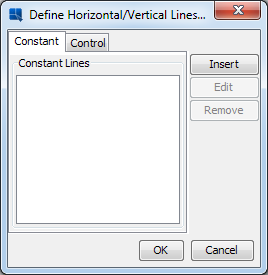
Define Horizontal/Vertical Lines Dialog
Clicking on or clicking on when an existing line is selected, respectively, will bring up a dialog allowing you to configure the selected line.

Constant Line Dialog
For constant lines you need to specify a label for the line, as well as the numeric value to use for the line. Note that for the category axis, the data points start with 0.5. You can also specify the line thickness and whether the line is horizontal or vertical. The last two options allow you to add an item to the chart legend for the line and whether to display any annotation for the line.
For Gantt charts, there is one extra option called Current Date for Gantt Chart. If you choose this option, the Constant line value field will deactivate and the current date will be used as the line value (the line position will be updated every time you run the chart).
For radar charts, the horizontal/vertical option is disabled. Radar charts draw constant/control lines at the same point around all the chart axes (in a similar manner to the radar grid). In addition, for radar charts, an additional option named Circular Style is present. By default, lines in radar charts are drawn in a segmented fashion - straight lines connect the points on each axis. Selecting this option will draw the constant/control as a circle.
| Note |
|---|---|
If you have not specified any annotation for the line then none will appear if you select the last option. For more on adding annotation to a chart, please see Section 3.14.6.1 - Adding Text. |
To add a control line, click on the Control Line tab in the dialog.

Control Line Dialog
For control lines you need to specify which series element you want to compute the value for (this option does not appear if no series is present) and how to compute the value. Options for control lines are average, minimum, maximum, and multiples of standard deviation.
After you have specified all of the options, the line will be added to the chart or the selected line will be changed, respectively. To edit any of the properties specified in the previous dialogs, you can select → again and select the line from the list. You can also double-click on the line that you want to modify.
You can change the appearance of fixed lines by first selecting the line and then selecting → , or clicking the icon on the toolbar. This will bring up a dialog allowing you to customize the line.

Line and Point Dialog for Fixed Lines
This dialog allows you to specify a standard line style or to create a custom dash pattern in the same manner as line and point formatting.
A powerful feature of ChartDesigner is the ability to add trend lines to charts. Trend lines can help to show more details of a chart's data by exposing and highlighting certain trends.

Chart with Trend Lines
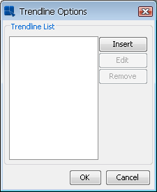
To add a trend line to a chart, select → . This will bring up a dialog showing the list of existing trend lines, allowing you to edit the selected trend line, remove the selected trend line, and/or create a new trend line.
Trend Line Options Dialog
Clicking on or clicking on when an existing trend line is selected, respectively, will bring up a dialog allowing you to configure the selected trend line.
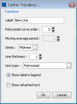
Define Trend Lines Dialog
In this dialog you can specify a label for the line, as well as what element of the data series to base the calculation on. The following types of trend lines are supported: linear, a polynomial of any degree, a power, exponential, logarithmic, a moving average, an exponential moving average, an triangular moving average, cubic B-spline, and a normal distribution curve. For moving averages you will need to specify the average period and for a polynomial you will need to specify the curve order. You can also specify the thickness of the line and configure whether a label in legend and the attached text should be shown. In case the chart has data series, you can configure the trendline for a specific series.
After you have specified all of the options, the trend line will be added to the chart or the selected trend line will be changed, respectively. To edit any of the properties specified in the previous dialog, you can select 'TrendLine' from the Insert menu again, and select the line from the list. You can change the appearance of the trend line by first selecting it, and then selecting → , or clicking the button on the toolbar. This will bring up a dialog allowing you to customize the lines.

Line and Point Dialog for Trend Lines
This dialog allows you to create a custom dash pattern in the same manner as line and point formatting.
A special type of trend line that allows you to draw a normal distribution curve for the data in the chart. In order to plot a normal distribution curve, the chart must either be a two-dimensional column or bar chart, it cannot have a data series, and the category should be numeric. Assuming these conditions are met, you can specify a normal distribution curve as one of the trend line options.
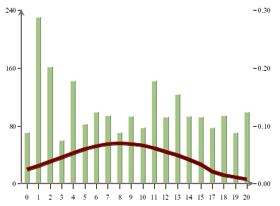
Chart with Normal Distribution Curve
Since the scale for the curve is usually different than the scale for the value axis, the curve is shown on a secondary axis. You can modify the scale by change the scale for the secondary axis.
Control areas are useful for comparing the chart data against a certain range of data. For most two-dimensional charts, control areas are drawn as filled areas on the chart plot between a range of values on the chart's value axis and/or category axis. The data points are then drawn over top of the control areas giving you a quick visual reference to see which data points fall within the designated range. Instead of drawing a background area on the plot, the control areas can also be shown only where the data points intersect the control area. This feature gives users a clear visual reference when specific threshold values are reached.
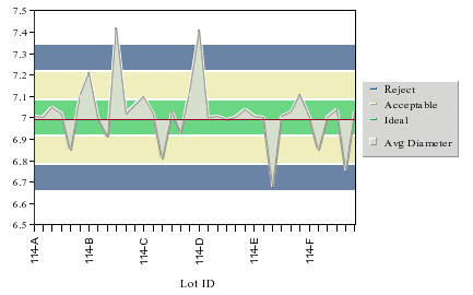
Two-Dimensional Area Chart with Control Areas
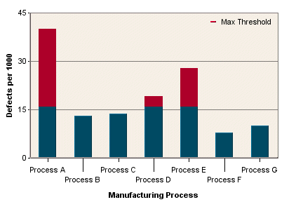
Column Chart with Control Area Drawn for Data Points
A special instance of control areas can be used for dial charts. For dial charts control areas are drawn as arcs on the face of the dial, allowing you to see if the dial hands (data points) fall within the range. Note that control areas are not available for radar and pie charts.

Dial Chart with Control Areas
To add a control area to a chart, select → . The following dialog will appear showing the list of existing control areas, allowing you to edit the selected control area, remove the selected control area, and/or create a new control area.
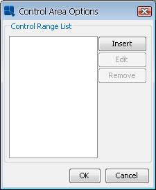
Control Area List
Clicking on or clicking on when an existing control area is selected, respectively, will bring up a dialog allowing you to configure the selected control area. If your chart is not a dial chart, the following dialog will open.

Control Area Configuration Dialog
The following options are provided for control areas:
Label | This allows you to specify a label for the control area. |
Use Value Axis Scale: | This allows you to specify whether the control area should be bounded by values on the value axis of the chart. |
Value Axis Starting Scale: | This is the lower bound for the control area on the value axis. |
Value Axis Ending Scale: | This is the upper bound for the control area on the value axis. |
Use Category Axis: | This allows you to specify whether the control area should be bounded by values on the category axis of the chart. |
Category Axis Starting Scale: | This is the lower bound for the control area on the category axis. |
CategoryAxis Ending Scale: | This is the upper bound for the control area on the category axis. |
Area Depth: | This specifies the depth for any of the appearance styles. If no style is selected then the depth will have no effect. |
Appearance: | This allows you to specify a 3D or shadow effect for the control area. If the area depth is specified as zero the appearance will not take effect. |
Enable Gradient: | Enable color gradient for the control. Gradient settings are described in Section 3.14.1.3 - Format Menu |
Show Label In Legend: | This specifies whether or not to show the control are label in the chart legend. |
Highligh Overlap Area: | This option will only show the control area where the data points overlap the control area boundaries. |
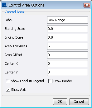
If your chart is a dial chart then a different dialog will appear when you select → and then click on the or button.
Control Area Dialog for Dial Charts:
The following options are provided for dial chart control areas:
Label: | This allows you to specify a label for the control area. |
Starting Scale: | This is the value where the control area begins. |
Ending Scale: | This is the value where the control area ends. |
Area Thickness: | This allows you to set the thickness for the control area |
Area Offset: | This allows you to specify the offset in pixels from the edge of the dial chart |
Center X: | This sets the X coordinate for the center of the control area. 0 shares the same center point as the dial face. You can specify a new number (either negative or positive) pixels to specify an offset position from the center of the dial. |
Center Y: | This sets the Y coordinate for the center of the control area. It is manipulated in the same manner as the previous option. |
Show Label in Legend: | Specifies whether to show the control area label in the chart legend |
Draw Border: | This allows you to draw a border around the control area. |
Show Axis: | This allows you to show or hide the axis for the remaining area not covered by the control range. |
After you have specified all of the options, the control area will be added to the chart or the selected control area will be changed, respectively. To edit any of the properties specified in the previous dialog, you can select → again, and select the control area from the list. You can also double-click on the control area that you want to modify.
In addition to displaying charts, you can also display a table showing the data points displayed in the chart. The table can be placed below or to the right of the chart plot.

Chart with Table
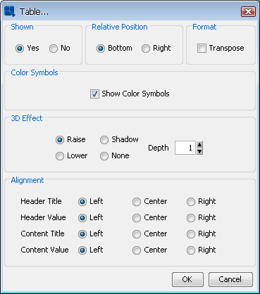
To add a table to a chart, or to modify the various display options for a table, select → . This will bring up a dialog allowing you to customize various options for the table display.
Format Table Dialog
From this dialog you can specify whether or not to display the table, as well as what relative position to give the table either to the bottom or right-hand side of the chart plot. You can also specify a 3D effect for the table and the depth of the effect.
The Transpose checkbox allows you to swap the columns and rows of the table. By default the category elements are drawn as the columns and the data series elements are drawn as the rows.
The Show Color Symbols option allows you to show/hide color boxes for data series in the table.
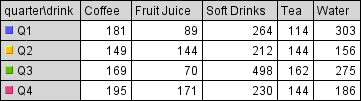
Chart table with color boxes
The Alignment options allow you to specify the horizontal alignment of the text in the table cells, either left, center, or right. The alignment can be set for the row and column headers, as well as the inner table cells.
| Note |
|---|---|
If there isn't enough room in the chart canvas, all the data points will not display in the table. The table size will adjust with the canvas size. It will also adjust with the font size for the text in the table cells. |
ChartDesigner has the capability to add hyperlinks to any data point in a chart. Links can be specified for single data points or for multiple elements. Any added hyperlinks will be applied to both the data points on the chart and to their respective fields on the legend. To add a hyperlink to a chart, select → or right-click on a data point and select Insert Link from the pop-up menu. This will bring up a dialog showing the list of existing hyperlinks, allowing you to configure them, remove them and/or create new ones.

Insert Link Dialog
Clicking on or clicking on when an existing hyperlink is selected, respectively, will bring up a dialog allowing you to configure the selected hyperlink.

Define Link Dialog
The URL field allows you to specify the Web page that you would like to link to.
Using the Series and Category drop down menus you can select the element in the data series and the category element for the hyperlink. You can also link to all data series elements or all category elements.
You can specify the Target parameter recognized by HTML when specifying a hyperlink to be attached to a data point or data series. This can be used to determine whether the new HTML page is opened in a new browser window or in the same browser window, or whether the new page occupies the same portion of the page as the current page.
The Hint field allows you to enter text that will pop-up when the mouse is passed over the data point. If you want to create pop-up labels without hyperlinks, you can leave the URL field blank and only specify the hint.
If you specify hyperlinks for charts, the hyperlinks will only be active when the chart is exported to Flash format*. For most image formats such as PNG, JPG, GIF, etc, an image map file containing information for the link will be automatically generated when you export the chart. You can insert the image and image map into an HTML file to view the image with clickable links.
| Note |
|---|---|
* For Flash export, when the user clicks on the hyperlink, there will likely be a warning message prompted by Flash saying that there was a potentially unsafe operation. You can turn this warning off by clicking on settings and adding the chart into the list of trusted locations. |
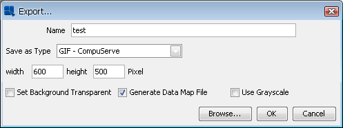
Export Dialog
ChartDesigner provides a number of extensive formatting capabilities for the chart axes. Users can customize everything from the axis scale to the way in which axis labels are displayed.
By default, the scale of any value axes in the chart is calculated to provide a 'best fit' for the data being plotted. This is often a useful feature if the data being displayed can change radically. There are, however, many times where you may want to manually set the scale of the axes. To modify the axis scale, select → , or click the  button on the toolbar. This will bring up a dialog allowing you to format the scale for any value axes in the chart.

Axis Scale Dialog
The following options are provided:
Automatic: | This turns on automatic scaling for the axis. This is the default option. | ||||
Manual: | This turns on manual scaling, to set the axis scale to the options provided. | ||||
Maximum: | This is the highest value on the axis scale. | ||||
Minimum: | This is the lowest value on the axis scale. | ||||
Unit: | This is the step interval between successive labels. | ||||
Add Padding: | This will raise the highest value of the axis to create a cushion between the max value of the data and the top of the chart. | ||||
Best Fit: | This will automatically place the origin of the chart based on the minimum and maximum values of the data. | ||||
Origin: | This allows you to specify where the X and Y axes should intersect. This is usually at zero. | ||||
Logarithmic Scale: | This produces a logarithmic scale for the given axis. This is valid only if the axis in question takes only positive values.
|
The axis scale dialog will have a tab for each value axis in the chart. To set the scale for other axes, click the tab for that axis. A unique option available for secondary axes allows you to align the axis scale. This will apply all of the options from the primary axis to the secondary axis, giving both axes the exact same scale.
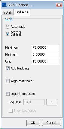
Axis Scale Dialog for Secondary Axis
The axis scale dialog changes for a Gantt chart. You can still select the Automatic option to have the scale configured automatically or the Manual option to custom set the scale. The Automatic axis scale has a few settings: it can automatically set up the scale step to be one day, month or year. The auto option always finds a best fit. The dynamic option also finds a best fit, but unlike the auto option, it uses standard step intervals only (for example: 1 month, 1 year etc...). When the manual axis scale is chosen, the Maximum, Minimum, Unit and Origin are replaced with Maximum Date, Minimum Date, Scale Step and Origin Date respectively and these new settings take in a Date/Time (represented by yyyy, MM, dd, hh, mm).

Axis Scale Dialog for Gantt Chart
The appearance properties of the axes and the axis labels are controlled through the axis elements dialog. To invoke the axis elements dialog, select → or click the  button on the tool bar. This will bring up the following dialog allowing you to customize elements in all the chart axes. You can also control the appearance of dial and pie chart labels from this dialog.
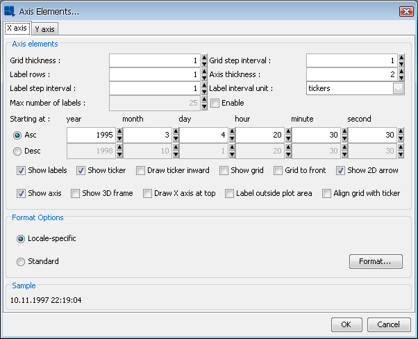
Axis Elements Dialog
A tab will appear in this dialog for each axis in the chart. The dialog allows you to perform the following options. Note that some options are only available for certain chart types, certain data types, and on certain axes.
Grid thickness: | This allows you to specify the thickness of any grid lines along the axis. |
Grid step interval: | This allows you to set the grid step interval for any grid lines along the axis. |
Label rows: | This allows labels to be displayed in alternating rows. This can prevent overlapping. This option is only available for the X-axis. |
Axis thickness: | This allows you to set the thickness of the axis in pixels. Note that this setting is applied to all axes in the chart. |
Label step interval: | This allows you to set the label step interval for the data. For example, setting this to 2 would draw the label for every other data point in the chart. |
Label interval unit: | This allows you to select the unit to be used when sorting and representing time-based data (date, time, or timestamp). Selecting tickers will use the data as it is read by Chart Designer. You can also select Dynamic for time-based data and that will choose an appropriate scale (depending on number of data points and range of data). |
Max number of labels: | This allows you to select the maximum number of labels and tickers to be displayed on the axis. If the number of labels exceeds the max count, the label step will be re-calculated. |
Ascending/Descending: | This option allows you to order and filter time-based data. You can sort the data in ascending or descending order, as well as specify the starting (or ending) point for the data. |
Show labels: | This option allows you to remove or display the labels for each axis. |
Show ticker: | This option allows you to remove or display the axis tickers. |
Draw ticker inward: | This option will draw the axis tickers inside the plot area instead of outside (default). |
Show sub-tickers: | This feature is only available for the value axis when the axis scale is set to logarithmic with a log base of 10. This feature will draw interval tickers (non-uniform) between the points on the value axis. |
Show grid: | This options allows you to remove or display the grid for each axis. |
Grid to front: | This option allows you to draw the grid lines on top of the data elements in the chart. By default the data points are drawn on top of the grid. |
Show 2D arrow: | This option allows you to remove or display the arrowhead at the end of the axis. Note that this option applies to all chart axes and it is only available for two-dimensional charts. |
Show axis: | This option allows you to remove or display the axis (for two-dimensional charts) or the wall (for three-dimensional charts). |
Show 3D frame: | This option allows you to remove or display a frame around the chart. Note that this option applies to all chart axes and it is only available for three-dimensional charts. |
Label outside plot area: | This sets the labels to be placed outside of the plot area, irrespective of where the axis is. This feature can be useful for category axis labels if you're plotting data with both positive and negative values. |
Align grid with ticker: | This aligns the grid line with the ticker instead of placing it between tickers. This places the ticker and the corresponding grid line along the same line. This option only applies to the category axis of column-type charts. |
Swap Y-axis position: | This will swap the primary and secondary value axes. This option will be found only under the 2nd Axis tab. |
Draw X-axis at top: | This allows the X-axis to be positioned at the top of the chart instead of the default bottom position. This option is available for two-dimensional column, bar, scatter, high-low, HLCO, bubble, and Gantt charts. |
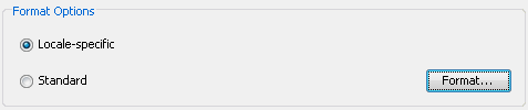
The axis elements dialog also allows you to format the appearance of the axis labels, depending on what type of data is plotted on the axis. The Format Options portion of the dialog contains the label formatting dialog.
- Formatting Numeric Data
For numeric data there are three primary options for display formatting: locale specific fixed point, fixed point, and scientific. You can select the option you want and then click the button for additional options.

Numeric Data Format Options
Locale-Specific Fixed Point
This will vary the format of the data depending on the locale in which it is being viewed. Additional formatting for this option allows you to specify whether the data should be displayed as a number, currency, or as a percentage. In addition, you can set the maximum and minimum number of integer digits and fraction digits. Other display attributes will vary depending on locale.

Locale-Specific Formatting Options
Fixed Point:
This will keep the data format consistent, regardless of locale. Additional formatting for this option allows you to set the number of decimals, the digit number to round to, unit symbols, negative signs, decimal and thousands separator, and specify leading zeros for fractions.

Fixed Point Formatting Options
Scientific:
This will display the data in scientific notation. Additional formatting for this option allows you to set the number of decimals.

Scientific Formatting Options
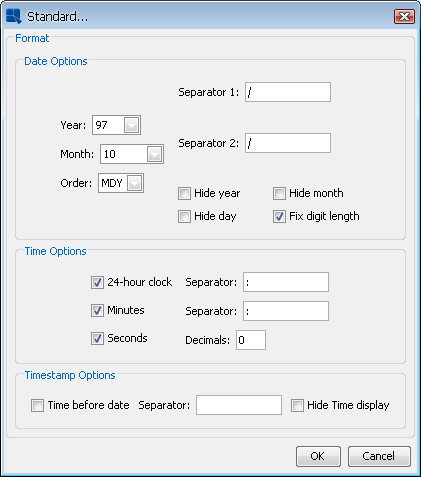
- Formatting Date/Time Data
For date/time data there are two primary options for display formatting: locale specific and standard. You can select the option you want and then click the button for additional options. The available options will vary depending on the nature of your data. Date, time, and timestamp data will bring up date, time, and date & time options respectively.
Date/Time Data Format Options
Locale-Specific:
This will vary the format of the data depending on the locale in which it is being viewed. Additional formatting for this option allows you to select full, long, medium, or short notations for date and time information. Other display attributes will vary depending on locale.

Locale-Specific Formatting Options
Standard:
This will keep the data format consistent, regardless of locale. Additional formatting for this option allows you to select year and month displays, as well as the order in which month, day, and year information is presented. You can also select the characters that you want to be used as separators. Time options allow you to display hours, minutes, and/or seconds and also to select the separators between them. For timestamp data, you can select to display the time before or after the date, as well as the separator to be used between them.
Standard Formatting Options
- Formatting Logical Data:
There are five options available for displaying logical or Boolean data. They are: T/F, True/False, Yes/No, Y/N, and 1/0.
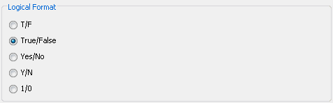
Logical Data Formatting Options
Any changes you make to the data formatting will take effect after you click the in the axis elements dialog. Note that there are no additional formatting options for string data.
ChartDesigner provides a number of ways to customize and configure the way data points are drawn and annotated on the chart, as well as the chart plot itself.
Many of the data display options are controlled through the data properties dialog. From this dialog you can control the size of bars/columns, set display options for null values, and specify options for data labels. To invoke the data properties dialog, select → or click the button on the toolbar. This will bring up the following dialog:
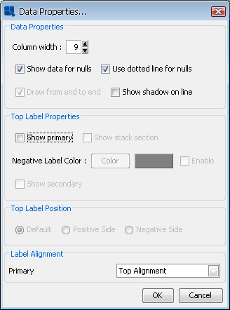
Data Properties Dialog
This data properties dialog contains the following options:
- Column width:
This specifies the ratio of the bar/column width with respect to the gap between successive bars in the chart. Each unit represents 1/10th of the space between data points. Therefore, entering
9would leave 10% of the space between data points blank, while10would eliminate all space between bars/columns. This option only pertains to two-dimensional bar, column, stack bar, stack column, high-low, HLCO, and Gantt charts. To control the column thickness in three-dimensional charts, you can use the thickness of shape slider in the navigation panel.- Show data for nulls:
This will connect lines when null data is present. For example, if you have three points and the value of point 1 is 4, point 2 is null, and point 3 is 6, then a line will be drawn from 4 to 6 for the three points. This property is only available for line charts or for other two-dimensional charts with lines. All other chart types will not plot data for nulls.
- Use dotted lines for nulls:
Instead of drawing a complete line through null values in the chart, you can use this option to specify a dotted line where the values are not present. Like the show data for nulls option, this property is only available for lines.
- Draw from end to end:
This option allows you to draw two-dimensional line and area charts across the entire plot area, rather than offsetting to the first and last data points on the chart.
- Show shadow on line:
This option specifies whether to show shading on two-dimensional lines. In order for shading to apply, the line must be thicker than one pixel.
- Show primary:
This will display data top labels for the primary values in the chart.
- Show stack section:
This will display individual labels for each stack section for stack bar, stack column, and stack area charts.
- Negative Label Color:
This will display the top labels with a value smaller than that of the origin in a different color that can be selected using the button after enabling the feature.
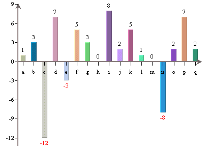
Chart with Colored Negative Top Labels
- Show secondary:
This will display data top labels for the secondary values in the chart.
- Top label position
This allows you to specify where the data top labels should be drawn. They are drawn above data points by default if they are positive and below data points if they are negative. Use the other options here, you can force the data points to always draw to the positive or negative side of the data.
- Label Alignment:
This option allows you to set the alignment for the data top labels. You can draw them at the top, bottom, or middle of the data points. In addition, you can select to draw the label inside the data point at the top or bottom. An additional option stack charts offers you to set the alignment for stack section labels.
For charts displaying date or time data on the category axis, ChartDesigner provides a unique feature allowing users to perform date/time based zooming. Using this feature, you can group the category elements into user-defined intervals and aggregate the points in each group. You can also filter the data by specifying upper and lower bounds for the results.
For example, suppose your data contains daily sales volume for the past two years. Using zooming you could aggregate the data to look at average volume per month, quarter, or year. Using the upper and lower bounds you could narrow the range to look at weekly sales volume within a specific quarter.
Zooming is available for all chart types except scatter, surface, box, dial, polar, radar, bubble, and Gantt.
When you create a new chart with date, time, or timestamp data in the category axis, you will be automatically prompted to specify zooming options. You can manually invoke the zooming option dialog by selecting → .
When you first select to add zooming a dialog will appear, prompting you to specify aggregation options for the grouped data points.

Aggregation Options Dialog
In this dialog you can specify the aggregation either sum, minimum, maximum, average, or count, as well as the maximum and minimum scale increments that can be used when zooming the data. After you have specified the options that you want, click and a new dialog will appear allowing you to specify additional zooming options.
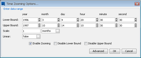
Zoom Options Dialog
This dialog allows you to specify a lower and upper bound for the data, as well as the interval by which you would like to group the data. The scale specified here must be within the maximum and minimum scale specified in the aggregation options dialog.
This dialog also allows you to preserve a linear scale for the chart. By setting the Linear option to true, the chart will always display points for the grouped intervals, even if there is no data associated with a particular group. For example, say again that you are measuring sales volume over a three month period - April May and June. If the input data has no records for May and you set the Linear option to true, a point will be drawn for May with a value of zero. If you set the "Linear" option to false, the data point for April will be immediately followed by June.
You can disable/enable zooming, as well as the lower and upper bound restrictions by using the checkboxes at the bottom of the dialog. Once you have finished specifying all the options, click and the zooming will be applied to the chart.
When deploying charts using Chart Viewer, end users can perform dynamic zooming. To perform a time-series zoom in the Chart Viewer, Ctrl+Click on a point on the chart and drag it to another point in the chart. This will automatically zoom in based on the lower and upper bounds selected using the mouse. The aggregation is performed according to the options that was set at design time. You can undo the zoom by Ctrl+Right-Click.
The scale internal is automatically chosen, depending on the data and the bounds chosen (as long as minimum 2 data points can be shown). The scale interval can also be changed in the Chart Viewer by pressing Alt+Z. This will bring up a dialog allowing the user to change the zoom settings.
ChartDesigner allows you to change the order of the category and series elements. To modify the ordering, select → or click the  button on the toolbar. This will bring up the following dialog:

Data Ordering Dialog
There is an Order By list which contains the category element, the series element, and an option marked VALUES. You have the following options for the category and series elements:
DataSource Order: | Turns the ordering off. The categories/series order will depend on the data source only and will not be altered by the ERES at all. |
Ascending: | This will arrange the categories/series elements in ascending order. For example, if the category elements are strings, they will be arranged alphabetically. |
Descending: | This will arrange the categories/series elements in descending order. |
Customize: | Allows you to customize the categories/series order. To customize the order, select an item from the list of Categories/Series items and then move it upwards or downwards in the list by clicking on the or button (the buttons are inactive until if you select the Customize option). |
You can also sort the category elements based on their corresponding values. To do this, select the VALUES option in the data ordering dialog.
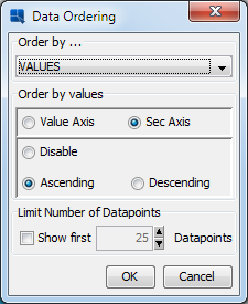
Value Data Ordering Dialog
If you choose the VALUES option, the dialog changes. From this dialog you can specify to sort the category elements based on their corresponding values in the value, or secondary value axis. You can also specify whether to sort them in ascending or descending order. This resulting sort by value chart is called a Pareto chart, and is often used in process control applications.
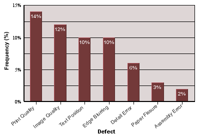
Pareto Chart
Please note that any sorting set will be re-applied if the chart is refreshed and/or if the data changes.
Sometimes, you want to plot only a few highest or lowest values. To do that, you can use the Top/Bottom N function.
To enable this feature, choose → , or click the button on the toolbar.
If the chart doesn't have any data series, the Ordering dialog will show the Limit Number Of DataPoints option.

This option can be enabled only if you order the chart by the categories or by the values in ascending or descending order. If you have such a chart, you can enable this function by selecting the Show first option. Then you can specify the maximum number of items that will be shown in the chart. If the data source returns more items than you specify in this option, excessive items will not be shown in the chart as if they didn't exist.
Histograms are a useful analysis tool, by allowing you to track the frequency that events occur, or the way that a set of data falls into specific ranges. ChartDesigner allows you to plot histograms based on the category elements in a chart. You can plot histograms for all category data types except time-based data (date, time, or timestamp).
Histograms are calculated by counting data points or instances of each category element. For numeric categories, you can further specify upper and lower bounds, as well as a scale to create ranges for the frequency counts.
To create a histogram, select → . A dialog will appear allowing you to select a histogram plot.
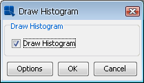
Select Histogram Dialog
When you select the Draw Histogram option another dialog will appear allowing you to specify options for the histogram plot. From this dialog you can select a lower or upper bound for that data being plotted. When you place bound restrictions, then the histogram will not count data that falls outside of the range specified by the upper and lower bounds. Generally it only makes sense to place bound restrictions on numeric category elements.
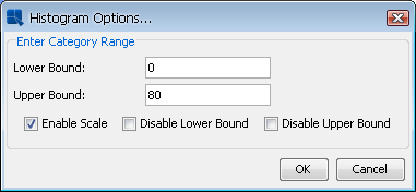
Histogram Options Dialog
For numeric category elements, you can also specify a scale in order to provide value ranges or groups in which to compute the frequency count. To specify a scale, select the Enable Scale option. This will bring up a new dialog allowing you to specify the scale.
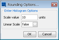
Histogram Scale Options
Here you can specify the number of units to be in each scale step. You can also specify whether to preserve a linear scale. This will draw a range on the category axis, even if there are no corresponding data points. For example, if the frequency count is zero between 20 and 30 then the “30” element will still appear on the category axis with a count of zero. However if linear scale is turned off the “30” element will not be drawn in the chart.
The plot area is the plane on which the data points are drawn for two-dimensional charts. You can customize the appearance of the plot area by selecting → . Assuming the current chart is a two-dimensional chart the following dialog will appear.

Plot Area Dialog
This dialog allows you to draw a border around the plot area, or fill it to provide a background color. If you fill the area, you can also specify certain three-dimensional effects either raising, lowering, or drawing a shadow.
On this dialog, you can also set up gradient background for the plot area. The gradient settings are the same as in the Rendering options described in the Section 3.14.1.3 - Format Menu.
You can control and modify the display of the chart legend by selecting → , by clicking on the  button on the toolbar, or by selecting Legend properties from legend pop-up menu (which pops up when you right-click on the legend). This will bring up the following dialog, allowing you to customize the legend properties.

Format Legend Dialog
The dialog contains the following options:
Display: | These options allow you to turn on or off the legend border, and background. This also allows you to display the point symbols instead of lines or blocks in the legend. |
Effect: | This allows you to add a three-dimensional effect to the legend. You can raise it, lower it, or draw a shadow. In addition to 3D effects, you can also display the legend with cut corners. |
Layout: | This allows you to change the legend from vertical, horizontal, square, or fixed column layout. |
Gradient: | Allows you to configure gradient for the legend background. The gradient settings are the same as in the Rendering options described in the Section 3.14.1.3 - Format Menu. |
Other: | This allows you to choose whether or not to display the legend, or to draw the legend in reverse order. You can set the fixed number of columns in legend in the Number of columns field. This field will be active only if you choose the Fixed columns layout option in the Layout section. You can also change the size of the symbols in the legend. |
In addition, you can remove specific category/series elements from the legend, by clicking the button. This will bring up a list of the legend items, where you can select which elements you would like to hide.
ChartDesigner renders three-dimensional charts in true 3D allowing light source modification, panning, zooming, and rotation. However, 3D rendering can be very memory and CPU intensive. When charts have a lot of data points (like 3D scatter and surface charts) it's possible to run out of memory when generating the chart. To solve this problem, a rendering approximation feature is provided. Using this algorithm the chart is not rendered perfectly, but it's usually acceptable when a lot of points have to be shown.
By default, approximation is turned on at a threshold value of 100 points. What this means, is that if a 3D chart has more than 100 data points that approximation will be used. You can turn off the approximation feature, or change the threshold value by selecting → . This will bring up the following dialog.
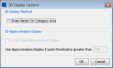
3D Display Options Dialog
The two options for 3D approximation allow you to turn on/off the approximation, and to set the threshold value. The other option in this dialog allow you to draw the series in-line (this is the same as the option in the navigation panel).
For column, bar, stack column, stack bar and HLCO charts, ChartDesigner allows you to configure a border around the columns. To set the border option, select → . This will bring up a dialog allowing you to set border options.
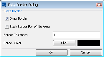
IData Border Dialog
The first option allows you to turn on/off the data border. The second option allows you to set a black border for any white areas in the chart. Please note that the border is black only if the first option is unchecked and will only appear around white areas in the chart. The third and fourth options allows you to set the border thickness, and the border color. If you click the button a dialog will appear allowing you to select or enter a new color.
ChartDesigner allows you to aggregate the data if there is more than one data point associated with a given category (and its series and/or stack, if a series and/or stack is present). This allows for a broader look at the data rather than just a single data point (out of many).
To aggregate the data, select → . A dialog will appear allowing you to enable aggregation.
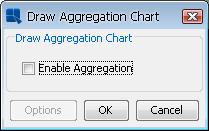
Select Aggregation Dialog
When you select , a second dialog box appears asking for the type of aggregation to be applied. You can choose from maximum, minimum, average, sum and count for the aggregates. You can specify a primary aggregate (aggregate applied to the column mapped to the primary axis) as well a secondary aggregate (aggregate applied to the column mapped to the secondary axis), if a secondary axis exists.
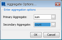
Aggregate Options Dialog
There are a number of formatting options that are unique to certain chart types. These options can be modified by selecting → , or clicking the  button on the toolbar. This will bring up a dialog that varies depending on the type of the current chart. Some chart types have no additional options.
For bubble charts the following dialog is displayed.
Bubble Options Dialog
The following options are available for bubble charts:
x-axis unit length: radius | This specifies the ratio of X-axis unit length to the radius of the bubble. |
Fill Bubble: | This allows you to specify whether or not to fill the bubble area. |
Draw Border: | This allows you to specify whether or not to draw a border around the bubbles. |
3D Shading: | This allows you to add three-dimensional shading to the bubbles. You can also specify the light intensity for the shading. |
Bubble Chart with 3D Shading
For dial charts the following dialog is displayed.
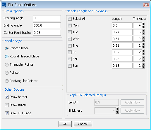
Dial Options Dialog
The following options are available for dial charts:
Starting Angle: | This specifies the angle where the first axis label is to be set. This property also determines where the border and dial area will start if the Draw Full Circle option is unchecked. The angle is represented in degrees and is 0 by default. Assuming the dial chart is a clock face, 0 degrees is 12 o'clock. | ||||||||||
Ending Angle: | This specifies the angle where the last axis label should be set. This property also determines where the border and dial area will end if the Draw Full Circle option is unchecked. The angle is represented in degrees and is 360 by default. Hence by default the labels (and data points) encompass the entire circumference for the dial. | ||||||||||
Center Point Radius: | This specifies the radius for an inner circle, which starts from the center of the dial chart. The radius is specified as a ration to the radius of the dial plot. Hence, a value of 1 will make the inner circle encompass the entire dial. If the Draw Full Circle option is unchecked, only the portion of the center point that is within the starting and ending angles will be shown. 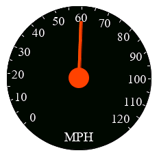 Dial Chart with Center Point Radius | ||||||||||
Needle Style: | This specifies the type of needle to draw.
The default is Pointed Blade. | ||||||||||
Draw Border: | This specifies whether or not to draw a border around the dial. | ||||||||||
Draw Arrow: | This specifies whether or not to draw arrowheads at the end of the dial hands. | ||||||||||
Draw Full Circle: | This specified whether to draw the dial as a complete circle (360 degrees) or only draw the portion of the circle determined by the starting and ending angles. | ||||||||||
Needle Length and Thickness: | This section specifies the length and thickness of the needle. The needle length is measured from the center of the dial. The range is from 0 (center of the dial) to 1 (the end of the dial). The thickness determines the width of the needle, larger values results in a wider pointer. When creating a chart, the needle length is randomly generated. The default thickness is 2. Each category element is represented by a different needle, you can change the properties individually or change multiple categories at once. To change the property of each needle individually, directly change the values to the right of the category. To make changes to multiple needles, check each category or check the Select All option, set the properties in the lower right corner, then click for each property changed. This will modify all checked categories to reflect the new values. |


Dial charts have the additional option to display a foreground or background image for the dial plot area. To add a foreground or background image, select → or → . These options are only enabled for dial charts.

Dial Chart Background Image Dialog
Selecting an image works in the same way as the background image dialog, see Section 3.14.5.1.1 - Background Images. In the dial chart image dialog, there is also an option to specify the radius of the image. Specifying 1 for the radius will make the image the same width and height as the plot area. Increasing or decreasing this value will enlarge or shrink the images respectively.
For overlay charts the following dialog is displayed.

Overlay Options Dialog
From this dialog you can specify which chart type you would like to use for each element of the data series. Available chart types for the series elements in an overlay chart are column, area, and line. You can also choose not to display certain series elements.
From this dialog you can also specify which axis you would like to use to plot a series element. You can place elements on the primary or secondary axes, or you can create new value axes for the series elements. To create a new value axis, select New Axis from the drop-down menu. Once you specify to use a new axis, a new option will be added to the drop-down menus for the other data series elements, allowing them to be drawn on the same axis that you previously specified. Using a variety of axes allows you to precisely tune the scale that the different series elements use. Each of these axes will have its own tab in the Axis Elements window, where you can change the label step interval for each axis independently of the others.
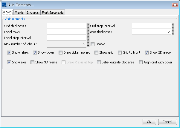
Axis Options Dialog for Multiple Value Axes
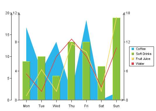
Overlay Chart with Multiple Value Axes
If one of the chart types used by the overlay chart is a line, you can specify whether or not to draw the line as a step line using the Combo Line tab. For more about step lines see Section 3.14.9.5 - Line Charts:
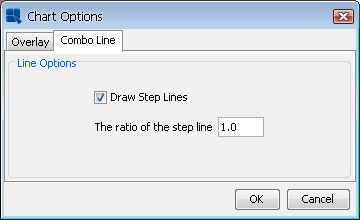
Combo Line Options for Overlay Charts
For pie charts the following dialog is displayed. (Note that different options will appear/disappear depending on whether the chart has a series, and if it's a 2D or 3D chart.) Here are the options available for a 2D chart with series:
Pie Options Dialog (With Series)
Here are the options available for a 2D chart without series, notice that the formation options are removed and the % in legend and Value in legend options are added:
Pie Options Dialog (Without Series)
The following options are available for pie charts:
Explode: | This allows you to pick one or more category/series elements whose sections are to be drawn at a certain distance away from the center of the pie. |
Sector Gap: | This allows you to pick one or more category/series elements whose sections are drawn at a certain distance away from the center of the pie and still maintain the same distance between pie slices and a circular boundary. |
Distance from origin: | This allows you to specify how far the exploded/sector gap sections are to be drawn away from the center. This number, represented as a percentage of the radius, indicates the distance between the center and the tip of the pie slice to be exported. |
Rotate pie: | This allows you to specify the number of degrees that the chart should be rotated in a clockwise direction. Available values are between 0 and 360 |
Place label: | This indicates the distance of the labels from the center of the pie. The position of an individual label can also be adjusted by dragging the text. |
“Others” % Threshold: | This feature is useful for pie charts that have a large number of small categories. Rather then draw a slice for each category, users can select a threshold value. Any category whose percentage of the value column is less than the threshold value will be lumped into an “Others” slice. |
Display Name for “Others”: | This option allows you to set the display name for the “Others” slice that is created for categories that fall below the supplied threshold value. This label will appear in the legend, and/or for the slice label. |
Label: | This determines whether a category/series label should be drawn for each pie slice. By default, these only appear as legend items. Note that the label will not appear if the data for the slice is 0 or null. |
Value: | This allows you to specify whether to display the actual value of each pie slice. Note that the value will not appear if the data for the slice is 0 or null. |
Percentage: | This allows you to display the percentage for each pie slice. The percentages are calculated by dividing the value of each section by the sum of all the values. Note that the percentage will not appear if the data for the slice is 0 or null. |
% in legend: | This allows you to display the percentage represented by each slice in the pie in the legend. If the pie slices can become very thin, this can be a preferable presentation. This option is only available if the pie chart does not have a data series. |
Value in legend: | This allows you to display the value represented by each slice in the pie in the legend. If the pie slices can become very thin, this can be a preferable presentation. This option is only available if the pie chart does not have a data series. |
Border: | This specifies whether to draw a border around each pie slice. This option is only available for two-dimensional pie charts. For three-dimensional pies you can use the border drawing option on the navigation panel. Note that the border will not appear if the data for the slice is 0 or null. |
Slice-to-Label Line: | This will draw a line from any label(s) to it's corresponding pie slice. Note that the slice-to-label line will not appear if the data for the slice is 0 or null. |
Label at the Side: | This will place the labels for the pie chart away from the plot around the outside of the chart. When used with the Slick-to-Label Line option, it gives users a way to display the pie labels for charts with many small categories without any text overlapping. Note that the label will not appear if the data for the slice is 0 or null. 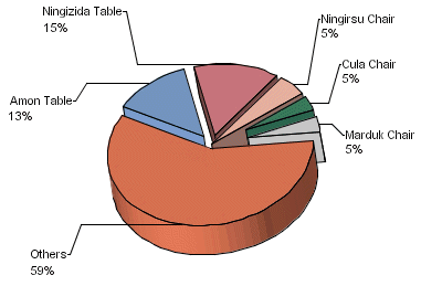 Pie Chart with Side Labels and Lines |
Best Fit: | This will arrange the multiple pies in the best configuration to fit the chart canvas. This is for pies with a data series only. |
Draw Linearly: | This will arrange the multiple pies in a straight horizontal line. This is for pies with a data series only. |
Number of Pies Per Row: | This allows you to create a custom arrangement of multiple pies, by specifying the number of pies to draw in each row of the arrangement. |
Gap between pies: | This allows you to specify the gap between the multiple pies. The number is a multiple of the pie radius, so the gap will adjust with the size of the chart plot. |
For two-dimensional line charts, one of two different dialogs will be displayed depending on whether the chart has a data series or not. If the chart has a data series then the following dialog is displayed.
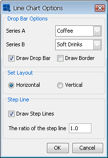
Line Options Dialog (with series)
Line charts with a data series have a specific option that allows you to draw drop bars between two series elements. The dialog options are as follows:
Series A: | This specifies the first series element that you would like to use for the drop bar. | ||||||
Series B: | This specifies the second series element that you would like to use for the drop bar. | ||||||
Draw Drop Bar: | This specifies whether or not to draw the drop bars. | ||||||
Draw Border: | This specifies whether or not to draw a border around the drop bars. | ||||||
Set Layout: | This specifies whether to draw the line chart in vertical or horizontal orientation. | ||||||
Step Line: | This allows you to draw the line chart as a step line. You can also specify the step line ratio to use. 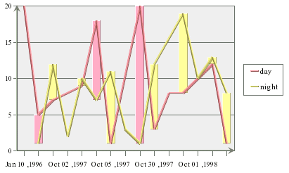 Line Chart with Drop Bars Note that the color of the drop bar will vary depending on which series has the higher value for a given point. If the line chart does not have a series, then the following dialog will appear.  Line Options Dialog (without series) The dialog options are as follows:
|

There are no additional options for three-dimensional line charts.
ChartDesigner contains a special option for line charts that allows you to have two values shown for the same line. Here the secondary axis a used to plot the second value (as in a line-line combination) and then combined with the line on the primary axis.
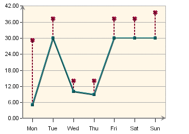
Double Value Line Chart
To create a double value line chart, design a line-line combination chart (a line chart with primary and secondary values). Then select → . This will bring up the axis elements dialog.
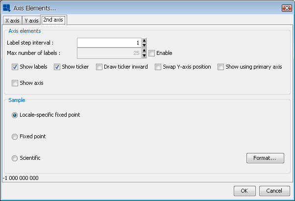
Axis Elements Dialog for Line-Line Combination Charts
Under the 2nd Axis tab, there is a checkbox marked Show using primary axis. Check this box and click 'OK'. Your chart will now be drawn as a double value line chart.
For HLCO charts the following dialog is displayed.
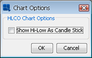
HLCO Options Dialog
The Show Hi-Low As Candle Stick option will turn the HLCO chart into a candle representation. A candle HLCO chart blends the high, low, close, and open data into a single object that resembles a candlestick.
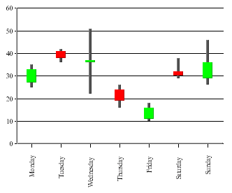
HLCO Candlestick Chart
For box charts the following dialog is displayed.

Box Options Dialog
This dialog allows you to specify whether to display the box chart in a horizontal or vertical orientation.
For stack area charts the following dialog is displayed.
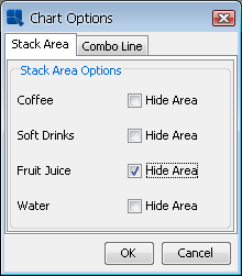
Stack Area Options Dialog
You can choose to hide any of the stacks in the chart by clicking on the corresponding check box. The Combo Line tab allows you to specify step lines if the chart is a line stack area combination. There are no additional options for three-dimensional stack area charts.
For Gantt charts the following dialog is displayed.
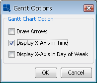
Gantt Options Dialog
The following options are available for Gantt charts:
- Draw Arrows:
This will draw connecting arrows between the category elements of the Gantt chart. This allows you to illustrate a sequence between scheduled events. The arrows are drawn in the order the category elements appear in the data source.
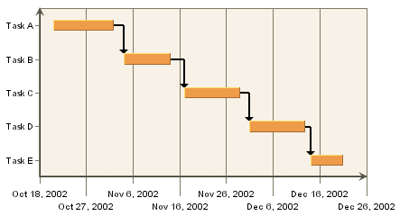
Gantt Chart with Arrows
- Display X-Axis in Time:
This shows the ticker labels as time values instead of numeric values for the X-axis.
- Display X-Axis in Day of Week:
This shows the ticker labels as days of the week with the date for each Sunday shown as well.
For radar charts the following dialog is displayed.

Radar Options Dialog
By default the scale is the same for all of the axes in the radar chart. Unchecking the Synchronize All Axes option will allow each axis in the radar chart to be scaled independently. You can select to use auto-scaling for each axis, or you can set the scales manually, by invoking the axis scale dialog.
The second options allows you to set how the grid is drawn for the radar chart. By default, if the grid is enabled, it is drawn in straight lines that connect the tickers on each axis. Enabling the Draw Circular Grid option will draw the grid in a circle, similar to the polar chart grid.
The third option allows you to specify a cut-off point for the data points (areas) in the radar chart. You can enter the maximum value that should be shown in the chart. The areas bounded by the data points will not be drawn beyond the specified cut-off point.
For scatter charts the following dialog is displayed.
Scatter Options Dialog
The Max Y Cut Off Point option allows you to specify a maximum value for the Y point of the scatter coordinates. Any coordinates that fall beyond this threshold are not plotted. Connecting lines wil draw up to the edge of the threshold, and continue to the next data point.
The Combo Line option allows you to specify to draw the connecting line as a step line, as well as specify the step line ratio.
For polar charts the following dialog is displayed.
Polar Options Dialog
Scale: | This option allows you to specify whether the input data for the angle (θ) portion of the data points is in radians or degrees. The chart will always display angles from 0 to 360. If the input data is in radians, it will be displayed as degrees. |
Direction | This option allows you to specify whether the circular plot should be drawn clockwise or counter clockwise. |
Start Angle: | By default the top of the polar chart plot is 0 degrees. This option allows you to specify a different angle for the top of the plot. The argument for this angle is supplied in degrees or radians, depending on the scale you have chosen. |
Number of Sectors: | This option allows you to select the number of sectors you'd like to show in the chart. Sectors are created by drawing additional polar axis lines at specified angle intervals. By default four sectors are shown. |
For column charts with a data series the following dialog is displayed:
Column Options Dialog
Normally, when column charts have a data series, each series has it's own color that is applied for every category in the chart. If you want to assign different colors to the columns in the chart regardless of the series, you can enable the Unique Color Column option in this dialog. With this turned on, you can set the color for each column in the chart independently.
For column/bar charts without a data series the following dialog is displayed:
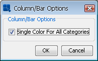
Column/Bar Options Dialog
Normally, when column/bar charts don't have a data series, all categories in the chart have single color. If you want to assign different colors to the categories in the chart, uncheck the Single Color For All Categories option in this dialog.
For any other two-dimensional line combination chart, the following dialog is displayed:

Line Combination Chart Options
This dialog allows you to specify whether to draw the combo line as a step line, as well as specify the step line ratio.
The chart options for a doughnut chart are almost exactly the same as those for a pie chart. You can refer to the options under Section 3.14.9.4 - Pie Charts for more details.
Doughnut Chart Options
The only option unique to doughnut charts is the Arc Length Ratio (%) which specifies the size of the hole at the center of the chart. A higher number results in a smaller hole.