This section covers some of the basics of charts including the different parts of a chart and the way in which tabular data either from the report or another data source is mapped to a chart.
The following diagram illustrates the various components that make up a chart. Also, this diagram references various terms that will be used throughout this guide.
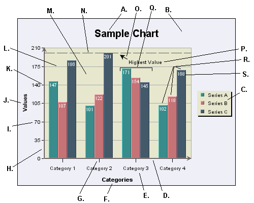
- A. Main Title
This is the main title for the chart.
- B. Chart Canvas
This is the background on which the chart is drawn. The canvas serves as the size/boundary for the chart and it is generally the same size as any exported image. You can modify the canvas color or place/add an image file as a background.
- C. Legend
This is the chart legend. The legend shows your category or series names along with a color point. Secondary values, as well as added trend/control lines and control areas, can also be displayed in the legend.
- D. Category (X) Axis
This is the X or category axis of the chart. Generally, the category axis plots the distinct entries from the data set for which you want to plot values in the chart. (The values are generally plotted on the Y-axis.) Certain chart types such as bar and Gantt reverse this by drawing the categories on the Y-axis, and plotting the values on the X-axis. Other chart types like scatter and bubble plots, plot values on each axis to create a point in 2D or 3D space.
- E. X-Axis Labels
These are the labels for the X-axis elements or categories.
- F. X-Axis Title
This is the X-axis title.
- G. X Ticker
These are the X-axis tickers. By default the tickers match each data point in the chart.
- H. Value (Y) Axis
This is the Y or value axis of the chart. Generally, the Y-axis plots the values for each of the categories. By default the scale of the Y axis is generated to provide a best fit for the data set; however, it can be manually adjusted. For combination charts, the second value axis is drawn at the right-hand side of the plot.
- I. Y-Axis Labels
These are the labels for the Y-axis values.
- J. Y-Axis Title
This is the Y-axis title.
- K. Y-Axis Ticker
These are the Y-axis tickers.
- L. Y Grid
These are grid lines drawn along each scale step in the Y-axis. Grid lines can also be drawn for the points on the X-axis (and Z-axis for 3D charts).
- M. Plot Area
This is the area, bounded by the axes, where all the data points are plotted. You can fill the area with color and/or draw a border around the area, along with other options. The plot area can be moved and re-sized on the chart canvas.
- N. Control Line
This is one of the special types of lines that can be added to a chart. In this instance, it is a control line that follows the highest value in a series. Control lines can also be drawn for averages and multiples of standard deviation. Users can also add a variety of trend lines to charts.
- O. Floating Line
A floating line is an arbitrary line added to a chart. In this case it is being used as a pointer with an arrow. Floating lines move in relative position with the chart plot. They can also be used to create filled shapes.
- P. Annotation Text
This is a piece of arbitrary text added to a chart (not labels or titles). You can place text anywhere in the chart canvas. Like floating lines, annotation text moves in relative position to the chart plot.
- Q. Category Elements
This is the plot for a category element. There are three points plotted for each category because this chart has a data series.
- R. Data Series Elements
These are the individual points that make up a category. A series allows groups of data to be plotted on a single chart. For more about information about categories and series, see Section 3.12.2 - Basic Data Mapping
- S. Data Top Labels
These are labels placed at each data point in the chart that display the exact value for each point.
Data mapping is the way that raw data is rendered in the chart. Although data can be drawn from many sources, a chart looks for the basic structure of the data to be in the form of a table. Hence, data passed in as arguments, from the report or from XML files is converted to a table structure before mapping.
A basic set of data might look something like this:
| Product | Sales |
|---|---|
| Chair | 362 |
| Table | 862 |
| Dresser | 1052 |
| Cabinet | 1211 |
To plot this data in a chart, you would want to plot the Sales value for each entry in the Product column. Hence, the products are your category and the sales numbers are your values. In a chart you would map the Product column to the X (category) axis and the Sales column to the Y (value) axis. The resulting plot would look like this in a column chart:
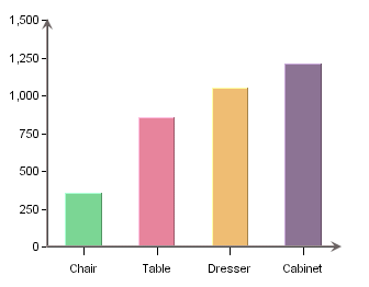
Here, a column is drawn to show the value for each distinct element in the category column. On top of the basic category values, additional information can be displayed in the form of a data series. For example, say that there is another element to our data that shows sales data not only for product, but also over a sales region. Our adjusted table would look like this:
| Product | Region | Sales |
|---|---|---|
| Chair | East | 114 |
| Chair | Midwest | 131 |
| Chair | West | 117 |
| Table | East | 231 |
| Table | Midwest | 187 |
| Table | West | 444 |
| Dresser | East | 327 |
| Dresser | Midwest | 469 |
| Dresser | West | 256 |
| Cabinet | East | 422 |
| Cabinet | Midwest | 386 |
| Cabinet | West | 403 |
In order to show the value for each region per product we could add the Region column to the data mapping as a data series. Doing this gives us the following chart:
Now each category has three data points, one for each region. For two-dimensional charts the series is always displayed in-line. In three-dimensional charts, the series is drawn on the Z-axis by default, although it can be drawn in-line as well. Below, is the same chart show in 3D.
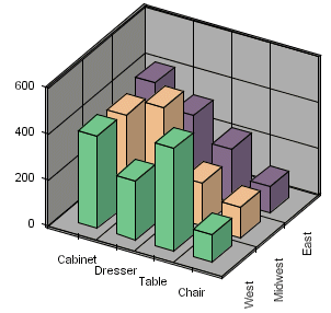
In this chart, the data series is drawn along the Z-axis. Note that the order of the categories has been changed to provide a better view of the data. This is the basic concept behind data mapping. Most chart types use this mapping technique or mapping options similar to this. Detailed data mapping instructions for each chart type are available in Section 3.13 - Chart Types and Data Mapping.
There are several options available both for saving chart definitions and exporting charts as image files. More information on how to save and export charts in the Chart Designer can be found in Section 3.16 - Saving & Exporting Charts.
There are two primary methods which you can use to store chart definitions created in ChartDesigner: either as chart or as template files.
- Chart files
Chart files save the chart in a binary file called
filename.cht. A chart file stores both the definitions of the chart (type, dimension, etc.) as well as the data that was used to create the chart. Hence, chart files are portable. Any time you open a chart file, it will open with the original data that was used to create the chart. After opening the chart, you can refresh the data from the source or change the chart's data source entirely.- Template files
Template files save the chart in a binary file called
filename.tpl. A template file stores only the chart definitions and stores only 10 records of data with the chart. Hence, any time a template file is opened it will try to connect to the original data source to retrieve the data. Because of this, template files can be less portable than chart files. Template files can also be used to pass chart attributes from one chart to another. To do this, you can apply a template to a chart. This will carry over many of the attributes of the template to the current chart. For more information about applying templates, please see Section 3.16.2.1 - Working with Templates.- PAC files
PAC files save the chart the way that it is ready for deployment. A
.PACfile takes the chart and all the supplementary files associated with it - background images, dynamic drill-downs, and parametric drill-downs and places them in a single binary file. This configuration makes it easy to deploy charts and move them between ERES installations. If you reopen a.PACfile in Chart Designer, it will expand all the files back to their original location. Therefore, the target directories will need to exist for a.PACfile to be opened successfully. Refrain from renaming the.PACfile after its creation because this will lead to problems during expansion.
In addition to saving chart definitions in binary format, chart files and template files can also be saved in XML format. These XML chart definition files can be modified outside of Chart Designer or Chart API.
Generally, charts can be deployed via the Web in one of two ways - either as applets or by generating image files. Applets can directly load chart definitions, either template or chart files. For more about using applets see the Chart Viewer section in Section 6.7 - Chart Viewer. For image files, ERES can render charts in the following formats:
- GIF
ERES can generate GIF images using one of two compression methods - RLE or LZW. The LZW method is faster and produces smaller files; however, its use is protected by patent. You must obtain a license from Unisys in order to unlock the LZW compression. By default, GIF files are generated using RLE compression.
- JPEG
JPEG is another popular image format. It is a higher resolution image format than GIF and it is not patent protected. When generating a JPEG file you can specify the quality and compression of the file. The higher the quality, the larger the file.
- PNG
PNG is an image format that is less popular but it can be displayed in most browsers. It is a high-quality image with a smaller file size than JPEG. There are three different compression options available for this format.
- SVG
SVG (Scalable Vector Graphics) is a relatively new image format that saves the image as vectors in an XML-based text format. Generally, you will need a browser plug-in to view these images.
- SWF
SWF is an Adobe Flash file. The flash format is vector based and it allows the chart to be re-sized after export. Also, flash allows for high-resolution printing and produces a small file size.
- BMP
This is a Windows bitmap format.
- WMF
WMF is the Windows Meta File format. This can be used for import/export into MS Office documents.
In addition to static images, ChartDesigner also allows the chart data to be exported as a text file or an XML file.