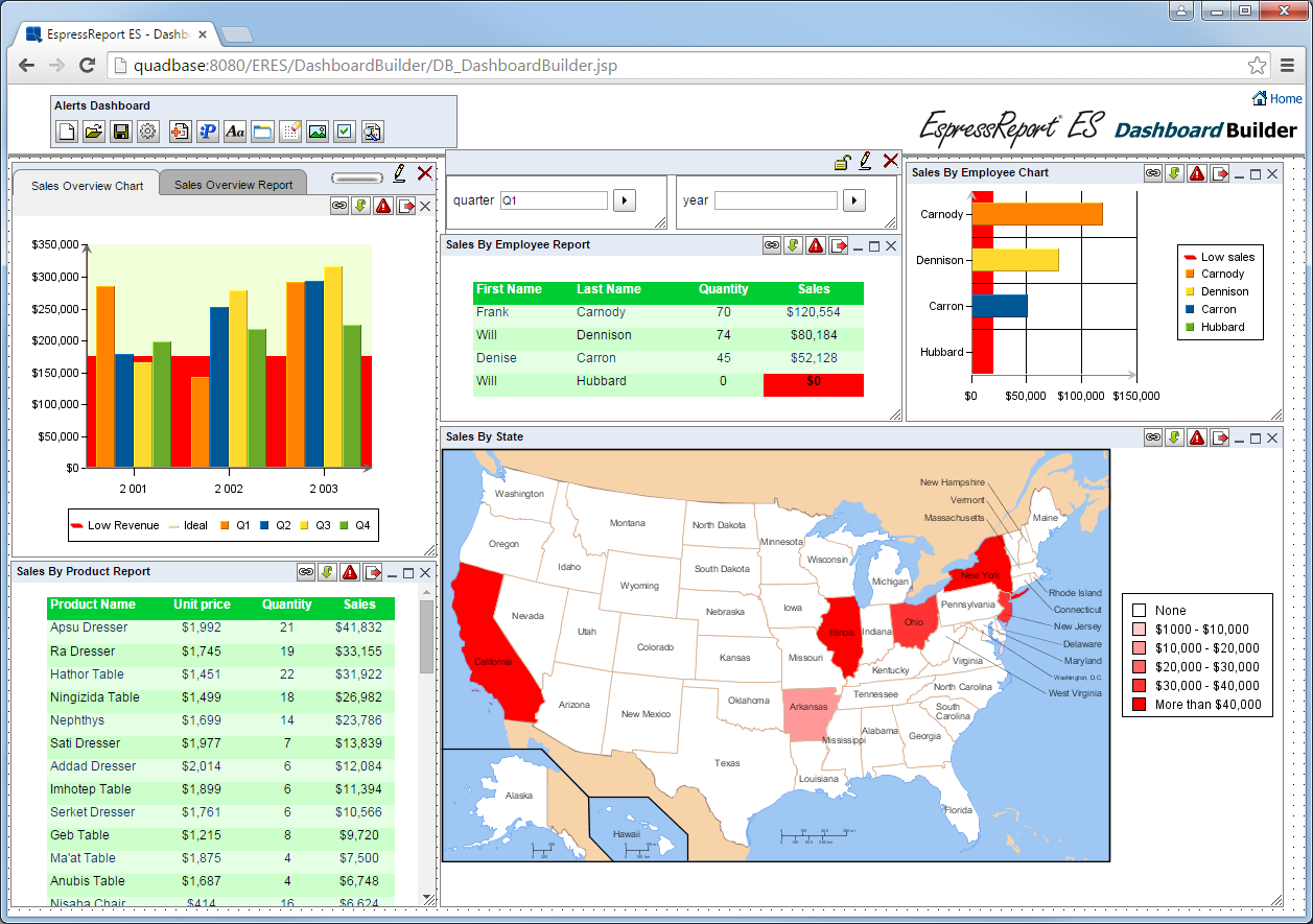
Another way the ERES allows users to publish reports, charts and maps is through dashboards. Dashboards allow users to easily consolidate summarized information in a single page or briefing. Dashboards in ERES require no special skill or administrative support. Simple thin-client interfaces allow all users to easily create customized information presentations.
Here are some sample dashboard presentations.

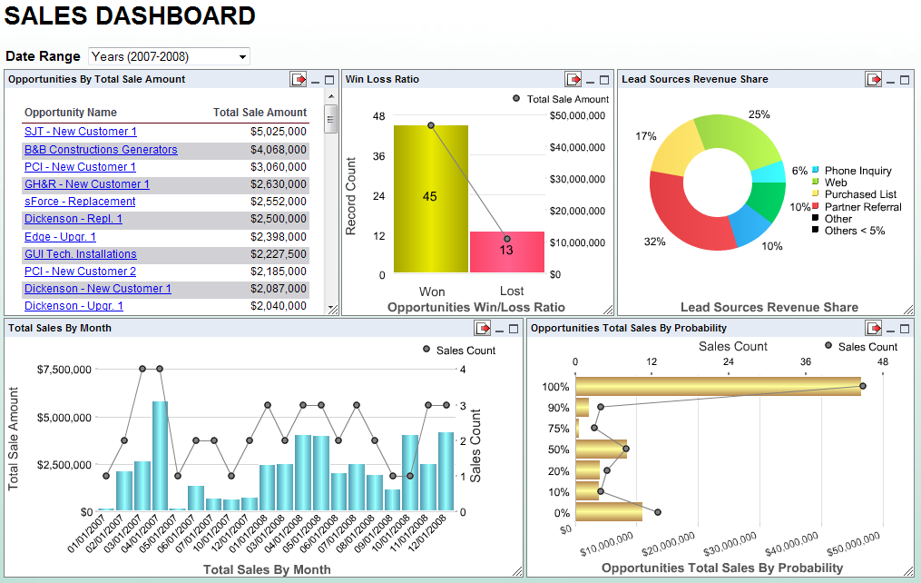
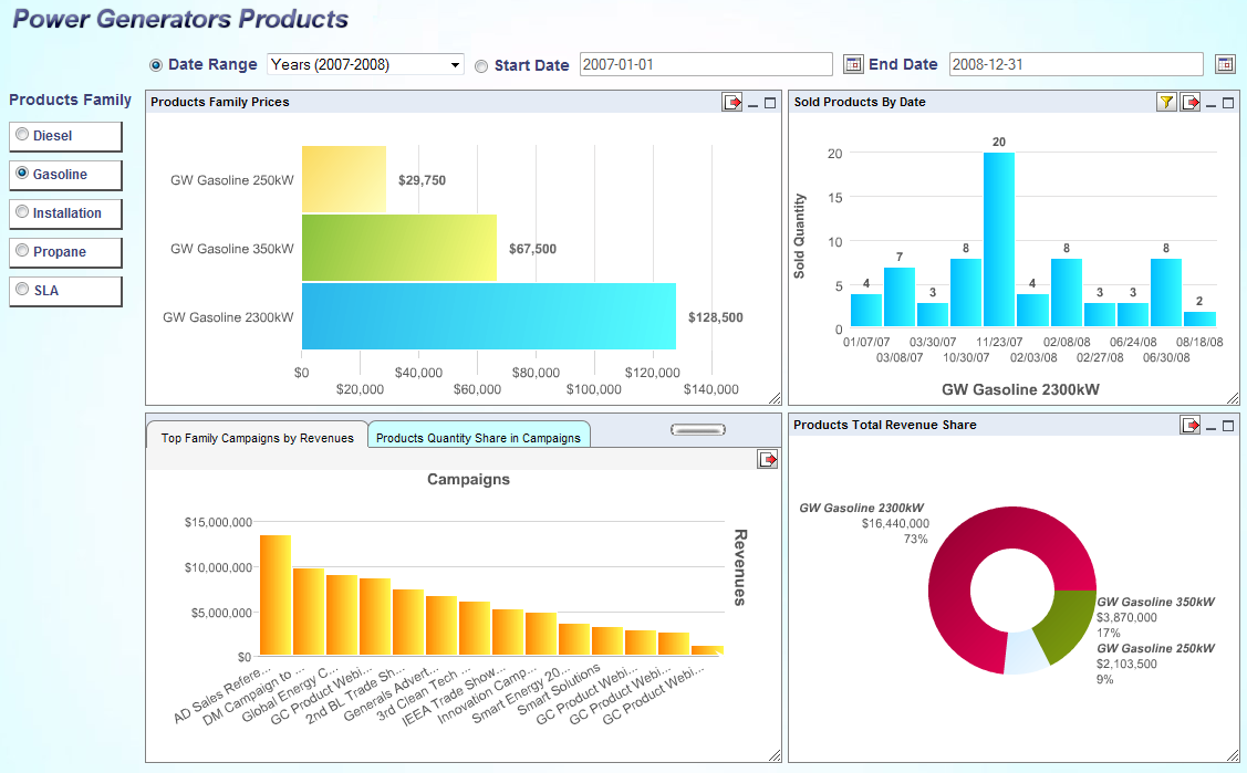
Sales Dashboard

Summary Dashboard
Products Dashboard
The top-level or main presentation consists of a set of charts, reports or maps arranged on the page. You can add shared parameters in a panel, or list the values of parameters so that the users of the dashboard can apply filters to refresh the applicable charts/reports/maps.
Individual options for each chart or report allow users to apply additional filters as well as export the charts, reports and maps in different forms back to the client.
Users can also add layers of drill-down to each chart/report/map in the main presentation. The drill-down can point to a report, chart or a map. This allows each piece of summarized information in the presentation to be immediately actionable.
Dashboards in ERES are created using the Dashboard Builder interface. This easy-to-use thin-client interface allows all users to easily create dashboard presentations using charts, reports and maps that have been deployed in the Organizer. The Dashboard Builder can be launched from the ERES Start page. If you've logged as a user with design privileges, you can follow the Dashboard Builder link to open the interface.
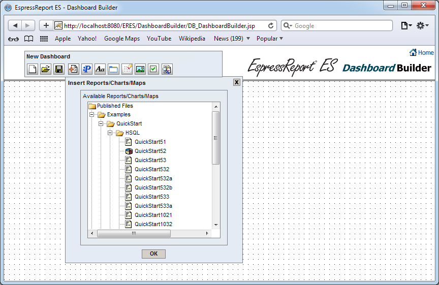
Dashboard Builder Interface
The top part of the Dashboard Builder interface contains a small toolbar that allows you to initiate the following actions:
 Start a new dashboard
 Open an existing dashboard
 Save the current dashboard
 Migrate dashboards from ERES version 6.3 or older
 Add report/chart/map to the current dashboard
 Add share parameter(s)
 Insert a label into the current dashboard
 Insert Folder
 Turn On/Off Grid
 Add dashboard background
 Dashboard additional options
 Preview the current dashboard
 Pack/unpack the dashboard builder toolbar
To add a chart, report or map to the dashboard, click the button on the dashboard builder toolbar. After you have clicked the button, the insert reports/charts/maps dialog will then appear. The dialog contains a tree that mirrors the folder structure in the Organizer. All of the charts, reports and maps to which you have access are listed. In order to insert a chart, report or map into the dashboard, simply click the chart or report entry in the tree. The chart, report or map will then be added to the dashboard.
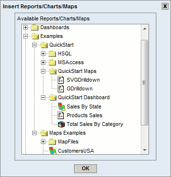
Insert Reports/Charts/Maps Dialog
Charts, reports and maps in the dashboard can be moved or resized in free-form. You can resize and move charts, reports and maps using the mouse. To move a chart/report/map, simply click to the header bar of the chart/report/map window and drag it. To resize a chart/report/map, click on the lower right corner of the chart/report/map window and drag on the sizing handle that appears around the lower right edge of the window. In addition, you may minimize or maximize it by clicking minimize  or maximize
  icon in the header bar.
If a report, chart or map contains alerts, icon  appears in the header bar. To learn more about alerts in dashboards, please visit Section 10.3.2 - User interface.
Shared parameters allow you to group common parameters from all the charts/reports/maps into a single parameter. You can apply a common filter to some or all of the dashboard items at the same time. All of a dashboard's shared parameters are listed in the Shared Parameters list in the share parameters dialog that can be open by clicking the button on the dashboard builder toolbar.
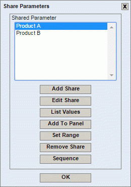
Share Parameters Dialog
To create a shared parameter, click the button in the Share Parameters dialog. This will open a dialog in a new window that allows you to set options for the share.
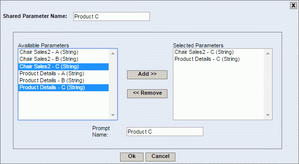
Shared Parameter Dialog
The left-hand side of the dialog shows all the parameters for all the selected charts/reports/maps in the dashboard. You can select which parameters you would like to add in the share, by selecting them in the left-hand side and clicking the button. Note that all parameters in the share must have the same data type.
The parameter mapping options (whether the parameter is mapped to a database column) is based on the first parameter selected for a share. For more information about parameter mapping, see Section 2.4.3.2.2.2 - Initializing Query Parameters.
For each shared parameter you can enter a prompt name, and select the default value. Once you have finished entering the information for the shared parameter, be sure to specify a name for the parameter in the field at the top, and click to save the changes. The parameter will then be added to the Shared Parameters list in the share parameters dialog.
You can edit or remove a shared parameter, by selecting it in the list, and clicking the or buttons.
In addition to adding/editing/removing shared parameters, you can also list the values of a shared parameter into a set of buttons in the dashboard or arrange shared parameter to be displayed in the panel that allows you to enter parameter value right from the dashboard. Please note in order to list the values of a parameter, the shared parameter may be single or multi-valued, and must have predefined selectable values. Arranging the layout of shared parameters can be done right from the share parameters dialog using the and buttons.

Share Parameters Dialog
- Display Shared Parameters:
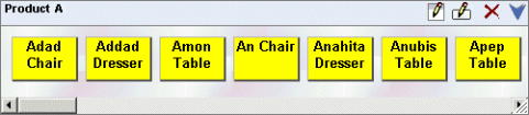
If the parameter has a small number of values, you may choose to list the values as buttons or images. For example, let's say your dashboard is showing sales data for your products, and you have a relatively small number of products. You can select this option to make a list which makes it easier for the users to pick a value for the filter. To list the values for a shared parameter, first select it from the shared parameters list and click the button. This will open the parameter value-list panel that contains the parameter values in buttons.
Parameter Value-list Panel
There are four additional buttons available in the panel header bar.

Modify Panel Attributes: This button will open a new dialog that allows you to modify the panel attributes such as background color and panel border. For more information about the dialog, please see Section 5.1.1.4 - Inserting Labels.

Modify Button Attributes: This button will open the following dialog that allows you to modify the buttons attributes.

Set Button Properties Dialog
The first option in this tab allows you to map shared parameter value to an image. To map shared parameter value, first select it from the left-hand panel, specify the image URL or browse for appropriate image using the button and click the button. In order to remove image URL mapping, select appropriate parameter value, clear the image URL text box and press the button or use the button to remove all mapping. The other options in the dialog allow you to specify button width, height and padding. You can also choose whether to show the buttons border or whether the buttons to be shaded or not. Another option allows you to display the boxes with a radio button. This option is not available for multi-valued parameters, which are automatically be given checkboxes.
The other tabs of the Set Button Properties dialog allow you to set the button text and background. The tabs are basically the same as for labels and they are described in the following Section 5.1.1.4 - Inserting Labels.

Delete: This button will delete the parameter value-list panel.


Set Buttons Alignment: These buttons will set the buttons to be aligned vertically or horizontally.
- Arranging layout of Shared Parameters:
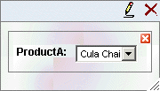
To arrange the layout of shared parameters by adding them to a panel. First select it from the shared parameters list and click the button. This will open a parameter panel with the parameter and the list box of the value added to the panel.
Parameter Panel
In the dashboard builder, you can move/resize the panel or move the small parameter box inside the panel. Also, you can close the panel such that none of the shared parameter will be detached. In the preview, you can only change the parameter values. Once you change the parameter value, the dashboard will be automatically refreshed.
There are two additional buttons available in the panel header bar.

Modify Panel Attributes: This button will open a new dialog that allows you to modify the parameter panel attributes such as text label properties, background color and border for the panel. For more information about the dialog, please see Section 5.1.1.4 - Inserting Labels.
Delete: This button will delete the parameter panel.

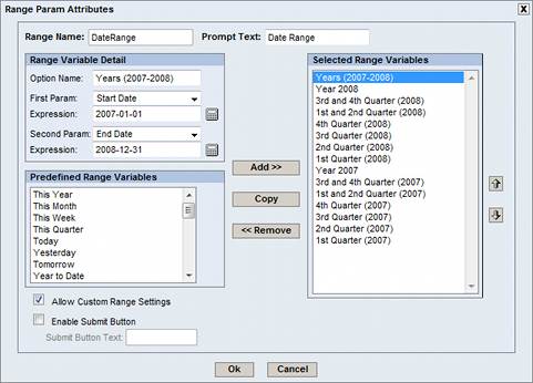
This function allows you to define a range across two shared parameters. To use this function, select two related shared parameters (such start and end date, or integer objects representing a range), then click Set Range. This will bring you to the Parameter Range screen.
Parameter Range Dialog
This screen has the following options:
- Range Name:
This field allows you to enter the title for the parameter range window.
- Prompt Text:
This text is displayed next to the selected combo parameter dropdown menu.
- Range Variable Detail:
This window has several sub-fields:
- Option Name:
This is the display name in the Selected Combined Parameter list.
- First Param:
This is the first parameter in the combined parameter, typically the starting value
- Second Param:
This is the last parameter in the combined parameter, typically the ending value
- Expression:
There are two expression fields, one for each parameter.
For date parameters, you may click on the button
 next to the expression field.
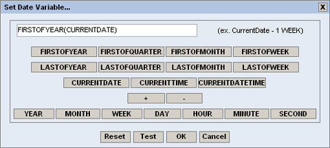
In this screen, you may enter one of the three keywords:
CurrentDate, CurrentTime,andCurrentDateTime, or one of the function names, such asFIRSTOFTHISYEAR. Function description you can see in the list of functionsYou may add or subtract units of time from the current date/time, allowing you to have a dynamic date range. For example, a report may have the following default values:
StartDate: CurrentDate - 1 WEEK
EndDate: CurrentDate
This would indicate that every time the report is run, the default prompt should be one week ago to the current date. Other supported measures are
YEAR, MONTH, DAY, HOUR, MINUTE,andSECOND. This feature only supports a single addition or subtraction. This feature does not support multi-value parameters.
- Predefined Range Variables:
This window contains example values to use in a parameter range. For example, for the date data type, the list contains expressions for
This Year, This Month, This Week, This Quarter,and many more. To use a predefined parameter, first ensure that the starting value is listed as the first parameter and the ending value is listed as the end parameter, then select the needed predefined parameter, and click . You may add more than one expression and all added expressions will be listed under the Selected Range Variable window.- Allow Custom Range Settings:
This option allows you to specify a parameter range by using calendar and parameter input boxes in the parameter range panel.
- Selected Range Variables:
This window displays all of the combined parameters that have been added to the dropdown menu for this combined parameter. Clicking on any value in this menu will cause the parameters for the given parameter name to appear in the Combined Share Parameter Detail window.
- Add:
This button can be in one of two modes: Change or Add. When the text of the button reads Add, the parameter information in the Combined Share Parameter Detail window will be added into the Selected Combo Params list.
- Change:
This button can be in one of two modes: Change or Add. Clicking on an item in the Selected Combo Parameter list will change the text to change. When in this mode, clicking the button will save any changes made in the Combined Share Parameter Detail window to the currently selected combined parameter.
- Copy:
This button will copy the selected item and add it to the Selected Combo Parameter list under a new name.
- Remove:
This button will remove the selected item from the Selected Combo Parameter list.
The Parameter Range Dashboard object: After creating one or more saved parameters, the Combined Parameter Dashboard object will appear. This object contains the following:
- Saved Parameter Dropdown menu:
This menu allows you to select any of the saved combined parameters created in the Combo Parameter window. Selecting the radio button next to this object will enable it.
- Parameter text boxes:
These text boxes represent the first and second parameters in the combined parameter. Note that you can use the calendar to specify the date parameters. To open the calendar, simply click the button
 in the shared parameters dialog.
By default, the user is prompted to enter all of the report parameters at once in the prompt dialog. This configuration, however, may not be the best approach if some parameters are mapped to database columns with a significant number of distinct values. It can be difficult to select from a very large list, and depending on the parameter combination, users may be able to select sets that don't return any data.
To assist with these problems, ERES provides a feature that allows the user to configure the order in which the parameters should be entered. With this feature enabled, the user enters parameters in the dialog in a pre-defined order. As such each selection will be applied as a filter to the next parameter prompt(s). Using cascading parameters can limit the number of distinct values presented to the user, and can prevent the user from selecting invalid parameter combinations.
At first, create a query named e.g. Cascade with parameter sequence on Woodview HSQL database that goes with ERES. To do this, open Organizer, click the  icon to open the Data Registry Manager dialog, select a data registry and click the button. Select
 Queries under Databases/Woodview (HSQL) node and click the button to create a new query. Type Cascade as a name and for example, use the following query:
SELECT ORDERS.QUARTER, YEAR(ORDERS.SHIPDATE) as "year", CATEGORIES.CATEGORYNAME, PRODUCTS.PRODUCTNAME
FROM ORDERS, CATEGORIES, PRODUCTS, ORDER_DETAILS
WHERE (ORDERS.ORDERID = ORDER_DETAILS.ORDERID)
AND (PRODUCTS.PRODUCTID = ORDER_DETAILS.PRODUCTID)
AND (CATEGORIES.CATEGORYID = PRODUCTS.CATEGORYID)
AND QUARTER = :quarter AND YEAR(ORDERS.SHIPDATE) =:year
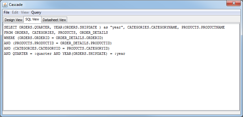
Cascading Parameters Query
Now, initialize query parameters. Check Prompt parameter in sequence and click the button. Set the parameter sequence according to the image below, i.e. the quarter parameter will be in the first level and year in the second level. Then map the first parameter quarter to database column ORDERS.QUARTER.
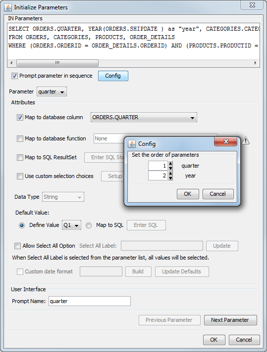
Initialize First Parameter
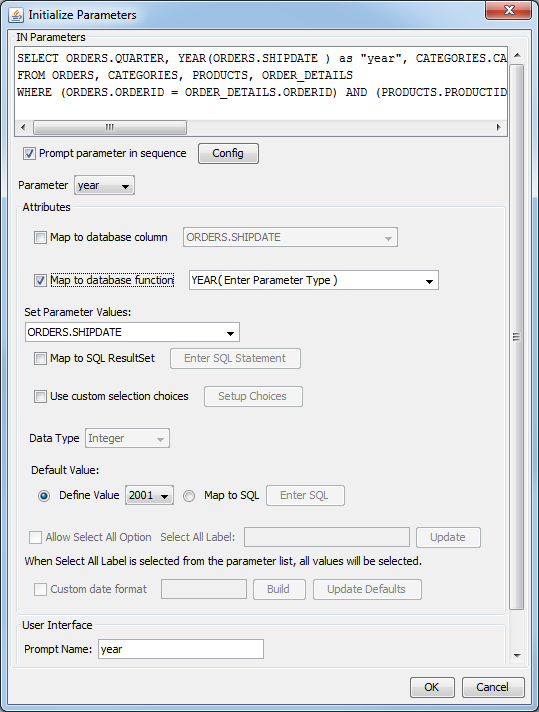
Map the second parameter year to database function YEAR and Set Parameter Values to ORDERS.SHIPDATE. Then click to save the query.
Initialize Second Parameter
Go to Dashboard Builder and open the Alerts dashboard (Published Files/Examples/Dashboards/Alerts Dashboard). Then click icon on the Dashboard Builder toolbar to show list of shared parameters in the dashboard. Notice that there are two shared parameters quarter and year already added in a dashboard. From the dialog, click the button at the bottom.

Shared Parameters Setting
The Parameter Sequence dialog will then appear. From the query tree on the left, select Cascade query that you have created in previous steps. It should automatically map query parameters to shared parameters in the dashboard.

Parameter Sequence Dialog
Click button and place the parameter panel into a dashboard.

Parameters Panel
The image below shows inserted cascade parameters panel in the dashboard. Now you may specify a parameter value for the first and the second level. Once you have specified the last parameter in the sequence the dashboard templates should refresh according to the selected values.
Dashboard with Cascade Parameters Panel
You can insert a label into a dashboard by clicking on the button on the dashboard builder toolbar. After you have clicked the button, a small rectangle will follow your mouse pointer around the builder interface. Position the rectangle where you would like to insert the label and click. The label will then be inserted into the dashboard. You can edit the label text by double-clicking to the label body.
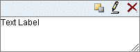
Inserting a Label
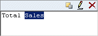
Editing a Label
Labels can be moved or resized in the same manner as for charts, reports and maps. To move a label, simply click to the header bar of the label window and drag it. To resize a label, click on the lower right corner of the label window and drag on the sizing handle that appears around the lower right edge of the window.
There are three additional buttons available for a label in the label header bar.
| Move to Back: This button will move the label to back. |
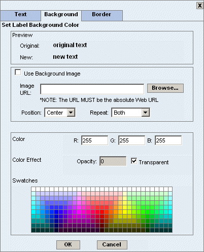
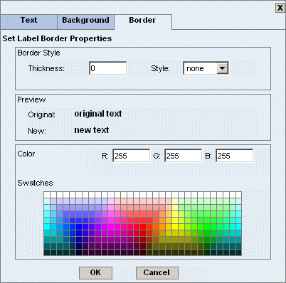
| Edit: This button will open a new dialog that allows you to specify text label properties, background color and border for the label.
|
| Delete: This button will delete the label. |

Please note that labels can also contain any HTML segment as the content. If there are font settings in the label content in the HTML segment, the external settings from the dialog will be overridden.
For example, let's say you have a label with the font type set to Arial. However, once you enter HTML segment <font face="Garamond">Label content</font> into the label, the Arial font will be overriden by the Garamond font for the Label content text.
You can also add dashboard background by clicking on the button on the dashboard builder toolbar. This will open a dialog that allows you to set the dashboard background.

Dashboard Background Dialog
The first option in the dialog allows you to use a background image for a dashboard. If you want to use a background image for the dashboard, simply check the Use Background Image checkbox and enter the image URL or use the button to browse to the appropriate background image. Please note the URL must be the absolute Web URL. In addition to adding background images, you can also specify the background image position (available positions are: center, left, right, top and bottom) or choose whether to set the dashboard background image to be repeated (available options are: both, horizontal, vertical and none). In the preview you can still see updated dashboard background.
The second option in the dialog allows you to set dashboard background color. The background color can be adjusted using swatches or RGB values.
Once you have finished setting dashboard background options, click to save the changes. You will be taken back to the Dashboard Builder interface.
You can also specify additional dashboard options by clicking on the button on the dashboard builder toolbar. This will open a dialog that allows you to set the dashboard components resizable/movable and other options.

Dashboard Options Dialog
- Dashboard components resizable
Allow dashboard viewers to resize the dashboard components. This option doesn't affect the Dashboard Builder, it works in dashboard viewer (i.e. when you open a dashboard from MenuPage etc.) and dashboard preview only.
- Dashboard components movable
Allow dashboard viewers to move the dashboard components. Like the previous option this one also affects deployed dashboards only.
- Show toolbar in preview
Hide/display toolbar in deployed dashboards. For more information about the preview toolbar, please see Section 5.1.3.1 - The Preview Toolbar.
- Show header bar.
Show/hide header bars for templates in the dashboard. Affects deployed dashboards only. In the DashboardBuilder, headers are always visible.
- Single page for report
This option allows you to set whether reports will be displayed in single page or multi-page format
- Enable Expand/Collapse for report
Enable the Expand and Collapse function for reports. To learn more about this feature, see the Section 3.5.2 - Exporting Reports chapter.
- Enable Expand/Collapse animation
Enable animation for the Expand and Collapse function.
- Use report/chart's original size
This affects charts/reports only at the moment you add them to the dashboard. If this option is enabled, charts/reports will be added to the dashboard using their original size settings (i.e. canvas size for charts and page size for reports). If this option is disabled, all reports/charts will be resized to a standard size and their original size settings will be ignored. This option doesn't affect charts/reports after they have been added to the dashboard so you can resize them as much as you want.
- Use original margin for report
This option will set reports to be displayed with their original margins as defined in the Page Setup in the Report Designer. If this option is disabled, report margins are set to 0.2 inches.
- Use Flash for Charts
Use Flash for charts insted of the default format (PNG).
- Enable Flash Charts Animation
Enable/disable animation for Flash charts.
- Snap to Grid
Snap components to grid when resizing/moving.
- Auto Refresh
Enable auto refresh for deployed dashboards (this option doesn't affect the DashboardBuilder - it affects the dashboard viewer and dashboard preview only). In already deployed dashboards, auto-refresh can be also enabled/modified from the preview toolbar.
Once you have finished setting dashboard options, click 'Ok' to save the changes. You will be taken back to the Dashboard Builder interface. Please note the dashboard options setting will be saved with your dashboard.
You can add drill-down to any chart/report/map in the dashboard. The drill-down feature allows you to map the chart data points, report columns, and/or shared parameters to the lower-level chart's or report's parameters. This creates a relationship where an end-user can click on a data point in a dashboard chart or row in a table and be taken to a lower-level report or chart that shows detailed information for the selected point.
You can specify more than one drilldown relationship within a template (chart/report/map) although you can only have a maximum of two drilldowns for charts and SVG maps. For a report, any column can be used as a drilldown anchor.
To add a layer of drill-down, click the button  in the chart/report/map header bar. A dialog will open that allows you to configure drill-down options for the chart, report or map.
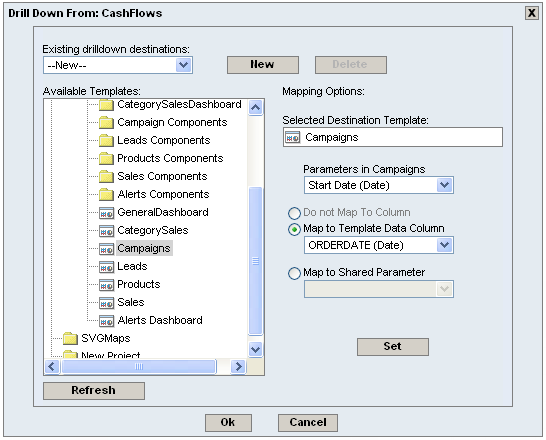
Drill-Down Options Dialog
The first option in the dialog, Existing drilldown destinations, is a dropdown selection box that will contain a list of the drilldowns that have been set in the template. The first element is always --New--. You can select a drilldown from the list and the component information will be filled automatically. If you choose --New--, all dialogs will be cleared and new entries into the dialogs can be entered. The items in the list are the names of the drilldown targets with a short notation of the template type, i.e., if the destination is a report named ABC, it will be shown in the list as: ABC (RPT). The template type notations are RPT for report, CHT for chart, DB for dashboard and MAP for Map. The button will only be enabled when you select an existing drilldown from the Existing drilldown destinations. When you hit this button, the current selected drilldown will be removed from the list, and the whole dialog will be reset.
The field in the left-hand side of the dialog contains a tree that mirrors the Organizer folder structure. All of the reports/charts/maps and dashboards to which you have access are listed. Please note that drill-downs to dashboards will be discussed in the next section.
To select a chart, report or map as the drill-down destination (lower-level) click it in the list. The dialog will update to show the name of the currently selected drill-down report/chart/map. The first drop-down list below the name will be populated with all of the parameters in the selected report/chart/map.
Each parameter in the destination report/chart/map can be unmapped (i.e., it does not pass the parameter value and shows the drillable link no matter where you click on the report/chart) or mapped to either a column (data element) in the top-level chart/report/map, or one of the shared parameters defined in the dashboard. To set an unmapped link, simply select the Do not Map To Column. Note that this option is only available if the next drillable link is a dashboard. To set the parameter, first select the destination parameter in the drop-down list. Then select the radio button to indicate whether it should be mapped to the top-level chart/report/map or a shared parameter. Then select the element/field or shared parameter from the appropriate drop-down list.
Note that a column selected for the drilldown in the Map to Chart/Table Column can only be used once, i.e., you can have only one drilldown per column. A shared parameter in the Map to Shared Parameter can be used multiple times in the dashboard. This is because a shared parameter isn't tied to a specific template in the dashboard, and it behaves like a parameter value provider for the drilldown destination template.
If all the destination template's parameters are mapped to shared parameters and if the parent template is a report, the first column of the report is used as the anchor for the drilldown link, though it won't pass the element value to the destination template. If the parent template is a chart or a SVG map, the data points become the anchor for the drilldown links.
You can click the button to save the drilldown settings that is currently being worked on. If the drilldown is new, a new entry in the Existing Drilldown destinations will be added, else the drilldown settings are updated in the browser memory. To make the saved settings permanent, click the button.
The button reloads the folder tree with latest organizer folder list. Note that all the folders will be shown in a collapsed view.
Once you have finished selecting options, click to save the changes. You will be taken back to the Dashboard Builder interface.
In addition to drill-down to any chart/report/map in the dashboard, you can also map the chart data points, report columns, and/or shared parameters to another dashboard. The dashboard builder supports both parameterized and non-parameterized dashboard as the destination of the drill-down. If the target dashboard has no parameter or you don't setup any parameter mapping, the template from which the drill-down link starts, will become clickable, and the result of the click will popup the target dashboard in a new window without any default parameter setup.
In case, you want to set a parameterized dashboard to be a drill-down destination, you will need to map shared parameter(s) from the target (child) dashboard to chart data points/report columns or shared parameters in the mother dashboard. It will behave like setting up a drill-down link for a report, chart or map as mentioned before. The corresponding field(s) will then be changed to a hyperlink and when you click the link, the target dashboard will pop up, and also, the shared parameter of the target dashboard will be updated.
You can setup a drilldown link without any parameter mapping to another dashboard. If the template has both unmapped drilldown and mapped drilldown and is a report or chart, the drilldown that appears depends on which point on the report/chart was clicked. If it is a datapoint that is used as a drilldown link for a mapped drill down, the mapped drillable link appears else the unmapped drillable link appears.
The other drill-down functionalities are basically the same as mentioned in the previous section. For more details about setting drill-downs and the drill-down options dialog, please navigate to the previous Section 5.1.1.7 - Drill-Down.
Folders allow you to place tabbed objects into your dashboard. Folders may contain charts, reports or maps, and use a tabbed interface to let you switch between the current object to display. You can insert a folder into a dashboard by clicking on the button on the dashboard builder toolbar. After you have clicked the button, a small rectangle will follow your mouse pointer around the builder interface. Position the rectangle where you would like to insert the folder and click. The folder will then be inserted into the dashboard. To move a folder at a later time, click and drag the mouse over the right-hand side of the folder's header bar.
New Folder
After adding a folder to the dashboard, you may drag and drop reports, charts and maps into it. After an object is added to a folder, a new tab is visible inside the folder, showing the names of the objects within it. To switch objects, simply click on the tab of the object you wish to view. Objects may be removed from the folder by clicking and dragging on the object's title bar.
Folder with objects and style formatting
There are two additional buttons available for a folder in the folder header bar:
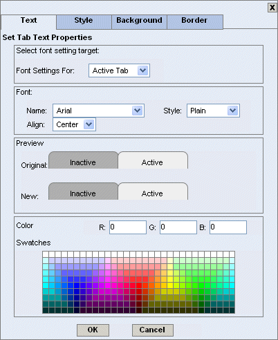
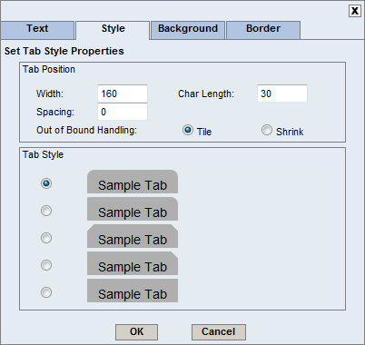
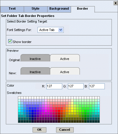
| Edit: This button will open a new dialog that allows you to specify text label properties, style, background color and border for the folder tabs.
|
| Delete: This button will delete the folder. |

Template Linkage allows you to use data from one chart, report or map as a parameter in another. To use this feature, click on the button  on the source chart, report or map to bring up the Set up Links in Dashboard screen.

On this screen, there are three columns:
- Column Name List -
This is a list of available columns and their data type in the source template. Click a value from this column to use as a parameter in another template.
- Available Template(s) -
This lists the other templates that are open in the current dashboard. Click on a template name to select it. While a template is selected, it will be highlighted in the dashboard.
- Available Parameter -
After selecting a column name and template, this list of available parameters appears. Select a parameter that you wish to map to the selected column name in the first column.
When you are done selecting values in each column, click . You may then select new fields if you wish to add additional links. Once a link has been established, clicking on a value in the specified source column (or chart object) will cause the target templates to be refreshed using data from that column.
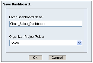
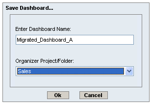
Once you have finished setting up all the dashboard definitions, you can save the dashboard by clicking the button on the toolbar. A new dialog will open prompting you to specify the name for the dashboard.
Save Dashboard Dialog
The first option allows you to specify a name for the dashboard. The dashboard will be saved with a .dsb extension in the /DashboardFiles/ directory of your ERES installation.
The second option allows you to specify whether to insert the dashboard into the Organizer. To add the dashboard to Organizer, click the radio button marked Yes. The drop-down list at the bottom, contains all of the projects and folders in Organizer to which you have access. Select the project or folder in Organizer where you'd like to place the dashboard.
Once you have finished specifying options, click the button to save the file.
At any point in the design process the dashboard can be previewed by clicking the button on the dashboard builder toolbar. This will open a new window showing the dashboard. Dashboards that have been deployed to the Organizer can also be viewed in the Menu Page. When you select the View option in the menu page the dashboard will open in a new window.
Dashboard
The top part of the Preview interface contains a small toolbar that allows you to initiate the following actions:
- Set shared parameter(s)
 Refresh a dashboard
 Set auto refresh
 Export Dashboard to PDF (Note: All objects in Dashboard are exported except Google Map due to its license restrictions)
- Pack/unpack the preview toolbar
This section gives you description of options available from the preview toolbar and additional options available from the chart/report/map header bar.
- Set Shared Parameters:
To set shared parameters, click the button
on the preview toolbar. After you have clicked the button, the shared parameters dialog will then appear. The dialog allows you to specify values for shared parameters.
Set Shared Parameters Dialog
Note that you can use the calendar for specifying date parameters. To open the calendar, simply click the button
in the shared parameters dialog.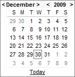
Calendar
Once you have finished specifying the shared parameters, click to save the changes. You will be taken back to the Preview.
- Auto Refresh:
If you want your dashboard to be refreshed periodically, click the button
on the preview toolbar. After you have clicked the button, the auto refresh dialog will then appear. The dialog allows you to set the refresh interval in seconds. For example, if you specify the refresh interval for 10 seconds, the dashboard will refresh every 10 seconds.
Auto Refresh Dialog
Once you have finished setting the auto refresh options, click to save the changes. You will be taken back to the Preview.
In addition to the options on the preview toolbar, there are two additional options available for each chart/report/map that can be triggered by clicking the small buttons in the chart/report/map header bars.
| Filter: This option will open a new dialog that allows you to specify additional filters/parameters for the chart/report/map, if it has parameters that aren't associated with one of the dashboard's shared parameters. 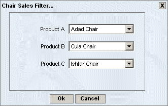 Dashboard Filter Chart/Report/Map Dialog You can select parameter values in this dialog. Once you have completed your selection, click the button. The dashboard will refresh, and the chart/report/map will reflect the new parameter values. |
| Export: This option will open a new dialog that allows you to export the chart/report/map in a variety of formats. For charts the following dialog is displayed:  Dashboard Export Chart Dialog The first option allows you to specify the format in which to export the chart. The available formats are GIF, JPEG, PNG, PDF, SVG, Excel Image (XLS), Flash, Text Data File, XML Data File and MAP Data File (HTML Image Map). The second option allows you to set the dimensions of the exported image. By default, these will match the canvas dimensions of your chart. The last set of options allow you to set some image type-specific options. You can set the background transparent for GIF files, set the quality for JPEG files, as well as specify encoding for PNG files. For more information about chart export options, please see Section 3.16.3 - Exporting Charts. Once you have finished specifying options for the exported chart click . A new window will open containing the exported chart. The toolbar is active on this window allowing you to save the generated file to the local system, or to print the chart locally. For reports the following dialog is displayed: 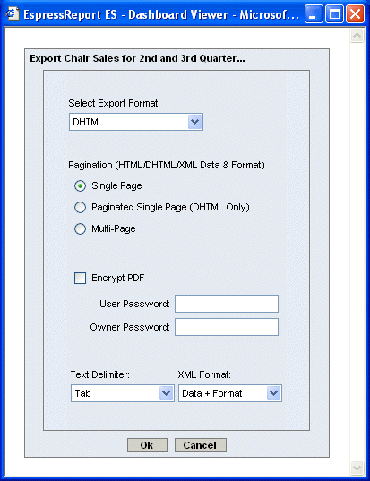 Dashboard Export Report Dialog The first option in the dialog allows you to specify in which format you would like to export the report. Available options are PDF, CSV, Excel (XLS), Excel 2007 (XLSX), DHTML, text, XML and rich text. Other options allow you to set single or multi-page export for DHTML, and XML exports. For PDF export you can enable encryption. For text export you can select the delimiter to be used, and for XML export you can select whether to export only the report data, or to export an XML description of the report and data. For more information about the export formats, and options, please see Section 3.5.2 - Exporting Reports. Once you have finished specifying options for the exported report click . A new window will open containing the exported report. The toolbar is active on this window allowing you to save the generated file to the local system, or to print the report locally. Maps support just one export format, so no export format settings dialog is displayed for maps. When you export a map, new window will open with Map Viewer showing the map. |
Often you may need to move dashboards from one location to another. For example dashboards may move between the server and the develop machine. On the develop machine the reports/charts/maps locations can change and may not be located from the data stored in the dashboard .dsb file. Therefore, ERES uses the DPAK files to move or archive dashboards along with it's components. To learn how to create a DPAK file, see the Section 2.1.4.4 - Dashboard and Map Packages.
![[Note]](../../../images/note.png) | Note |
|---|---|
The DPAK files can be viewed in the MenuPage, but they can't be open in the Dashboard Builder. To edit a dashboard from a DPAK file, you have to unpack it first (to learn how to unpack a DPAK file, see the Section 2.1.4.4 - Dashboard and Map Packages). |
DPAK files can't be created in ERES version 6.3 and older. If you want to move a dashboard from an old ERES version (6.3 or older) to a new ERES version (6.6), you will have to use the “Dasboard Migration” feature.
To use this feature, you will need to copy the following files from source ERES server to the corresponding files on the destined ERES server :
dashboard file from <InstallDirectory>/DashboardFiles
report files from <InstallDirectory>/ReportFiles (can be a stand-alone report or behave as a drill-down target)
chart files from <InstallDirectory>/ChartFiles (can be a stand-alone chart or behave as a drill-down target)
drilldown reports/charts from <InstallDirectory>/DrillDown (for drill-down templates that were created in the drilldown wizard)
sub-reports from <InstallDirectory>/SubReports (for sub-reports that were created in the sub-report wizard)
charts embedded in reports from <InstallDirectory>/chart
map files from <InstallDirectory>/MapFiles with all the files used by this map (i.e. Coordinates file, Tooltip template and DrillDown template for Google Maps or SVG Image and DrillDown template for SVG Maps). If you are not sure about what files are used by your map, you can view the map file and search for filenames. Map files are XML files, so they are human-readable. Please note that all the files used by your map should be copied in the same subdirectories of the ERES installation directory on the destinated ERES server. Otherwise, you will have change the file links in the map file manually.
necessary images which are used in dashboard, but not available from the destined machine
| Note |
|---|---|
The directories that are mentioned in the above list are the default directories that are used for saving certain file types. If you saved a template to a different directory or if you inserted some files into Organizer from a custom directory, you will have to search for the files in their original locations. |
Next, you will need to add previously mentioned files to the destined Organizer and then launch the dashboard builder.
To migrate a dashboard from the dashboard builder, click the button on the dashboard builder toolbar. After you have clicked the button, the following dialog will then appear.

Dashboard migration dialog
The dialog contains a tree that mirrors the folder structure in the Organizer. All of the dashboards to which you have access are listed. In order to select a dashboard to migrate, simply select it in the tree and click . The migration mapping dialog will then appear.

Dashboard migration dialog
From this dialog you can map the original reports/charts/maps to the reports/charts/maps in the destined Organizer. Please note when your dashboard uses images (dashboard background, shared param panels background, shared param value list button icons, etc.), which are not available from the destined machine, you need to set image mapping as well. To set the image mapping click link at bottom of the dialog. The dialog will then extend to allow you specifying/changing the image mapping.

Dashboard migration dialog
All the images that were used in the original dashboard will be listed with their URLs. You can see the preview of the original (the first image) and current mapped image (the second image). If an image is not correctly mapped, the second preview image will be blank. Once you have finished specifying the mapping for the dashboard files/images click . It will open the following dialog prompting you to enter the name for the migrated dashboard.
Dashboard migration dialog
Once you have finished specifying the options click and the dashboard will then be saved.