In addition to the default chart elements, EspressChart provides a number of additional elements that you can add to a chart.
There are two ways to add text to a chart: as titles or as plain text elements.
- Adding Titles:
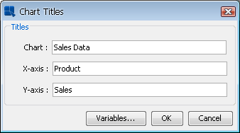
To add titles to a chart, select → . This will bring up a dialog prompting you to enter titles for the chart.
Add Titles Dialog
The dialog allows you to specify a main title for the chart and a title for each of the axes. Pie and dial charts, which do not have axes, prompt you for the chart title only. After you have finished specifying the titles click and they will be added to the chart. Titles are placed and sized automatically. However, they can be moved and the fonts can be changed.
- Adding Text:
To add individual text fields to the chart, select → or click the
 button on the toolbar. This will bring up a dialog prompting you to add text to the chart.
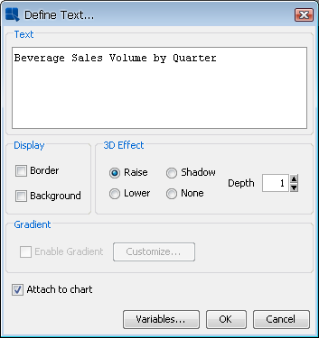
Add Text Dialog
From this dialog you can specify the text and configure some display options. You can specify whether to draw a border around the text or around a background. You can also specify what effect you want to apply to the background.
On this dialog, you can also set up gradient background for the text label. The gradient settings are the same as in the Rendering options described in the Section 6.1.3 - Format Menu.
Once you have finished specifying the text, click . You will then be able to place the text in the chart. A small rectangle will follow your pointer around the chart canvas. Click the mouse where you would like to place the text.
- Annotation Text:
EspressChart also supports annotation. Annotation allows you to attach labels or text fields to a particular element, such as a line or the chart plot. For example, you can insert a control line showing the maximum value to a chart and attach a text label called
MAXto this control line. Each time the maximum value changes, the label will adjust its position along with the control line. For more information about the control lines, please see Section 6.6.2.3 - Fixed Horizontal/Vertical Lines.You can specify text to be annotation in two ways. To attach the text to the chart plot, select the Attach to Chart option when adding text. To attach the text to a specific object like a control line, first select the object, and then select → or click the
button on the toolbar. The option for Attach to selected object will be automatically checked. Leave it checked and any text you add will be automatically attached to the object.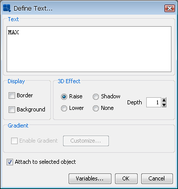
Add Text (Annotation) Dialog
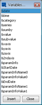
EspressChart allows you to specify certain variables within text that allow for run time substitution based on certain values/objects in the chart. For example, if your chart uses a parameterized query as the data source, you could use the ¶mInfo variable to display which parameter value(s) were selected at runtime.
Both the insert titles dialog and the add text dialog have a button marked at the bottom. This will bring up a dialog with a list of variables you can use and it will allow you to select one to add to the title or to the text.
Variables Dialog
The following text variables are supported:
&drillInfo: | This displays which data point is being drilled on for drill-down charts. This variable does not work for parameter drill-down. |
¶mInfo: | This displays the parameter value(s) that were selected. You can use this variable instead of &drillInfo for parameter drill-down charts. |
&date: | This displays the date when the chart was last drawn/redrawn. |
&time: | This displays the time when the charts were last drawn/redrawn. |
&category: | This displays the name of the category column. |
&series: | This displays the name of the data series column. |
&sumby: | This displays the name of the sum-by column. |
&value: | This displays the name of the value column |
&subvalue: | This displays the name of the secondary value column |
&xaxis: | This displays the name of the column that is mapped to the X-axis. This is for charts that map a value instead of a category to the X-axis like scatter or bubble charts. |
&yaxis: | This displays the name of the column that is mapped to the Y-axis. This is for scatter, bubble, and surface charts. |
&zaxis: | This displays the name of the column that is mapped to the Z-axis. This is for scatter, bubble, and surface charts. |
&2ndaxis: | This displays the name of the column that is mapped to the 2nd-axis. |
¶mInfoName<index>: | If the chart contains parameters, this displays the name of the parameter for the selected index. |
¶mInfoValue<index>: | If the chart contains parameters, this displays the supplied parameter value for the selected index. |
&<paramName>>: | If the chart contains a parameter with this name, this will display the value selected for that parameter. |
EspressChart allows you to overwrite a particular piece of text in a chart. This can be useful if the data source does not use particularly intuitive column names. Note that this feature will replace all instances of the text. For example, if you have a column chart without a series that displays a column name for both the X-axis label and the legend item, you cannot use text replacement to change only the label and not the legend item. The text replacement feature will also change only whole strings and not instances where there is a partial match.
To use text replacement, select → . This will bring up a dialog allowing you to specify replaced text.
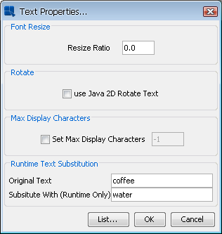
Text Properties Dialog
Please note that when making successive changes to the same text, the original text must be used. For example, assume you replaced the word “coffee” with “water”. Now if you want to change “water” to “soft drink” the text replacement should have the original text, which is “coffee” and then “soft drink” as the replacement. To remove any text replacement, simply replace the original string with itself. Hence, using the same example, you would replace “coffee” with “coffee”.
You can see a list of all the original text and the replacements by clicking on the button. This will bring up a dialog listing all of the text replacement in the chart.
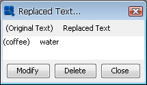
Replaced Text List
From this dialog you can select any of the replaced text and modify or undo the replacement by clicking the buttons at the bottom of the dialog.
EspressChart has the ability to automatically adjust the font size of the text in a chart as it is resized. This is useful if you're using the same chart template to produce a number of charts in different sizes. You can specify a ratio for the font size to adjust based on changes in the chart canvas. To specify a resize ratio, select → .
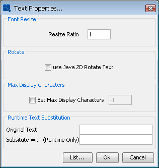
Text Properties Dialog
The ratio dictates the relative percent that the font should resize in regards to the canvas. For example, say you resize a chart from 500 x 500 pixels to 250 x 250. With a resize ratio of 1 then text with 12 point font would decrease to 6 point, decreasing by the same percent as the canvas. However, with a resize ratio of 0.5 the font would decrease half as much as the canvas so our 12 point font would only decrease to 9 point.
Long labels or text in a chart can sometimes take up too much space in the chart plot, leaving little room for the actual chart. For situations like this, EspressChart offers a text cropping feature for chart text. Text that is longer than a user-supplied threshold will be truncated with “...”. The hint box for the chart will show the whole label. To specify text cropping, select → .
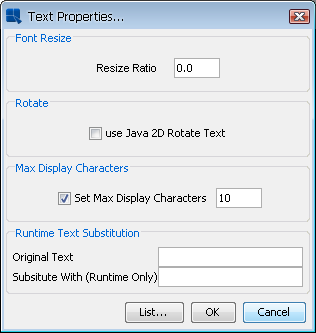
Text Properties Dialog
To enable text cropping, check the Set Max Display Characters option and specify the maximum character length in the dialog. Any text longer than the specified number of characters will be truncated.
EspressChart allows you to add and format a number of different types of lines for charts.
You can choose to display lines and points for all the data points in the chart for any two dimensional chart type. Note that some chart types already use this representation (i.e. line or scatter charts).
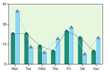
Column Chart with Lines and Points Defined
Line and point display is controlled by selecting → , or click the ![]() button on the toolbar. This will bring up a dialog presenting several options.
button on the toolbar. This will bring up a dialog presenting several options.
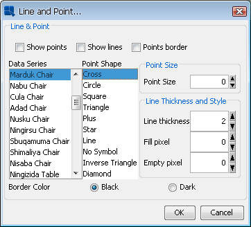
Line and Point Dialog
The first three options allow you to specify whether you would like to show lines, points, and a points border for the chart. For radar, scatter, and polar charts you also have the option of showing areas. For radar and polar charts the area option will fill in the areas enclosed by the data points. For scatter charts it will draw columns from the X axis to the data points. The remaining options allow you to customize the line and point displays for each element in the data series.
For each data series element, you can specify the point shape that you would like to use. You can also control the size of the points. The default point size is 0. You can specify point sizes of -1, -2, & -3 which represent sizes of 0.75, 0.5, and 0.25 respectively. At -3 (0.25), the point will be drawn as a dot regardless of the selected point shape.
For lines you can specify the line thickness, as well as customize a dash pattern. The dash pattern is created by specifying the number of filled pixels and the number of empty pixels (between 0 and 255). The line is then drawn by dividing into segments - the number of filled pixels followed by the number of empty pixels. Setting 0 for both will result in a solid line. Setting 255 for both will result in no line being drawn.
The last option allows you to change data point symbol border color to black or darker shade of symbol color.
Floating lines are free-form lines that can be arbitrarily added to any place on the chart canvas. Often floating lines are used to point to a specific element in a chart. To add a floating line select → , or click the ![]() button on the toolbar.
button on the toolbar.
When you select this option, your mouse pointer will change to a cross. Click within the chart canvas where you would like the line to begin. Each additional click will add a point to the line, allowing you to add another segment. This way you can use floating lines to draw shapes as well. Once you have finished, right-click to stop drawing. The line will then be added.
Once a line has been placed on the canvas, it cannot be moved individually. It will move with the chart plot, like annotation text. To specify options for a floating line, first select it, and then select → or click the button on the toolbar. This will bring up a dialog allowing you to format various properties for the floating line.
Line and Point Dialog for Floating Lines
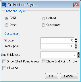
The dialog allows you to specify a standard line style or to create a custom dash pattern in the same manner as line and point formatting. You can also specify the line thickness in pixels. The checkboxes at the bottom of the dialog allow you to place an arrowhead at the start and/or end of the line, as well as fill the area enclosed by the line to create a solid shape.
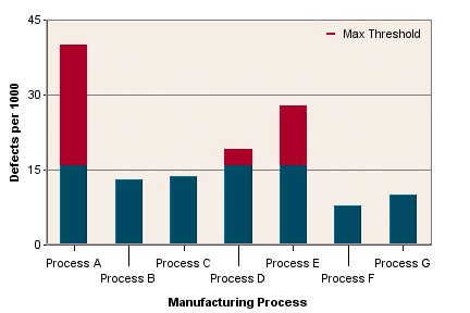
Fixed horizontal or vertical lines are lines that are drawn on one of the chart axes. These lines can also be drawn on three-dimensional charts where they appear as planes. There are two types of fixed lines: constant lines and control lines. Constant lines are lines that are fixed to a certain value in an axis. Control lines are drawn based on computed values that allow you to spot data points that are outside of certain value ranges. To add either type of line to a chart, select Horz\Vert Line from the Insert menu. This will bring up a dialog showing the list of existing horizontal/vertical lines, allowing you to edit the selected line, remove the selected line, and/or create a new line.
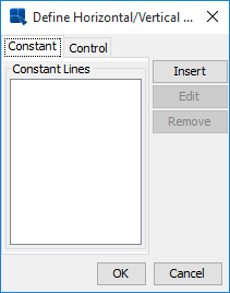
Define Horizontal/Vertical Lines Dialog
Clicking on or clicking on when an existing line is selected, respectively, will bring up a dialog allowing you to configure the selected line.
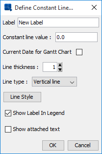
Constant Line Dialog
For constant lines you need to specify a label for the line, as well as the numeric value to use for the line. Note that for the category axis, the data points start with 0.5. You can also specify the line thickness and whether the line is horizontal or vertical. The last two options allow you to add an item to the chart legend for the line and whether to display any annotation for the line.
For Gantt charts, there is one extra option called Current Date for Gantt Chart. If you choose this option, the Constant line value field will deactivate and the current date will be used as the line value (the line position will be updated every time you run the chart).
For radar charts, the horizontal/vertical option is disabled. Radar charts draw constant/control lines at the same point around all the chart axes (in a similar manner to the radar grid). In addition, for radar charts, an additional option named Circular Style is present. By default, lines in radar charts are drawn in a segmented fashion - straight lines connect the points on each axis. Selecting this option will draw the constant/control as a circle.
![[Note]](../../../images/note.png) | Note |
|---|---|
If you have not specified any annotation for the line then none will appear if you select the last option. For more on adding annotation to a chart, please see Section 6.6.1 - Adding Text. |
To add a control line, click on the Control Line tab in the dialog.
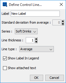
Control Line Dialog
For control lines you need to specify which series element you want to compute the value for (this option does not appear if no series is present) and how to compute the value. Options for control lines are average, minimum, maximum, and multiples of standard deviation.
After you have specified all of the options, the line will be added to the chart or the selected line will be changed, respectively. To edit any of the properties specified in the previous dialogs, you can select → again and select the line from the list. You can also double-click on the line that you want to modify.
You can change the appearance of fixed lines by first selecting the line and then selecting → , or clicking the icon on the toolbar. This will bring up a dialog allowing you to customize the line.
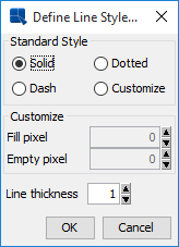
Line and Point Dialog for Fixed Lines
This dialog allows you to specify a standard line style or to create a custom dash pattern in the same manner as line and point formatting.
For stack type chart, i.e., Stack Column, Stack Bar and Stack Area, we have API function:
...
newControlLine(int linetype, String label, int level);
...
can draw control line with indicated stack level. For more information about this option, see Section 10.6.2.5 - Adding Multiple Control Lines to Stack Type Chart. If a stack column chart with the combo chart of stack area, the API can only works on the main axis data, i.e., stack column data; In this case, the API code cannot get the secondary value to draw control lines on stack area as combo.
You can also set the control line color with this API code. The following image shows the muliple control lines in different color, and display the meaning of them in the legend of the chart.
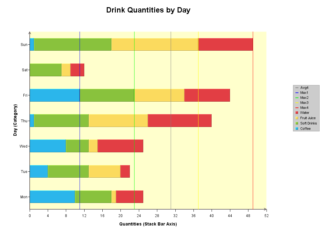
Stack Chart with Multiple Control Lines
A powerful feature of EspressChart is the ability to add trend lines to charts. Trend lines can help to show more details of a chart's data by exposing and highlighting certain trends.
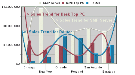
Chart with Trend Lines
To add a trend line to a chart, select → . This will bring up a dialog showing the list of existing trend lines, allowing you to edit the selected trend line, remove the selected trend line, and/or create a new trend line.
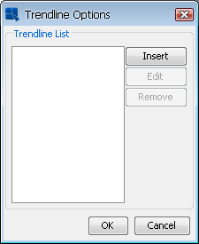
Trend Line Options Dialog
Clicking on or clicking on when an existing trend line is selected, respectively, will bring up a dialog allowing you to configure the selected trend line.
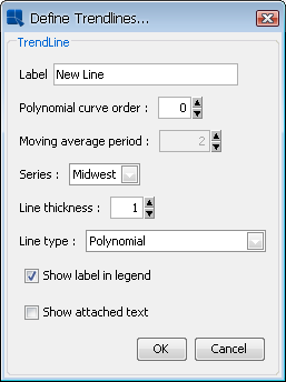
Define Trend Lines Dialog
In this dialog you can specify a label for the line, as well as what element of the data series to base the calculation on. The following types of trend lines are supported: a polynomial of any degree (please note that a linear trend line is a polynomial trend line of the 1st degree, i.e. the Polynomial curve order option has to be set to 1 ), a power, exponential, logarithmic, a moving average, an exponential moving average, an triangular moving average, cubic B-spline, and a normal distribution curve. For moving averages you will need to specify the average period and for a polynomial you will need to specify the curve order. You can also specify the thickness of the line and configure whether a label in legend and the attached text should be shown. In case the chart has data series, you can configure the trendline for a specific series.
After you have specified all of the options, the trend line will be added to the chart or the selected trend line will be changed, respectively. To edit any of the properties specified in the previous dialog, you can select 'TrendLine' from the Insert menu again, and select the line from the list. You can change the appearance of the trend line by first selecting it, and then selecting → , or clicking the button on the toolbar. This will bring up a dialog allowing you to customize the lines.
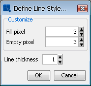
Line and Point Dialog for Trend Lines
This dialog allows you to create a custom dash pattern in the same manner as line and point formatting.
A special type of trend line that allows you to draw a normal distribution curve for the data in the chart. In order to plot a normal distribution curve, the chart must either be a two-dimensional column or bar chart, it cannot have a data series, and the category should be numeric. Assuming these conditions are met, you can specify a normal distribution curve as one of the trend line options.
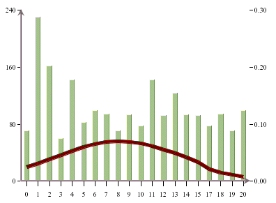
Chart with Normal Distribution Curve
Since the scale for the curve is usually different than the scale for the value axis, the curve is shown on a secondary axis. You can modify the scale by changing the scale for the secondary axis.
Control areas are useful for comparing the chart data against a certain range of data. For most two-dimensional charts, control areas are drawn as filled areas on the chart plot between a range of values on the chart's value axis and/or category axis. The data points are then drawn over top of the control areas giving you a quick visual reference to see which data points fall within the designated range. Instead of drawing a background area on the plot, the control areas can also be shown only where the data points intersect the control area. This feature gives users a clear visual reference when specific threshold values are reached.
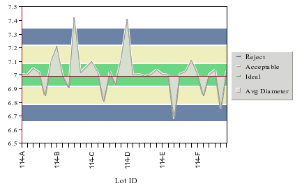
Two-Dimensional Area Chart with Control Areas
Column Chart with Control Area Drawn for Data Points
A special instance of control areas can be used for dial charts. For dial charts control areas are drawn as arcs on the face of the dial, allowing you to see if the dial hands (data points) fall within the range. Note that control areas are not available for radar and pie charts.
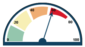
Dial Chart with Control Areas
To add a control area to a chart, select → . The following dialog will appear showing the list of existing control areas, allowing you to edit the selected control area, remove the selected control area, and/or create a new control area.
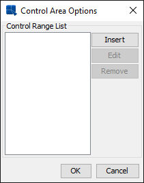
Control Area List
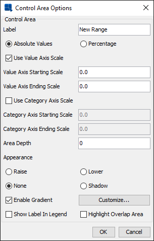
Clicking on or clicking on when an existing control area is selected, respectively, will bring up a dialog allowing you to configure the selected control area. If your chart is not a dial chart, the following dialog will open.
Control Area Configuration Dialog
The following options are provided for control areas:
Label: | This option allows you to specify a label for the control area. |
Absolute Values: | This option allows you to specify the scale in absolute values. |
Percentage: | This option allows you to specify the scale in percentage. |
Use Value Axis Scale: | This option allows you to specify whether the control area should be bounded by values on the value axis of the chart. |
Value Axis Starting Scale: | This is the lower bound for the control area on the value axis. |
Value Axis Ending Scale: | This is the upper bound for the control area on the value axis. |
Use Category Axis: | This option allows you to specify whether the control area should be bounded by values on the category axis of the chart. |
Category Axis Starting Scale: | This is the lower bound for the control area on the category axis. |
CategoryAxis Ending Scale: | This is the upper bound for the control area on the category axis. |
Area Depth: | This option specifies the depth for any of the appearance styles. If no style is selected, the depth will have no effect. |
Appearance: | This option allows you to specify a 3D or shadow effect for the control area. If the area depth is specified as zero, the appearance will not take effect. |
Enable Gradient: | Enable color gradient for the control. Gradient settings are described in Section 6.1.3 - Format Menu |
Show Label In Legend: | This option specifies whether or not to show the control area label in the chart legend. |
Highlight Overlap Area: | This option will only show the control area where the data points overlap the control area boundaries. |
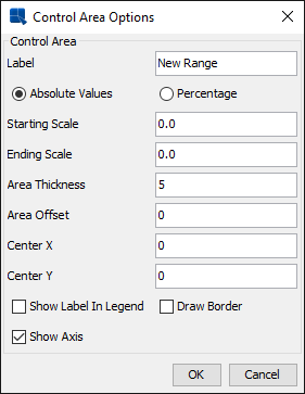
If your chart is a dial chart, then a different dialog will appear when you select → and then click on the or button.
Control Area Dialog for Dial Charts:
The following options are provided for dial chart control areas:
Label: | This option allows you to specify a label for the control area. |
Absolute Values: | This option allows you to specify the scale in absolute values. |
Percentage: | This option allows you to specify the scale in percentage. |
Starting Scale: | This is the value where the control area begins. |
Ending Scale: | This is the value where the control area ends. |
Area Thickness: | This option allows you to set the thickness for the control area |
Area Offset: | This option allows you to specify the offset in pixels from the edge of the dial chart |
Center X: | This sets the X coordinate for the center of the control area. 0 shares the same center point as the dial face. You can specify a new number (either negative or positive) pixels to specify an offset position from the center of the dial. |
Center Y: | This sets the Y coordinate for the center of the control area. It works in the same way as the previous option. |
Show Label in Legend: | Specifies whether to show the control area label in the chart legend. |
Draw Border: | This option allows you to draw a border around the control area. |
Show Axis: | This option allows you to show or hide the axis for the remaining area not covered by the control range. |
After you have specified all of the options, the control area will be added to the chart or the selected control area will be changed, respectively. To edit any of the properties specified in the previous dialog, you can select → again, and select the control area from the list. You can also double-click on the control area that you want to modify.
In addition to displaying charts, you can also display a table showing the data points displayed in the chart. The table can be placed below or to the right of the chart plot.
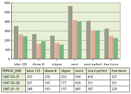
Chart with Table
To add a table to a chart, or to modify the various display options for a table, select → . This will bring up a dialog allowing you to customize various options for the table display.
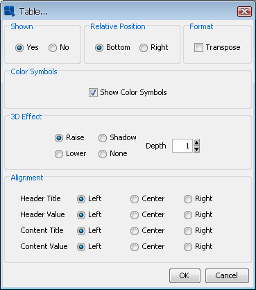
Format Table Dialog
From this dialog you can specify whether or not to display the table, as well as what relative position to give the table either to the bottom or right-hand side of the chart plot. You can also specify a 3D effect for the table and its depth.
The Transpose checkbox allows you to swap the columns and rows of the table. By default, the category elements are drawn as columns and the data series elements as rows.
The Show Color Symbols option allows you to show/hide color boxes for data series in the table.
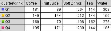
Chart table with color boxes
The Alignment options allows you to specify horizontal alignment of the text in the table cells, either left, center, or right. The alignment can be set for row headers, column headers, and inner table cells.
| Note |
|---|---|
If there isn't enough room in the chart canvas, not all data points will be displayed in the table. The table size adjusts with the canvas size and also with the font size in the table cells. |
EspressChart has an capability to add hyperlinks to any data point in a chart. Links can be specified for either single data points or multiple elements. Any added hyperlinks will be applied to both the data points on the chart and to their respective fields on the legend. To add a hyperlink to a chart, select → or right-click on a data point and select Insert Link from the pop-up menu. This will bring up a dialog showing a list of existing hyperlinks which you can configure, remove, and/or create new ones.
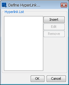
Insert Link Dialog
Clicking on or clicking on when an existing hyperlink is selected will bring up a dialog allowing you to configure the selected hyperlink.
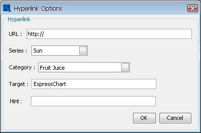
Define Link Dialog
The URL field allows you to specify a Web page that you want to link.
The Series and Category drop down menus allows you to select an element in the data series and category elements for the hyperlink. You can also link to all data series elements or all category elements.
You can specify the Target parameter recognized by HTML when specifying a hyperlink to be attached to a data point or data series. This can be used to determine whether the new HTML page should open in a new browser window, in the same browser window, or whether the new page should occupy the same portion of the page as the current page.
The Hint field allows you to enter text that will pop-up when you move your mouse cursor over a data point. If you want to create pop-up labels without hyperlinks, you can leave the URL field blank and only specify the hint.
If you specify hyperlinks for charts, they will be active only when the chart is exported to Flash format*. For most image formats such as PNG, JPG, GIF, etc, an image map file containing information for the link will be automatically generated when you export the chart. You can insert the image and image map into an HTML file to view the image with clickable links.
| Note |
|---|---|
* For Flash export, when the user clicks on the hyperlink, there will likely be a warning message prompted by Flash saying that there was a potentially unsafe operation. You can turn this warning off by clicking on settings and adding the chart into the list of trusted locations. |
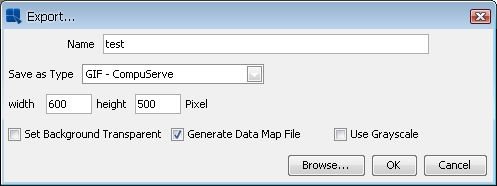
Export Dialog