There are a number of formatting options that are unique to certain chart types. These options can be modified by selecting → , or clicking the  button on the toolbar. This will bring up a dialog that varies depending on the type of the current chart. Some chart types have no additional options.
For bubble charts, the following dialog is displayed:
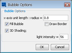
Bubble Options Dialog
The following options are available for bubble charts:
x-axis unit length: radius | This option specifies the ratio of X-axis unit length to the radius of the bubble. |
Fill Bubble: | This option allows you to specify whether or not to fill the bubble area. |
Draw Border: | This option allows you to specify whether or not to draw a border around the bubbles. |
3D Shading: | This option allows you to add 3D shading to the bubbles. You can also specify the light intensity for the shading. |
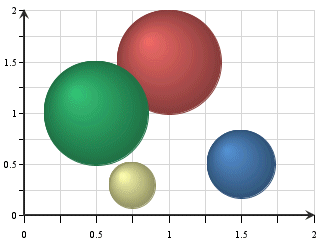
Bubble Chart with 3D Shading
For dial charts, the following dialog is displayed.
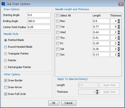
Dial Options Dialog
The following options are available for dial charts:
Starting Angle: | This option specifies the angle where the first axis label is to be set. This property also determines where the border and dial area will start if the Draw Full Circle option is unchecked. The angle is represented in degrees and is 0 by default. Assuming the dial chart is a clock face, 0 degrees is 12 o'clock. | ||||||||||
Ending Angle: | This option specifies the angle where the last axis label should be set. This property also determines where the border and dial area will end if the Draw Full Circle option is unchecked. The angle is represented in degrees and is 360 by default. Hence by default the labels (and data points) encompass the entire circumference of the dial. | ||||||||||
Center Point Radius: | This option specifies the radius for an inner circle, which starts from the center of the dial chart. The radius is specified as a ratio to the radius of the dial plot. Hence, a value of 1 will make the inner circle encompass the entire dial. If the Draw Full Circle option is unchecked, only the portion of the center point that is within the starting and ending angles will be shown. 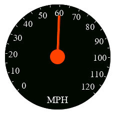 Dial Chart with Center Point Radius | ||||||||||
Needle Style: | This option specifies the type of needle to draw.
Default needle is Pointed Blade. | ||||||||||
Draw Border: | This option specifies whether or not to draw a border around the dial. | ||||||||||
Draw Arrow: | This option specifies whether or not to draw arrowheads at the end of the dial hands. | ||||||||||
Draw Full Circle: | This option specifies whether to draw the dial as a complete circle (360 degrees) or only draw the portion of the circle determined by the starting and ending angles. | ||||||||||
Needle Length and Thickness: | This option specifies the length and thickness of the needle. The needle length is measured from the center of the dial. The range is from 0 (center of the dial) to 1 (the end of the dial). The thickness determines the width of the needle, larger values results in a wider pointer. When creating a chart, the needle length is randomly generated. Default thickness is 2. Each category element is represented by a different needle. You can either change properties individually or change multiple categories at once. To change the property of each needle individually, directly change the values to the right of the category. To make changes to multiple needles, check each category or check the Select All option, set the properties in the lower right corner and then click on the button for each property changed. This will modify all checked categories to new values. |


Dial charts have an additional option to display a foreground or background image for the dial plot area. To add a foreground or background image, select → or → . These options are only enabled for dial charts.
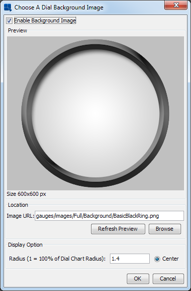
Dial Chart Background Image Dialog
Selecting an image works in the same way as the background image dialog, see Section 6.5.1.1 - Background Images. In the dial chart image dialog, there is also an option to specify the radius of the image. Specifying 1 for the radius will make the image the same width and height as the plot area. Increasing or decreasing this value will enlarge or shrink the images.
For overlay charts, the following dialog is displayed:
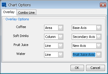
Overlay Options Dialog
From this dialog, you can specify which chart type you would like to use for each element of the data series. Available chart types for the series elements in an overlay chart are column, area, and line. You can also choose not to display certain series elements.
From this dialog, you can also specify which axis you would like to use to plot a series element. You can place elements on the primary or secondary axes, or you can create new value axes for the series elements. To create a new value axis, select New Axis from the drop-down menu. Once you specify to use a new axis, a new option will be added to the drop-down menus for the other data series elements, allowing them to be drawn on the same axis that you previously specified. Using a variety of axes allows you to precisely tune the scale that the different series elements use. Each of these axes will have its own tab in the Axis Elements window, where you can change the label step interval for each axis independently of the others.
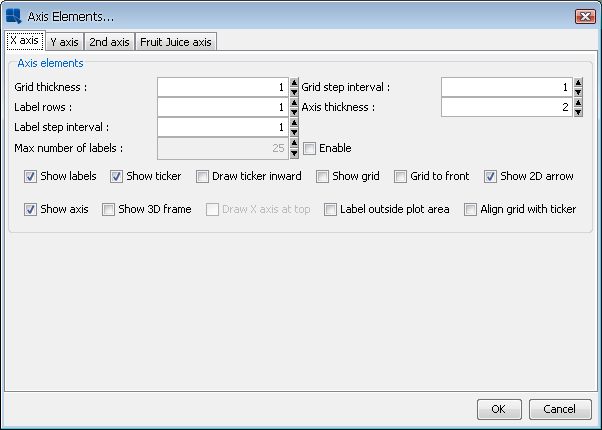
Axis Options Dialog for Multiple Value Axes
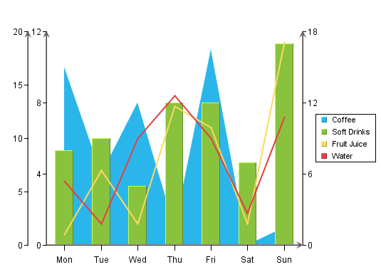
Overlay Chart with Multiple Value Axes
If one of the chart types used by the overlay chart is a line, you can specify whether or not to draw the line as a step line using the Combo Line tab. For more about step lines see Section 6.9.5 - Line Charts:
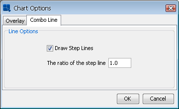
Combo Line Options for Overlay Charts
For pie charts, the following dialog is displayed. (Note that different options will appear/disappear depending on whether the chart has a series, and if it's a 2D or 3D chart.) Here are the options available for a 2D chart with series:
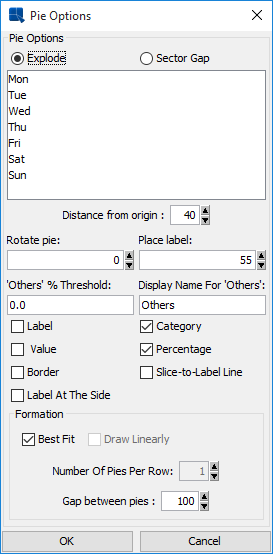
Pie Options Dialog (With Series)
Here are the options available for a 2D chart without series. Notice that the formation options are removed and the % in legend and Value in legend options are added:
Pie Options Dialog (Without Series)
The following options are available for pie charts:
Explode: | This option allows you to pick one or more category/series elements whose sections are to be drawn at a certain distance away from the center of the pie. |
Sector Gap: | This option allows you to pick one or more category/series elements whose sections are drawn at a certain distance away from the center of the pie and still maintain the same distance between pie slices and a circular boundary. |
Distance from origin: | This option allows you to specify how far the exploded/sector gap sections are to be drawn away from the center. This number, represented as a percentage of the radius, indicates the distance between the center and the tip of the pie slice to be exported. |
Rotate pie: | This option allows you to specify the number of degrees that the chart should be rotated in a clockwise direction. Available values are between 0 and 360 |
Place label: | This option indicates the distance of the labels from the center of the pie. The position of an individual label can also be adjusted by dragging the text. |
“Others” % Threshold: | This feature is useful for pie charts that have a large number of small categories. Rather than draw a slice for each category, users can select a threshold value. Any category whose percentage of the value column is less than the threshold value will be lumped into an “Others” slice. |
Display Name for “Others”: | This option allows you to set the display name for the “Others” slice that is created for categories that fall below the supplied threshold value. This label will appear in the legend, and/or for the slice label. |
Label: | This option determines whether a category/series label should be drawn for each pie slice. By default, these only appear as legend items. Note that the label will not appear if the data for the slice is 0 or null. |
Value: | This option allows you to specify whether to display the actual value of each pie slice. Note that the value will not appear if the data for the slice is 0 or null. |
Category: | This option allows you to specify whether to display the category of each pie slice. |
Percentage: | This option allows you to display the percentage for each pie slice. The percentages are calculated by dividing the value of each section by the sum of all the values. Note that the percentage will not appear if the data for the slice is 0 or null. |
% in legend: | This option allows you to display the percentage represented by each slice in the pie in the legend. This can be a preferable presentation if the pie slices become too thin. This option is only available if the pie chart does not have a data series. |
Value in legend: | This option allows you to display the value represented by each slice in the pie in the legend. This can be a preferable presentation if the pie slices become too thin. This option is only available if the pie chart does not have a data series. |
Border: | This option specifies whether to draw a border around each pie slice. This option is only available for two-dimensional pie charts. For three-dimensional pies, you can use the border drawing option on the navigation panel. Note that the border will not appear if the data for the slice is 0 or null. |
Slice-to-Label Line: | This option will draw a line from any label(s) to it's corresponding pie slice. Note that the slice-to-label line will not appear if the data for the slice is 0 or null. |
Label at the Side: | This option will place labels for the pie chart away from the plot around the outside of the chart. When used with the Slick-to-Label Line option, it gives users a way to display the pie labels for charts with many small categories without any text overlapping. Note that the label will not appear if the data for the slice is 0 or null. 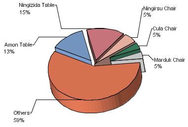 Pie Chart with Side Labels and Lines |
Best Fit: | This option will arrange multiple pies in best configuration to fit the chart canvas. It's only available for pies with data series. |
Draw Linearly: | This option will arrange multiple pies in a straight horizontal line. It's only available for pies with data series. |
Number of Pies Per Row: | This option allows you to create a custom arrangement of multiple pies, by specifying the number of pies to draw in each row of the arrangement. |
Gap between pies: | This option allows you to specify the gap between the multiple pies. The number is a multiple of the pie radius, so the gap will adjust with the size of the chart plot. |
For two-dimensional line charts, one of two different dialogs will be displayed depending on whether the chart has a data series or not. If the chart has a data series then the following dialog is displayed.
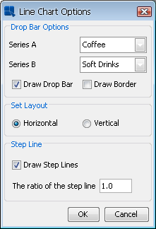
Line Options Dialog (with series)
Line charts with data series have a specific option that allows you to draw drop bars between two series elements. The dialog options are as follows:
Series A: | This option specifies the first series element for the drop bar. | ||||||
Series B: | This option specifies the second series element for the drop bar. | ||||||
Draw Drop Bar: | This option specifies whether or not to draw drop bars. | ||||||
Draw Border: | This option specifies whether or not to draw a border around drop bars. | ||||||
Set Layout: | This option specifies whether to draw a line chart in vertical or horizontal orientation. | ||||||
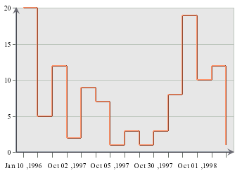
Step Line: | This option allows you to draw line chart as a step line. You can also specify the step line ratio to use. 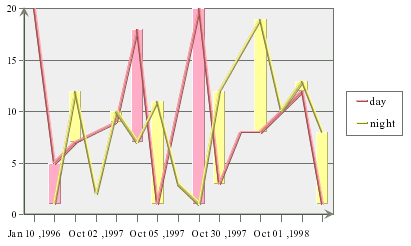 Line Chart with Drop Bars Note that the color of the drop bar will vary depending on which series has the higher value for a given point. If the line chart does not have a series, then the following dialog will appear. 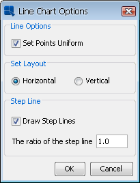 Line Options Dialog (without series) The dialog options are as follows:
|
There are no additional options for three-dimensional line charts.
EspressChart contains a special option for line charts that allows you to have two values shown for the same line. Here the secondary axis is used to plot the second value (as in a line-line combination) and then combined with the line on the primary axis.
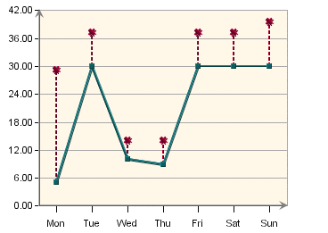
Double Value Line Chart
To create a double value line chart, design a line-line combination chart (a line chart with primary and secondary values). Then select → . This will bring up the axis elements dialog.
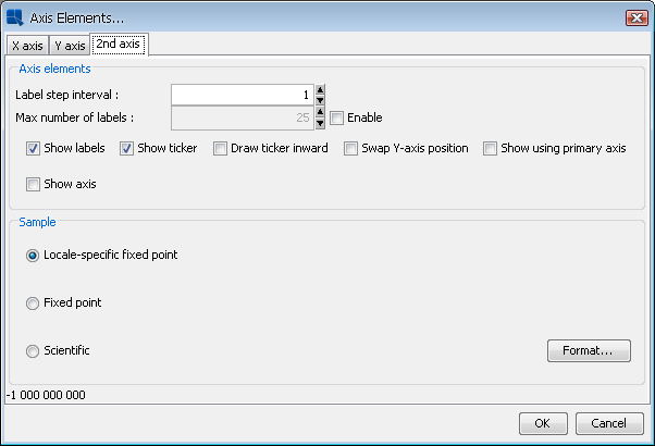
Axis Elements Dialog for Line-Line Combination Charts
Under the 2nd Axis tab, there is a checkbox marked Show using primary axis. Check this box and click on the OK button. Your chart will now be drawn as a double value line chart.
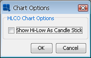
For HLCO charts, the following dialog is displayed:
HLCO Options Dialog
The Show Hi-Low As Candle Stick option will turn the HLCO chart into a candle representation. A candle HLCO chart blends high, low, close, and open data into a single object that resembles a candlestick.
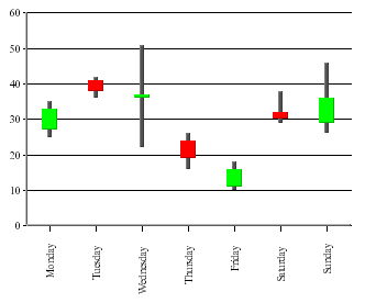
HLCO Candlestick Chart
For box charts, the following dialog is displayed:
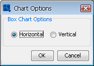
Box Options Dialog
This dialog allows you to specify whether to display the box chart in a horizontal or vertical orientation.
For stack area charts, the following dialog is displayed:
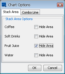
Stack Area Options Dialog
You can choose to hide any of the stacks in the chart by clicking on the corresponding check box. The Combo Line tab allows you to specify step lines if the chart is a line stack area combination. There are no additional options for three-dimensional stack area charts.
For Gantt charts, the following dialog is displayed:
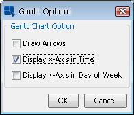
Gantt Options Dialog
The following options are available for Gantt charts:
- Draw Arrows:
This option will draw connecting arrows between category elements of the Gantt chart. This allows you to illustrate a sequence between scheduled events. The arrows are drawn in the order the category elements appear in the data source.
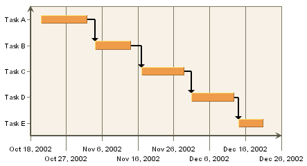
Gantt Chart with Arrows
- Display X-Axis in Time:
This option shows the ticker labels as time values instead of numeric values for the X-axis.
- Display X-Axis in Day of Week:
This option shows the ticker labels as days of the week with the date for each Sunday shown as well.
For radar charts, the following dialog is displayed:
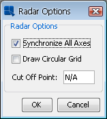
Radar Options Dialog
By default, the scale is same for all axes in the radar chart. Unchecking the Synchronize All Axes option will allow each axis in the radar chart to be scaled independently. You can select to use auto-scaling for each axis, or you can set the scales manually by invoking the axis scale dialog.
The second option allows you to set how the grid is drawn for the radar chart. By default, if the grid is enabled, it is drawn in straight lines that connect the tickers on each axis. Enabling the Draw Circular Grid option will draw the grid in a circle, similar to the polar chart grid.
The third option allows you to specify a cut-off point for the data points (areas) in the radar chart. You can enter a maximum value that should be shown in the chart. The areas bounded by the data points will not be drawn beyond the specified cut-off point.
For scatter charts, the following dialog is displayed:
Scatter Options Dialog
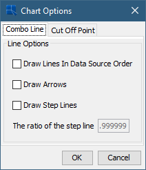
The Combo Line tab allows you to set Draw Lines In Data Source Order, Draw Arrows on lines or Draw the connecting lines as a Step Lines, as well as specify the step lines ratio.
The Cut Off Point tab allows you to specify a maximum value for the Y point of the scatter coordinates. Any coordinates that fall beyond this threshold will not be plotted. Connecting lines will draw up to the edge of the threshold and continue to the next data point.
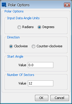
For polar charts, the following dialog is displayed:
Polar Options Dialog
Scale: | This option allows you to specify whether the input data for the angle (θ) portion of the data points is in radians or degrees. The chart will always display angles from 0 to 360. If the input data is in radians, it will be displayed as degrees. |
Direction | This option allows you to specify whether the circular plot should be drawn clockwise or counter-clockwise. |
Start Angle: | By default, the top of the polar chart plot is 0 degrees. This option allows you to specify a different angle for the top of the plot. The argument for this angle is supplied in degrees or radians, depending on the scale you have chosen. |
Number of Sectors: | This option allows you to select number of sectors you'd like to show in the chart. Sectors are created by drawing additional polar axis lines at specified angle intervals. By default, four sectors are shown. |
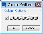
For column charts with data series, the following dialog is displayed:
Column Options Dialog
Normally, when column charts have data series, each series has it's own color that is applied for every category in the chart. If you want to assign different colors to the columns in the chart regardless of the series, you can enable the Unique Color Column option in this dialog. When it's turned on, you can set color for each column in the chart individually.
For column/bar charts without data series, the following dialog is displayed:
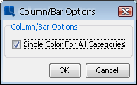
Column/Bar Options Dialog
Normally, when column/bar charts don't have data series, all categories in the chart have single color. If you want to assign different colors to the categories in the chart, uncheck the Single Color For All Categories option in this dialog.
For any other two-dimensional line combination chart, the following dialog is displayed:
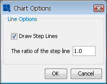
Line Combination Chart Options
This dialog allows you to specify whether to draw the combo line as a step line, as well as specify the step line ratio.
The chart options for a doughnut chart are almost exactly the same as the options for a pie chart. You can refer to the options under Section 6.9.4 - Pie Charts for more details.
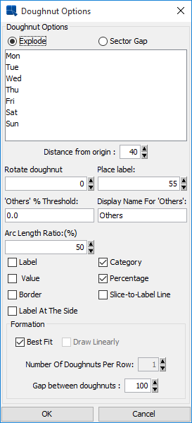
Doughnut Chart Options
The only option unique to doughnut charts is the Arc Length Ratio (%) which specifies the size of the hole at the center of the chart. A higher number results in a smaller hole.