After setting up data sources and creating queries, the next step to create charts and reports is to take the results of the data source and map them to the report and chart. Depending on the type of report or chart being created, the mapping options will vary. This section only covers basic mapping for certain report and chart layouts. For more information, please see Section 3.2 - Report Types and Data Mapping for report mapping and Section 3.13 - Chart Types and Data Mapping for chart mapping.
This section looks at several ways data can be mapped to the table structure of reports. This section will use the query created in Section Q.3.1.2 - Create a Query as the data source for the report.
The simple columnar layout is the most straight forward type of report mapping. Columns from the data source are drawn in a straight table in the report without any grouping and breaks.
To begin creating a report, open your data registry and select the node for your query. Click the button. A new window will open, with a table containing the results of the query (first 20 records only). Notice that because your query contains a parameter, it initially runs with the default values that were specified when the parameters were initialized.
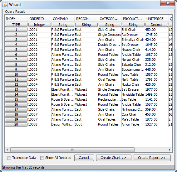
Query Result Screen
The bottom of the screen contains two buttons, and , which allow you to use the query to design a chart or report. To continue designing the report, click . This will bring up a dialog asking you which report layout option you would like to use.
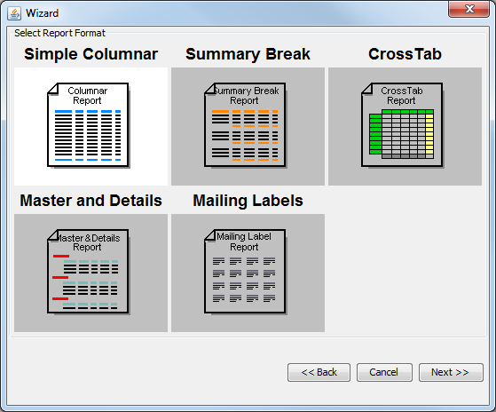
Select Report Layout Dialog
From this dialog, select Simple Columnar as the layout and click the button. The next step in the Report Wizard allows you to select which columns from the query you would like to use in the report, as well as re-arrange the column order. (Although the column order is not particularly important for the simple columnar layout, it can have a significant impact on other layouts depending on the mapping options selected).
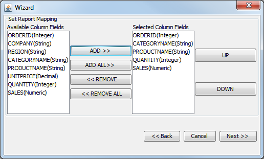
Column Selection/Ordering Dialog
In this dialog, select the following fields for the report:
ORDERID
CATEGORYNAME
PRODUCTNAME
QUANTITY
SALES
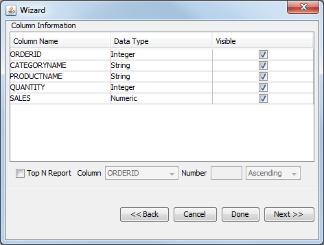
Once you have selected the fields, click to continue on in the Wizard. The next dialog is the data mapping dialog. This is where you can select how to map the fields from the data source into the selected report layout. This is a simple columnar layout, so the only options are whether to set columns as visible or not and whether to generate a top N presentation.
Data Mapping Dialog
In this dialog, select to leave all the columns visible and do not select the top N option. (For more about top N presentations, please see Section 3.2.1.1.1 - Top N Report). Next click the button. (There are some optional additional steps in the Wizard which will be explained later in this section). This will bring up the Report Designer interface with an unformatted version of your report.
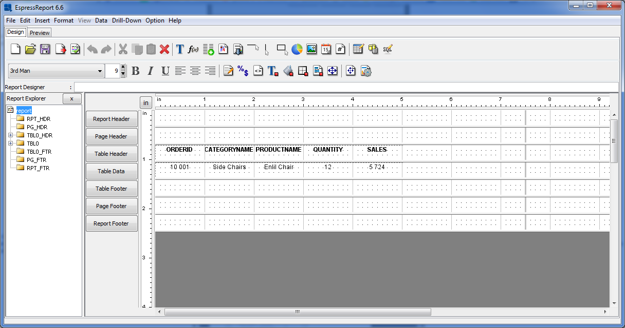
Simple Columnar Report in Design Window
Now click on the Preview Tab in the upper-left hand corner of the window. A dialog will open asking you whether you would like to preview the report with live or saved data. Select the Live Data option and click . A parameter selection dialog will appear prompting you to select a start and end date by which to filter the report. Specify a range that is large enough to produce enough records and click . You will then see the report output. Notice how the simple columnar layout places the columns from the result set in the report directly, without any grouping, sorting, or summaries.
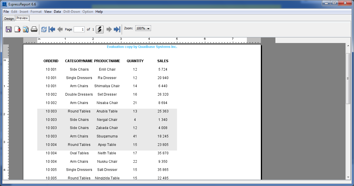
Simple Columnar Report Preview
The summary break layout is similar to the columnar layout, except it adds the ability to group and aggregate the report columns. A summary break report must be grouped by at least one column. Using the report created in Section Q.4.1.1 - Simple Columnar Layout, we will convert it into a summary break layout.
Go to the design window and select the Icon on the toolbar ![]() . This will return you to the Report Wizard, where we will select a different report layout. From the last data mapping dialog, hit the button until you get back to the report layout dialog.
. This will return you to the Report Wizard, where we will select a different report layout. From the last data mapping dialog, hit the button until you get back to the report layout dialog.
Change the report layout type to Summary Break and click . In the next screen, keep the column selection the same and click again to go to the data mapping window. You will notice that there are more options in this window than there were for the columnar layout.
Data Mapping Screen for Summary Break Layout
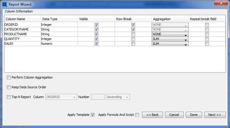
In the data mapping dialog, check the option called Row Break for the first two columns. This will have the report group by those two columns. From the drop-down menus under Aggregation, select to SUM the QUANTITY and SALES columns. Also, uncheck the Apply Template option, as you do not need to carry over the formatting from the simple columnar layout. Once you have finished specifying options, again click the button. You will get a warning if you have not applied template. Click to continue. You will be taken back to the Report Designer where the new mapping has taken effect.
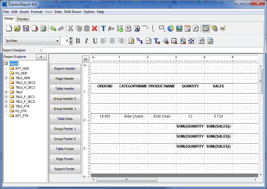
Summary Break Report in Design Window
In the Designer you will notice that because there are two levels of nested grouping in the report there are now corresponding Group Header and Footer sections for each. For more about report sections and their behavior, please see Section 3.3.1 - Report Sections. Now click on the Preview tab to preview the report. Again, you will be prompted to specify parameter values. Once you see the report in the preview window, notice that the data is grouped by category name and order ID and that intermediate summaries are calculated for each group.

Summary Break Report Preview
A crosstab report shows data in a matrix-like form, allowing multi-dimensional data to be displayed in a two-dimensional layout. In the current example, we will use the crosstab layout to breakdown the sales column by product category and region.
Go to the design window and select Change Data Mapping ![]() . When the Report wizard re-opens, click the button until you get back to the layout selection screen. From this screen, select to use a CrossTab layout and click . At the column selection/ordering screen (next in the Wizard), change the selection to be the following:
. When the Report wizard re-opens, click the button until you get back to the layout selection screen. From this screen, select to use a CrossTab layout and click . At the column selection/ordering screen (next in the Wizard), change the selection to be the following:
CATEGORYNAME
REGION
SALES
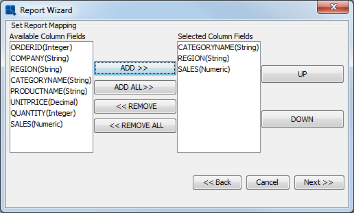
Column Selection for Crosstab Report
Once you have specified the columns in the correct order, click the button to bring up the data mapping option for the crosstab layout.
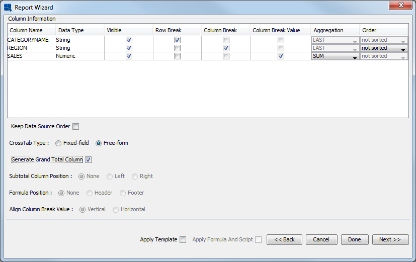
Data Mapping Screen for Crosstab Layout
For the CATEGORYNAME column, check the option marked Row Break. This will create a row in the report data for each distinct category name. Next select the Column Break option for the REGION column. This will create a column in the report data for each distinct region. Leave the Order option as not sorted. Finally, select the Column Break Value option for the SALES column and click on the Aggregation menu to select SUM. This will give you the total sales for each category and region in the report.
You can also select the CrossTab Type, either free-form or fixed-field. A fixed-field crosstab report is a special report type that can expand and contract with changing data. For more information about fixed-field crosstab reports, see Section 3.2.3.3 - Fixed-Field Crosstab Report. We will choose the Free-form type in this example. Once you have finished specifying the options, click the button to go to the Report Designer. You will get a warning if no template was applied. Click to continue.
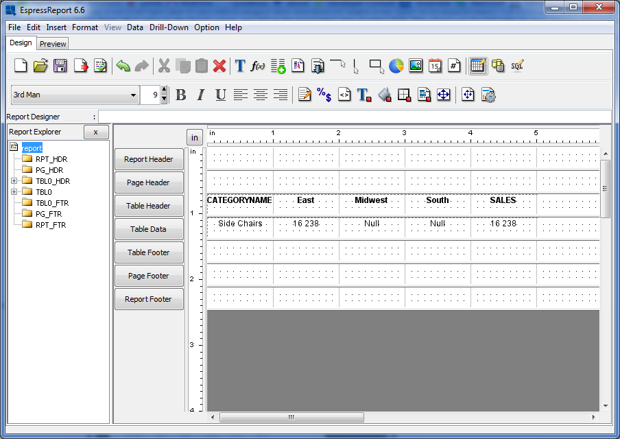
Crosstab Report in Design Window
As you can see a report column has been generated for each region, and has been automatically totaled both vertically (columns) and horizontally (rows). Now click on the Preview tab to preview the crosstab layout.

Crosstab Report Preview
Like the summary break layout, the master & details layout also allows you to group the data. It also allows you to automatically add column fields to the Group Header section, creating a one to many layout that can also be configured in a side-by-side layout.
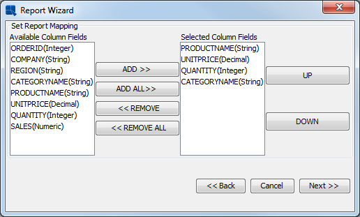
Go back to the design window and select Change Data Mapping from the Data menu. Again, navigate back to the layout selection screen. This time select the Master and Details layout. Click to get to the column selection screen. In the column selection screen, change the selection to include the following columns:
ORDERID
COMPANY
QUANTITY
PRODUCTNAME
UNITPRICE
SALES
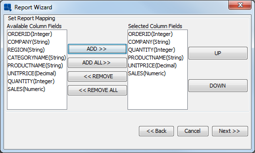
Column Selection for Master & Details Report
Once you have specified the columns in the correct order, click the button to bring up the data mapping dialog for the master & details layout.
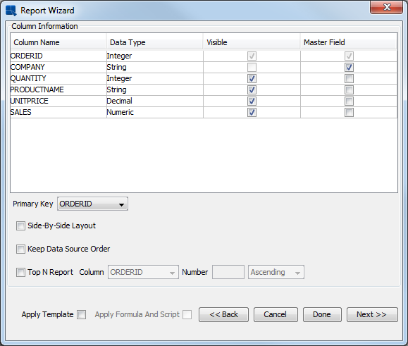
Data Mapping Screen for Master & Details Layouts
Select the ORDERID field as the Primary Key from the drop-down menu in the lower-left hand portion of the screen. This will group the data by the ORDERID field. Next, check the Master Field option for the COMPANY column. This will place the COMPANY field in the Group Header section of the report.
Instead of clicking to get to the Report Designer from this screen, click the button to invoke the additional pre-formatting options. You will get warning that all the formating will be lost. Click to continue to the dialog that allows you to add several elements to the report.
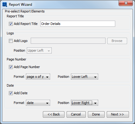
Add Report Elements Dialog
Check the boxes to add a Report Title, Page Number and Date. Enter the text you would like as the report title and specify the format and location of the date and time using the drop-down boxes for each option. Once you have finished setting the options, click . A new dialog will open allowing you to specify a style for the new report.

Report Style Selection
Select the Block Left-Align style and click the button. You will be taken to the Report Designer window, where the elements have been added. There is now some default formatting applied to the report.
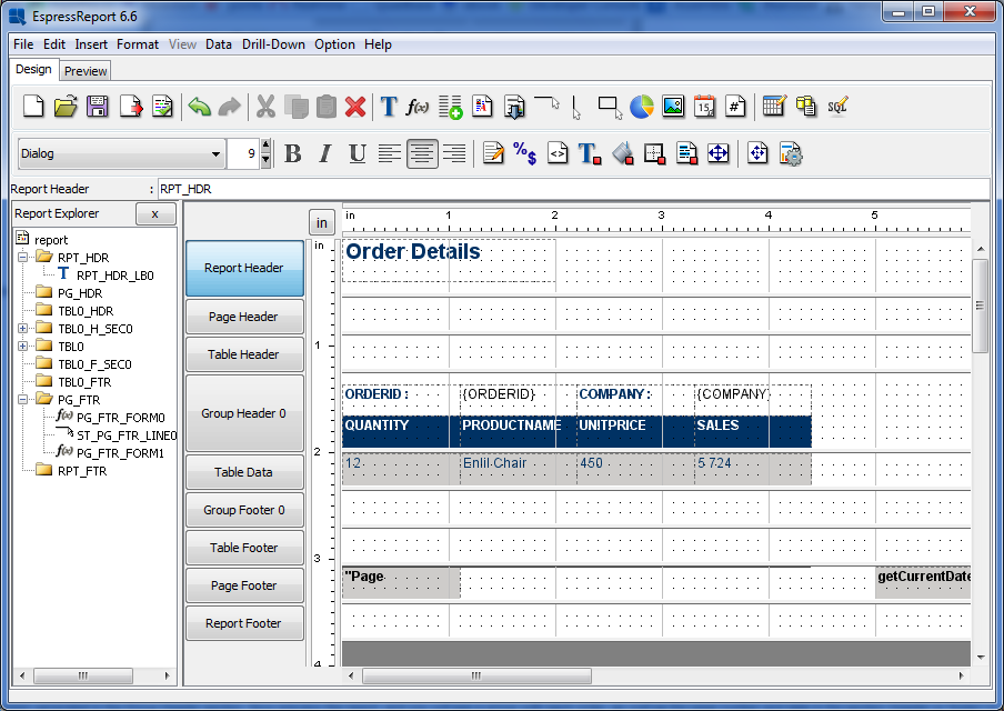
Master & Details Report in Design Window (with pre-formatting)
As you can see the ORDERID and COMPANY fields have been generated in the Group Header section. Now preview the report, and you will see a group with each order, as well as the page number and date in the section (header or footer) in which they were placed.

Master & Details Report in Preview Window
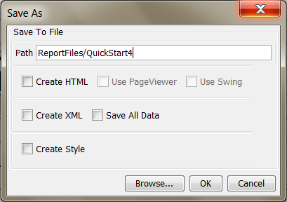
Now that you have finished creating a report, click the button on the toolbar to save the report ![]() . This will bring up a new dialog, allowing you to specify save options for the report.
. This will bring up a new dialog, allowing you to specify save options for the report.
Save As Dialog
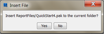
Enter a name for the report and click . By default the report will be saved in the /ReportFiles/ directory under the ERES install directory. A dialog will open, asking you if you would like to insert the report into the current folder in the Organizer.
Save to Organizer Prompt
Click and the report will be added to your project in the Organizer.
A mailing labels layout is similar to a simple columnar layout; however, it prearranges data in a manner that allows you to create mailing labels.
Go back to the design window and select Change Data Mapping from the Data menu. Navigate back to the layout selection screen. This time select the Mailing Labels layout. Click to get to the column selection screen. In the column selection screen, change the selection to include the following columns:
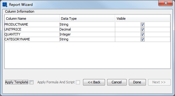
PRODUCTNAME
UNITPRICE
QUANTITY
CATEGORYNAME
Column Selection for Mailing Labels Report
Once you have specified the columns in the correct order, click the button to bring up the data mapping dialog for the maling labels layout.
Data Mapping Screen for Mailing Labels Layouts
The only option is whether to set columns visible or not because this is a mailing labels layout. Also, uncheck the Apply Template option, as you do not need to carry over the formatting from the Master & Details layout. Once you have finished specifying options, again click the button. You will get warning that all the formating will be lost. Click to continue. You will be taken back to the Report Designer where the new mapping has taken effect.

Mailing Labels Report in Design Window
Now click on the Preview tab to preview the Mailing Labels layout.
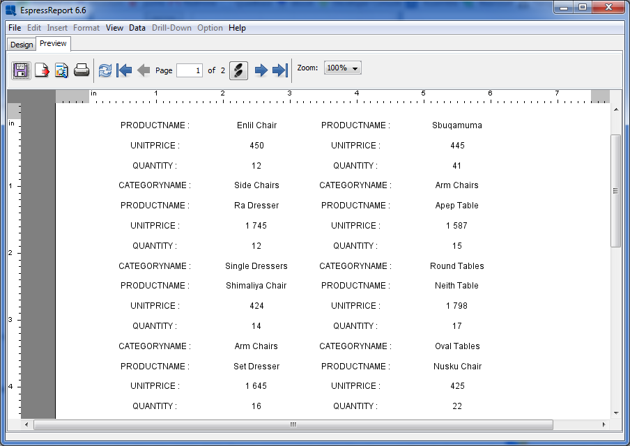
Mailing Labels Report in Preview Window
Now go to the Report Designer window, and select Exit from the File menu to close the interface. We want to keep the report from the previous chapter, so select in the prompt that asking you for saving changes.
This section will look at several ways that data can be mapped to charts. This section will use the text file data source that was setup in Section Q.3.1.4 - Setup a Text Data Source.
Column charts are a good starting point as the mapping for column charts is very similar to that of bar, area, and line charts. To begin creating a chart, click the button in the Organizer toolbar ![]() . This will launch the Chart Designer interface and open your data registry. In the Data Source Manager, select the node for your text data source and click the button. A dialog will open with a table containg the contents of the text file (first 20 records).
. This will launch the Chart Designer interface and open your data registry. In the Data Source Manager, select the node for your text data source and click the button. A dialog will open with a table containg the contents of the text file (first 20 records).
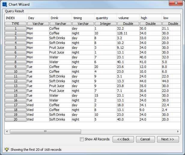
Contents of Text File
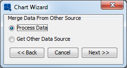
At the bottom of the dialog, click the button. A dialog will open asking you if you would like to select an additional data source for the chart.
Add Data Source Dialog
Select the Process Data option and click . You will then be taken to a dialog prompting you to select which type of chart you would like to create.
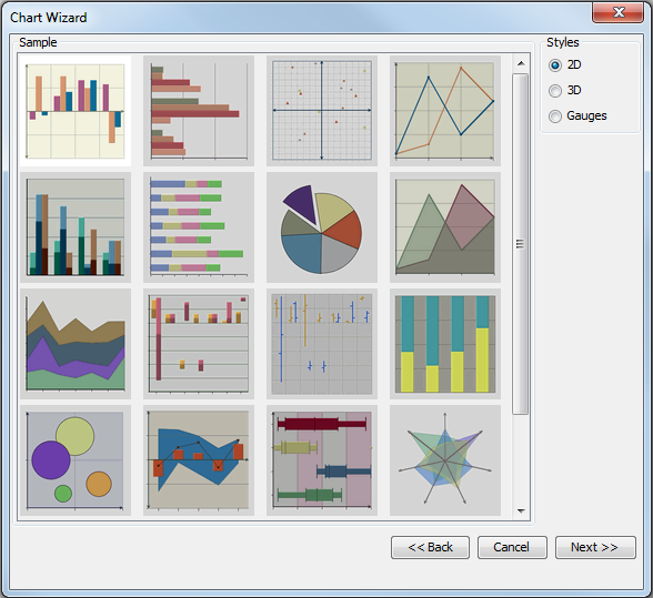
Chart Types Dialog
From this dialog, select a 2D Column Chart (the first image) and a two-dimensional column chart as the data type and click . You will then be taken to the data mapping dialog which allows you to map columns from the data source to chart elements.
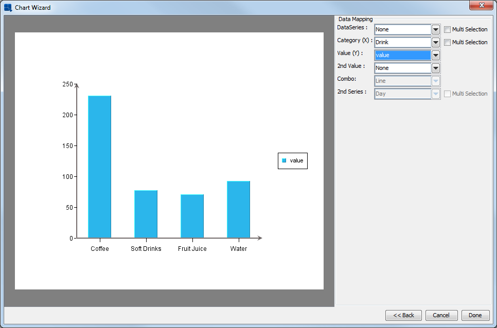
Chart Data Mapping Dialog
Set the Data Series to None, the Category to Drink and the Value to value. Then click to finish the Wizard and go to the Chart Designer interface.
If the generated chart does not fit in the viewport of the Chart Designer, select Canvas from the Format menu. This will bring up a dialog allowing you to set the size of the chart.
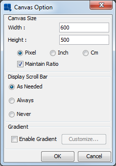
Chart Canvas Dialog
Enter a smaller size for the chart canvas and click to close the dialog. You should now see the whole chart in the viewport.
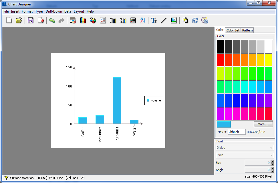
Chart Designer Showing Column Chart
Notice that the column chart contains a column for each distinct value in the Drink column and shows the corresponding value for each day.
At this point, the column chart only contains data points for the categories Drink column. However, ERES supports adding another dimension to this data by way of a series. To add a series to the column chart, click the button in the toolbar ![]() . This will return you to the data mapping window.
. This will return you to the data mapping window.
In the mapping window, change the Data Series option from None to Day and click to return to the Chart Designer.
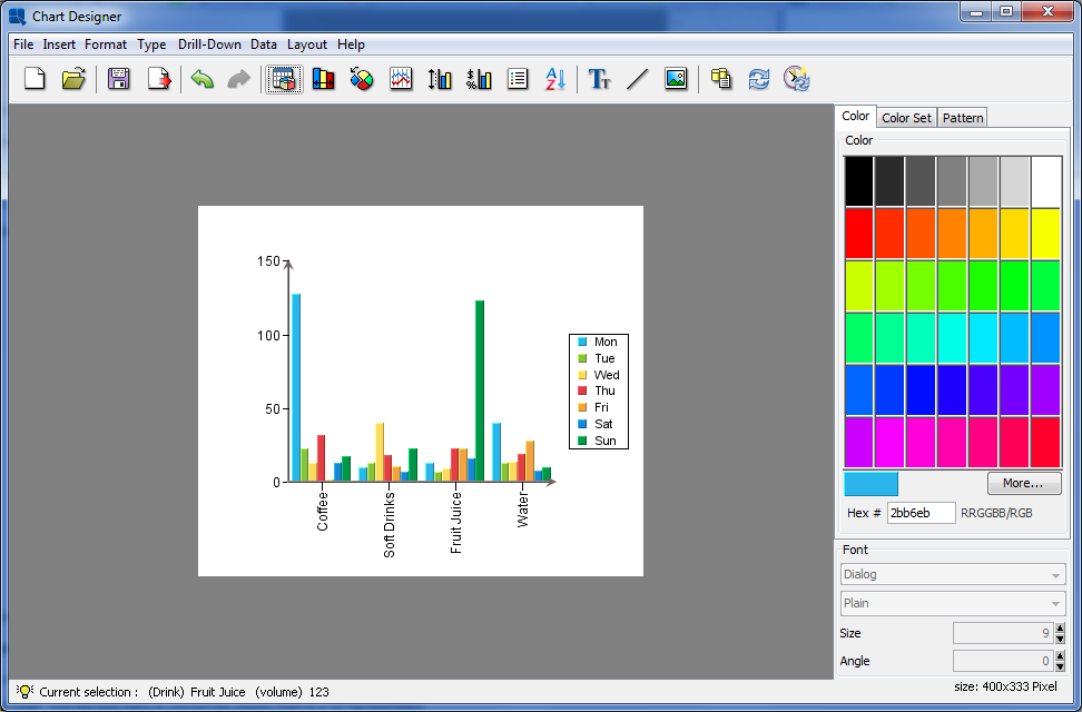
Chart Designer Showing Column Chart with Series
Notice now that instead of a single data point for each drink, the column for each drink is now comprised of seven small columns, one showing the data point for each day.
In a two-dimensional chart, the data series is represented in-line along the X axis. However, a three-dimensional representation provides another axis to work with.
In the Chart Designer select 3D Chart from the Type menu to convert the column chart to a 3D representation.

Chart Designer Showing 3D Column Chart
The 3D tool bar will automatically appear at the bottom of the Chart Designer when the chart is converted to 3D. The chart may appear squished when you convert it. You can use the sliders next to the zoom function to change the X, Y, and Z scaling for the 3D chart. You can also use the navigation buttons to position the chart in space. For more information about 3D features, see Section 3.14.4 - The Navigation Panel.
Notice that with the chart in 3D, the data series is now moved to the Z axis of the chart by default.
Pie charts are another commonly used chart type that shows values as a percentage of a whole. To convert your chart to a pie chart, first go to the Type menu and select 2D Chart to convert your column chart back to two-dimensional form. Then select Pie from the Type menu. The chart will then be converted to a pie representation.
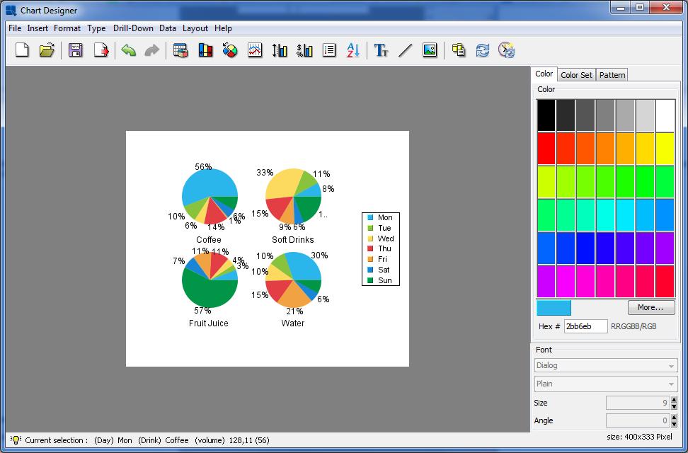
Chart Designer Showing Pie Chart with Series
Multiple pies are drawn when you have a data series; one for each cateogry. Each categories is broken down showing percentage contribution for the series elements.
In order to turn the chart into a single pie, we will remove the series. Click the button ![]() on the toolbar to bring up the mapping options.
on the toolbar to bring up the mapping options.
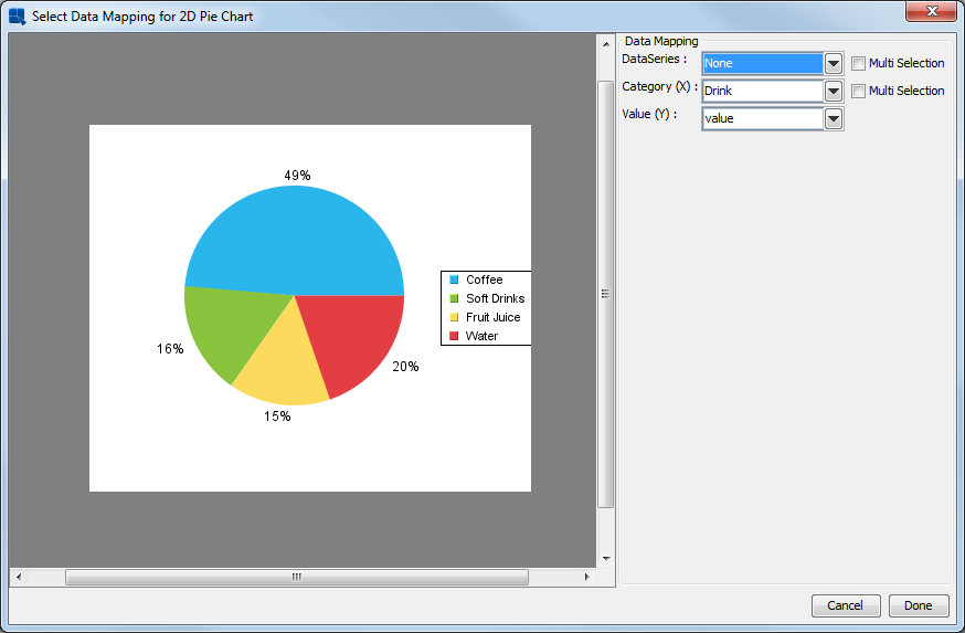
Data Mapping Options for Pie Charts
Change the Data Series option to None and click . Now in the Chart Designer you will see a single pie made up of your drink categories.
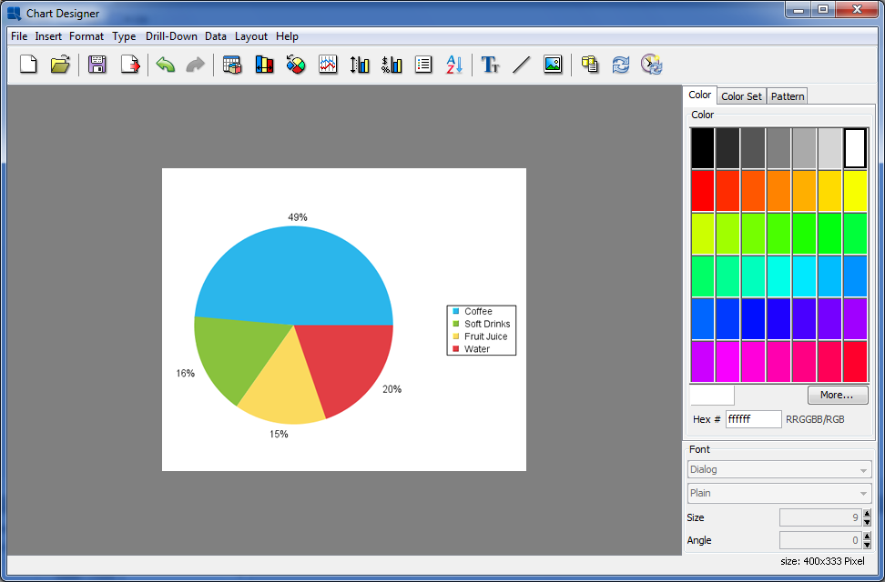
Chart Designer Showing Pie Chart
Another way to display multi-dimensional data is to use a stack type representation to show contributions to a total. To convert your pie chart into a stack column chart, select Stack Column from the Type menu. Chart Designer will ask whether you want to redo data mapping for the new chart type. Click and confirm the change by clicking in the “Select Data Mapping for 2D Stack Column Chart” dialog. The chart will then be converted to a stack column layout.
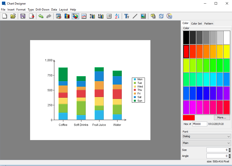
Chart Designer Showing Stack Column Chart
Notice that the chart now shows the columns as stacks made up of the values for each drink. Now click the button ![]() on the toolbar. In the data mapping window there is a new option called Sum by. This is set to the Day column. The Sum by column provides the individual stacks in these types of charts. Set Sum by to Drink and Category to Day. Click to return to the Chart Desinger. You should see the following chart.
on the toolbar. In the data mapping window there is a new option called Sum by. This is set to the Day column. The Sum by column provides the individual stacks in these types of charts. Set Sum by to Drink and Category to Day. Click to return to the Chart Desinger. You should see the following chart.
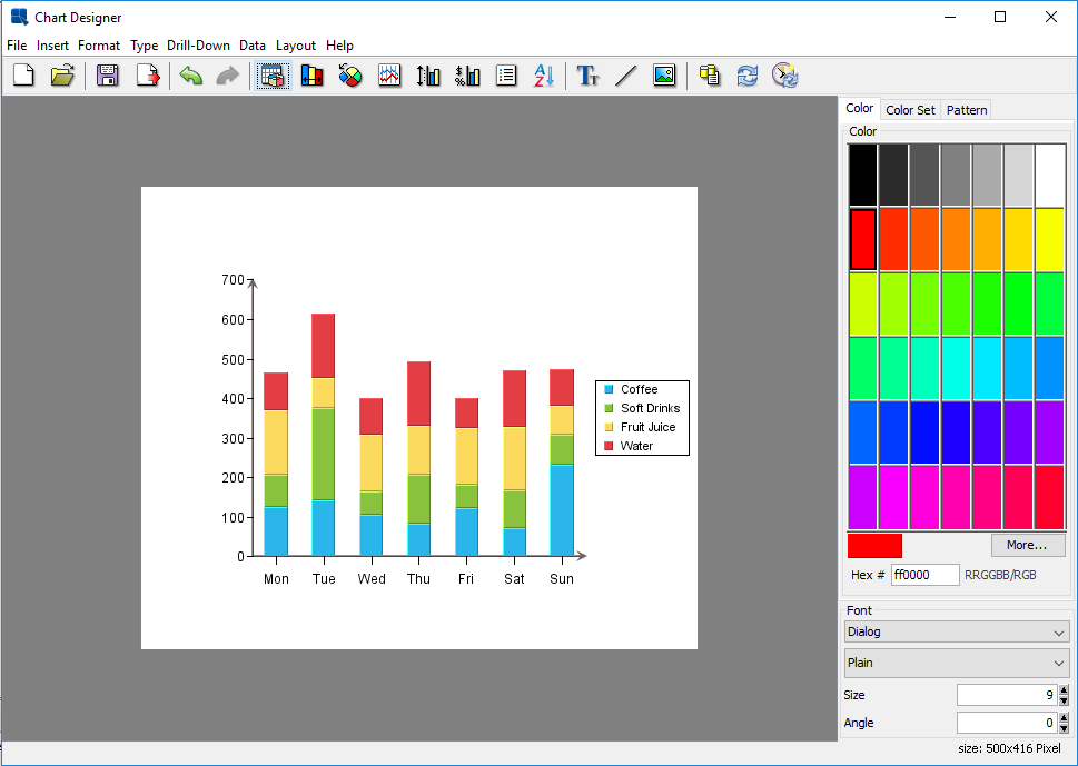
Stack Column Chart
Now that you have finished designing a chart, click the button on the Toolbar ![]() . A dialog will open prompting you to specify a location and file name for the chart.
. A dialog will open prompting you to specify a location and file name for the chart.

Save As Dialog
Enter a file name, and select to use either a PAC, CHT, or TPL format. For more about chart formats, see Section 3.16.2 - Saving Charts without Report Data. The chart will be saved in the /ChartFiles/ directory under the ERES installation by default. You will then be prompted to add the file to the Organizer. Click . Close the Chart Designer.