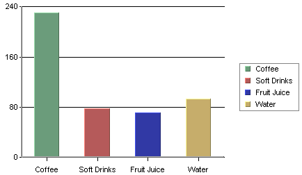
Column Chart (Without Data Series)
A column chart displays each row in the data table as a vertical bar (or column). The categories are listed along the X-axis and the values plotted along the Y-axis. Column charts are good for comparing discrete values for different groups. Each group is represented by a different color.
In a two-dimensional chart, if a data series has been selected then the entire series for a single category will be displayed in the XY plane. If a three-dimensional column chart is being used then all the vertical bars in a given data series are drawn using the same color along the Z-axis. If a data series is not present in the chart, the categories will be represented by the same color by default. Different colors for the categories are possible to set by clicking the ![]() icon on the toolbar (or selecting → ), and unchecking the Single Color For All Categories option.
icon on the toolbar (or selecting → ), and unchecking the Single Color For All Categories option.
In the examples given, we have chosen Drink as the category variable and Value as the value variable (most examples use the Sample.dat file included in the EspressChart installation). Year has been selected as the data series variable for the chart below. Therefore, each name has two columns shown: one for last year and one for this year which are the only two values present in the data series column.
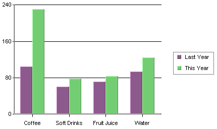
Column Chart with Data Series
Data mapping for column charts is fairly straightforward. It is similar to the examples first presented in Section 3.2 - Basic Data Mapping. For column charts, the following options are available:
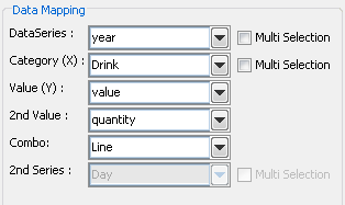
Mapping Options for Column Charts
Data Series: | Choose a data column whose distinct values will determine the number of data series in the chart. Each element in a data series is drawn using the same set of colors and other attributes. |
Category (X): | Choose a data column whose distinct values will determine the categories. |
Value (Y): | Choose a data column to provide values for each category. |
2nd value: | Add a second value to create a combination chart. |
2nd Series: | Choose another column to be series for the secondary chart. This option is applicable only if the secondary chart is an overlay chart. |
Combo: | Choose the chart type for the secondary chart. For column charts the combo options are Line and Overlay. |
The data mapping also allows you to transpose the data (in other words: to select several columns for a single category). To learn more about data transposition, please see Section 5.1.1 - Data Transposition.
The last three data mapping options allow you to add a second value to the chart. EspressChart supports secondary values for all chart types except pie, radar, bubble, dial, surface, and scatter charts. In the example below, a second value of Quantity has been added to our column chart.
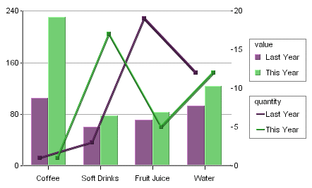
Column Chart With 2nd Value
As you can see, the second axis labels are drawn on the right-hand side of the plot area (you can choose to make this axis visible). Usually, the second value will share the same categories and series as the primary value. However, for two-dimensional column, stack column, stack area, high low, HLCO, and percentage column charts you can specify an overlay combination, which allows you to specify a second series. For more on overlay charts, please see Section 5.17 - Overlay Charts.