Once you have finished data mapping for your chart or report, you are taken to the Designer interface where you can customize many different features/properties of the report or chart. This section details how to use some of the most commonly used features in the Report and Chart Designers.
In this section, we will open an unformatted template and use some of the basic formatting features in EspressReport to create a polished presentation. To begin formatting the report, you will first need to add the template to the Organizer.
If you do not have the Organizer open, open it. Then select your project in the left-hand side. Next, click the button on the toolbar ![]() . A new dialog allowing you to select a file to insert into the Organizer.
. A new dialog allowing you to select a file to insert into the Organizer.
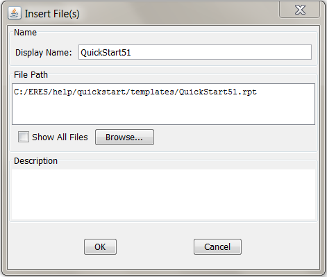
Insert File Dialog
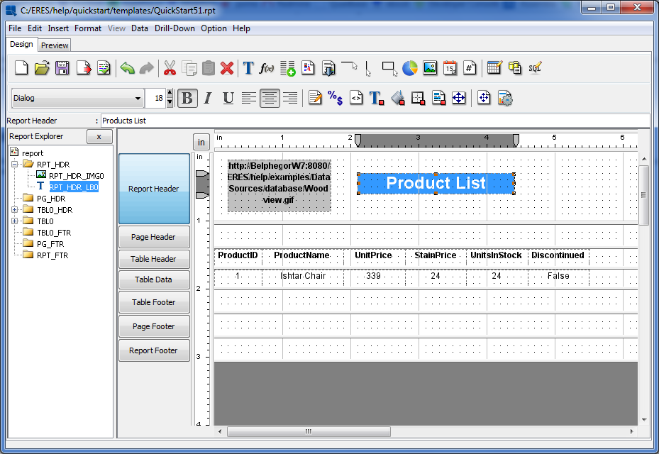
In the dialog, click the button, navigate to help/quickstart/templates/, and select QuickStart51.rpt. The display name and corresponding URL should be automatically filled in if you have set the URL mapping correctly(Section 2.1.5 - URL Mapping). Click to add the report. The dialog will close and you will see an entry in the Organizer for the newly added report.
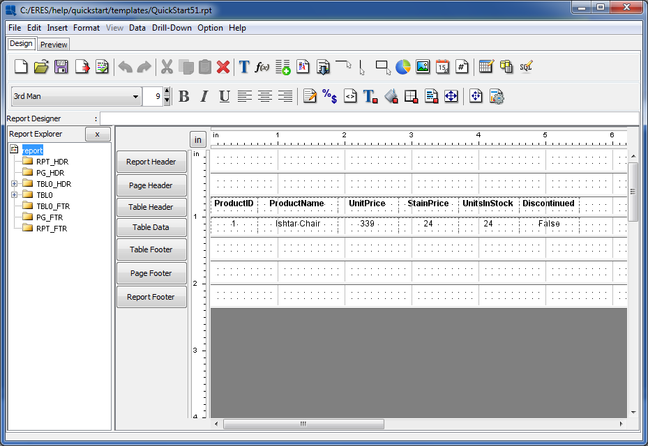
QuickStart51.rpt in the Report Designer
Report elements can be moved one by one, by click and dragging on the cell. Report elements can also be moved as groups. To move a group of elements you must first select the group using the selection box. To activate the selection box, click and drag to draw a box around the report columns. They should become highlighted when you release the mouse. To add some more elements to your current selection, press the CTRL key and draw another selection box (while holding the CTRL key).
Drawing a Selection Box in Report Designer
Once the fields in the report have been selected, click and drag to indent them about half an inch. Next, click the button on the toolbar ![]() . This will align all of the cell text to the left edge of the cell.
. This will align all of the cell text to the left edge of the cell.
There are number of options available that allow you to control how data will be displayed (date format, decimal places, rounding, etc). Using the selection box again, select the UnitPrice, and StainPrice columns (just the column fields not the headers).

Two Column Selection
Once the columns have been selected, select the Data Format option from the Format menu. This will open a dialog prompting you to select which data type you would like to set the format for. Select Numeric and click .

Data Type for Formatting Dialog
This will open a new dialog. From this dialog select Fixed Point and click the button. At the next dialog select to have two decimal points and select the dollar sign as the Units symbol.
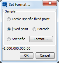
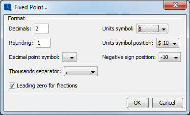
Numeric Format Dialogs
Click and again at the previous dialog. The selected fields will be converted to currency format.
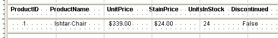
Numeric Data in Currency Format
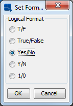
Next, select the Discontinued column. The border outline will appear by clicking it. Again, click on the button ![]() . This time a dialog will appear allowing you to select a format for the Boolean column. Select Yes/No and click . The data in the column will now change.
. This time a dialog will appear allowing you to select a format for the Boolean column. Select Yes/No and click . The data in the column will now change.
Data Format Dialog for Boolean Data
Now we will edit the label text. By default column headers will display the column names from the database. However, you can override these headers with a custom one. Double click on the ProductID cell and a dialog will appear allowing you to modify the column header. Insert a space between Product and ID and click . The change will appear in the design window.

Edit Column Header Dialog
Repeat this for each column label except Discontinued so that you have inserted appropriate spaces in all of them.
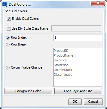
The dual colors feature in EspressReport allows users to differentiate different rows or groups of data by changing the background color, and/or font. Use the group selection tool to turn on dual colors and select all of the columns in the report (not headers).
Next, select the button on the toolbar ![]() . A dialog will appear prompting you to set dual colors for the columns. Click the checkbox labeled Enable Dual Colors. Then select the Row Index radio button to indicate that you would like to change color based on a row value. Enter
. A dialog will appear prompting you to set dual colors for the columns. Click the checkbox labeled Enable Dual Colors. Then select the Row Index radio button to indicate that you would like to change color based on a row value. Enter 1 for the row index value.
Dual Colors Dialog
Next, click on the button. A dialog will appear giving you the option to set the background transparent and showing the current background color.
Background Transparency Dialog
Click on the button labeled and a new dialog will appear with color swatches allowing you to select a new background color.
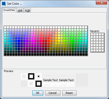
Choose Color Dialog
Select the new background color that you would like to use and click . You will return to the first dialog where the color selection will be reflected. Click on again and you will return to the Dual Colors dialog. Once you are back at the Dual Colors dialog, click the button. This will bring up a dialog allowing you to specify the font, font size, and font style for the alternating rows.

Font Style and Size Dialog
From this dialog, set the Font to be Dialog, the Style to be Plain and the Size to be 9 pt. This will match the fonts for the alternating rows. Click to go back to the dual colors dialog and once more to return to the Report Designer. Now when you preview the report you will see alternating bands of color for each row.
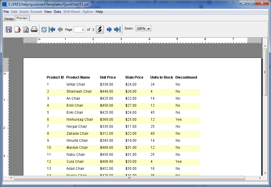
Dual Colors in Preview
To further customize reports, many different types of elements can be added to a report template.
To insert an image into the report header, first you will want to resize the section to fit the image. In the design window, place the mouse over the lower section divider of the Report Header section, click and drag down making the section about an inch taller.
Re-Sizing a Report Section
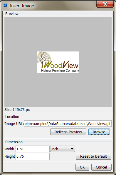
Once the section is re-sized, click the button on the toolbar ![]() . A small rectangle will follow your mouse pointer around the design window. Position the rectangle in the upper left-hand corner of the Report Header section and click. A dialog will appear prompting you to select an image to insert. Click on and navigate to
. A small rectangle will follow your mouse pointer around the design window. Position the rectangle in the upper left-hand corner of the Report Header section and click. A dialog will appear prompting you to select an image to insert. Click on and navigate to help/examples/DataSources/database/Woodview.gif. You should now see an image in the preview panel.
Insert Image Dialog
Click and the image will be inserted into the report. The image will be represented by a gray rectangle in the design view. You can see the image when you preview the report.
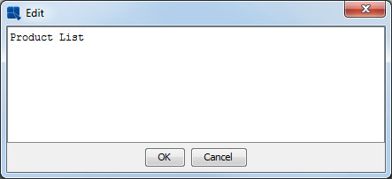
To insert a title, click on the button on the toolbar ![]() . A small rectangle will now follow your mouse pointer around the design window. Position the rectangle next to the image you are inserted in and click. A dialog will appear prompting you to enter the label text. Type in the text of your desired title.
. A small rectangle will now follow your mouse pointer around the design window. Position the rectangle next to the image you are inserted in and click. A dialog will appear prompting you to enter the label text. Type in the text of your desired title.
Insert Label Dialog
Click and the title will be added to the report. As you can see, the text is fairly small by default. To change this, change the font size dialog on the toolbar to be 18pt font.
Toolbar Font Options
When you do this you will notice that some of the text in the title cell has now disappeared. This is because the text is now larger than the space defined. To re-size the cell, right click and drag until you can see the report title again.
Then click the button on the toolbar to set the text alignment to the left as you did for the other report elements. Move and position the title cell so it is next to the inserted image.
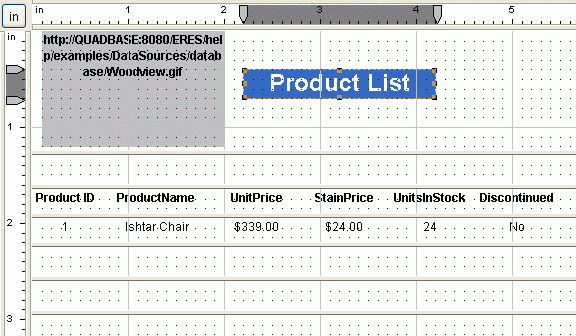
Report Header with Image and Title
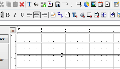
Next, we will add a horizontal line below the column headers. To do this, first re-size the Table Header section slightly to provide some more space below the column headers. Next, select the button on the toolbar ![]() . Your cursor will then change into a cross. Click below the
. Your cursor will then change into a cross. Click below the ProductID header and drag across to the last column to draw the line.
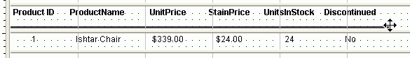
Drawing a Line in Report Designer
Report Explorer from the Option menu is turned on by default. It is the panel on the left-hand side of the Report Designer, showing the report elements in a tree format. Click to expand some of the sections and you will see all of the elements in the report represented in the tree. If you select one of the elements in the tree, the corresponding element in the report will be selected.
Designer with Explorer Open
You can close the report explorer by selecting Report Explorer again from the Option menu.
In EspressReport, each of the report sections has a number of configurable options allowing you to display the data in the sections in any number of different ways. To invoke the options menu for a section, click on the button for that section on the left-hand side of the design window. In this example, bring up the options menu for the Table Header section by clicking on the corresponding button.
From the pop-up menu select Repeat On Every Page. This will cause the Table Header to be drawn on each report page instead of only once (which is the default). For more about report section options, see Section 3.3.3 - Section Options.
Now that you have finished formatting the report, preview it to see the results.
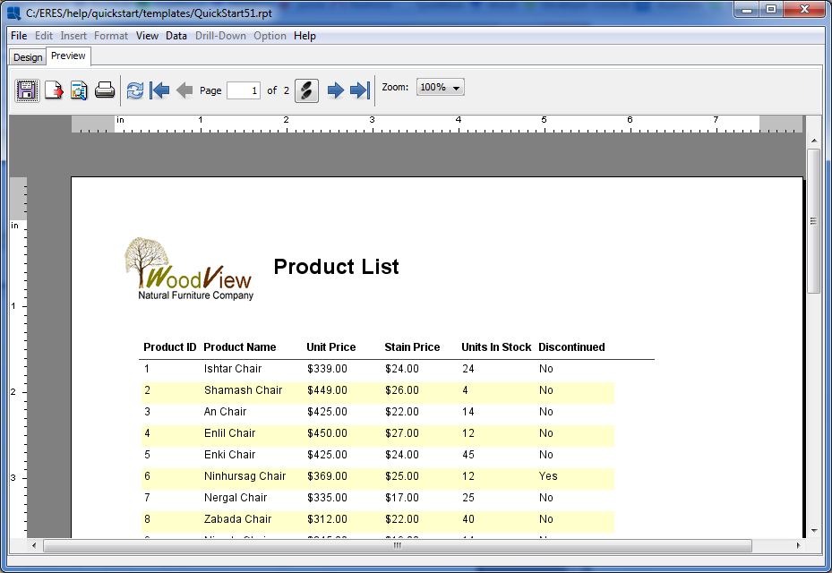
Finished Report
Now save the changes you have made to the report and exit from the Report Designer.
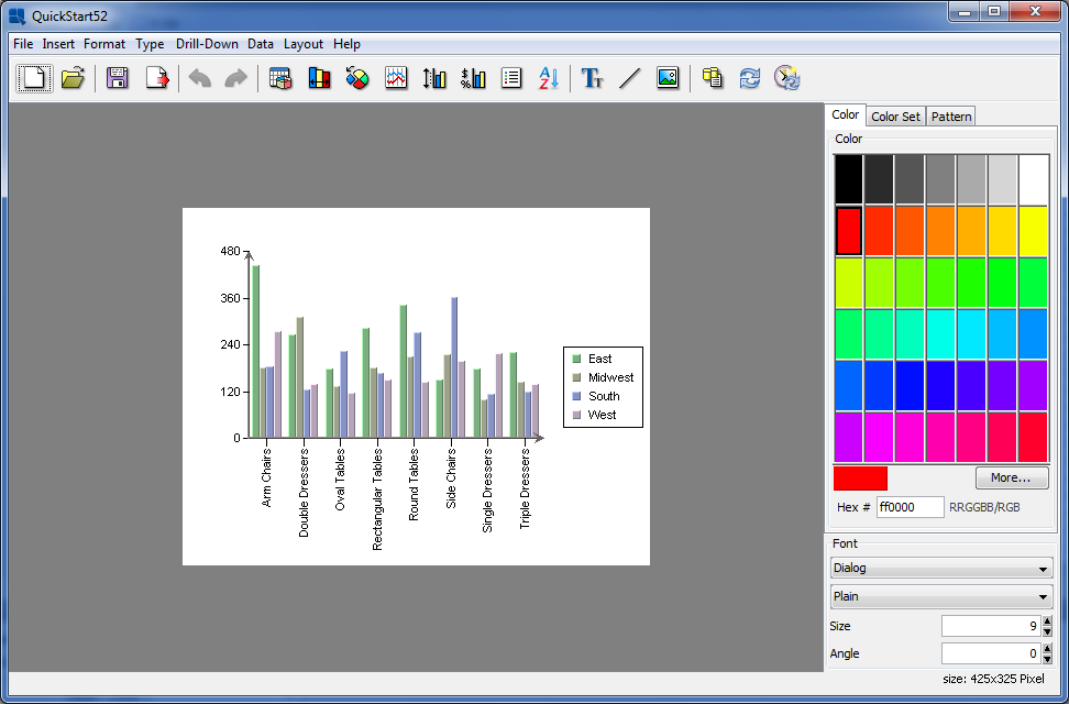
In this section, we will use some of the basic formatting features in the Chart Designer to change the look and feel of an unformatted chart. To begin you will need to add the chart to the Organizer.
Following the same procedure as in Section Q.5.1.1 - Add a Report Template to Organizer, add the QuickStart52.tpl file under help/quickstart/templates into your project in the Organizer. Next, right click on the entry for this file in Organizer and select Open File from the pop-up menu. This will open the chart in the Chart Designer. As you can see its relatively un-formatted.
Unformatted Chart in Designer
Many chart appearance options are controlled using the Axis Elements dialog. To bring up this dialog, click the button on the toolbar ![]() . This will bring up a tabbed dialog allowing you to set different options for each chart axis. Click on the Y Axis tab to bring up options for the value axis.
. This will bring up a tabbed dialog allowing you to set different options for each chart axis. Click on the Y Axis tab to bring up options for the value axis.
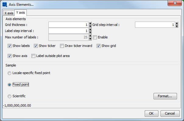
Axis Elements Dialog
Check the box marked Show grid to add grid lines to the Y Axis. Select Fixed point for the data format and click the button. This will bring up an additional dialog allowing you to set format options for the numeric data. Select the number of decimals as 2 and click .

Numberic Format Dialog
Click again to dismiss the axis elements dialog and you will see the specified changes reflected in the chart.

Chart with new Axis Formatting
Chart colors can be selected individually or you can select predefined color set. In Chart Designer, click on the Color set tab on the right and select a color combination you like.
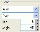
Now click on one of the X axis (category) labels. The lower left-hand corner of the design window will reflect your selection. In the font dialog on the lower right-hand side, change the angle of the labels from 90 to 45 degrees.
Font Panel
The chart labels will then rotate. You may need to adjust the position of the labels slightly. To do this, click and drag on a label. All the X axis labels will follow your cursor around the chart canvas.
Next, we will add titles to the chart. To do this, select Titles from the Insert menu. This will bring up a dialog prompting you to enter a main title for the chart as well as titles for each of the axes.
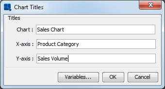
Chart Titles Dialog
Enter any titles that you would like for the various elements and click . The titles will then be added to the chart. Titles are placed automatically but you can manually adjust their positions by clicking and dragging the text on the chart canvas.
If you do not see chart titles, click and drag on the chart plot to move the chart. You should then be able to see the titles. You can adjust the font and font size of the chart titles by clicking them and changing the settings in the font panel.
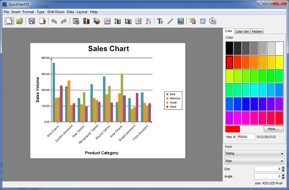
Chart With Titles
You can also customize the plot of two-dimensional charts, creating a separate background for the data points. To do this, select Plot Area from the Format menu. This will bring up a dialog allowing you to set display options for the chart plot.

Plot Area Dialog
Select to draw both the Area and the Border with a Thickness of 1. Specify None for the Appearance. Once you have specified the options, click and the plot area for the chart will be modified. You can change the background color of the plot area by clicking to select it and then modifying the color in the color panel.
Chart With Colored Plot Area
Now save the changes you have made to the chart and exit the Chart Designer.
EspressReport ES provides a large built-in formula and scripting library, giving you many ways to manipulate and analyze report data. In the following section we will take a template and use formulas and scripts to calculate/add some values to the report.
Following the same procedure as in Section Q.5.1.1 - Add a Report Template to Organizer, add the QuickStart53.rpt file under help/quickstart/templates into your project in the Organizer. Then right click on the entry for this file in Organizer and select Open File from the pop-up menu. This will open the report in Report Designer.
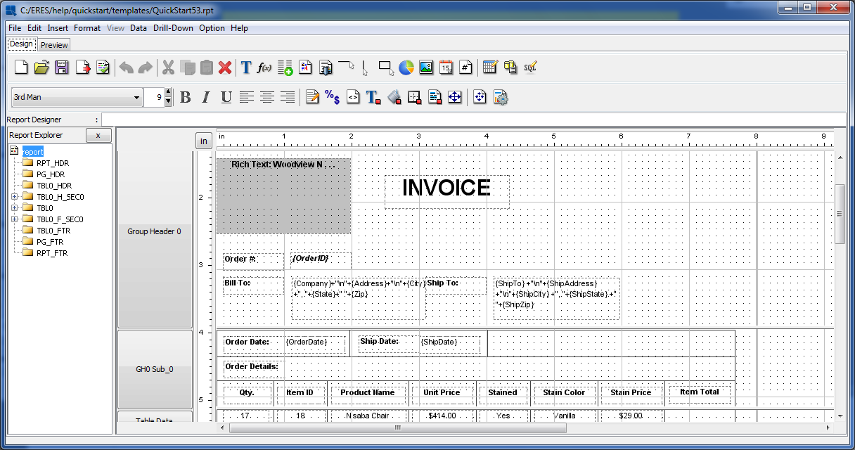
QuickStart53.rpt in Report Designer
The report is an invoice created using the Master & Details layout. Notice that the Item Total, as well as the Sub-total are blank. We will add in the formulas to calculate these values.
To insert a formula, click the button on the toolbar ![]() . This will bring up a dialog containing all the formulas within the report. Notice that the template has several existing formulas. Click to create a new formula. At the prompt, specify the name
. This will bring up a dialog containing all the formulas within the report. Notice that the template has several existing formulas. Click to create a new formula. At the prompt, specify the name ItemTotal for the formula.
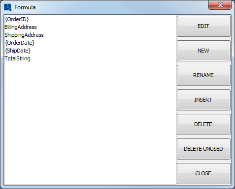
Report Formula List
The Formula Builder window will then open. Double click on the Columns folder in the right-hand side to expand it. Then double click on the UnitPrice column to add it to the formula. Next, click the button. Next, double click on the Quantity column to add it. The finished formula should look like this: {UnitPrice}*{Quantity}.
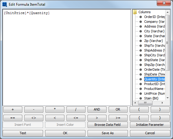
Formula Builder Window
Click the button to ensure that the formula is entered correctly. Then click . You will be taken back to the formula list where your new formula has been added. From the formula list, select the ItemTotal formula that you just created and click the button. The dialog will close and a small dotted rectangle will follow your pointer around the design window. Position the formula below the Item Total label and between the lines in the Table Data section and click. The formula will then be added to the report.
Next set the data format for the formula to be currency, like in Section Q.5.1.3 - Data Formatting. Now preview the report, notice that because the formula was added to the Table data section, it now computes for each row of data.
Notice that the formula you added in the previous section does not correctly calculate the line total for the invoice. By only multiplying the unit price and the quantity the formula is ignoring whether an item was stained (which incurs an additional cost). To take care of this, we will use cell scripting.
To add a script, select the ItemTotal formula that you created in Section Q.5.3.2 - Add a Formula and click the button on the toolbar ![]() . This will bring up a dialog containing all the scripts in the report. Since no scripts have been previously added the dialog will be blank.
. This will bring up a dialog containing all the scripts in the report. Since no scripts have been previously added the dialog will be blank.
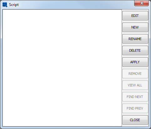
Script List Window
Click to create a new script. In the prompt, type the name StainCheck for the script. Click and the Formula Builder will open allowing you to add the script. Enter the following script:
if ({Stain} == True) {

value=({UnitPrice}+{StainPrice})*{Quantity};

} else {

value={UnitPrice}*{Quantity}; }
The script dynamically modifies the ItemTotal price depending on whether the item has been stained or not. If the item has been stained({Stain} == True) then the ItemTotal value includes the stain price. If the item has not been stained, the price is calculated in the same manner as before.
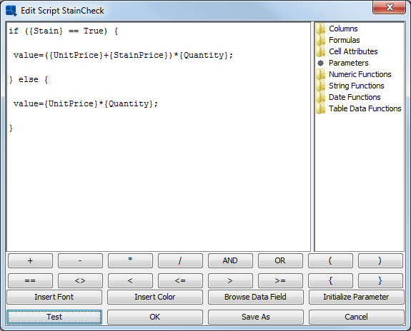
Formula Builder for Cell Scripts
Click to ensure that the script has been entered correctly. Then click . You will return to the script list where the new script has been added. In the script list, select the script that you just created and click the button to apply the script to the column. Notice that a check mark appears in the upper-left hand corner of the cell to which the script has been applied. Then click the button to close the dialog.
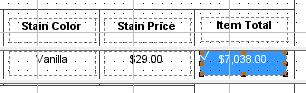
Cell with Applied Script in Design Window
In ERES, formulas can also be used to aggregate report columns. Adding an aggregation is the same as adding a formula like in Section Q.5.3.2 - Add a Formula. Click the icon and select to add a new formula. Call this formula SubTotal.
In the Formula Builder, double click on the Numeric Functions folder to expand it. Double click on the sum(field) function to insert it into the formula. Next use the cursor to highlight the field portion of the sum function. Double click on the Columns folder to expand it. At the end of the list of columns is one called ItemTotal that you created in
Section Q.5.3.2 - Add a Formula. Double click it to add it to the formula. The finished formula should look like this: sum({ItemTotal})

Formula Builder with Aggregation Formula
Click to ensure that the formula is entered correctly. Then click to return to the formula list. In the formula list, select the formula that you have created and click the button. The dialog will close and a small dotted rectangle will follow your pointer around the design window. Position the formula in the Group Footer section of the report, below the Item Total column, and click to add it.
Because the formula is in the Group Footer section, it will not calculate until the report is run, and it only displays the text of the formula. Format the formula as currency like in Section Q.5.1.3 - Data Formatting. Now preview the report. Notice that the aggregation reflects the values that are modified by the cell script.

Report With Formulas
For additional exercise, add two more formulas to the Group Footer section: one to calculate the sales tax and one to calculate a grand total for the order. Once you have finished, click the button to save the changes that you have made and close the Report Designer.
A unique feature of ERES is the ability to perform drill-down on reports automatically. Using drill-down, users can easily present summarized data in a top-layer report and can click through to view more detailed information. Using this feature, only one template has to be designed for each level of drill-down. For more information on this feature, see Section 3.8 - Drill Down.
Because the drill-down features uses parameterized queries, you will have to have the Woodview database set up (detailed in
Section Q.3.1.1.1 - Setup a JDBC Connection) in order to do this exercise. By default the templates use the JDBC database. If you want to connect to the Access (ODBC) database instead, select the templates for the drill-down layers from the help/quickstart/templates/Access directory.
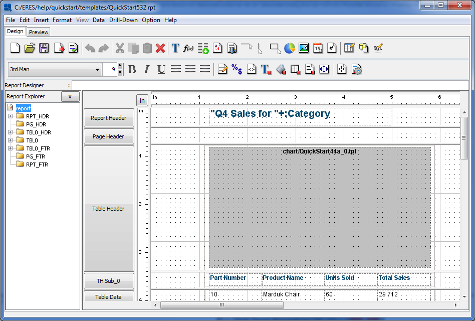
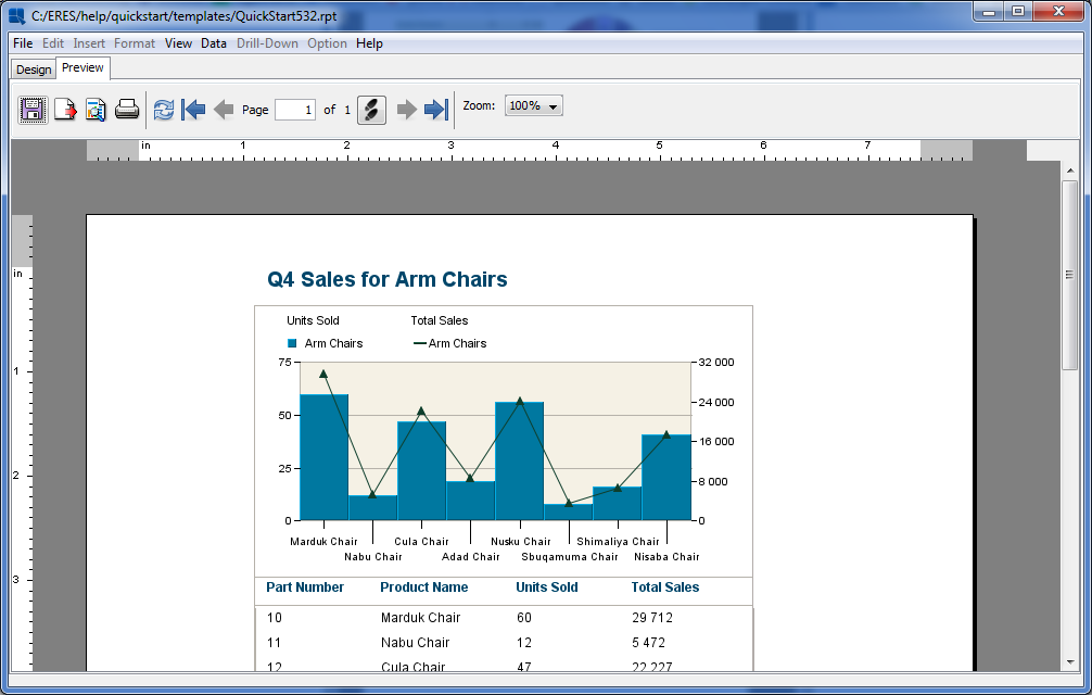
Following the same procedure as in Section Q.5.1.1 - Add a Report Template to Organizer, add the QuickStart532.rpt file under help/quickstart/templates into your project in the Organizer. Right click on the entry for this file in Organizer and select Open File from the pop-up menu. This will open the report in Report Designer.
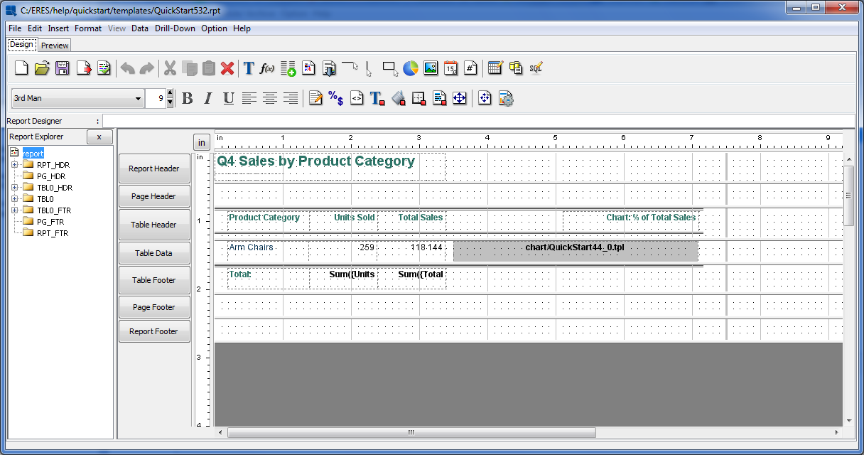
QuickStart532.rpt in the Design Window
The report shows aggregated sales data grouped by product category. Next, we will link this template to another parameterized template, so that users can drill into each category and look at the sales figures for products in each category. To add a layer of drill-down, select Navigate from the Drill-Down menu. This will bring up a dialog showing the hierarchy of the any drill-down layers for the report. Only the root will show because there are not any layers defined.

Drill-Down Navigation Dialog
To add a new layer of drill-down, click the button. This will bring up a dialog asking you if you would like to use an existing template or create a new one. If you select to create a new template, you will go back to the data registry where you can start designing a report. You can also use an existing report. In either case, the report you use must have a parameterized query or class as the data source. For more on this see Section 2.4.3.2.2 - Parameterized Queries and Section 2.4.6.1 - Parameterized Class Files. In this instance, select to use an existing report and click .

Report Options Dialog
At the prompt browse to the <ERESInstallDir>/help/quickstart/templates, and select the QuickStart532a.rpt file (or QuickStart532a_Acc.rpt from the /Access/ directory). A dialog will then open prompting you to select a column from the primary report to map to the drill down layer.
Column - Parameter Mapping Dialog
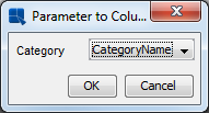
Select to map the CategoryName column to the parameter, and click . A dialog will open prompting you to specify a display name for the report. Enter a name and click . The drill-down layer will now open in the design window.
First Drill-Down Level in Report Designer
If you preview this level, you can see how the report is parameterized based on the Category Name. Back in the design window, again select Navigate from the Drill-Down menu. You will now see a new node for your added level under the ROOT node. The stars "**" indicate which level is currently open in the designer.

Drill-Down Navigation Dialog with Additional Layer
Now we will add one more layer of drill-down to this report, that allows users to drill through the product sales, to see the records of each order for a given product. To do this, select the node for the level you created, and click .
Again, select to use an existing template for the new drill-down layer. At the dialog, browse to the <ERESInstallDir>/help/quickstart/templates directory and select the QuickStart532b.rpt file (or QuickStart532b_Acc.rpt from the /Access/ directory). This will bring up the parameter to column mapping dialog.
Second Parameter Mapping Dialog
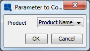
Select to map the Product Name column to the parameter and click Enter a display name for the new layer and click again to open it in the design window.
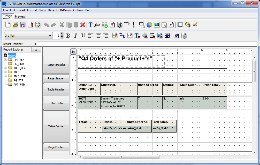
Second Drill-Down Level in Report Designer
Now, select Navigate from the Drill-Down menu again. Notice that there is a new node for the layer you just added. Select the root report, and click the Edit button to open it in the design window. You will see the first report open in the designer. Then click Close to dismiss the navigation dialog.
Now preview the report. Notice that the cursor changes when you mouse over a field in the Category Name column. Click on one and you will be taken to the next level that shows sales for each product in that category.
Within the product report you can click on a field in the Product Name column to go to the third level report showing the orders for that particular product.

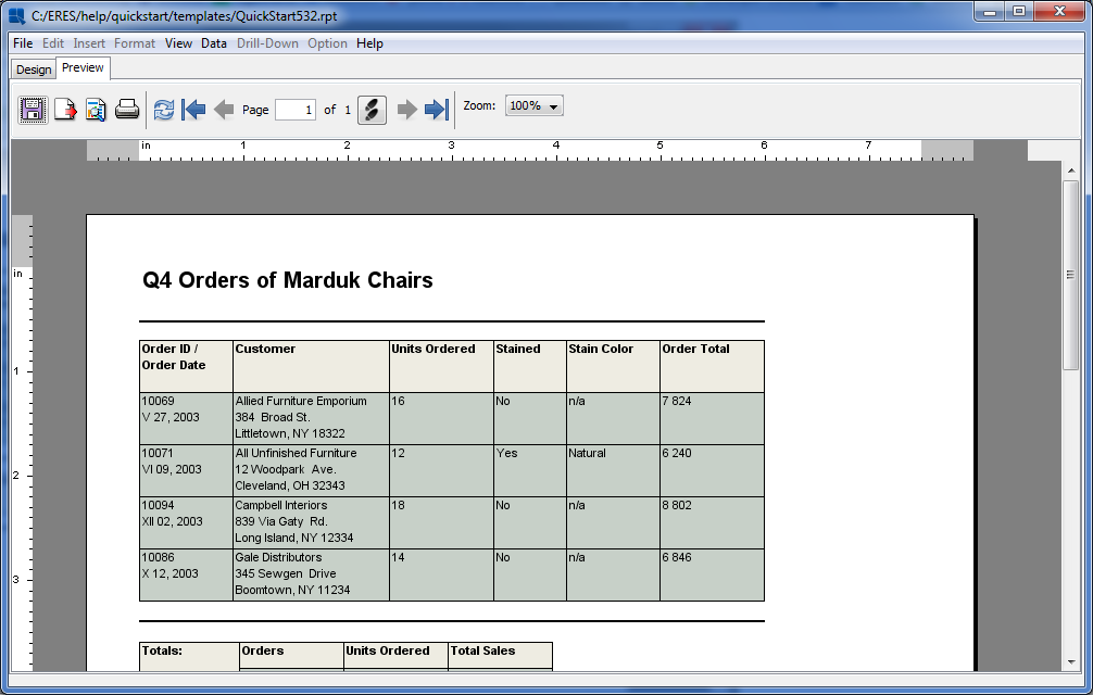
Drill-Down Reports in Preview Window
To navigate back to higher layers, right click and select Back from the pop-up menu. Now click the button to save the changes that you have made to the report.
Another powerful feature in ERES is the ability to use sub-reports to create more complex report layouts and combine data from multiple sources in a report. For detailed information about sub-reports, seeSection 3.9 - Sub-Reports.
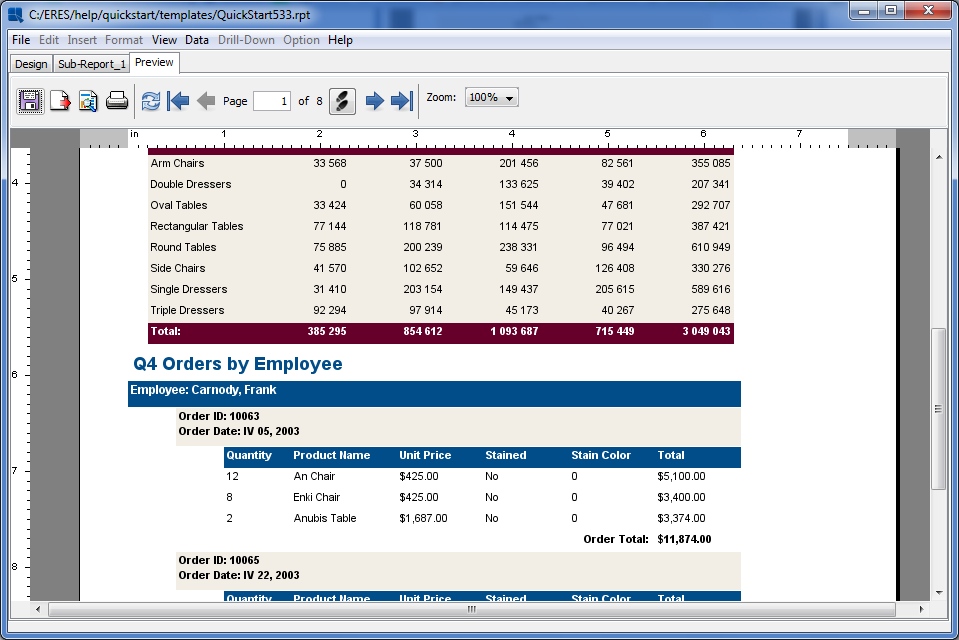
Following the same procedure as in Section Q.5.1.1 - Add a Report Template to Organizer, add the QuickStart533.rpt file under help/quickstart/templates into your project in the Organizer. Then right click on the entry for this file in Organizer and select Open File from the pop-up menu. This will open the report in Report Designer.

QuickStart533.rpt in Report Designer
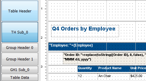
The report uses two levels of nested grouping to show sales for each employee. We will now add a sub-report to the header that shows aggregated sales by category and employee (in a crosstab layout). Before adding the sub-report, we will create a new report section in which to place the sub-report. Although a sub-report can be placed anywhere in a report, it often makes sense to give a sub-report its own section, especially if the size of the sub-report can vary.
To insert a nested section, click on the button on the left-hand side to bring up the section options menu. Select Insert Section. This will spawn a nested section for the table header. For more about nested sections, see Section 3.3.1.1 - Nested Sections.
Next we will move the title into the new nested section. To do this, select the cell containing the report title and hit CTRL+X to cut it. Place the cursor in the new section and hit CTRL+V to paste. The cursor will turn to a cross. Position it where you would like the field and click to add it. You may want to re-size the new section to fit the cell.
New Report Section
Next, click the button on the toolbar ![]() . Your mouse pointer will change to the shape of the plus sign. Press the left mouse button in the top-left corner of the
. Your mouse pointer will change to the shape of the plus sign. Press the left mouse button in the top-left corner of the Table Header section, keep the button pressed and drag to position the sub-report in the section (release the mouse button when you are satisfied with the size of the subreport).
As with drill-down, you have the option of creating a new report for the sub-report or using an existing template. Unlike drill-down, however, the template does not have to have a parameterized query as the data source (unless you want to create linked sub-reports. For more on this, please see Section 3.9.4 - Linked Sub-Reports). Select to use an existing template and click .
Report Options Dialog
At the prompt, browse to the /QuickStart/, select the QuickStart533a.rpt file, and click . The sub-report will then open in a new tab called Sub-Report_1 in the Report Designer.
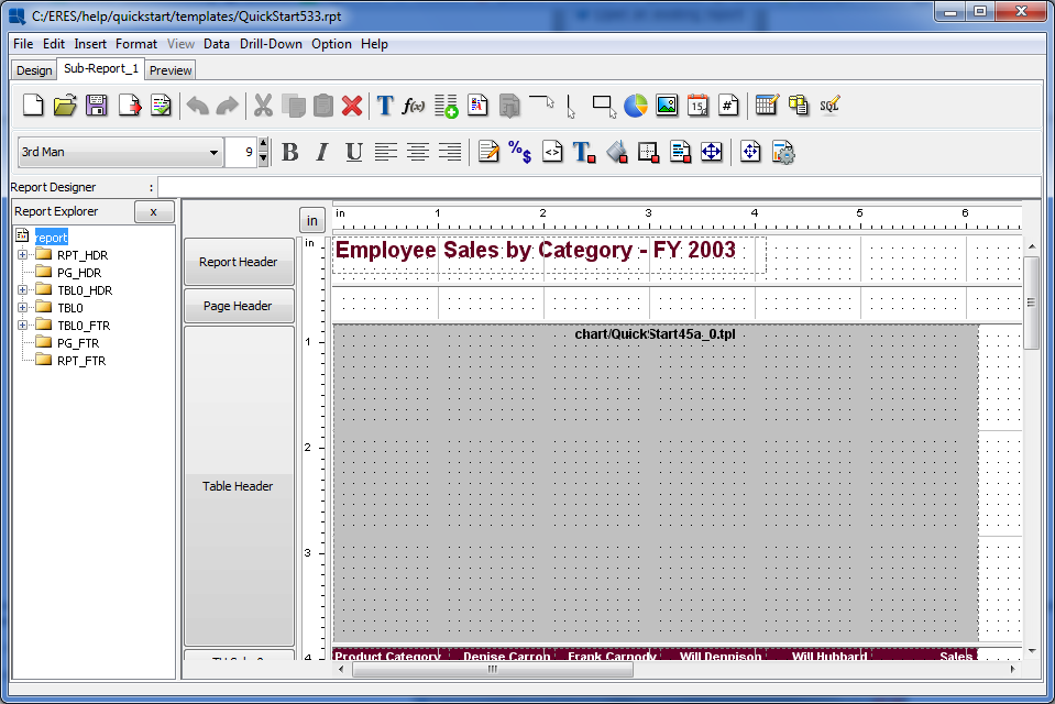
Sub-Report in Designer
You can preview just the sub-report by toggling between the Preview and Sub-Report tab. Now go back to the main report by clicking the Design tab. The sub-report will appear as a small gray rectangle. Move the rectangle to the upper left-hand corner of the section and click and drag on the horizontal ruler to increase the width of the sub report to be about seven inches.
Next, we will set the sub-report to re-size dynamically. Right click on the sub-report and select Resize To Fit Content from the pop-up menu. This will turn the dynamic sizing on or off.
Now preview the report. You can see that the entire sub-report runs before the main report.

Sub-Report with Main Report in Preview
Sub-Report with Main Report in Preview
Once you have finished modifying the report, click the button on the toolbar to save the changes you have made, and close the Report Designer.
In this section we will use some of the charting features in ERES to provide a chart that quickly conveys salient information to the viewer. For detailed information about the features discussed in this section and other charting features, please see Section 3.14 - The Chart Designer Interface.
Following the same procedure as in Section Q.5.1.1 - Add a Report Template to Organizer, add the QuickStart54.tpl file under help/quickstart/templates into your project in the Organizer. Then right click on the entry for this file in Organizer and select Open File from the pop-up menu. This will open the chart in Chart Designer.
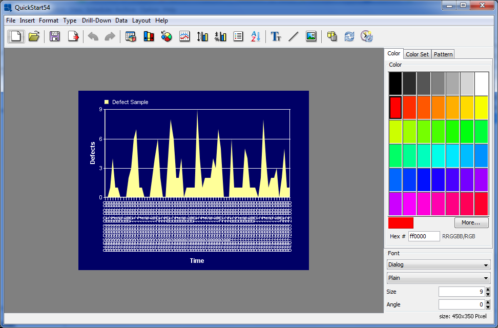
QuickStart54.tpl in Chart Designer
The chart shows hourly defect counts for a manufacturing process. Since the chart shows three days worth of data it is difficult to make out the individual points and the X axis labels are not legible because they are drawn on top of each other.
One way to improve the chart, is to use the time series zooming feature to aggregate the data into fewer data points. In this instance, lets look at the total number of defects for each eight hour shift, instead of plotting the data for each hour.
To turn on zooming, select Time Zooming Options from the Format menu. This will bring up the following dialog.

Zoom Options Dialog
In this dialog, set the Scale to be 8 hours and elect to preserve a Linear scale by setting that option to true. Leave the Disable Upper Bound and Disable Lower Bound options checked. Check the Enable Zooming option. This will bring up a new dialog prompting you to select the aggregation for the zooming.
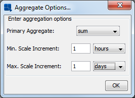
Aggregation Options Dialog
In this dialog, set the Primary Aggregate to be sum, the Minimum Scale to be 1 hour, and the Maximus Scale to be 1 day. Then click to return to the zoom options dialog, and again to return to apply the zoom setting. The chart now shows the total number of defects for each eight hour period.

Chart With Zooming Applied
Next, we will use the control area feature to highlight any shift where there were more than 20 defects.
To add a control area, select Control Area from the Insert menu and then click Insert in the control range list. This will bring up a dialog allowing you to select options for the new control area.
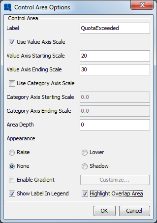
Control Area Dialog
In this dialog, enter a name for your control area. Then check the option marked Use Value Axis Scale, and enter 20 for the Starting Scale, and 30 for the Ending Scale. Then at the bottom of the dialog check the options marked Show Label In Legend and Highlight Overlap Area. Then click to apply the control area. Notice how only the areas where the number of defects is colored. You can set the color, by selecting the overlapped area, and selecting a new color from the palette on the right-hand side.

Chart With Control Areas Applied
Once you have finished modifying the chart, click the button on the toolbar to save the changes you have made and close the Chart Designer.