This section contains a series of short exercises designed to illustrate some of the basic features of the Report Designer. For more detailS about any of the features described in this section, please see the Designer Guide portion of the documentation.
This example assumes that you will be running Report Designer locally on the machine on which it is installed. For details about running remotely please see Section 1.2.5 - Starting Report Designer
Before Report Designer can start, EspressManager must be running. EspressManager is the back-end component that manages data access and file I/O for Report Designer (this allows it to run both locally and remotely). To start EspressManager, execute the EspressManager.bat file in the root directory of your installation ( EspressManager.sh for Unix installations). By default, the monitor will open in a new window when EspressManager starts.
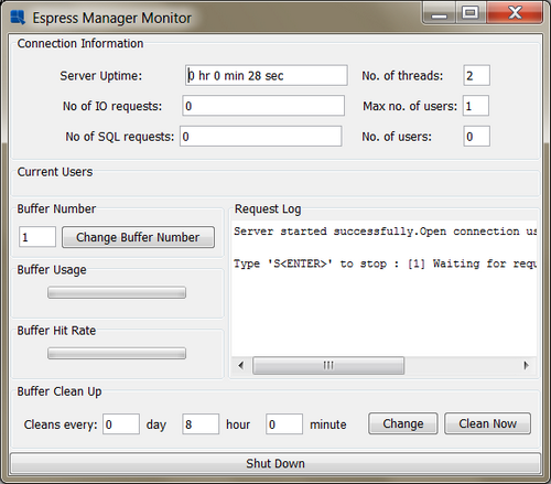
EspressManager Monitor
With EspressManager running, you can then start Report Designer by executing the ReportDesigner.bat file in the root directory of your installation (ReportDesigner.sh for Unix installations). A dialog box will then appear prompting you to log in. To log in as the default user, use the user name "guest" with no password (see Section 1.2.3 - Configuration of the Designer Guide for more on configuring users).

Designer Login Window
After you have entered the user name and password, click and the Report Designer will open in a new window.
Data sources are maintained within a data registry. To create a new data registry, first select to start a new report by selecting from the File menu. This will bring up a dialog prompting you to either use an existing registry or to create a new one.

Registry Selection Dialog
Select to start a new data registry, and click . This will open a dialog prompting you to specify a name for the registry. Enter any name you would like for the data registry, and click . The data registry will open in a new window.
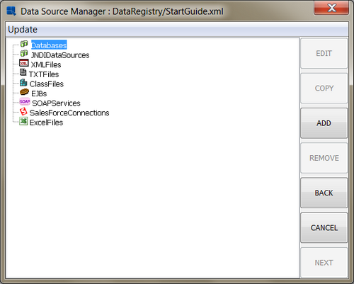
Data Registry Window
EspressReport allows you to connect to JDBC and ODBC compliant data sources. Examples of each are included with your installation guide. The examples in this guide will use the JDBC source. If you prefer, you can use the ODBC versions, by using the templates under help/quickstart/templates/Access
In this exercise, we will set up a JDBC connection to the Woodview HSQL database that comes with the EspressReport Installation. (HSQL is an open source Java application database).
From the Data Source Manager, click on the note in the left-hand frame, and then click the button. A dialog will then appear prompting you to enter the connection information for the new database. Enter Woodview as the name of the Database, select HSQL from the Driver List, enter jdbc:hsqldb:help/examples/DataSources/database/woodview for the URL, and enter org.hsqldb.jdbcDriver as the driver. Click on both the and boxes. Then enter sa for the user name and leave the password blank.

Add Database Dialog
Leave the auto-join and table name properties alone and click the button to make sure you have entered the information correctly. Then click to bring back up the Data Source Manager window, where there will be a new node under "Databases" for Woodview.
For users running on a Windows platform, EspressReport can also make a connection to an ODBC source by using Sun's ODBC-JDBC bridge.
In this exercise, we will set up an ODBC connection to the Woodview Access database that comes with the EspressReport installation. To do this, you must first set up the Woodview database as a data source in your system. Launch the ODBC data sources window from the Windows control panel. Then add a user or system DSN. Select Microsoft Access as the database driver and specify the data source name as Woodview. Click the button under 'Database'. Browse to the Woodview.mdb file, which is in the EspressReport installation under help/examples/DataSources/database. Select this file. You should now see a new entry under the "System DSN" or "User DSN" tab called Woodview.

Windows ODBC Data Source Administrator
Once you have set up the DSN for Woodview, go back to the Data Source Manager. Click on the Databases note in the left-hand frame and then click the button. A dialog will then appear prompting you to enter the connection information for the new database. If you are using Sun's JVM (i.e. JRE 1.5 or higher), the default driver specified will work. Enter WoodviewODBC as the name of the Database and enter jdbc:odbc:Woodview for the URL. Click on both the and boxes. Finally, enter admin for both the user name and password.

Setup Database Dialog
Leave the auto-join and table name properties alone and click the button to make sure you have entered the information correctly. Next, click to bring back up the Data Source Manager window, where there will be a new node under "Databases" for WoodviewODBC.
EspressReport provides a number of different interfaces to query a database to retrieve the report data. You can type a SQL statement, use the Query Builder, or use data views to create a query interface that insulates the end user from the database structure. In this example, we will use the Query Builder to create a query.
![[Note]](../../../images/note.png) | Note |
|---|---|
You can use either the JDBC or ODBC data source for this example, the data is the same. The screen shots are from the Access Database. |
To create a new query, click to expand the Woodview, or WoodviewODBC node in the left-hand frame of the Data Source Manager. Two sub-nodes will appear, one called Queries and one called Data Views. Select the Queries node and click . A dialog will appear prompting you to specify a name for the query, and to select whether to launch the Query Builder or to enter an SQL statement.

Query Name Dialog
Enter any name you would like, select , and click on . The Query Builder will launch. You will see a separate window containing all of the tables for Woodview sitting over top of the main Query Builder window.

Query Builder Dialog
To add a table to the query, select the table in the Tables window and click the button. You can also double click on the table name. Using one of the two methods, add the following tables to the query:
Categories
Customers
Order Details
Orders
Products
The tables will appear in the top half of the Query Builder window. You will see the join lines connecting various fields in the tables.

Query Builder with Tables
To add a field to the query, you can double click on the field in the table window. You can also double click on the Table and Field fields in the lower (QBE) portion of the Query Builder window, and then select the table and field from the drop-down menus. Using either method, add the following fields to the query:
OrderID from Orders
Company from Customers
Region from Customers
CategoryName from Categories
ProductName from Products
UnitPrice from Products
Quantity from Order Details
In the eighth column, which should be blank, right click in the Field field, and select Build from the pop-up menu. This will open the Formula Builder interface allowing you to create a computed column.

Formula Builder Window
First, click on the button to construct the column. Then, double click on the Tables folder. It will open up into five nodes, one for each of the tables that you selected for the query. Opening a table folder will list all of the column fields in that table. Open up the Products folder, select UnitPrice, and click . Then click the add () button. Next insert "StainCost" from the "Order Details" table. Then click on the button. Click the multiply () button. Finally, insert "Quantity" from the Order Details column. The finished formula should look like this:
(PRODUCTS.UNITPRICE+ORDER_DETAILS.STAINCOST)*ORDER_DETAILS.QUANTITY.

Formula Builder Window with Formula
Click and the computed column will be added to the query. Next, we will give the column you built an alias. Right click on the column and select Alias from the pop-up menu. A dialog will appear prompting you to specify a column alias.

Column Alias Dialog
Click and you will see the column name change in the Query Builder. Now click on the tab in the Query Builder. Your query will run and you should see the first thirty records of the query results.

Query Builder Datasheet View
Now that you have finished designing the query, select from the File menu to save the changes. This will close the Query Builder window and return you to the Data Source Manager window. There will now be a node under "Queries" for the query you have just designed.

Data Source Manager With Query
EspressReport enables you to easily parameterize report queries, allowing report data to be dynamically filtered at run-time. In this exercise we will add parameters to the query created in Section Q.3.2.2 - Create a Query
To open the query that you created, select it and click the button in the Data Source Manager. Your query will re-open in the query builder. The Tables window will open on top of the Query Builder. Click to close the tables window and scroll down in the lower (QBE) portion of the query builder window until you see the Condition field. Right click in the Condition field under the OrderID column and select from the pop-up menu. This will bring up the Formula Builder and will allow you to construct a condition for the query.
Within the Formula Builder, double click on the Tables folder to expand it. Then expand the Orders node and double click on the OrderDate field. Next, click the button and then click the button. This will bring up a dialog prompting you specify a name for the query parameter.
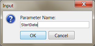
Parameter Name Dialog
Enter StartDate for the parameter name and click . The parameter will be added to the query. Then click the button. Click the button again. Enter EndDate as the 2nd parameter name. The finished condition should now appear as
Orders.OrderDate BETWEEN :StartDate AND :EndDate.

Formula Builder with Conditions
Click to close the Formula Builder and to return to the Query Builder window. Now click on the tab. Because you have just added two parameters to the query, an initialization dialog will appear, asking you to specify some properties for the query parameters.

Parameter Initialization Dialog
From this dialog, select to map the parameter to a database column by clicking the option under Attributes. Select Orders.OrderDate from the drop-down menu. This will automatically fill in the default value and data type options. Next, modify the Prompt name to read Start Date. Click the button, and map the "EndDate" parameter to the same column. Click on the drop-down menu to select an end date. Select a date far enough from the start date that by default that you will have more than a couple records to work with (this makes report design easier). Change its prompt to read End Date.
Click to close the initialization dialog once you have specified all the options. A new dialog will appear prompting you to select a date range by which to filter the result set.

Parameter Selection Dialog
Select the Start and End date that you would like and click . You will now see the filtered result in the datasheet window. Now, click from the File menu to save the changes that you have made to the query.
A unique feature in EspressReport is the ability to create data views. Data views are local schemas/views that allow an administrator to pre-configure a group of tables and fields. This lets end users need only select fields and define simple conditions to create a query. To create a data view, select the Data Views node under Woodview or WoodviewODBC and click .
| Note |
|---|---|
You can use either the JDBC or ODBC data source for this example, the data is the same. The screen shots are from the Access Database. |
This will open a new dialog asking you to select database tables that you would like to use. Select the following tables:
Customers
Order Details
Orders
Products

Data View Tables Dialog
Next, click on the Joins tab. You will see a representation of the tables like in the Query Builder. You can see the auto-join lines between the tables. This window can be used to join the tables or to modify the auto-joins, if necessary. Click to finalize the table selection. The next window allows you to select and group fields for the view. At the top of the window you can specify a name for the view. Call the data view Invoicing.
Next, double click on the Customers folder to reveal the fields for that table. Add the following fields by selecting them and clicking the button:
Company
Contactname
Address
City
State
Zip
Now add fields from the other tables as follows:
- Orders:
Company
Contactname
Address
City
State
Zip
- Order Details:
OrderID
Stain
StainColor
Quantity
- Products:
ProductName
UnitPrice
StainPrice
Next click the button. At the prompt, specify the name Customer Information. Add two more headings in this manner, one called Shipping Information and one called Order Information. Once the headings have been created, select the following fields (Using CTRL+Click. or SHIFT+Click for multiple selection):
Company
Contactname
Address
City
State
Zip
Once the fields are selected, click the button and select Customer Information from the drop-down list. The fields will be moved under that heading. Next, select the following fields in the same manner:
ShipTo
ShipAddress
ShipCity
ShipState
ShipZip
ShipDate
Add these fields to the "Shipping Information" group the same way you did before. Next,select the following fields:
OrderDate
OrderID
Stain
StainColor
Quantity
ProductName
UnitPrice
StainPrice
Add these fields to the "Order Information" group. Next, select the Contactname field on the right-hand (view) side and click the button. In the dialog, specify the name Contact name. Repeat this for each field, giving it a clear name rather than a single word.
Next, select the Order ID field on the right-hand (view) side and click the button to move the field to the top of the "Order Info" heading. Use the arrows to arrange the items in the "Order Info" heading in the following order:
Order ID
Order Date
Product name
Unit Price
Stain
Stain Color
Stain Price
Quantity

Data View Fields Window
Now the data view has been completed. Click in the fields dialog to save the view. It will be saved as a new node under "Data Views" in the Data Source Manager.
Now that a data view has been created, you can write queries against the view. This allows users to develop queries without knowing the underlying structure of the database. It also allows administrators to limit which database elements the user has access to. In this exercise we will create a query for the data view you created in Section Q.3.2.3 - Create a Data View
In the Data Source Manager, select the Invoicing data view. Then click the button. This will open a dialog, prompting you to select fields from the view. To select fields, first, double click on a heading to expand it. Add the following fields to the query by selecting them and clicking :
Order ID
Order Date
Product name
Unit Price
Quantity

Data View Query Field Selection Dialog
Once you have finished adding the fields, click . This will bring up a new window which enables you to set conditions, grouping, and ordering for the query. Like the Query Builder, this window also allows you to preview the query result with the Datasheet View tab.

Data View Conditions Dialog
First, specify a name for the query in the space provided at the top. Then double click on the Condition field for the Order Date column. This will bring up a dialog allowing you to specify a condition for the field.

Specify Condition Dialog
Click the button. A new dialog will appear prompting you to specify a start and end date with which to filter the results. Select 2001-01-14 as the first date, and 2003-12-09 as the second.
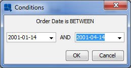
Specify Condition Fields Dialog
Click to close the dialog and add the condition. You will be taken back to the conditions window. Now you can click on the Datasheet View tab to preview the query.
Click in the main window and the query will be saved using the name you provided. You will then be taken to the first step in the Report Wizard. Click in this dialog to close the interface and return to the Data Source Manager. There will now be a new node for your query under the Invoicing data view.
This section looks at the different ways data from the data source can be mapped into a report structure. In this section, we will take the result set from the query created in Section Q.3.2.2 - Create a Query and use it to generate reports in the different layouts supported in EspressReport. For detailed information about all the different layout and mapping options, see Section 1.4 - Report Types and Data Mapping of the Designer Guide.
The simple columnar layout is the most straight-forward type of mapping. Columns from the data source are drawn in a straight table in the report, without any grouping or breaks.
To begin mapping a report, first select the query node in the Data Source Manager and click the button. A new window will open with a table containing the results of the query (the first 20 records only). Notice that because your query contains a parameter it initially runs with the default values that were specified when the parameters were initialized.
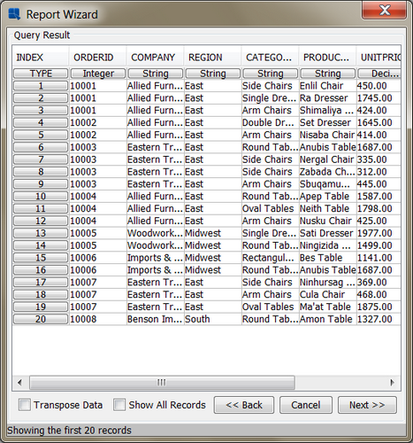
Query Result Screen
To continue with the Report Wizard, click the button. This will bring up a dialog asking you which report layout option you would like to use.

Select Report Layout Dialog
From this dialog, select Simple Columnar as the layout, and click the button. The next step in the Report Wizard allows you to select which columns from the query you would like to use in the report, as well as re-arrange the column order. (Although the column order is not particularly important for the simple columnar layout, it can have a significant impact on other layouts depending on the mapping options selected).

Column Selection/Ordering Dialog
In this dialog, select the following fields for the report:
OrderID
CategoryName
ProductName
Quantity
Sales
Once you have selected the fields, click to continue on in the Wizard. The next dialog is the data mapping dialog. This is where you can select how to map the fields from the data source into the selected report layout. Because this is a simple columnar layout, the only options are whether to set columns visible or not, or to generate a top N presentation.

Data Mapping Dialog
In this dialog, elect to leave all the columns visible and do not select the top N option. (For more about top N presentations, please see Section 1.4.1.1.1 - Top N Report of the Designer Guide). Next, click the button. (There are some optional additional steps in the Wizard which will be explained later in this section). This will bring up the Report Designer interface with an unformatted version of your report.

Simple Columnar Report in Design Window
Now click on the Preview Tab in the upper-left hand corner of the window. A parameter selection dialog will appear prompting you to select a start and end date by which to filter the report. Specify a large enough range that you will get more than a couple of records and click . You will then see the report output. Notice how the simple columnar layout just places the columns from the result set in the report directly, without any grouping, sorting, or summaries.

Simple Columnar Report Preview
The summary break layout is similar to the columnar layout, except it adds the ability to group and aggregate the report columns. A summary break report must be grouped by at least one column. Using the report created in Section Q.3.3.1 - Simple Columnar Layout. We will convert it into a summary break layout by using the report created in Section Q.3.3.1 - Simple Columnar Layout,.
Go to the design window, and select the Change Data Mapping Icon on the toolbar: ![]() . This will return you to the Report Wizard, where we will select a different report layout. From the last data mapping dialog, hit the button until you get back to the report layout dialog.
. This will return you to the Report Wizard, where we will select a different report layout. From the last data mapping dialog, hit the button until you get back to the report layout dialog.
Change the report layout type to summary break and click . In the next screen, keep the column selection the same and click again to go to the data mapping window. You will notice that there are more options in this window than there were for the columnar layout.

Data Mapping Screen for Summary Break Layout
In the data mapping dialog, check the option called Row Break for the first two columns. This will group the report by those two columns. From the drop down menus under Aggregation. Next, select the sum of the Quantity and Sales columns from the drop down menu under Aggregation. Also, un-check the Apply Template option, as you do not need to carry over the formatting from the simple columnar layout. Once you have finished specifying the options, click the button. You will be taken back to the Report Designer where the new mapping has taken effect.

Summary Break Report in Design Window
In the Designer, you will notice that there are two levels of nested grouping in the report; therefore, there are now corresponding Group Header and Footer sections for each. For more about report sections and their behavior, please see Section 1.5.1 - Report Sections of the Designer Guide. Now click on the Preview tab to preview the report. Again, you will be prompted to specify parameter values. Once you see the report in the Preview window, notice how the data is grouped by Category Name and Order ID, and that intermediate summaries are calculated for each group.

Summary Break Report Preview
A crosstab report shows data in a matrix-like form, allowing multi-dimensional data to be displayed in a two-dimensional layout. In the current example, we will use the crosstab layout to break-down the sales column by product category and by region.
Go to the design window and select Change Data Mapping. When the Report Wizard re-opens, click the button until you get back to the layout selection screen. From this screen, select to use a crosstab layout and click . At the column selection/ordering screen (next in the Wizard), change the selection to be the following:
CategoryName
Region
Sales

Column Selection for Crosstab Report
Once you have specified the columns in the correct order, click the button to bring up the data mapping option for the crosstab layout.
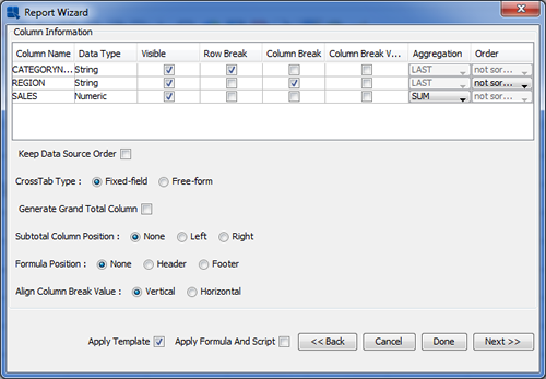
Data Mapping Screen for Crosstab Layout
For the CategoryName column, check the option marked Row Break. This will create a row in the report data for each distinct category name. Next, select the Column Break option for the Region column. This will create a column in the report data for each distinct region. Leave the Order option as not sorted. Finally, select the Column Break Value option for the Sales column, and click on the Aggregation menu to select SUM. This will give you the total sales for each category and region in the report. Once you have finished specifying the options, click the button to go to the Report Designer.

Crosstab Report in Design Window
As you can see, a report column has been generated for each region and it has been automatically totaled both vertically (columns) and horizontally (rows). Now, click on the Preview tab to preview the crosstab layout.

Crosstab Report Preview
Try previewing again (by going to the design window and then clicking Preview again), this time specifying a much smaller time range. Notice how the number of columns decreases because the values no longer exist in the data. When you expand the date range again the columns will re-appear.
Like the summary break layout, the Master & Details layout also allows you to group the data. It also allows you to automatically add column fields to the group header section, creating a one to many layout that can also be configured in a side-by-side layout.
Go back to the design window and select Change Data Mapping from the Data menu. Again, navigate back to the layout selection screen. This time select the Master & Details layout. Click to get to the column selection screen. In the column selection screen, change the selection to include the following columns:
OrderID
Company
Quantity
ProductName
UnitPrice
Sales

Column Selection for Master & Details Report
Once you have specified the columns in the correct order, click the button to bring up the data mapping dialog for the master & details layout.
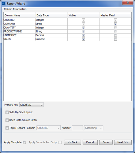
Data Mapping Screen for Master & Details Layouts
Select the OrderID field as the 'Primary Key' from the drop-down menu in the lower-left hand portion of the screen. This will group the data by the OrderID field. Next, check the Master Field option for the Company column. This will place the Company field in the Group Header section of the report.
Instead of clicking to get to the Report Designer from this screen, click the button to invoke the additional pre-formatting options. The first dialog allows you to add several elements to the report.

Add Report Elements Dialog
Check the boxes to add a report title, page number, and date. Enter the text you would like as the report title and specify the format and location of the date and time using the drop-down boxes for each option. Once you have finished setting the options, click . A new dialog will open which will enable you to specify a style for the new report.

Report Style Selection
Select the Block Left-Align style, and click the button. A warning will pop-up that you can ignore, and then you will be taken to the Report Designer window, where the elements have been added, and now there is some default formatting applied to the report.

Master & Details Report in Design Window (with pre-formatting)
As you can see the OrderID and Company fields have been generated in the Group Header section. Now preview the report, and you will see a group with each order, as well as the page number and date in the section (header or footer) in which they were placed.

Master & Details Report in Preview Window
In this section, we will open an unformatted template and use some of the basic formatting features in EspressReport to create a polished presentation. From the Design window in Report Designer click on the button: ![]() . This will bring up a dialog prompting you to specify a filename for the template that you would like to open. Click the button and navigate to the
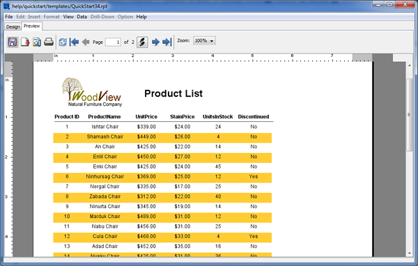
. This will bring up a dialog prompting you to specify a filename for the template that you would like to open. Click the button and navigate to the <InstallDir>/help/quickstart/templates directory. There select the QuickStart34.rpt file, and elect to open it. The report will open in the Design window. As you can see, the report elements have almost no formatting.

QuickStart34.rpt in Design Window
Report elements can be moved one by one, by click and dragging on the cell. Report elements can also be moved as groups. To move a group of elements you must first select the group using the selection box. To activate the selection box, click and drag to draw a box around the report columns. When you release the mouse they should become highlighted. To add some more elements to your current selection, press the CTRL key and draw another selection box (while still pressing the CTRL key).

Drawing a Selection Box in Report Designer
Once the fields in the report have been selected, click and drag to indent them about half an inch. Next, click the left button on the toolbar: button on the toolbar: ![]() . This will align all of the cell text to the left edge of the cell.
. This will align all of the cell text to the left edge of the cell.
There are number of options available that allow you to control how data displayed (date format, decimal places, rounding, etc). Using the selection box again, select the UnitPrice, and StainPrice columns (just the column fields not the headers).

Two Column Selection
Once the columns have been selected, select the Data Format option from the Format menu. This will open a dialog prompting you to select which data type you would like to set the format for. Select Numeric and click .

Data Type for Formatting Dialog
This will open a new dialog. From this dialog select Fixed Point and click the button. At the next dialog, select to have 2 decimal points and select the dollar sign as the units symbol

Set Format Dialog

Numeric Format Dialogs
Click , and again at the previous dialog and the selected fields will be converted to currency format.

Numeric Data in Currency Format
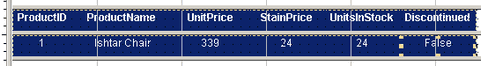
Next, select the Discontinued column by clicking on it (the border outline will appear). Again, click on the button. This time a dialog will appear allowing you to select a format for the Boolean column. Select Yes/No and click Ok. The data in the column will now change.

Data Format Dialog for Boolean Data
Now we will edit the label text. By default, column headers will display the column names from the database. However, you can override these headers with a custom one. To do so, double click on the ProductID cell and a dialog will appear allowing you to modify the column header. Insert a space between "Product" and "ID" and click . The change will appear in the Design window.

Edit Column Header Dialog
Repeat this for each column label (except "Discontinued") so that you have inserted appropriate spaces in all of them.
The dual colors feature in EspressReport allows users to differentiate different rows or groups of data by changing the background color and/or font. To turn on dual colors, use the group selection tool to select all of the columns in the report (not headers).
Next, select the button on the toolbar: ![]() . A dialog will appear prompting you to set dual colors for the columns. Click the check box labeled Enable Dual Colors. Then select the Row Index radio button to indicate that you would like to change color based on a row value. Enter
. A dialog will appear prompting you to set dual colors for the columns. Click the check box labeled Enable Dual Colors. Then select the Row Index radio button to indicate that you would like to change color based on a row value. Enter 1 for the row index value.

Dual Colors Dialog
Next, click on the button. A dialog will appear, giving you the option to set the background transparent and showing the current background color.

Background Transparency Dialog
Click on the button labeled and a new dialog will appear with color swatches allowing you to select a new background color.

Choose Color Dialog
Select the new background color that you would like to use and click . You will return to the first dialog, where the color selection will be reflected. Click on again and you will return to the Dual Colors dialog. Once you are back at the dual colors dialog, click the button. This will bring up a dialog allowing you to specify the font, font size, and font style for the alternating rows.

Font Style and Size Dialog
From this dialog, set the font to be Dialog, the style to be plain, and the size to be 9 pt. This will match the fonts for the alternating rows. Click to go back to the dual colors dialog and once more to return to the Report Designer. Now when you preview the report you will see alternating bands of color for each row.

Dual Colors in Preview
To further customize reports, many different types of elements can be added to a report template.
To insert an image into the report header, first you will want to resize the section to fit the image. In the Design window, place the mouse over the lower section divider of the Report Header section, click and drag down making the section about an inch taller.

Re-Sizing a Report Section
Once the section is resized, click the button on the toolbar: ![]() . A small rectangle will follow your mouse pointer around the Design window. Position the rectangle in the upper left-hand corner of the Report Header section and click. A dialog will appear prompting you to select an image to insert. Click on and navigate to
. A small rectangle will follow your mouse pointer around the Design window. Position the rectangle in the upper left-hand corner of the Report Header section and click. A dialog will appear prompting you to select an image to insert. Click on and navigate to help\examples\DataSources\database\Woodview.gif. You should now see an image in the preview panel.

Insert Image Dialog
Click and the image will be inserted into the report. The image will be represented by a gray rectangle in the Design view. You can see the image when you preview the report.
To insert a title, click on the button on the toolbar: ![]() . A small rectangle will now follow your mouse pointer around the Design window. Position the rectangle next to the image you inserted and click. A dialog will appear prompting you to enter the label text. Type in the text of your desired title.
. A small rectangle will now follow your mouse pointer around the Design window. Position the rectangle next to the image you inserted and click. A dialog will appear prompting you to enter the label text. Type in the text of your desired title.

Insert Label Dialog
Click and the title will be added to the report. As you can see, by default the text is fairly small. To change this, change the font size dialog on the toolbar to be 18pt font.
Toolbar Font Options
When you do this you will notice that some of the text in the title cell has now disappeared. This is because the text is now larger than the space defined. To resize the cell, click and drag on the re-sizing handles until you can see the report title again.
Then click the button on the toolbar to set the text alignment to the left as you did for the other report elements. Move and position the title cell so it is next to the inserted image.

Report Header with Image and Title
Next, we will add a horizontal line below the column headers. To do this, first resize the Table Header section slightly to provide some more space below the column headers. Next, select the button on the toolbar: ![]() . Your cursor will then change into a cross. Click below the ProductID header, and drag across to the last column to draw the line.
. Your cursor will then change into a cross. Click below the ProductID header, and drag across to the last column to draw the line.

Drawing a Line in Report Designer
While selecting report elements, you may have noticed the Report Explorer panel on the left-hand side of the Report Designer, showing the report elements in a tree format. Click to expand some of the sections, and you will see all of the elements in the report represented in the tree. If you select one of the elements in the tree, the corresponding element in the report will be selected (and vice-versa).

Designer with Explorer Open
You can close the report explorer by selecting → , or by clicking on the button in the top-right corner of the Report Explorer panel.
In EspressReport each of the report sections has a number of configurable options allowing you to display the data in the sections in any number of different ways. To invoke the options menu for a section, click on the button for that section on the left-hand side of the design window. In this example bring up the options menu for the Table Header section, by clicking on the corresponding button.
From the pop-up menu select Repeat On Every Page. This will cause the Table Header to be drawn on each report page instead of only once (which is the default). For more about report section options see Section 1.5.3 - Section Options of the Designer Guide.
Now that you have finished formatting the report, preview it to see the results.
Finished Report
EspressReport provides a large built-in formula and scripting library, giving you many ways to manipulate and analyze report data. In the following section we will take a template and use formulas and scripts to calculate/add some values to the report.
From the design window click the button: ![]() . Then browse to the
. Then browse to the <InstallDir>/help/quickstart/templates directory. There select the QuickStart35.rpt file, and elect to open it. The report will open in the design window.

QuickStart35.rpt in Design Window
The report is an invoice created using the Master & Details layout. Notice that the Item Total, as well as the sub-totals are blank. We will add in the formulas to calculate these values.
To insert a formula, click the button on the toolbar: ![]() . This will bring up a dialog containing all the formulas within the report. Notice that the template has several existing formulas. Click to create a new formula, at the prompt specify the name
. This will bring up a dialog containing all the formulas within the report. Notice that the template has several existing formulas. Click to create a new formula, at the prompt specify the name ItemTotal for the formula.

Report Formula List
The Formula Builder window will then open. Double click on the Columns folder in the right-hand side to expand it. Then double click on the UnitPrice column to add it to the formula. Next click the multiply button. Next, double click on the Quantity column to add it. The finished formula should look like this:
{UnitPrice}*{Quantity}

Formula Builder Window
Click the button to ensure that the formula is entered correctly. Then click . You will be taken back to the formula list where your new formula has been added. From the formula list, select the ItemTotal formula that you just created, and click the Insert button. The dialog will close, and a small dotted rectangle will follow your pointer around the design window. Position the formula below the Item Total label, and between the lines in the Table Data section, and click. The formula will then be added to the report.
Now preview the report, notice that because the formula was added to the Table data section, it now computes for each row of data. You may also have noticed that the formula data format was automatically set to currency.
Notice that the formula you added in the previous section does not correctly calculate the line total for the invoice. By only multiplying the unit price and the quantity the formula is ignoring whether an item was stained (which incurs an additional cost). To take care of this, we will use cell scripting.
To add a script, select the ItemTotal formula that you created in Section Q.3.5.1 - Add a Formula, and click the scripting button on the toolbar: ![]() . This will bring up a dialog containing all the scripts in the report. Since no scripts have been previously added the dialog will be blank.
. This will bring up a dialog containing all the scripts in the report. Since no scripts have been previously added the dialog will be blank.

Script List Window
Click to create a new script. In the prompt type the name StainCheck for the script. Click and the formula builder will open allowing you to add the script. Enter the following script:
if ({Stain} == True) {
value=({UnitPrice}+{StainPrice})*{Quantity};
 }else {
value={UnitPrice}*{Quantity};
 }
The script dynamically modifies the ItemTotal price depending on whether the item has been stained or not. If the item has been stained
{Stain} == Truethen the ItemTotal value includes the stain price. If the item hasn't been stained then the price is calculated in the same manner as before.

Formula Builder for Cell Scripts
Click to ensure that the script has been entered correctly. Then click . You will return to the script list where the new script has been added. In the script list select the script that you just created, and click the button. The dialog will close and the script will be applied to the column. Notice that a check mark appears in the upper-left hand corner of the cell to which the script has been applied.

Cell with Applied Script in Design Window
In EspressReport formulas can also be used to aggregate report columns. Adding an aggregation is the same as adding a formula like in Section Q.3.5.1 - Add a Formula. Click the button on the toolbar: ![]() to add a new formula. Call this formula
to add a new formula. Call this formula SubTotal.
In the formula builder, double click on the Numeric Functions folder to expand it. Double click on the Sum function to insert it into the formula. Next use the cursor to highlight the "field" portion of the sum function. Then double click on the Columns folder to expand it. At the end of the list of columns is one called "ItemTotal" that you created in Section Q.3.5.1 - Add a Formula. Double click it to add it to the formula. The finished formula should look like this:
sum({ItemTotal})
Formula Builder with Aggregation Formula
Click to ensure that the formula is entered correctly. Then click to return to the formula list. In the formula list, select the formula that you have created, and click the button. The dialog will close and a small dotted rectangle will follow your pointer around the design window. Position the formula in the Group Footer section of the report, below the Item Total column, and click to add it.
Because the formula is in the Group Footer section, it will not calculate until the report is run, and only displays the text of the formula. Now preview the report. Notice that the aggregation reflects the values that are modified by the cell script.

Report With Formulas
For additional exercise, add two more formulas to the Group Footer section. One to calculate the sales tax, and one to calculate a grand total for the order.
A unique feature of EspressReport is the ability to perform drill down on reports automatically. Using drill down, users can easily present summarized data in a top-layer report, and allow users to click through to view more detailed information. Using this feature, only one template has to be designed for each level of drill down. For more information on this feature, see Section 1.10 - Drill Down in the Designer Guide.
Because the drill down features uses parameterized queries, you will have to have the Woodview database set up (detailed in Section Q.3.2.1.1 - Setup a JDBC Connection) in order to do this exercise. By default the templates use the JDBC database. If you want to connect to the Access (ODBC) database instead, select the templates for the drill down layers from the help/quickstart/templates/Access directory.
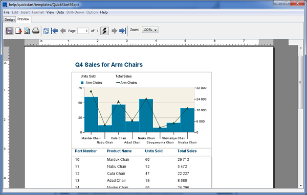
From the design window click the button. Then browse to the <InstallDir>/help/quickstart/templates directory. There select the QuickStart36.rpt file, and elect to open it. The report will open in the design window.

QuickStart36.rpt in Design Window
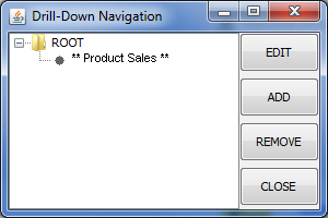
The report shows aggregated sales data grouped by product category. Next, we will link this template to another parameterized template, so that users can drill into each category and look at the sales figures for products in each category. To add a layer of drill down, select → . This will bring up a dialog showing the hierarchy of the any drill down layers for the report. Because there aren't any layers defined, only the root will show.

Drill Down Navigation Dialog
To add a new layer of drill down, click the button. This will bring up a dialog asking you if you would like to use an existing template or create a new one. If you select to create a new template, you will go back to the data registry where you can start designing a report. You can also use an existing report. In either case the report you use must have a parameterized query or class as the data source. For more on this see Section 1.3.2.2.2 - Parameterized Queries and Section 1.3.5.1 - Parameterized Class Files of the Designer Guide. In this instance, select to use an existing report and click .

Report Options Dialog
At the prompt browse to the <InstallDir>/help/quickstart/templates, and select the QuickStart36a.rpt file. (or QuickStart36a_Acc.rpt from the /Access/ directory). A dialog will then open prompting you to select a column from the primary report to map to the drill down layer.

Column - Parameter Mapping Dialog
Select to map the Categoryname column to the parameter, and click . A dialog will open prompting you to specify a display name for the report. Enter a name and click . The drill down layer will now open in the design window.

First Drill Down Level in Report Designer
If you preview this level, you can see how the report is parameterized based on the Category name. Back in the design window, select → again. You will now see a new node for your added level under the ROOT node. The stars "**" indicate which level is currently open in the designer.
Drill Down Navigation Dialog with Additional Layer
Now we will add one more layer of drill down to this report, that allows users to drill through the product sales, to see the records of each order for a given product. To do this, select the node for the level you created, and click .
Again, select to use an existing template for the new drill down layer. At the dialog, browse to the <InstallDir>/help/quickstart/templates, and select the QuickStart36b.rpt file. (or QuickStart36b_Acc.rpt from the /Access/ directory). This will bring up the parameter to column mapping dialog.

Second Parameter Mapping Dialog
Select to map the Product name column to the parameter and click . Enter a display name for the new layer and click again to open it in the design window.

Second Drill Down Level in Report Designer
Now, select → again. Notice that there is a new node for the layer you just added. Select the root report, and click the button to open it in the design window. You will see the first report open in the designer. Then click to dismiss the navigation dialog.
Now preview the report. Notice that the cursor changes when you mouse over a field in the Category name column. Click on one, and you will be taken to the next level that shows sales for each product in that category.
Within the product report you can click on a field in the Product name column to go to the third level report showing the orders for that particular product.

Drill-Down Level 1
Drill-Down Level 2

Drill-Down Level 3
To navigate back to higher layers, right click and select Back from the pop-up menu. For information on how to deploy drill-down reports see Section Q.4.7 - Deploy/Export Drill-Down
Another powerful feature in EspressReport is the ability to use sub-reports to create more complex report layouts, and combine data from multiple sources in a report. For detailed information about sub-reports, see Section 1.11 - Sub-Reports in the Designer Guide.
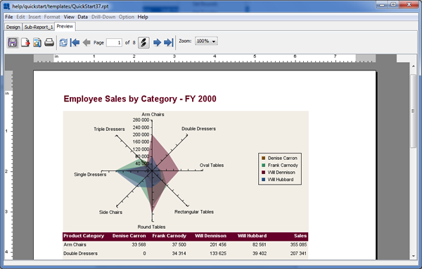
From the design window click the button. Then browse to the <InstallDir>/help/quickstart/templates directory. There select the QuickStart37.rpt file, and select to open it. The report will open in the design window.

QuickStart37.rpt in Designer
The report uses two levels of nested grouping to show sales for each employee. We will now add a sub-report to the header that shows aggregated sales by category and employee (in a crosstab layout). Before adding the sub-report, we will create a new report section in which to place the sub-report. Although a sub-report can be placed anywhere in a report, it often makes sense to give a sub-report it's own section, especially if the size of the sub-report can vary.
To insert a nested section, click on the button on the left-hand side to bring up the section options menu. Select Insert Section. This will spawn a nested section for the table header. For more about nested sections, see Section 1.5.1.1 - Nested Sections of the Designer Guide.
Next we will move the title into the new nested section. To do this, select the cell containing the report title and hit CTRL+X to cut it. Then place the cursor in the new section and hit CTRL+V to paste. The cursor will turn to a cross. Position it where you would like the field, and click to add it. You may want to resize the new section a bit to fit the cell.

New Report Section
Next, click the button on the toolbar: ![]() . You will be prompted to save the changes to your report before continuing. Once you have saved, your mouse pointer will change to the shape of the plus sign. Press the left mouse button in the top-left corner of the
. You will be prompted to save the changes to your report before continuing. Once you have saved, your mouse pointer will change to the shape of the plus sign. Press the left mouse button in the top-left corner of the Table Header section, keep the button pressed and drag to position the sub-report in the section (release the mouse button when you are satisfied with the size of the subreport).
As with drill down, you have the option of creating a new report for the sub-report, or using an existing template. Unlike drill down, however, the template does not have to have a parameterized query as the data source (unless you want to create linked sub-reports. For more on this, please see Section 1.11.4 - Linked Sub-Reports of the Designer Guide). Select to use an existing template, and click .

Report Options Dialog
At the prompt, browse to the <InstallDir>/help/quickstart/templates directory. There select the QuickStart37a.rpt file, and click . The sub-report will then open in a new tab called Sub-Report_1 in the Report Designer.

Sub-Report in Designer
You can preview just the sub-report by toggling between the Preview and Sub-Report tab. Now go back to the main report by clicking the Design tab. The sub-report will appear as a small gray rectangle. Move the rectangle to the upper left-hand corner of the section, and click and drag on the horizontal ruler to increase the width of the sub report to be about seven inches.
Next, we will set the sub-report to re-size dynamically. Right click on the sub-report and make sure the Resize to fit Content from the pop-up menu is selected (there should be a ticker next to the option).

Resize to Fit Content Dialog
Now preview the report. You can see that the entire sub-report runs before the main report.
Main Report in Preview

Sub-Report with Main Report in Preview
EspressReport includes an extensive charting library that allows you to plot data in over 30 different two-dimensional and three-dimensional chart types. Charts can use independent data sources and can be deployed/embedded within reports or completely independently. Information about designing and deploying charts can be found in the Chapter 3 - Charting Guide.
In this example, we will add a chart to a crosstab report. From the Design window, click the ![]() button on the toolbar. Then browse to the
button on the toolbar. Then browse to the <InstallDir>/help/quickstart/templates directory. There select the QuickStart38.rpt file and elect to open it. The report will open in the Design window.

QuickStart38.rpt in Design Window
In this report we will add a chart below the summaries in the Table Footer. First, you need to make some room in the section for the chart. Mouse over the lower section boundary for the Table Footer, click, and drag down, to add about four inches of space to the section. Next, click the insert button on the toolbar: ![]() . A small dotted rectangle will follow your pointer around the Design window. Position it below the "Total" label in the Table Footer section and click. The Chart Designer will then load and guide you through the steps of generating the chart.
. A small dotted rectangle will follow your pointer around the Design window. Position it below the "Total" label in the Table Footer section and click. The Chart Designer will then load and guide you through the steps of generating the chart.
The first screen that you see prompts you to specify information about the chart's data source. Charts can retrieve their data from the report, or they can have an independent data source.

Chart Data Options
In this case, select to use the report data for the chart and click . This will bring up a table showing the report data from which the chart will be drawn.

Chart Data Dialog
Click to continue to the next dialog in the Chart Wizard. The next screen in the Chart Wizard allows you to select the chart type that you would like to use. You can toggle between two-dimensional and three-dimensional chart types using the radio buttons. Select a two-dimensional column chart as the type that you would like to use and click .

Chart Types Dialog
The next screen allows you to set data mapping for the chart. Data mapping is the process by which the columns of data from your data source are mapped to the elements of the chart. Select the Multi-value option next to the Data Series field. The field should change from single-value to multi-value selection box. Use Ctrl+click method to select the following four columns as the data series:
East
Midwest
South
West
Now set the Category (X) option to “Product Category”. The dialog should look like this now:

Data Mapping Dialog
Once you have finished setting the mapping options, click Done and you will go to the Chart Designer window where you can customize the chart.
The first thing we will modify in the chart is the canvas size. This controls the size of the finished chart. To do this, select → . This will bring up a dialog allowing you to modify the chart canvas.

Chart Canvas Dialog
Select the button to specify the measurements in inches, un-select the Maintain Ratio option and set the new chart canvas size to 5 inches by 4 inches. Click . This will resize the canvas in the view port of the Chart Designer.
Now that the chart canvas has been resized the chart plot will appear small, and portions of the X-Axis labels may be truncated. This can be adjusted by resizing the chart. You can click and drag on the chart plot to move it and right click and drag to resize it. You can also click and drag to move the legend. Use these options to position the chart plot and legend on the canvas.

Chart Designer with Positioned Chart and Legend
Next you can modify the format of the axis labels. To do this click the ![]() button on the toolbar. This will bring up a tabbed dialog allowing you to set different options for each chart axis. Click on the "Y Axis" tab to bring up options for the value axis.
button on the toolbar. This will bring up a tabbed dialog allowing you to set different options for each chart axis. Click on the "Y Axis" tab to bring up options for the value axis.

Axis Elements Dialog
Check the box marked Show grid to add grid lines to the Y-Axis. Then select Fixed point for the data format and click the button. This will bring up an additional dialog allowing you to set format options for the numeric data. Select the number of decimals as 2 and click .

Value Axis Fixed Point Formatting Dialog
Click again to dismiss the axis elements dialog and you will see the specified changes reflected in the chart.

Chart After Axis Element Formatting
To modify the colors of the chart elements, you can use one of the pre-set “Color Sets”. Click on the Color Set tab in the right-hand side of the Chart Designer window. Choose any color set. This will apply the color set for the data elements. You can also change the color for any element by clicking to select it (the hint at the lower left-hand corner of the Design window will indicate the currently selected element) and picking a new color from the color panel.

Picking a color set
Next, you can add titles to the chart. To do this, select → . This will bring up a dialog allowing you to enter titles for the chart, as well as for each of the axes.

Chart Titles Dialog
Leave the main title blank and enter titles for both the X and Y axes. The titles will then be added to the chart. Titles are placed automatically but you may need to manually adjust their positions by clicking and dragging the text on the chart canvas.

Chart with Axis Titles
Finally, you can customize the appearance of the plot area by adding a background and border to the plot. To do this, → . This will bring up a dialog allowing you to set display options for the chart plot.

Plot Area Dialog
Select to draw both the plot area and the border with a thickness of 1. Specify None for the appearance. Choose the Enable Gradient option. Once you have specified the options, click and the plot area for the chart will be modified. You can change the background color of the plot area, by clicking to select it, and then modifying the color in the color panel.

Chart with Plot Area
Next, save the changes you have made by clicking the ![]() button on the toolbar (because the chart uses report data, it will be saved automatically in the
button on the toolbar (because the chart uses report data, it will be saved automatically in the /chart/ directory). Then exit the Chart Designer by selecting → . This will return you to the Design window where a gray rectangle now represents your chart.

Chart in Report Designer
Now preview the report. You will see the chart displayed below the table.
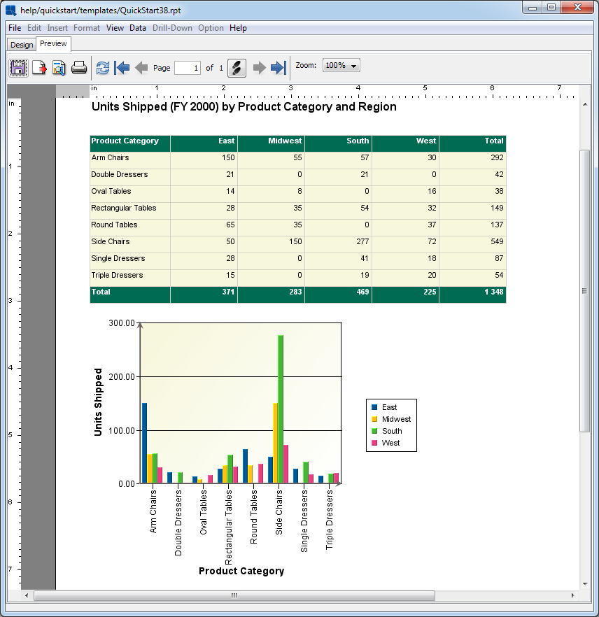
Report with Chart in Preview